Gallery of prints for sale

Sunday 25 November 2012

Colour & spatial depth: Brown, Kato Eishu, Tanomura Chikuden & Challis


What are some of the principles guiding artists’ use of colour and tone to create the illusion of spatial depth?


A rainbow illuminating my desk
Let me begin by saying that most folk have an inherent understanding of colour in terms of choosing the best colour for a certain purpose; this includes choosing a colour scheme for portraying spatial depth in an image. If asked to explain their choice, however, the discussion may lean more to personal associations, past experiences and popular expectations that relate to colour rather than pictorial conventions and theories dealing with colour and perception. Mindful that there is little point in addressing colour and spatial depth in terms of personal insights and dispositions—there are far too many variables impacting on the decision process to entertain such an undertaking—the following discussion focuses on three fundamental but closely related principles underpinning most artistic practices: colour perspective, chromatic perspective and tonal perspective. For the sake of clarity, most of the discussion concerns artworks created with paint (i.e. processes that colour theorists’ term “subtractive”) but most of the principles apply equally well to screen-based artworks including those that deal with projected light (i.e. processes that colour theorists’ term “additive”).

A rainbow illuminating my desk

Regarding the first of these principles, colour perspective, this is probably the most fundamental of all the ways that artists portray depth, as it involves all the hues of the rainbow. Essentially the use of colour to achieve pictorial depth in an image is a simple as saying: “Colours that are warm (i.e. colours like orange, red and all the browns that have associations with heat) should feature towards the foreground and the colours that are cool (i.e. colours like green and blue and all the aqua colours that have association with cold) should feature towards the background.” Such a simplistic statement, however, is only a broad guide and if applied in a formulaic way could lead to a perfunctory and unsatisfying outcome.


In terms of subtleties involved in using colour to achieve spatial depth, ideally an artist ensures that the colours in a composition “live happily with each other”—a poetic expression for a desiring a colour-coordinated image where each colour looks like it belongs and contributes in a cohesive way to a unified overall image. To achieve this colour unity artists often introduce an element of cool colour to a warm foreground and an element of warm colour to a cool background. This may involve literally adding a splash of each colour group to the other (as shown below in my painting, September Garden) or mixing all the colours with a touch of each other so that they all appear to belong to the same colour family (as shown further below in my painting, October Garden). Of course, an artist must be careful when mixing cool colours with warm as such mixtures of complements may result in images with muddy colours resembling army camouflage.


James Brown
September Garden, 2011
Oil on canvas
59 x 70.5 cm
[This painting has been sold]
James Brown
October Garden, 2011
Oil on canvas
59 x 70.5 cm
[This painting has been sold]

An important principle in making colours “sing” or “talk to each other” is the choice of colour placed in between. There is an old adage (thankfully ignored by most artists, as from my experience there is little truth to it) that “blue and green should never be seen without a colour in between.” For some artists this may be a useful rule, especially when blue and green play such a vital role in creating the illusion of spatial depth. Like all generalisations, however, the context in which colours are used is critical. Some artists, such as Sam Fullbrook (1922–2004), have no problem with placing strokes of blue and green together and their artworks are undeniably lyrical as a consequence. Of course, in other artists’ hands the same juxtaposition can appear unpleasantly saccharine. In terms of making the two colours sing, or excite the eye, however, there is truth to the adage. For instance, if middle-tone grey is placed between blue and green the abutting edge of grey beside the blue will appear to have an orange colour cast to it while the abutting edge of grey beside the green will appear to be a reddish grey (see colour diagram below). This colour interaction—technically termed “simultaneous contrast”—at the line of abutment is a marvellous way to induce the viewer’s eye to optically see more colours in an image than are really there. 

Juxtaposition of middle-grey with blue and green 
(Interestingly, the blue, grey and green are all the same tone)

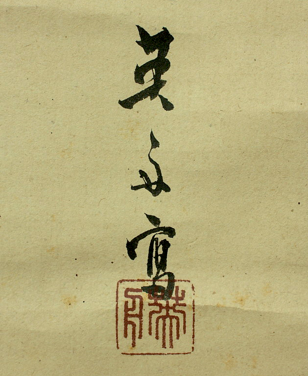
Arguably, Oriental artists have been aware of this phenomenon far longer than in the West, as it is a part of their brush tradition to connote colour without using colour. For example, in Kato Eishu (alias Einosuke, 1873–1939) scroll painting of chickens (shown below), the greyed magenta strokes giving form to the chickens’ comb, wattle and legs do more than simply enliven the painting with a dash of colour. To my eyes, or more specifically to my mind’s eyes, these stokes of colour affect my perception so that I see green in the rooster’s tail, yellow in the hen’s feathers and blue extending behind the chicken family. Even more peculiar, I see the dull magenta as not being a single colour but a full range of warm colours with the head of the hen appearing as scarlet and the head of the rooster as a dull violet-red (see the digital reconstruction with the colours I perceive shown further below.) While I can imagine sceptics wishing to propose that this is nonsense or symptomatic that I may need bucket loads of medication, thankfully Edwin Land’s Retinex theory (also known as the Land Effect) supports my perception.


Kato Eishu (alias Einosuke, 1873–1939)
Chickens
(upper left) view of the whole scroll
(lower left) view of the scroll when rolled
(right) detail of image section
Ink on paper scroll
173 x 43.8 cm (scroll); 113.5 x 29.3 cm (image)
Condition: light surface dustiness, minor wear to mount and folding lines commensurate with the age of the painting, otherwise in good condition.
I am selling this scroll for $370 AUD including postage and handling to anywhere in the world. Please contact me using the email link at the top of the page if you are interested.


Detail of Kato Eishu’s Chickens

Detail of Kato Eishu’s Chickens
(left) original detail of Kato Eishu’s Chickens
(right) digitally altered detail recreating the Land Effect

Edwin Land, the inventor of the Polaroid camera, discovered this effect in 1977 (see an excerpt from his talk for the BBC on colour perception below). Essentially, he proposes that our eyes and brain are “wired” to see colour constancy (i.e. our brain ignores changing local conditions in our view of coloured objects, such as cast shadows and reflected light, to ensure that our perception of the objects’ colours is consistent). Going further, our brain and eyes are equipped to add colour where colour constancy is needed. By extension of this fascinating discovery (presuming my understanding of the phenomenon is not too biased to how I wish to understand it), in the case of Kato Eishu’s Chickens, this means that my vision of an almost technicolour reading of what is essentially a monochrome painting is not outside the realms of possibility. 


Uploaded by technologizer on May 4, 2011
Excerpt from a 1985 episode of the BBC's Horizons show on colour perception, featuring Polaroid founder Edwin Land.

(For another site that explains the principle in an easy to understand way see: http://www.grand-illusions.com/acatalog/Land_Effect.html)


To test the efficacy of the Land Effect I have digitally reconstructed September Garden below by desaturating its hues (i.e. neutralising the colours to grey) but retaining the centre red flower in full colour. By intention, a viewer should be able to see colour in the surrounding grey tones based on an expectation of what the colours should be after seeing the full-colour image earlier. Whether this envisaged outcome is validated from personal experience or not is open for discussion. If it is validated, then the idea of limiting the number of colours employed to represent a broad spectrum of colours, especially with regard to portraying spatial depth, may be a useful guiding principle for constructing images.


Experimental test of the Land Effect 

Regarding chromatic perspective as a principle to achieve spatial depth, like colour perspective, it can be summed up in a very simple statement: “Saturated colours (i.e. colours that match the rainbow hues in intensity) should feature towards the foreground and colours that are chromatically degenerated (i.e. dull and greyed-out colours) should feature towards the background.” As is the case with colour perspective, however, there is a myriad of subtleties that can make the outcome of applying the principle more inviting than using it in a soulless perfunctory way. 

My painting of cactus flowers, Small Lanterns (shown below), for example, features vibrant foreground colours set against a grey background, but the two spatial zones of foreground and background are designed to “talk” to each other. This visual dialogue occurs at the silhouette edge of the flowers and leaves, where the cactus meets the background. Along this line of intersection I have added small accents of darker background tone at points where I conceived that the subject needed pictorial weighting to suggest tension in the cactus’ form. To my eyes, these nodal points bring the background and cactus close to the same spatial plane—as if the background and the cactus are like separate painted ceramic tiles with the dark tonal accents acting like grout joining them together (see detail further below). This connection of spatial planes at the nodal points, in one sense, creates spatial ambiguity by flattening the illusion of spatial depth. In a larger view of the painting as a whole, however, the perception of spatial ambiguity occurs only at the nodal points and, as a consequence of these points of connection, the painting may be seen as a cohesive, unified composition. In short, the subtlety of this device ensures that the key subject of a composition is not divorced completely from its surroundings even though the use of chromatic perspective presents the subject in deep space.

James Brown
Small Lanterns, 2011
Oil on canvas
70.5 x 59 cm
[This painting has been sold]
Digital accentuation of silhouette edges in Small Lanterns
Regarding tonal perspective in the use of colour, this principle for achieving spatial depth may be summed up in the statement: “Dark colours should feature towards the foreground and light colours should feature towards the background.” This arrangement of tones is straight forward and it captures the illusion of pictorial depth very well. As is always the case, however, there are exceptions. For example, if an artist wishes to represent the space in a small room the use of the rule would not produce a satisfactory outcome—the room would appear to be very deep. Accordingly, to portray shallow space, as in a small room, an artist reverses this rule and uses light colours in the foreground and dark colours in the background. Similarly in depicting a scene featuring a body of water, if the artist wishes to portray a lake or a wide river then the rule of a dark foreground with a light distance is fine. If, however, the artist wished to portray a small pond, creek or narrow canal then the rule should be reversed.

To demonstrate this phenomenon I will return to Japanese painting and offer the mountain landscape shown below by Tanomura Chikuden (1777–1835) as an image to focus on. Before I start, however, I need to clarify how the tones are used in the painting, because, like all Oriental paintings, side lighting is not used to give a subject form and to create the illusion of three dimensions. Going further the varying tones of black ink in this painting do more than display a grey scale version of a mountainous landscape receding into the distance; the way the brush strokes are laid and the white spaces between them express mood and colour. In fact Tamomura Chikuden’s paintings are famous for representing melancholy by the phrasing and disposition of his marks. In the detail further below, for instance, note how he builds the texture of the mountain by the dot-like deposits of ink that he leaves at critical stages along a line.

Tanomura Chikuden (1777–1835)
[Mountainous Landscape]
(upper left) view of the whole scroll
(lower left) view of the scroll when rolled
(right) detail of image section
Ink on paper scroll
199.1 x 4.7 cm (scroll); 134.7 x 33 cm (image)
Condition: several minor marks and folding lines commensurate with the age of the painting, otherwise in good condition.
I am selling this scroll and box for $390 AUD including postage and handling to anywhere in the world. Please contact me using the email link at the top of the page if you are interested or click the “Buy Now” button below.
This scroll has been sold

(left) detail of Tanomura Chikuden’s brush strokes
(right) detail area of the painting marked in red 

In terms of tonal perspective, this painting relies on the same tonal perspective principle as artists use in the West: a dark foreground and a light toned distance. The application of the principle, however, is far from a Western approach. In a broad way, each mountain is presented a tone lighter than the next to achieve spatial depth in accordance with the tonal perspective principles. Nevertheless, each mountain is painted like a stage-flat, with pancake-shallow space, separated from the other mountains by mist.

This perceived flattening of the individual mountains is a conundrum: at first glance, the application of the principle seems to be applied but closer inspection reveals inconsistencies that result in the flattening. For example, in the detail shown below of a cluster of mountain ridges, the lighter aspects of the front ridge are towards the foreground (i.e. the viewer) while the darker aspects are towards the distance—an arrangement that is inconsistent with the perspective principle. The ridges behind the closer one, however, may be viewed as darker towards the foreground (i.e. the centre areas of the ridges) with their lighter aspects at the silhouette extremities—an arrangement that is consistent with the perspective principle.


Detail of Tanomura Chikuden’s landscape
As an exploratory Western approach to portraying the same mountain I have inverted the tones in the digitally adjusted detail shown below (my apologies to sensitive folk that object to any manipulation of masterpieces).

Detail of Tanomura Chikuden’s landscape with inversion of tones and other digital modifications to deepen the illusion of spatial depth
A Western artist’s application of the principle may be seen in E Challis’ engraving of JMW Turner’s The Arch of Titus—Rome (shown below). Here, the foreground including the sky is dark and the far distance is light in tone. What is fascinating about the introduction of colour shown in the watercolour tinted version of the same print (see further below) is how colour perspective can present a challenge when it is used in conjunction in with tonal perspective—as invariably it is. I mention this because if an artist wishes to portray a shadowy foreground then the choice of colours is usually biased to the cool hues. Conversely when an artist wishes to portray a light background the choice of colours is usually biased to warm hues. This can be a problem as such an arrangement conflicts with colour perspective where the warm colours should be in the foreground and the cool colours should be in the distance. Although from a technical standpoint this is a concern, in reality the effect of colour constancy in the mind’s wiring overcomes the problem as the eye makes adjustments according to lighting effects such as shadows. A most arresting demonstration of the eye’s ability to make adjustments for shadows and light may be seen in the famous Addison Illusion (demonstrated in the video further below).

(engraver) E Challis
(artist) JMW Turner (1775–1851)
(upper image) The Arch of Titus—Rome
Published 1861, The Art Journal, Virtue and Co, London
Engraving, 15.5 x 27.5 cm (image); 23 x 32 cm (sheet)  
(lower image) The Arch of Titus—Rome
Published 1876-9, The Turner Gallery by George Virtue and D. Appleton & Co., London & New York
Engraving, hand-tinted with watercolour on heavy cream wove paper
15.2 x 27.5 cm (image); 24.5 x 36.5 cm (sheet)  
Condition: slight age toning to edge otherwise in good condition.
I am selling both of the above prints (i.e. the black and white engraving and the watercolour tinting version of the same print a combined total cost of $86 AUD including postage and handling to anywhere in the world. Please contact me using the email link at the top of the page if you are interested.
Detail of Challis’ The Arch of Titus—Rome


Uploaded by uoplerta on Aug 13, 2011
The Adelson Illusion 

_____________________
In future posts I will augment these three perspectives with additional ones, such as, opacity, sheen, shape and texture perspectives.

Most important, for the first time I have opened the blog to comments. 
Please let me know your thoughts, advice about inaccuracies (including typos) and additional information that you would like to add to any post. 

Tuesday 13 November 2012

Dotted Lozenge: Goltzius


What are some the advantages of the dotted lozenge style of rendering?

Detail of Hendrik Goltzius’ Vulcanus (1592), showing the dotted lozenge style of rendering tone

There are many drawing styles with long historical pedigrees of use (e.g. the return and hook strokes discussed in the earlier post, Passion in a Line), but one style that has virtually disappeared from use is the dotted lozenge (shown in the detail above). This distinctive style for rendering the effects of light and shade on a subject involves the artist in initially laying down a matrix of cross-hatched strokes (i.e. a set of parallel lines overlaid by another set of parallel lines aligned at an angle to the lines underneath as shown in the diagram below) and then inserting a dot in the centre of the diamond-shapes (lozenges) created in the cross-hatched matrix (see further below). The following discussion traces the evolution of this style and proposes some of the advantages for its use in the hope that the style may be revived with fresh applications for digital illustration.

Cross-hatched style of rendering
Dotted lozenge style of rendering

The artist credited with the development of this rendering style is Hendrik Goltzius (1558–1617). Like all styles, it didn't simply appear one day. Instead, it evolved from the rendering practices of other artists and the Goltzius morphed them into the dotted lozenge manner of shading. For instance, Albrecht Durer (1471–1528) developed the line and dot technique for rending the transition from dark tones to light involving a set of parallel lines to represent shadows that taper off into dots aligned to the end of each line to represent the transition to light (see diagram below with detail of Durer’s famous engraving, Adam and Eve). 


(left) Durer's line and dot style of rendering
(right) Detail of Durer’s Adam and Eve, 1504

Uploaded by on Nov 11, 2010

Even Durer’s style had it predecessors with engravers like the Master of the Playing Cards (active c.1425–50) who used parallel lines of varying length to represent tonal changes (see detail below of Saint Sebastian by the Master of the Playing Cards).


left) Master of the Playing Cards’  parallel lines of varying length style of rendering
(right) Detail of Master of the Playing Cards’ Saint Sebastian, c. 1425–50


Regarding the use of dots without any line work to render a tonal transition, Giulio Campagnola (c.1482–after1515) is credited with being the inventor of the “dotted manner” (i.e. stippling as shown below in the diagram and detail from Campagnola’s Venus Reclining in a Landscape) but the use of dots extends back earlier into the fifteenth century with the punched dots in metal-cut prints and far earlier to the first cave paintings. 


(left) Campagnola’s dotted manner (stippling) of rendering
(right) Detail of Campagnola’s Venus Reclining in a Landscape, c.1508–09

The cross-hatching style had its own evolution as well. This style made its first appearance in the prints of Master ES (active c. 1450–67) (see diagram and detail below from The Visitation by Master ES). Here the type of cross-hatching features sets of straight aligned strokes that are multi-layered when dark tones are required and thinned in their layering for the light tones.  

(left) Master ES’ cross-hatching style
(right) Detail of Master ES’ The Visitation, c.1450 

This style of cross-hatching then evolved with Martin Schongauer (c.1448–1491) whose prints were the first to feature curved lines lightly delineating the contours of the subject in the cross-hatched strokes (see diagram and detail below of Schongauer’s Christ as the Man of Sorrows between The Virgin Mary and St John).

(left) Schongauer’s curved cross-hatching style
(right) Detail of Schongauer’s Christ as the Man of Sorrows between The Virgin Mary and St John, c.1471–73


Even the attributes of the lines used in shading had evolved by the time of Goltizius allowing him to build upon Schongauer’s curved cross-hatching. At the time of Master ES and Master of the Playing Cards, for example, the lines employed were the same thickness along the shaft of the strokes reflecting the type of burin used to engrave the lines. With the invention of the échoppe (i.e. an etching needle with a oval-sectioned end) by Jacques Callot (c.1592–1635) the mechanical regularity of the early engravers’ lines used for shading gave way to etched lines of varying thickness that could be manipulated to swell when depicting dark areas of an image and become thin when depicting lit areas (see diagram and detail below of Callot’s The Nobleman with Fur coat).


(left) Callot’s swelling style of line
(right) Detail of Callot’s The Nobleman with Fur coat, 1624

Subtleties, such as Callot’s phrased swelling of line and Schongauer’s curved cross-hatching, became an important variable in Goltzius’ application of the dotted lozenge style. For instance, in Goltzius’ engraving, Marcurius (shown below), his phrasing and curving of the strokes articulate the surface contours of Mercury’s belly while Campagnola’s "dotted manner" renders the final stage of the tonal transition into light with a gentle merging of the inscribed marks with the white of the paper. 


Hendrik GOLTZIUS (1558–1617)
Marcurius [Mercury], 1592
After Polidoro da Caravaggio (c.1500–1536)
From the series: Eight Deities
Engraving on laid paper
Lettered above “MARCURIUS”; in lower left “Polidorus” and at right “HG. Sculp. 8”
35.9 x 21.7 cm (plate) 45 x 30.8 cm (sheet)
Strauss 296; Hirschmannn 303; Hollstein 303.ll;
New Hollstein 322 (Hendrick Goltzius); Bartsch lll.77.254
Condition: Very strong impression (most likely a lifetime impression) with wide margins. The sheet is supported on thin Gyokuryu paper because of tears on the edges of the sheet (well away from the image). There are handling marks, damp stains towards the top of the sheet but otherwise the print is in good condition. I am selling this print for $380 AUD including postage and handling to anywhere in the world. This is a large print and will be shipped in a tube. Please contact me using the email link at the top of the page if you are interested or click the Buy it Now button below.

This print has been sold


Detail of Goltzius’ Marcurius

The flexibility of the dotted lozenge for showing the extremes of tone from the darkest shadows to brilliant light and its flexibility to express vitality by virtue of the swelling lines made the style popular with artists. This was especially true around the time of Goltzius as by 1585 there was strong interest in the expressive potential of theatrical exaggeration typifying the period style of Mannerism. For the Mannerists, such as Bartholomeus (Bartholomaeus) Spranger (1546–1611), whose paintings Goltzius translated into prints, the plasticity of modelling that the swelling line provided and the precision that the placement of the dots permitted lead to a new phrase in the art lexicon for describing the ultimate form of vitality: Sprangerism—a term exemplified by displays of voluminous muscles, contortion of the subject and bravura in laying closely aligned marks to render form.

Beyond providing the artists with a very adaptable style, there is another interesting outcome that has important ramifications when using the dotted lozenge: the placement of dots into the matrix of cross-hatching helps to prevent the formation of moiré patterns. These patterns arise when two sets of parallel lines are overlaid but they are most noticeable when the parallel lines in each set are spaced close together and the sets of lines are overlaid at very slight angle to each other.

Uploaded by the by ElicaTeam


For instance, in Goltzius’ Vulcanus, compare the cross-hatched background beside Vulcan’s left leg (shown below) where no dot features in the matrix of lines with the dotted lozenge treatment of his leg (shown further below). From my observation, the background where there are no dots has moiré patterns, whereas Vulcan’s leg has no, or few, apparent patterns. Arguably, what is happening to the optical illusion is that the dot in the cross-hatched matrix disrupts the patterns from forming. But there is also an alternative explanation that has little to do with the dots causing interference: moiré patterns are minimised when the angle between the sets of parallel lines is close to either 45 or 90 degrees.

Hendrik GOLTZIUS (1558–1617)
Vulcanus [Vulcan/Hephaistos], 1592
After Polidoro da Caravaggio (c.1500–1536)
From the series: Eight Deities
Engraving on laid paper
Lettered above "VULCANUS". In lower left corner "Polidorus Inue" and at right "HGoltzius. Sculp.". Numbered in lower right corner "4".
35.6 x 21.7 cm (plate) 45.3 x 31 cm (sheet)
Strauss 292; Hirschmannn 299; Hollstein 299.ll;
New Hollstein 318 (Hendrick Goltzius); Bartsch lll.77.252
Condition: Very strong impression (most likely a lifetime impression) with wide margins. The sheet is supported on thin Gyokuryu paper because of tears on the edges of the sheet (well away from the image). There are handling marks, damp stains towards the top of the sheet but otherwise the print is in good condition. I am selling this print for $380 AUD including postage and handling to anywhere in the world. This is a large print and will be shipped in a tube. Please contact me using the email link at the top of the page if you are interested or click the Buy Now button below.

This print has been sold
Detail of Goltzius’ Vulcanus showing moiré patterns in the cross-hatched background

There are many reasons for the abandonment of this versatile style towards the end of the nineteenth century: fresh ways of making images arose; the process of cross-hatching following by dotting is technically demanding and time consuming; and, the outcome can appear mechanical with resonance of a past era in printmaking. Like a lot of traditional styles, however, there will come a time for their revival when the time is “right.” A few decades ago the time was certainly not right but with the fresh ways of creating images now that the digital age has arrived, this may be the moment to reinvent the dotted lozenge.

In the digital experiments below, I have used some of the default filters in Photoshop to add new dimensions to the dotted lozenge in the hope that they may suggest ways to breathe life into this virtually forgotten style. The first pair of images explores the idea of reshaping the matrix of marks into a bas-relief. The second pair of images demonstrates the effectiveness of blur and lens flare filters to create tonal gradations that would not have been possible for the early printmakers. The final set of images explores alternative ways to change the dotted lozenge from negative (white) lines to positive (black) lines—a simple flick of a tool.

Dotted lozenge as bas-relief 
Dotted lozenge with blur (upper image) and lens flare (lower image) 
Dotted lozenge with transition from negative (white) lines to positive (black) lines

Wednesday 7 November 2012

Formatting an image: Van Sichem, Springinklee, Sadahide, Hecht, Smith, Legros & Lepere


What are some issues underpinning the choice of a format shape (i.e. outer boundary) for an image?


To thoroughly address the issues involved in formatting an image, the range of format shapes (or lack of a boundary at all) would necessitate tedious and repetitiously listing of similar issues. Moreover there is also the phenomenon that the digital age has brought a new meaning to what constitutes the boundary edge of an image—at least from the audience’s viewpoint. After all there is no longer a tangible support sheet of paper or canvas that sets the outer limits for an image. Mindful of the above realities, I have limited the scope of the following discussion to the following format shapes in the hope that most of the key issues concerning formatting of images will be addressed: an image with a delineated boundary (i.e. a borderline around the image); a polyptych (i.e. a group of images abutting each other that may be read individually in terms of their composition or as a single cohesive group composition); a vignette (i.e. an image fading away from the centre); and, a free-form boundary (i.e. a border created by the pictorial requirements of the subject).

Regarding the first of these boundaries (i.e. a borderline marking the outer edge of the image), the earliest woodcuts invariably feature a bold borderline, such as the Christoffel van Sichem II’s Saint Paul (shown below and discussed in the earlier post, Van Sichem II: Advancing & receding forms). One reason for using a solid line around a woodcut image is certainly to separate the image from potentially distracting imagery or text surrounding it, but there is also a practical reason: the printing process involved in creating a woodcut impression “needs” the borderline. This is because the solid edging of wood on the woodblock that produces the printed borderline acts as a physical support during the process of inking and pressing the print to ensure that the ink is distributed evenly. Moreover, without such an edge the finely cut lines further within the image would crumble very quick during successive printings as there would not be a supporting rim of wood taking the impact of the printing process.

Christoffel van Sichem II (1581–1658)
St Paul, published 1648 (but most likely executed in 1620)
From the 17th century biblical text, t'Scat der Zielen, dat is: Het geheete leven ons Heeren Jesu Christi..., published in Amsterdam in 1648 by Pieter I. Paets.
Woodcut, 34.2 x 21.7 cm (sheet)
(see further discussion about this print in the earlier post: Van Sichem II: Advancing & receding forms)
For example in Hans Springinklee’s The Ambassadors of Emmanuel, King of Portugal, demanding the Hand of Eleanor, eldest daughter of Philip I of Castile (shown below) the print is a composite of two plates and no borderline exists where the plates abut each other. To fully appreciate the importance of the outer framing line, compare the sharpness of the printing where the imagery is close to the borderline (see details A and B shown further below) with the areas towards the centre of the print which do not have a borderline support (see detail C also shown below).

Hans Springinklee (c.1490/95–c.1540)
The Ambassadors of Emmanuel, King of Portugal, demanding the Hand of Eleanor, eldest daughter of Philip I of Castile, 1515–1518
from the 1775 edition of Weisskunig, plate 156. 
Woodcut in two sections
This print is a composite image taken from two separate blocks with two versions of the smaller block allowing for three different printed variations (see The Fitzwilliam Museum catalogue entry for this print: http://www.fitzmuseum.cam.ac.uk/opac/search/cataloguedetail.html?&priref=129820&_function_=xslt&_limit_=10 [accessed 27.10.2012]).
Condition: strong impression on paper with no foxing or blemishes. There is a previous collector’s ink stamp on verso, along with pencil and ink inscriptions and mounting hinges. The original packaging for this print (no longer available) showed the following inscription that may provide authenticy and printing state information but I am not familiar with these catalogue sources:C.D.I., 374, 4 (1); Put 220 v." I am selling this print for ... [deleted] including postage and handling to anywhere in the world. Please contact me using the email link at the top of the page if you are interested or click the “Buy Now” button.


[deleted] 
(left) Detail A of the left side of Springinklee’sThe Ambassadors of Emmanuel, King 
of Portugal, demanding the Hand of Eleanor, eldest daughter of Philip I of Castile
(right) Detail B of the right side
Detail C of the unsupported centre area of Springinklee’sThe Ambassadors of Emmanuel, King of Portugal, demanding the Hand of Eleanor, eldest daughter 
of Philip I of Castile

With regard to the formatting of a polyptych, the boundary edge separating each panel in a multi-panelled overall image serves two vital functions. First, the abutting edge of each of the panels helps the viewer to visually digest what may be a large and conceptually complex image into smaller more easily negotiable portions to contemplate and understand. Consider, for instance, the difficulty in reading the text and images interspersed in the pages from a nineteenth-century Japanese woodcut book shown below and compare this sea of visual information with the text and images separated into abutting panels in the three pages from Gountei Sadahide’s (1807–1873) The Chronicle (shown further below).

Two-volume book of Japanese tales bound together with a colour woodcut frontis plate for each volume and black woodcut illustrations throughout, c. 1880
16.5 x 11 cm
Condition: poor condition with significant signs of handling, worm holes and general grubbiness. I am selling this book for $120 AUD including postage and handling to anywhere in the world. Please contact me using the email link at the top of the page if you are interested or click the “Buy Now” button.


This book has been sold


View of the above book showing one of the colour woodcuts
Gountei Sadahide (1807–1873)
Three pages from The Chronicle
25.5 x 16.5 cm (approximate size of each leaf)
Condition: slightly worn impressions with age toning, I am selling the three prints for ... [deleted]  including postage and handling to anywhere in the world. Please contact me using the email link at the top of the page if you are interested or click the “Buy Now” button.


[deleted] 

The second important function is all about visual dialogue. Here, the abutment of each panel with the next invites the viewer to see relationships among the displayed features of the panels and to correlate the projected meanings of all the panels into a single collective multi-layered meaning—a bit like two people on either side of a river noticing each other and starting a conversation. The critical difference between a collection of artworks wedged together and a polyptych lies with the concept of visual dialogue: the collection of artworks wedged together can only be conceived as a polyptych if there are conceptual links uniting them as a composite whole. There is also a difference between a large image that is simply broken into panels and then reunited and a polyptych with is a composite image of separate but related components.

Sometimes, however, the difference is not so clear. For example, in another nineteenth century Japanese book of woodcuts shown below, there is a borderline around each plate that separates one image from the next. When the book is opened, the portrayed subject in each pair of prints—termed a diptych—is a continuation of the same scene. This would normally mean that these prints are not diptych panels at all, but rather a single image that is broken into two portions. From my standpoint, however, the pairs of prints are diptych panels rather than a single cut image as each plate is a separate unified composition with features clearly intended to be read in visual dialogue with its partner. For instance, both pairs of images shown below feature a figure in one plate responding to another figure in the opposing plate. And, importantly, this portrayed communication between the figures is across the printed borderline and the physical gap of the pages (see details further below).


A Japanese book of black and white woodcut illustrations with a colour woodcut frontis on original paper cover, c. 1880
16.5 x 11 cm
Condition: a little worn, marked, some creasing and wormholes. I am selling this book for ... [deleted]  including postage and handling to anywhere in the world. Please contact me using the email link at the top of the page if you are interested or click the “Buy Now” button.

[deleted] 


Cover of the above book


Detail of visual dialogue between figures

Regarding the third type of image format—the vignette—the all important issue is to fade the image from a point of fixation usually arising from a binocular viewpoint. By this I mean, looking at the subject with two eyes where the focus is narrowed to a point while away from this point, in a full 360 degrees, the focal clarity diminishes. An example of this approach to the vignette format may be seen in Wilhelm Hecht’s (1843–1920) etched portrait of the German painter, Carl Piloty (shown below). Here, the viewer’s attention is focused on the Piloty’s face, partly because it is positioned towards the centre of the plate mark on the vertical axis and also because the treatment of the facial features are so finely rendered in detail. As the viewer’s eye strays away from this area of high focus down the subject’s coat and away into the background, the treatment of the surface details becomes progressively more about loosely laid strokes than with showing intimate details of the subject (compare the details further below).

Wilhelm Hecht (1843–1920)
Carl Piloty, 1883
Etching on heavy cream wove paper
Signed in the plate lower left: “W. Hecht. 83”
Inscribed below the image at the centre, “DRAWN & Etched by W. Hecht.”, with “CARL PILOTY” inscribed further below at the centre
35 x 28.5 cm (plate); 24.6 x 20.3 cm (image); 43.5 x 32.5 cm (sheet)
Condition: very strong impression. The paper is clean (almost pristine) with small nicks and minimal handling marks. I am selling this print for $85 AUD including postage and handling to anywhere in the world. This is a large print and will be shipped in a tube. Please contact me using the email link at the top of the page if you are interested or click the “Buy Now” button.

This print has been sold
Detail of Hecht’s Carl Piloty

Another use of the vignette is to recreate the effect of tunnel vision—arguably, a peculiarly male type of vision arising from the primordial hunter’s targeted focus. As an example of this curious phenomenon of tunnel vision, John Moyr Smith’s (1839–1912) Macbeth and Macduff (shown below) is ideal. By design, the print focuses attention on the two outstretched arms of the protagonists at the centre of the image by progressive darkening and distorting the scene towards the peripheral rim (see details further below). This treatment of the outer boundary raises the question that is not often addressed by artists: how should artists portray subject material at the outer field of their vision—the peripheral rim? Of course this seemingly simple question raises a host of other closely linked questions relating to the various vision types such as day vision (also known as phototopic, cone and colour vision) and night vision (also known as scotopic, rod and peripheral vision).

John Moyr Smith (1839–1912)
Macbeth and Macduff, 1889
Etching in brown ink on heavy cream wove paper
26.3 x 17.5 cm (plate); 40.2 x 18.7 cm (sheet)
Illustration (plate 25, Act V, Scene Vll) from, The Tragedie of Macbeth, published by Sampson Low, Marston, Searle & Rivington, London.
Condition: strong impression in pristine condition. I am selling this print for ... [deleted]  including postage and handling to anywhere in the world. This is a large print and will be shipped in a tube. Please contact me using the email link at the top of the page if you are interested or click the “Buy Now” button.

[deleted] 

Detail of John Moyr Smith’s Macbeth and Macduff, 1889
Although the point of fixation may be more than a fine point and in fact may span a whole face, or even a much larger area, as in the case with Moyr Smith’s print, with some images the point of fixation is indeed a very small area that is in focus. For example, in Alphonse Legros’ (1837–1911) portrait of the artist, George Fredrick Watts (1817–1904)(shown below), the point of fixation is Watt’s nose. Compare, for instance, the transition in focus between the sharp focus on his nose with soft focus on his ear (see details further below). In rendering the nose, Legros has used fine, short lines that are closely spaced and modelled with strong contrast between the dark of the nostril and the light on the nose ridge. By contrast, the ear is treated with more widely spaced and broken strokes and with minimal tonal contrast. As is the case with Hecht’s portrait, the portrayed deterioration of focal clarity continues from Watt’s face to the lower reaches of his coat. Interestingly, Legros must have been very conscious of presenting a smooth transition in focus in this area. I mention this as he has diminished the initial strength of loosely laid lines describing the lower coat in the earlier state of the print (see the first image) so that the edition with the text line, “G.F.Watts” (see the second image), presents a more gradual softening of focus.


Alphonse Legros (1837–1911)
Portrait de G.F. Watts RA, 1879
Etching and drypoint printed in brown-black ink on wove paper
(upper image) state before letters
18.5 x 13.5 cm (plate); 31.5 x 24.5 cm (sheet)
(lower image) state with the text line: “G.F.Watts” (lower centre) and “A.Legros sc” (lower right). This state has a revised image margin created with plate tone. The line work of the previous state is still visiable where the plate tone has been erased.
Published in the Journal of Modern & Ancient Art (1900).
18.3 x 13.3 cm (plate); 28.8 x 21.8 cm (sheet)
Condition: both prints are strong impressions in pristine condition.
I am selling both states of this print (i.e. two prints) for $210 AUD including postage and handling to anywhere in the world. Please contact me using the email link at the top of the page if you are interested or click the “Buy Now” button.

These prints have been sold
Detail of Legros’ Portrait de G.F. Watts RA
(left) initial strokes before the line of text is added
(right) the same strokes softened (burnished) after the line of text is added
Before moving to the issues underpinning the next approach to formatting—a free-form border—I need to point out that there is a difference between Legro’s etching of Watts that relies on a binocular viewpoint (i.e. Legros’ had both eyes open when he drew Watts) and a monocular representation of Watts (i.e. if Legros had portrayed Watts by only looking through as single eye in the same way that a single lens camera would capture Watts). In the case of a monocular depiction of Watts, the focus would be on a single plane, like a sheet of glass extending to infinity, that is parallel with the eye or lens and every feature of the subject on this plane would be in focus and every feature behind or in front of the plane would gradually become blurred away from the plane. The reason that this may be an issue with a vignette lies with the fact that the plane of focal clarity extends “forever” without fading towards a peripheral rim. In reality, however, a single eye or lens does have a limited range of view and so a vignette using monocular vision is a fully justifiable and authentic format.


The final type of format I wish to discuss is not really a format shape at all but rather an inevitable outer boundary to an image dictated by the subject’s physical dimensions. For example, the hand-finished offset lithograph prints, Oncidium Crispum and Stenocarpus Cunningham (shown below), at first glance look like they both have rectangular format boundaries suggested by the portrayed plants having been pictorially cropped on all sides. On closer inspection, however, this perception is not true. In fact the leaves of the plants are depicted as physically cut along with the far right flower stem of the orchid (see details further below). In short, the initial perception of the featured subjects having been composed in a neat rectangular frame is simply an illusion, but an illusion designed to fool the eye nonetheless.

Instead of the tight constraint of a rectangle’s geometrical format, the plants form their own naturally composed frame, which, by the artist’s clear intention, just happens to be like a rectangle. Such a “naturally composed frame” is not limited to the silhouette edge in two dimensions. In the image of the orchid, Oncidium Crispum, for instance, the artist projects the orchid bulbs and the spray of flowers towards the viewer carving in space a three-dimensional format perceived as the outer surface of a free-form volume.

Oncidium Crispum, c. 1860
from Louis Van Houtte & Charles Lemaire’s Flore des serres et des Jardins de l’Europe, published in Ghent, 1845–88
Offset lithograph hand finished at the time of publication.
25 x 32 cm (sheet)
Condition: sharp image with strong colour, reverse side blank and with centre fold as issued. There is scattered foxing otherwise in good condition. I am selling this print (Oncidium Crispum) and the print below (Stenocarpus Cunningham) (i.e. two prints) for the total cost of $58 AUD including postage and handling to anywhere in the world. Please contact me using the email link at the top of the page if you are interested or click the “Buy Now” button.


This print has been sold

Detail of Oncidium Crispum showing cut leaves
Detail of Oncidium Crispum showing cut spray of flowers
Stenocarpus Cunningham, c. 1860
from Louis Van Houtte & Charles Lemaire’s Flore des serres et des Jardins de l’Europe, published in Ghent, 1845–88
Offset lithograph hand finished at the time of publication.
34 x 24.5 cm (sheet)
Condition: sharp image with strong colour, reverse side blank and with two centre folds as issued. There is light offsetting of text showing on the background and wear on the two folds, otherwise in good condition. I am selling this print (Stenocarpus Cunningham) and the print above (Oncidium Crispum) (i.e. two prints) for the total cost of $58 AUD including postage and handling to anywhere in the world. Please contact me using the email link at the top of the page if you are interested or click the “Buy Now” button above.
Detail of Stenocarpus Cunningham showing cut leaves
The concept of an image having its free-form boundary determined by the portrayed subject’s form does not have to be limited to the subject’s silhouette edge. In Lepere’s etching, Un quai à Rouen (shown below), for instance, the borderline is the outcome of the artist’s perceiving a line of connected features of the portrayed busy quay—a type of line that I have discussed in the post Linear Vectors & Nodal Points in terms of a linear vector. It begins in the immediate foreground with cobble stones. Next, when reading anti-clockwise, the line links together the outer edge of a group of wharf-workers before it ascends vertically following the shadow side of a docked ship to its uppermost point on the ship’s flag pole. From this uppermost point, the line then follows, in a much less delineated course, the outline of distant clouds and the far side of the harbour before descending to the water and once again follows the outer edge of the same group of wharf-workers. The reading of this line of connected features has elements of the vignette format but the essential difference is that here the boundary does not show a significant focal deterioration of details.

Auguste-Louis Lepere (1849–1910)
Un quai à Rouen, 1899
Published in Revue de l'art Ancien et Moderne
Etching printed by Chardon Wittmann on cream wove paper
20.8 x 14.4 cm (plate); 26 x 20.2 cm (sheet)
Condition: strong impression is pristine condition.
I am selling this print for ... [deleted]  including postage and handling to anywhere in the world. This is a large print and will be shipped in a tube. Please contact me using the email link at the top of the page if you are interested or click the “Buy Now” button.


[deleted] 

Detail of Lepere’s Un quai à Rouen, 1899

There are so many different types of formats that I could—and perhaps should—discuss; for instance, the tondo (a circular format) and formats where the border annotates the portrayed subject that it frames, such as may be seen in the engravings by Pintz (discussed in the post Expression by Juxtaposition. Although I do not wish to dismiss this consideration, my intention, as I commented at the start of this discussion, is to clarify the issues underpinning just a handful of different types of formatting with the view that the same issues also underpin most of the other format types. Nevertheless, in future posts I will address more formats, as there are some that are very interesting ones that draw upon the world of optical illusions.