What are some approaches to using colour for portraying form?
There is a long tradition in drawing extending back at least to the sixteenth century with artists like Jean Clouet (c.1475/85–1540) of using black and sanguine chalks on a buff coloured ground, as can be seen in Clouet’s study, Portrait of a Woman [Queen Marguerite of Navarre?] (shown below). Here, Clouet’s refinement of using a touch of colour to this otherwise grey drawing adds colour warmth and full-blooded life to the portrait. Colouet’s subtle use of colour is also matched by his sensitivity in applying the chalk, as Perrin Stein (curator of the 2005 exhibition at the British Museum
Clouet's style is characterized by a delicate handling of the chalk; the planes of the face are typically modelled in soft diagonal hatching, from upper right to lower left, blending black and red to produce naturalistic flesh tones, effects that have been compared to the sfumato of Leonardo. In addition, the British Museum
 |
1908,0714.46
© The Trustees of the
Jean Clouet (c.1475/85–1540)
Portrait of a Woman [Queen Marguerite of
Black and red chalk
18.9 x 19.6 cm
=1&searchText=1908,0714.46 [viewed 30 March 2013])
|
In the eighteenth century, artists such as Antoine
Watteau (1684–1721) applied the use of three differently coloured
chalks—usually white, black and sanguine—on a mid-toned and often coloured sheet
of paper to render their chosen subjects in an approach termed, aux trois crayons (French translation
for “with three pencils/crayons/chalks”). The principle behind this approach is
that the toned support sheet for the drawing acts as a mid-tone while the white
and black chalks allow for the extremes of a tonal range from white to black in
a drawing. Augmenting this tonal spectrum is the use sanguine chalk—a blood red
colour—designed to add a touch of colour and to anoint the portrayed subject
with the suggestion of life. Watteau’s use of the aux trois crayons approach may be seen very clearly in his drawing,
Five Studies of a Woman's Head (shown
below).
 |
AN244844001
© The Trustees of the
Antoine Watteau (1684–1721)
Five studies of a woman's head, one lightly sketched, c.1716–17
Two shades of red, black and white chalk, on buff paper
33.1 x 23.8 cms
&images=on&numpages=10¤tPage=18 [Viewed 30 March 2013])
|
The evocation of a full range of colours that a viewer may perceive when looking at a drawing executed with the extremely limited palette of the aux trios crayons approach can be explained with reference to the fascinating phenomenon termed the “Land Effect” (see earlier post, Colour and spatial depth). Nevertheless, even a drawing executed in sanguine chalk alone can connote a wide range of colours for a receptive viewer. For example, some sensitive folk may perceive a range of mind-generated colours when looking at the effect of the single colour, sanguine, in Watteau’s drawing of an engraver at work (shown below). This capacity of the mind’s eye to manufacture colours beyond what is provided by the artist is assisted even more when a neutral tone especially the mid-tone of grey is added to an artwork executed in a single colour. This capacity can be tested by looking at the somewhat muddy drawing, View of a North Italian Town
 |
AN244844001
© The Trustees of the
Antoine Watteau (1684–1721)
An engraver working at his table [M. Baron or Nicolas Dorigny?], c.1717 (?)
Red chalk
23.5 x 30.4 cms
Page=12 [Viewed 30 March 2013])
|
 |
AN245790001
© The Trustees of the
Attributed to Antoine Watteau (1684–1721)
also attributed to Nicolas Vleughels (1668–1737)
View of a north Italian town, with a campanile and distant mountains;
bell tower and various buildings within the town walls, boats on water
in the foreground and mid-distance, mountains behind,
tree at left foreground, c. 1684–1721
Red chalk, and grey wash
14.3 x 21 cms
currentPage=15 [Viewed 30 March 2013])
|
The colour of the ground (i.e. the colour of the paper) also plays a significant role in how an image is perceived. This is especially true for artworks executed using the aux deux crayons (French translation for “with two pencils/crayons/chalks”) approach. For example, the warm neutral tint of the paper in Bernard-Romain Julien’s (1802–71) exquisite renderings, Etude aux deux crayons N°13 after Perignon, Etude aux deux crayons N°60 after Brune and Etude aux deux crayons N°78 after Rougel (shown below, see also the equally fine rendering of a child discussed in the earlier post, Five key responses to art) makes a significant contribution to the meanings that these prints project.
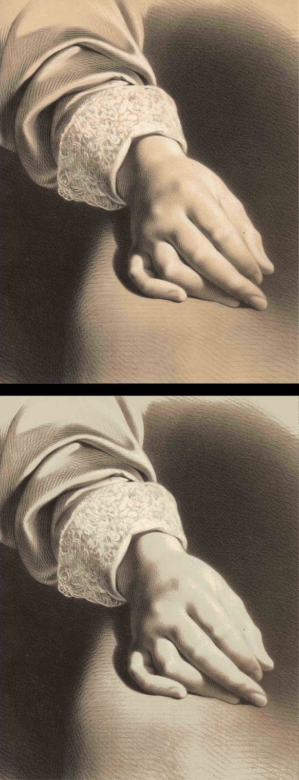
As a final example of using the ground as an integral additional colour and tone in an two-colour image I wish to draw attention to the highly refined use of ground colour in Julien’s Grande etude aux deux crayons, No. 15 (shown below). Of special interest, note the subtle gradation of tone in the foreground figure’s shoulder and how the ground colour is seamlessly integrated into the neutral tones rendering the shoulder’s contours.
 |
Bernard-Romain Julien (1802–71)
Etude aux deux crayons N°13 (after Perignon)
Lithograph on cream wove paper (vellum)
45.5 x 30.8 cm
Condition: strong impression with light surface soiling and signs of use (two pin holes on the far left that are probably binding marks).
I am selling this print for a total cost of [deleted] including postage and handling to anywhere in the world. This is a large print and will be posted in a tube. Please contact me using the email link at the top of the page if you have any queries or click the “Buy Now” button below.
|
 |
Detail of Julien’s Etude aux deux crayons N°13 (after Perignon)
|
 |
Detail of Julien’s Etude aux deux crayons N°13 (after Perignon)
|
 |
Bernard-Romain Julien (1802–71)
Etude aux deux crayons N°60 (after Brune)
Lithograph on cream wove paper (vellum)
48.5 x 31.3 cm
Condition: strong impression with light surface soiling and signs of use (pin holes in top corners and abrasion under centre text lines.
I am selling this print for a total cost of [deleted] including postage and handling to anywhere in the world. This is a large print and will be posted in a tube. Please contact me using the email link at the top of the page if you have any queries or click the “Buy Now” button below.
|
 |
Detail of Julien’s Etude aux deux crayons N°60 (after Brune)
|
 |
Detail of Julien’s Etude aux deux crayons N°60 (after Brune)
|
 |
Bernard-Romain Julien (1802–71)
Etude aux deux crayons N°78 (after Rougel)
Lithograph on cream wove paper (vellum)
47.7 x 31.3 cm
Condition: strong impression with light surface soiling and signs of use.
I am selling this print for a total cost of $178 AUD including postage and handling to anywhere in the world. This is a large print and will be posted in a tube. Please contact me using the email link at the top of the page if you have any queries or click the “Buy Now” button below. |
 |
Detail of Julien’s Etude aux deux crayons N°78 (after Rougel)
|
 |
Detail of Julien’s Etude aux deux crayons N°78 (after Rougel)
|
Essentially, the ground colour lends the suggestion that the portrayed subject is a living entity in the same way that the colour, sanguine, projects a sense of life in aux trios crayons images. Compare, for example, how the projected meaning changes significantly in Etude aux deux crayons N°13 when the original colour of the ground (shown in the detail below) is cooled to a dull green-blue by digital modification (as shown in the detail further below). From a personal reading of the same print on a cool ground, the meaning is now about a non-living entity, such as a detail of a stone mortuary statue.
 |
(above) detail of Julien’s Etude aux deux crayons N°13 (after Perignon)
(below) digital alteration of the original warm ground colour to a cool colour
|
Beyond the colour of the ground, a fascinating field for study is the effect that the tone of the ground (i.e. the shade of the sheet of paper/drawing support) can have on projected meanings. For instance, to appreciate a common—but important—phenomenon regarding the effect of background tone on colour, see the photograph below showing the smoke from a lit stick of incense in front of a white and black sculpture. The grey smoke in front of the white sculpture—a plaster cast of Rodin’s Head of Balzac—appears dark in tone and takes on a warm colour cast (i.e. the smoke looks pinkish) whereas in from of the black sculpture—a bronze bust by an unknown sculptor of Euclid or perhaps Plato—the smoke appears to be light in tone and takes on a cool colour cast (i.e. it looks bluish). By extension of such an everyday observation, a colour drawing on a white background will appear to be darker and warmer in colour bias than the same drawing on a black background. Just as interesting, but harder to explain in a definitive way, on a white ground the “humidity” of the colour is dry whereas on a black ground the colour is wet. Sadly, few theorists recognise or discuss this variable that I have called “humidity,” even though I suspect that I am not alone in seeing this mercurial attribute that seems to be an amalgam of effects (e.g. saturation of hue, opacity of the colour, sheen of the colour layer and viscosity of the colour stroke).
 |
Effects of dark and light-toned backgrounds
|
Another equally problematic effect arising from the tone of the ground colour is the curious attribute of spatial depth. This effect is noticeable when looking at black text on a white ground compared to looking at the same text displayed as white on a black background. From personal experience, of writing with black marker pens on a whiteboard in the classroom, the relationship of the black text on the white ground is within a very shallow notion of space. By this I mean that a viewer understands (and sees clearly) that the black marker pen strokes are drawn on top of the white board and, accordingly, there is very little room for the suggestion of spatial depth between the black text and the white board. By contrast, and again from personal experience, white chalk marks on a blackboard are spatially ambiguous as the viewer is less able to understand the spatial relationship between the chalk marks and the perceptual conundrum of a spatial void created by the black background. The observation also extends to PowerPoint presentations where white text on a black background appears to “float” whereas back text on a white background is spatially flat.
With regard to the effect of this phenomenon in imagery, a coloured drawing made on a white ground is usually viewed with a clear understanding of the spatial relationship between a portrayed subject and the white ground. The same portrayed subject on a black ground, however, may be perceived as spatially ambiguous. As an illustration of both effects, compare Zeyang Jiang’s study on white paper of Rodin’s plaster Head of Balzac (shown below) with the same drawing digitally modified so that it is displayed on a black ground (shown further below). From my standpoint, Zeyang Jiang’s original drawing is far easier to understand in term of the portrayed form than the digitally modified black background version.
 |
Zeyang
Jiang
Study of Rodin’s Head of Balzac, 2012
Pen and
ink with watercolour
25 x 20 cm
|
 |
Zeyang Jiang’s Study of Rodin’s Head of Balzac with digitally blackened ground
|
Of course, the colour of the ground is usually an integral colour component in two and three-colour images. But when artists incorporate the ground colour as part of their palette of colours, they tend to use the colour of the ground sparingly so that its relationship to the other colours is meaningful. For example, in the two lithographs by an unidentified nineteenth-century artist shown below, the white paper is used with restrained precision to portray only those elements in the architecture where light is at its strongest.
 |
Unidentified artist
Le Jubé de St. Pierre à Louvain [The rood screen of St. Peter at
Colour lithograph on heavy wove paper
Inscribed above the image (top right corner): “No 4” the image (top right corner)
Inscribed below the image (centre): “LE JUBE DE ST. PIERRE A LOUVAIN”
28.2 x 38.6 cm (image); 36.8 x 55.1 cm (sheet)
Condition: strong impression with minor signs of use.
I am selling this print and the print below—Le Jubé de L’Église Dixmude—(i.e. two lithographs) for a total cost of $147 AUD including postage and handling to anywhere in the world. These are large prints and will be posted in a tube. Please contact me using the email link at the top of the page if you have any queries or click the “Buy Now” button below. |
 |
Detail of Le Jubé de St. Pierre à Louvain
|
 |
Unidentified artist
Le Jubé de L’Église Dixmude [The loft of the
Colour lithograph on heavy wove paper
Inscribed above the image (top right corner): “No 15” (crossed in pencil)
Inscribed below the image (centre): “LE JUBE DE L’ÉGLISE DIXMUDE”
38.7 x 27.1 cm (image); 54.4 x 36.8 cm (sheet)
Condition: strong impression with minor signs of use.
I am selling this print and the print above— Le Jubé de St. Pierre à Louvain —(i.e. two lithographs) for a total cost of $147 AUD including postage and handling to anywhere in the world. These are large prints and will be posted in a tube. Please contact me using the email link at the top of the page if you have any queries or click the “Buy Now” button above.
|
 |
Detail of Le Jubé de L’Église Dixmude
|
 |
Bernard-Romain Julien (1802–71)
La Lecon Mutuelle [The Mutual Lesson]
Grande etude aux deux crayons N°15 (after de Rudder)
Lithograph
in two colours on wove paper
58 x 44.3
cm
Condition:
this is a beautiful impression but there are signs of handling and light
surface soiling. There are repaired tears to the bottom edge of the sheet and chipping
to the top edge of the sheet. There is a repaired tear on the right side of the
sheet and the lower right corner is restored.
I am
selling this print for a total cost of $188 AUD including postage and handling
to anywhere in the world. This is a large print and will be posted in a tube.
Please contact me using the email link at the top of the page if you have any
queries or click the “Buy Now” button below.
|
 |
Detail of
Julien’s La Lecon Mutuelle
|
 |
Detail of
Julien’s La Lecon Mutuelle
|