What are some of the ways that artists frame their compositions using repoussoir elements (i.e. pictorial features, such as trees, cliffs, rocks and sometimes figures arranged in the foreground and usually towards the left and right sides of an image)?
Noel Coward: Mad Dogs and Englishmen, 1932
There is a straightforward reason why artists use repoussoir elements in their compositions: they are very effective in creating the illusion of spatial depth. But there is more to the use of these elements than creating such an illusion. The following discussion addresses some of the ways that artists employ repoussoir elements and how these different applications can project equally different meanings.
For artists like Jean-Baptiste-Camille Corot (1796–1875), for instance, their use of repoussoir elements typifies the approach of many romantic artists: the arrangement of trees in the foreground to frame a vista, as shown in Corot’s etchings, Campagne Boisée [Wooded Countryside], Souvenir d’Italie [Remembrance of Italy] and Environs de Rome [Neighbourhood of Rome](all shown below). Beyond helping to represent spatial depth, this arrangement presents what I have described in the earlier post, From “Liber Veritatis” to “Liber Studiorum” (Part 3), as the “primordial hunter’s vision.” Essentially this is a tunnel-like view of a distant feature in the manner that a hunter’s vision of a potential meal in the distance would be focused on it and virtually nothing else. In Corot’s prints shown below, this presentation of a fixated tunnel-vision is the outcome of the dark massing of trees on the left and right sides of each image—the repoussoir elements. This effect creates a U-shaped aperture that invites a viewer to contemplate the distant vista without the necessity to study what is featured in the immediate foreground.
 |
Jean-Baptiste-Camille Corot (1796–1875)
Campagne Boisée [Wooded Countryside], 1866
etching on Pannekoek Holland wove paper as published in Frédéric Henriet’s Le Paysagiste aux champs, croquis d’après nature, 1866
10 x 13.1 cm (image); 10.5 x 13.7 (plate); 41.3 x 30.8 cm
state ii (?) (of iv) I assume that this is a pre-lettering trial proof impression for the Henriet’s publication. In the third state there are 25 impressions on
Melot C.8; Robaut 3131
Condition: This is a very rare print. Far from the image there are handling marks (slight nicks to the edges and the bottom-right corner of the sheet has fold marks), a very strong central fold, humidity (?) staining to the far-right edge and general dustiness. I am selling this print for $1060 AUD including postage and handling to anywhere in the world. Please contact me using the email link at the top of the page if you are interested or click the “Buy Now” button below.
 |
 |
Detail of Campagne Boisée
|
 |
Detail of Campagne Boisée
|
 |
Jean-Baptiste-Camille Corot (1796–1875)
Souvenir d’Italie [Remembrance of Italy], c.1863
Etching, chine appliqué on laid paper with unicorn watermark
state i (of iii) rare pre-lettering proof
29.6 x 22.2 cm (image); 32 x 24 cm (plate); 40.2 x 30 (sheet)
Melot C.5; Robaut 3126
Condition: very rare, superb impression with fine lines showing in the lower areas of the sky that are not very evident in the reproduction of this first impression print in Melot’s Graphic Art of the Pre-Impressionists. There is irradiation toning from the print having been window mounted and there are two small mounting tabs verso otherwise in near pristine condition.
I am selling this print for $3400 AUD including postage and handling to anywhere in the world. Please contact me using the email link at the top of the page if you are interested or click the “Buy Now” button below.
 |
 |
Detail of Souvenir d’Italie
|
 |
Detail of Souvenir d’Italie
|
 |
Detail of Souvenir d’Italie
|
 |
Jean-Baptiste-Camille Corot (1796–1875)
Environs de Rome [Neighbourhood of Rome], 1866
Etching on
state ii (of iii)
Melot in Graphic Art of the Pre-Impressionists notes that according to Billy-Herzberg (1874) the edition was divided into two printings: “The first on
28.8 x 21.2 cm (image); 31.6 x 23.8 cm (plate); 49 x30 (sheet)
Inscribed below the image: “Corot sculp.” (lower left); “ENVIRONS DE ROME/Paris Publié par CADART & Luquet. Editeurs, 79, Rue
Melot C.6; Robaut 3128
Condition: superb, richly inked impression. The front of the print shows irradiation toning from the print having been window mounted and there is a fine brown line near the bottom of the sheet (10.4 cm from the image). The back of the print has paper mounting tabs and there is a collector’s monogram stamp featuring the letters “GP” inscribed in a circle.
I am selling this print for $3400 AUD including postage and handling to anywhere in the world. Please contact me using the email link at the top of the page if you are interested or click the “Buy Now” button below.
This print has been sold
|
 |
Detail of Environs de Rome
|
 |
Detail of Environs de Rome
|
 |
Detail of Environs de Rome
|
Underpinning the invitation posed by the repoussoir trees to look “into” the distance is the visual code of many compositions prior to the twentieth century; namely, the centre-of-interest is shown in sunlight (e.g. the cathedrals in Souvenir d’Italie and Environs de Rome) so as to give comfort to, and reflect the social niceties of, cultured viewers who prefer a spiritually uplifting view of the world around them. By this I mean that the view framed by repoussoir trees is not a view to emptiness but rather it is carefully orchestrated to connote meaning.
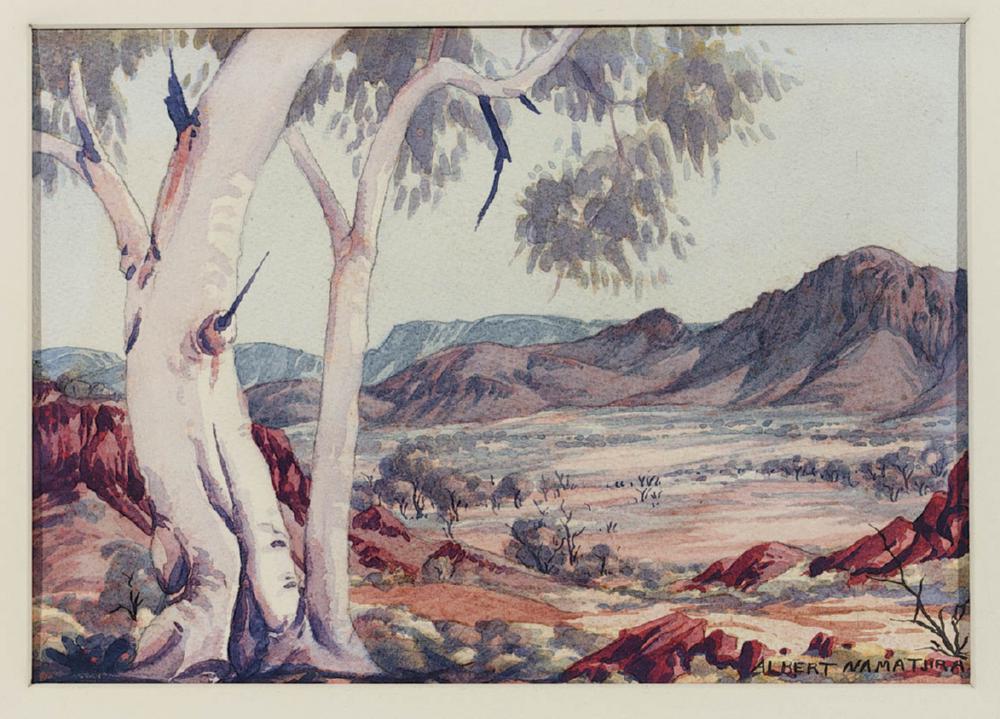
This additional meaning may seem insignificant until contemplating the watercolours of indigenous Central Australian artists of the Hemannsburg School, such as those by Albert Namatjira (1902–1959); see for example, Namatjira’s watercolour, Glen Helen (http://img.aasd.com.au/27591700.jpg; http://www.aasd.com.au/subscribers/list_all_works.cfm?concat=namatjiraalber&order=0&start=311&show=10 [viewed 14 May 2013). With these watercolourists, the use of repoussoir trees may frame landscape vistas but the framed vistas seldom feature a clear point of focus in terms of traditional European centres-of-interest, such as man-made or naturally occurring phenomenological oddities. Nevertheless, there may be room to argue that while there may not be a conspicuous point of interest in most of the Hemannsburg paintings at the time of Namatjira there is a broad focus on the spread of mountain ranges—the soul of the landscape. (For an insightful account of the difference in viewpoints between the Hemannsburg and European artists see: Hardy, Jane et al. [eds] 1992, The Heritage of Namatjira: The Watercolourists of Central Australia, William Heinemann Australia, Port Melbourne.) Arguably, this use of repoussoir elements to frame non-specific features in landscape may be extended to even contemporary uses of repoussoir elements in Australian landscape imagery as may be seen in Ray Crooke’s (1922- ) painting, Ant Hill Country, Laura, c.1969 (http://artsearch.nga.gov.au/Detail.cfm?IRN=139646 [viewed 19.5.2013]) After all, George Seddon (1997) in Landsprints: Reflections on Place and Landscape makes the interesting comment that “Australian landscapes are seamless. They rarely compose so neatly into identifiable ‘scenes’” (p. 138).
Before discussing other ways that artists use repoussoir elements, I need to draw attention to a subtle transition in mindset that often underpins the way romantic artists employ this device: the transition from temporal concerns (i.e. the everyday “here-and-now” interests of the present moment) in the foreground to transcendent feelings (i.e. spiritual elevation where time is irrelevant) in the distance. From my reading of this transition, the notion of temporality is expressed by emphatic marks handled in a broad and gestural manner to suggest a peripheral glimpse of the immediate surroundings at the station position of the artist. This treatment is often augmented by the use of figures engaged in everyday activities as may be seen in the figure sitting contemplatively in the shadows of Campagne Boisée and Souvenir d’Italie (see details above). Such incidental figures, termed “staffage,” provide the context in which the foreground is subliminally interpreted as part of the present moment. The notion of transcendent feelings in the distance is connoted by marks that, by contrast with those in the foreground, are fine, separated from each other and laid with a vertical and horizontal directional bias (see details above of the distant buildings).
Use of reproussoir elements to create distinct spatial zones catering for the propensities of different mindsets is not restricted to landscape imagery. For example, Daniel van Blerk’s digital image, Do or Die (shown below), contextualises the viewer behind a glass plane fractured with two holes—perhaps the punctured surface of a drawing tablet—on the other side of which a stylus-toting youth is inscribing in dripping blood-red colour upon the glass “Do or Die.” These holes and their radiating web of cracks, along with the written line of text, are repoussoir elements separating two spatial realms in the image: the realm of the viewer who is cast as a passive observer behind the glass and the realm of the portrayed figure with the stylus on the other side of the glass. Clearly the contextual use of the repoussoir elements in this image is not designed to provide spiritual uplift. Instead these visual devices provide a context to engage the viewer with reflexive confrontation. By this I mean that the figure is both staring at the viewer in an emotionally disengaged way and virtually writing on the viewer’s left eye—albeit, safely behind a screen of glass.
.jpg) |
Daniel van Blerk
Do or Die, 2013
Digital image
|
The notion that repoussoir elements can contextualise a viewer’s space is interesting for me. Moreover, as an artist from the tropics in Australia who spends a large part of time contemplating the work of his peers, the idea that such elements can connote meanings associated with where a subject is viewed is not far fetched at all. For instance, when I compare Corot’s romantically beautiful and very French etching, L’Etang, appropriately published in a book of poems (shown below), with Ron McBurnie’s equally romantic etching, Winter Light (also shown below) I am struck by an essential difference in the use of repoussoir in the arrangement of trees. In Corot’s print the viewpoint to the scene portrayed is from a sunny position with the repoussoir trees on the left contextualising the viewer in a position warmed by the sun. By contrast, the repoussoir overhanging tree in McBurnie’s print contextualises the viewer in shadow, as this is an essential standpoint for North Queenlanders accustomed to contemplating the world from a shadowy nook because the tropical sun’s heat is so fierce. In short, there is a good argument summed up in Noel Coward’s 1932 song, Mad Dogs and Englishmen (see video further below) regarding cultural leanings influencing where different viewers prefer to stand:
"Mad Dogs & Englishmen
Go out in the midday sun.
The Japanese don't care to,
The Chinese wouldn't dare to,
Hindus and Argentines
Sleep firmly from twelve to one,
But Englishmen
Detest a Siesta.
In the Philippines
They have lovely screens
To protect you from the glare.
In the Malay states
There are hats like plates
Which the Britishers won't wear.
At twelve noon
The natives swoon,
And no further work is done,
But mad dogs and Englishmen
Go out in the midday sun!” (Noel Coward, 1932)
 |
Jean-Baptiste-Camille Corot (1796–1875)
Ville d’Avray [Boatman on Pond (Evening Effect)], 1862
from Poésies, 1863 (a posthumous edition of Edmond Roche’s poems). According to Melot, the edition “includes poems dedicated to various artists, among them one ‘A M. C. Corot’ dated from Ville d’Avray, which begins (p. 99): Nous regardions l’étang d’une eau morne et plombée: (We were gazing at the pond with its bleak and leaden water), and ends: ‘Cette idylle à nos yeux peut encor reparaître/ Si vous le voulez bien: N’êtes-vous pas le Maître/ Qui l’avez recréée après le Créateur?’ (This idyll can appear once more before our eyes/ Should you so wish: Are you not the Master/ Who has created it again after the Creator?)” (Melot, p. 258).
Etching and drypoint
7.2 x 12.3 cm (image); 8 x 13 (plate); 10.8 x 17.4 cm (sheet)
state iii (of iii)
Melot C.3; Robaut 3125
Condition: strong impression and rare to find one intact in the first edition book of poems, Poésie, by Roche with its tissue guards as, according to Melot, the edition was only “about 200.” The book is in good condition with minor signs of handling to the cover and light foxing to some pages (mainly the tissue guards). I am selling this book with Corot’s print and four other etchings by de Bar, Herst, Michelin and Grenaud for $1260 AUD including postage and handling to anywhere in the world. Please contact me using the email link at the top of the page if you are interested or click the “Buy Now” button below.
 |
 |
Ron McBurnie (1957– )
Winter Light, 2011
Hard ground etching
Edition: 30
59 x 89.5 cm (plate); 76.2 x 111.4 cm (sheet)
This print has been sold
|
 |
Detail of Winter Light
|
 |
Detail of Winter Light
|
 |
Detail of Winter Light
|
Ron Mc Burnie discussing the repoussoir effect in Winter Light
Noel Coward: Mad Dogs and Englishmen, 1932


