What are some of the principles that help artists portray a vast landscape scene?
For Italians the word “veduta” means “view,” but as a term in the arts it carries the more precise meaning of a vast and highly detailed view of a landscape, including the urbanised landscape and marine views. In art, the veduta is essentially a portrayed vista that could almost be described as a panorama but without the idea of panning around the landscape in 360°.
The concept of the veduta has a long history. One of its earliest proponents is Paul Bril (1554–1626) who etched a few magnificent plates (see for example Bril’s Views of the Coast of Campania at the British Museum
http://www.britishmuseum.org/research/collection_online/collection_object_details/collection_image_gallery.aspx?assetId=427135&objectId=3023295&partId=1) but whose veduta designs were more popularly known from their translation into prints by artists such as the Perelle brothers, especially Nicholas Perelle (1631–95), Crispin van de Passe the Elder (c.1565–1637) exemplified in their prints shown below, along with an etching by an unknown printmaker, published by Jean Le Blond (c.1594–1666).  |
Nicolas Perelle (1631–95) and/or Adam Perelle (1640–95)
[Landscape] after Paul Bril (1554–1626)
Published by Pierre Drevet (1663–1738)
Etching on fine laid paper
Inscribed in the lower margin: (left) “Drevet excudit”; (right) “P. Bril invent. / Perelle fecit.”
(sheet) 31 x 38.5 cm; (plate) 24.5 x 31 cm; (image) 22.9 x 30.3 cm
Condition: Well-inked impression taken from a slightly worn plate. There are two vertical printer's creases (i.e. creases created during the printing process where compressed folds in the paper reveal white lines) and the centre-fold (as is customary in large prints when published in books/folios) has a 1.5 cm break at the bottom of the sheet. Beyond these issues the print has large margins and the paper is in good condition for its age with no foxing or stains. I am selling this etching for a total cost of [deleted] including postage and handling to anywhere in the world. Please contact me using the email link at the top of the page if you have any queries.
     |
 |
Crispin van de Passe the Elder (c.1565–1637) [attributed]
Praetereunt aegrum que faerdos (after Paul Bril [1554–1626]), c.1600/10
from the series: The Story of the Good Samaritan
Engraving on fine laid paper with "Arms of Amsterdam" watermark and margins Inscribed lower margin: (left) “P Bril inventor”; (centre) “Praetereunt aegrum que faerdos. Atque leuita, / Luce. 10.31”; (right) “2”
The inscribed verse is from the Gospel According to Luke (10.31): "A priest happened to be going down the same road, he saw him, passed on."
State I (of I)
Hollstein 106 (see description of this print at Edition-Originale: http://www.edition-originale.com/fr/oeuvres-dart/gravures-du-xvie-au-xviiie-siecle/bril-praetereunt-aegrum-que-sacerdos-atque-1600-29871 [viewed 26 August 2014])
(Other images from the series, The Story of the Good Samaritan, may be seen at LACMA:
http://collections.lacma.org/node/203291; http://collections.lacma.org/node/203292; http://collections.lacma.org/node/203343; http://collections.lacma.org/node/203352 http://collections.lacma.org/node/203479; http://collections.lacma.org/node/232796;
[viewed 21 August 2014])
Condition: Excellent impression but with a vertical dry-fold; otherwise in good condition. I am selling this engraving for a total cost of [deleted] including postage and handling to anywhere in the world. Please contact me using the email link at the top of the page if you have any queries.
      |
 |
The etcher is unknown
The Hermit (after Paul Bril) (1554–1626)
Published by either Nicholas or Jean Le Blond (c.1594–1666)
Etching on fine wove paper with 2 cm chainlines
Inscribed in the lower margin: (left) “P. Brille Invent”; (right) “Le Blond Execudit”
(sheet) 24.6 x 30.5 cm; (plate) cut on or within the plate-mark;
(image) 23 x 29.6 cm
Condition: Superb early and richly inked impression in excellent condition for its age (i.e. there are no signs of foxing, stains, tears, bumps or creases), but there are the remnants of mounting hinges verso. I am selling this near pristine condition etching for a total cost of [deleted] including postage and handling to anywhere in the world. Please contact me using the email link at the top of the page if you have any queries.
 .jpg) .jpg) .jpg) .jpg) |
Arguably, the most famous artist in the long tradition of presenting these broad vista viewpoints is Giovanni Antonio Canal (also Canale) (1697–1768), better known by his mononym “Canaletto” [“little Canal”].[1] His stature as the best-known of the vedutisti artists rests in part with his skills in portraying scenes of Venice with great objectivity, for example, Al Dolo (see http://www.harvardartmuseums.org/art/299852 [viewed 28 August 2014]) but he is also acclaimed for his “vedute capricci” (i.e. architectural fantasies), seen, for example, in Imaginary View of Venice (see
http://commons.wikimedia.org/wiki/File:Giovanni_Antonio_Canal,_il_Canaletto_-_Imaginary_View_of_Venice_-_WGA03985.jpg [viewed 28 August 2014]).
From my standpoint, however, Giovanni Battista (also known as Giambattista) Piranesi (1720–1778) is the most visually riveting of the vedutisti. In fact he is so interesting to me that his vision of grand vistas led to the design of Piranesi-esque underwater features in the fish tank that now serves as my bed-head (see below). Unlike many other artists working with veduta compositions, Piranesi is famous for his “vedute ideate” (a term for an imaginary scene depicted as if were real) such as his prison series of sixteen prints, the famous Carceri d'invenzione [Imaginary Prisons], showing sinister torture devices in arched, voluminous and dramatically lit dungeons.

Fortunately, images from the Carceri d'invenzione series abound on the internet (e.g. see the New York Public Library Digital Gallery:
http://digitalgallery.nypl.org/nypldigital/dgkeysearchresult.cfm?word=Piranesi%2C%20Giovanni%20Battista&s=3¬word=&f=4 [viewed 28 August 2014]). The video shown below by Grégoire Dupond, however, takes an audience beyond Piranesi's 2-D images and into an immersive tour of his prisons in a spectacular and memorable way. Although not everyone may agree, I envisage that immersive formatting, such as the style that Dupond employs, may lead to a revitalisation—perhaps even a complete overhaul—of veduta imagery in the future. This may be especially true when technology enables all our senses to be engaged in the experience of being at a site in cyber space. (For those who find the prospect fascinating, I have added an additional video about 3-D modelling of a Piranesi fireplace etching at the end of this discussion.[2])
http://digitalgallery.nypl.org/nypldigital/dgkeysearchresult.cfm?word=Piranesi%2C%20Giovanni%20Battista&s=3¬word=&f=4 [viewed 28 August 2014]). The video shown below by Grégoire Dupond, however, takes an audience beyond Piranesi's 2-D images and into an immersive tour of his prisons in a spectacular and memorable way. Although not everyone may agree, I envisage that immersive formatting, such as the style that Dupond employs, may lead to a revitalisation—perhaps even a complete overhaul—of veduta imagery in the future. This may be especially true when technology enables all our senses to be engaged in the experience of being at a site in cyber space. (For those who find the prospect fascinating, I have added an additional video about 3-D modelling of a Piranesi fireplace etching at the end of this discussion.[2])
Rather than prognosticate about principles that might apply to future advances in formatting vedute (note that “vedute” is the plural for the singular “veduta”) images, in the following two-part discussion I will focus only on principles that have been applied in the past. Essentially, my aim is to explain some of the subtle—perhaps even secret—principles underpinning graphically strong vedute images. Perhaps more interesting, however, I wish to illustrate how artists use these principles to make a portrayed vista appear to show more than is really represented. For this, the first instalment, I will focus on two principles that have a profound affect on a viewer’s perception of what is depicted: allusion to unrepresented subject material (i.e. using visual prompts or clues to suggest what may lie outside of the portrayed scene) and repoussoir elements (i.e. visual devices designed to frame the field of view and focus attention towards the central area of a composition).
Regarding the principal of allusion to unrepresented subject material, let me begin by proposing that this is the most effective of all the principles that I will be addressing. By this I mean that use of this principle enables an artist to portray a scene in a way that the viewer knows, or at least senses, that what is depicted is only a fraction of what could be seen should the artist have wished to create a 360° panorama—which, of course, a veduta is not.
Interestingly, this very useful principle is seldom employed in a clearly intentional way by the early vedutisti. In saying this, nevertheless, I need to point out that artists like Bril (along with those who transcribed his designs into prints) applied the principle inadvertently, in terms of cropping their landscapes at the peripheral framing edge of a vista. Such acts of pictorial cropping certainly carry the implication that a landscape continues beyond the depicted vista. For example, the foreground trees on either side of Crispin van de Passe the Elder’s Praetereunt aegrum que faerdos are pictorially cropped by the edge of the image and the viewer subconsciously "understands" that the landscape extends further than the landscape features actually portrayed. My point, however, is that the act of cropping and the inherent understanding that the landscape continues beyond the field of view are often serendipitous rather than intentional. Certainly my perception of Bril’s landscapes translated into the prints shown above invite my eye to examine the portrayed landscapes rather than to prompt myself to imaginatively visualise what lies outside of what I can see. In short, the seldom employed principle is one which is designed to invite the eye to examine a portrayed landscape while simultaneously inviting the viewer to contemplate and be aware of landscape elements beyond the field of view.
Both of Piranesi’s large etchings, Tempio antico volgarmente detto della Salute and Veduta del Palazzo Odescalchi (shown below), exhibit this principle of alluding to unrepresented subject material in what I perceive to be an intentional way. Moreover, the principle is also applied very successfully. For instance, in Tempio antico volgarmente detto della Salute a shadow cast from a pyramidal structure [3] onto the wall of what the title of the print advises is an ancient Temple of Health.[4] By virtue of this shadow pattern's position on the wall, attentive viewers understand that the pyramidal structure casting the shadow lies unseen outside of the frame of view and, more specifically, "behind" them. In Veduta del Palazzo Odescalchi a similar triangular shadow is cast onto a building's wall from another structure lying outside of the portrayed scene and again attentive viewers understand the location of this unseen structure. In short, the portrayed cast shadows in both prints are visual devices alluding to subject matter—in this case buildings—lying outside of the portrayed vista. Going further, they are devices that act to prompt attentive viewers to appreciate that the depicted scene is only a segment of the whole scene—"the bigger picture."
 |
Giovanni Battista (also Giambattista) Piranesi (1720–1778)
Tempio antico volgarmente detto della Salute su la Via d'Albano, cinque miglia lontan da Roma . . . [Ancient temple commonly called the
from the series, Vedute di Roma, XVI (Views of Rome, volume 16), c.1763
etching and engraving on heavy laid paper with centre fold (as published) and the watermark: “Fleur-de-lis in a double circle”
Lettered as if a stone inscription at lower right with the title and “l'opera con tutt' i suoi ornamenti è di terra cotta, è l Capitello A è composito a differenza di t[ut]ti gli altri”. At lower left “Piranesi F.”
(sheet) 52 x 73.1 cm; (plate) 41.3 x 55.8 cm; (image) 40.6 x 55.2 cm
State I of IV (lifetime impression)
Taschen 942; Focillon 776; Wilton-Ely 204; Ficacci 942; Hind 71 (see also the description of this print at The British Museum: http://www.britishmuseum.org/research/collection_online/collection_object_details.aspx?objectId=3001871&partId=1 [viewed 2 September 2014])
Condition: Rare lifetime impression. This is a richly inked strong impression in excellent condition for its age; nevertheless, there is light toning along with a few minor spots in the margins and a slight printer’s crease created during the printing process in the top margin. Essentially, this print is superb. I am selling this etching for a total cost of [deleted] including postage and handling to anywhere in the world. This is a very large print and will be shipped rolled in a tube. Please contact me using the email link at the top of the page if you have any queries.
       |
 |
Giovanni Battista (also Giambattista) Piranesi (1720–1778)
Veduta de Palazzo Odescalchi [View of the Palazzo Odescalchi, designed by Cavaliere Bernini, opposite the Palazzo Colonna and the Church of SS. Apostoli]
from the series, Vedute di Roma, I (Views of Rome, volume 1), c.1750–78
published in the 1st Paris Edition (1800–07)
etching on heavy laid paper
Inscribed lower margin (centre): title and a numbered key; lower margin (left): “Presso l'Autore a Strada Felice nel Palazzo Tomati vicino all Trinità de' monti. A paoli due e mezzo”; lower margin (right): “6 / Gio. Batt. Piranesi Archi. F.”
(sheet) 55.2 x 80 cm; (plate) 40.5 x 61.7 cm; (image) 38 x 61 cm
(Hind) State III of V
Taschen 916; Focillon 741; Wilton-Ely 178; Hind 26 (see also the description of this print at The British Museum: http://www.britishmuseum.org/research/collection_online/collection_object_details.aspx?objectId=1674405&partId=1 and at Bonhams: https://www.bonhams.com/auctions/13494/lot/1010/ [viewed 7 September 2014])
Condition: crisp impression with a few tiny tears to the margin edges and minor margin toning, otherwise in fine condition. I am selling this etching for a total cost of [deleted] including postage and handling to anywhere in the world. This is a very large print and will be shipped rolled in a tube. Please contact me using the email link at the top of the page if you have any queries.
        |
To demonstrate the graphic role and benefit that these shadows play, I digitally removed the shadows in the both prints and abutted the digital modifications underneath the original compositions as shown below. Hopefully the "before and after" juxtapositions will illustrate how critical the use of this principle is in expressing "the bigger picture" (i.e. the cast shadows featured in the original prints suggest that there is more in the surroundings than is shown in the portrayed scene while the images where digital modifications have removed the shadows do not actively invite a viewer to imagine more than what is depicted).
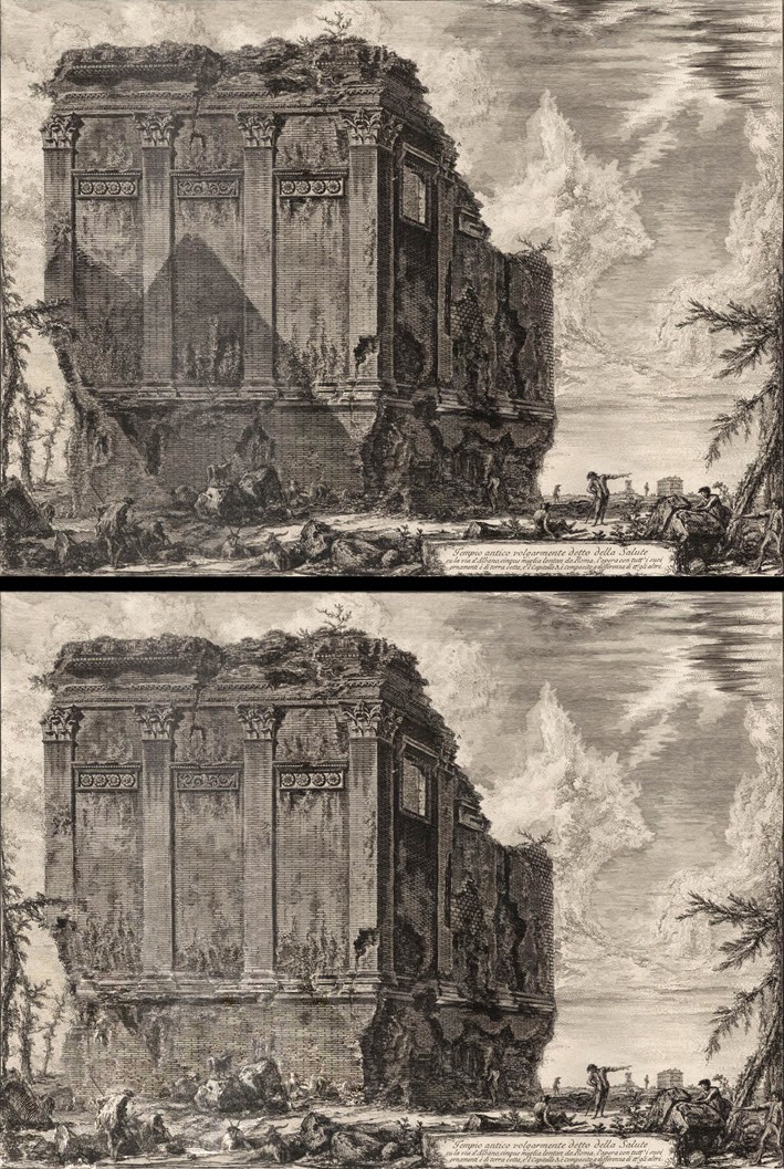 |
Alluding to subject material lying outside of the field of view
(Upper image) Piranesi’s Tempio antico volgarmente detto della Salute
(Lower image) digitally modified image with cast shadow removed
|
 |
Alluding to subject material lying outside of the field of view
(Upper image) Piranesi’s Veduta de Palazzo Odescalchi
(Lower image) digitally modified image with cast shadow removed
|
Of course, the unrepresented subject material that is implied by the cast shadows in both of these prints is completely believable. By this I mean that viewers are not obliged to engage in deep contemplation to understand the significance of the cast shadows; after all there is little stretch of imagination to conceive that there are other buildings in the vicinity that can cast the shadows that Piranesi presents. Beyond allusions to "believable" subjects lying outside a portrayed scene, artists may also allude to more conceptually demanding (i.e. verging on unbelievable) subjects and some of these allusions can change the meaning of an image completely.
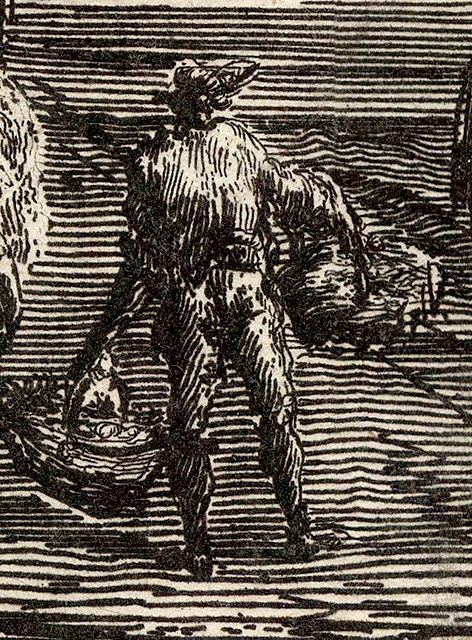
To demonstrate what I mean, I have introduced into Crispin van de Passe the Elder’s engraving, Praetereunt aegrum que faerdos (after Paul Bril), two additional visual devices alluding to conceptually challenging subject material as shown below. First, there is the inclusion of a warm light that illuminates the scene from the upper-left. This inclusion is intended to suggest that lying outside of the picture area is “something” that is creating such a light. Second, I have added a conceptually challenging cast shadow of a modern flying machine that is anachronistic for the time of the scene depicted in the print: a helicopter; or, to borrow an expression from Vanuatu Pidgin English, a "Mixmaster belong Jesus Christ"—a phrase attributed to the folk of Espiritu Santo by the journalist Richard Shears in 1980 (see http://nursemyra.wordpress.com/2012/06/10/mixmaster-blong-jesus-christ/ [viewed 31 August 2014]). Essentially both inclusions are designed to be visually arresting and conceptually problematic. More important, hopefully they illustrate that the choice of subject being alluded to can play a major role in projecting meaning.
Regarding the second principle—a topic that I have discussed previously in the posts, Repoussoir Elements (see http://www.printsandprinciples.com/2013/05/repoussoir-elements-corot-van-blerk-and.html) and Representing Light (see http://www.printsandprinciples.com/2012/10/sadeler-lalanne-dananache-desbrosses.html)—instead of reiterating the points of my previous discussions, I wish to propose a more subtle use of this principle defined in Wikipedia as “an object along the right or left foreground that directs the viewer's eye into the composition by bracketing (framing) the edge” (see http://en.wikipedia.org/wiki/Repoussoir [viewed 9 September 2014]). Indeed the use of this principle which I am about to describe is less about directing attention into the pictorial space of a veduta and more about creating the illusion of another separate spatial realm within the portrayed scene.
 |
Alluding
to subject material lying outside of the field of view
(Upper
image) Crispin van de Passe the Elder’s Praetereunt aegrum que faerdos
(Lower
image) digitally modified image with the addition of colour and a helicopter’s
shadow
(n.b. the
shadow pattern of the helicopter is based on a morphed compilation of
photographs extracted from the internet)
|
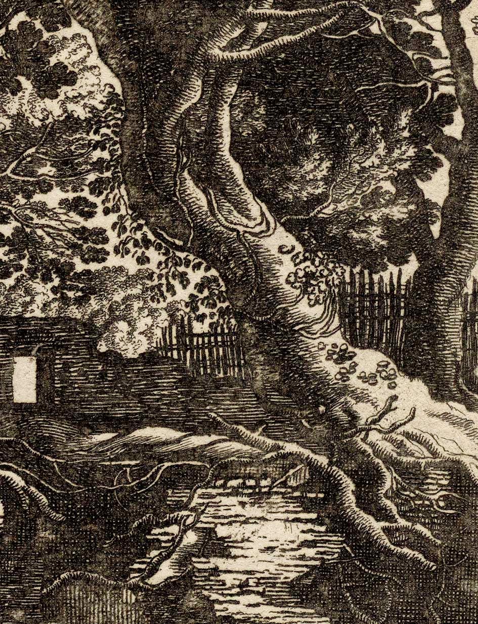
This use of repoussoir formatting is all about creating disorienting contexts for the portrayed subject. By this I am referring to contexts that invite a viewer into discrete pictorial spaces within a scene (i.e. creating an illusion of separate spatial worlds) that suggest there is a larger unrepresented scene beyond. A fine example of such contextualising by repoussoir elements is Isaak Major’s (c.1576–1630) etching, Bohemian Landscape with Two Men Drawing a Waterfall next to an Arch.
 |
Isaak Major (also known as Isaak Mayor) (c.1576–1630)
[Bohemian Landscape with Two Men Drawing a Waterfall next to an Arch], c.1610 Plate 8 from the series, Nine Bohemian Landscapes, 1600–30
Published by Johan Georg Hertel (1719–68)
Etching on fine laid paper
Inscribed lower-left in image: “Isaac Maior fe.”; lower-right in margin: “Ioh Georg: Hertel. excudit Aug. Vind”; lower-right in image: “8.”
(sheet) 31.5 x 41.2 cm; (plate) 23.9 x 37 cm
Hollstein 15; Nagler 15 (see a description of this print at The British Museum: http://www.britishmuseum.org/research/collection_online/collection_object_details.aspx?objectId=1505946&partId=1&people=116149&peoA=116149-2-60&page=1 and the other prints from the series: http://www.britishmuseum.org/research/collection_online/search.aspx?people=116149&peoA=116149-2-60 [viewed 10 September 2014])
Condition: crisp impression with margins and in very good condition for its age (i.e. there are no foxing marks, stains or tears). The lower margin has a lightly erased pencil inscription about the history of the print (from what I can decipher) and more pencil notes are on the back of the sheet along with traces of glue and thinning to the paper from past mounting. I am selling this rare etching for a total cost of [deleted] including postage and handling to anywhere in the world. Please contact me using the email link at the top of the page if you have any queries.
      |
Before I explain this more subtle
use of repoussoir formatting, however, I need to point out how Major has
applied repoussoir formatting in a classic way; that is, through his
arrangement of the large tree and rocks depicted in shadows of the right
foreground. These features are positioned and employed as if they were the right
wing to a proscenium theatre. By this I mean that the forms pictorially frame
the more distant waterfall and other features in the landscape while
simultaneously keeping a viewer’s attention away from seeing the landscape
continuing seamlessly on the right.
Regarding a less traditional use of
repoussoir formatting (in the sense that the repoussoir elements are further
within the image than at its border edge) note how the natural stone arch
functions like the proscenium arch on a stage directing an audiences’ attention
to the critical view. What is more fascinating for me, however, is that the
stone arch does more than simply frame the distant vista portrayed. To my eyes,
it creates the Keyhole Effect illusion (discussed in the earlier post Suspension of Disbelief [see http://www.printsandprinciples.com/2012/12/vant-padje-scheyndel-rosetsu-boissieu.html])
in how a viewer perceives the distant vista. This illusion arises from looking
through the “aperture” of the stone arch and perceiving that landscape viewed
beyond the arch is a discrete spatial realm separated from foreground space occupied
by the draughtsmen and, at least conceptually, the viewer. In short, what is
observed is like the phenomenon of peeping into a much larger space. Or to
express this in a way closer to the aim of this discussion, the effect of using
repoussoir formatting in this way (i.e. to create a keyhole aperture) makes “a portrayed vista appear to show more than is really
represented.”
In the next instalment of this
discussion about secret principles used in veduta images, I will address two
more subtle ways of creating the illusion of a vista that is far grander than that which
is actually drawn on the printing plate.
1 For a fine discussion about Canaletto’s etchings see Canaletto: Master Etcher by Carl J Weinhardt, JR., available for download from The Metropolitan Museum of Art:
www.metmuseum.org/pubs/bulletins/1/pdf/3258280.pdf.bannered.pdf (viewed 24 August 2014).
The Metropolitan Museum of Art also offers for download the complete 1989 exhibition catalogue, Canaletto, by Katharine Baetjer and J.G. Links; with essays by J.G. Links, Michael Levey, Francis Haskell, Alessandro Bettagno, Viola Pemberton-Pigott:
http://libmma.contentdm.oclc.org/cdm/compoundobject/collection/p15324coll10/id/49680 (viewed 24 August 2014).
A digitised version of 1902 edition of The Etchings of Canalletto is available for download from:
https://ia600506.us.archive.org/9/items/etchingsofcanale00canauoft/etchingsofcanale00canauoft.pdf (viewed 28 August 2014).
3 Colin Holden in his marvellous catalogue, Piranesi's Grandest Tour from Europe to Australia (2014), notes that this structure is a "second-century tomb (not a temple to Salus)" (p. 60) and advises that "there was no pyramid nearby" (ibid.). Holden makes the interesting point that as there was no local pyramid that could cast the shadow that Piranesi may be referencing Egyptian pyramids and offers the insight that "Egyptian civilisation was ancient and its grand tombs already looted when Rome was in its infancy" (ibid.). From a personal standpoint, and I may be wrong as I only have a tourist’s knowledge of Rome
http://www.britishmuseum.org/research/collection_online/collection_object_details.aspx?objectId=1674760&partId=1&people=111365&peoA=111365-2-60&page=1 [viewed 4 September 2014])
4
According
to The British Museum ,
Piranesi is incorrect in his assignation of the featured building in this print
to the ancient Temple
of Health