Beyond the fundamentals of how to apply sight-size measuring to gauge a figure’s proportions, what are some of the more subtle principles guiding an artist’s hand when drawing a figure?
After writing the last post about some of the subtle principles guiding artists when they draw figures (or any subject for that matter), I realised that there were far too many important principles that should have been explained but had not been addressed. In short, I had only lightly touched upon the topic of figure drawing principles and this post is a start at rectifying my concerns.
Rather than focusing on “fixing” problems with one of my own drawings using Harry Carmean’s life drawings as a resource base as I had done in the last post, for this discussion I will focus on a major etching by Karel Dujardin (1622–78), The Battlefield (shown below). As before, I will again reference principles that I see in Carmean’s drawings—viz. sequence, line phrasing, weighing a line, exotopic tone and diversity (these will be explained shortly)—and once more I will employ digitally manipulation to illustrate my explanations.

Although I have proposed that the sequencing of the marks on the lit leg helps to express the horse’s movement, I also wish to propose that the seemingly irregular arrangement of contour marks on the shadow leg connotes the horse’s unease with its surroundings even if no obvious movement is actually represented. This suggestion of unease arises from the conundrum concerning the whereabouts of the viewer's eye-level in terms of the curvature of the lines rendering the shadow leg. By this I mean that artists usually represent contour marks at eye-level with a horizontal line while marks below eye-level are rendered with an increasingly more circular curvature the further they are away from eye level; a principle that also applies to marks above eye-level. Dujardin was fully aware of this principle as demonstrated in his rendering of the tree at the far-left in Dujardin’s Shepherdess Speaking to Her Dog (shown below). For this reason I see the irregular arrangement of marks in the leg as intentional and, from my viewpoint, the arrangement is an analogue for the horse's state of unease.

Rather than focusing on “fixing” problems with one of my own drawings using Harry Carmean’s life drawings as a resource base as I had done in the last post, for this discussion I will focus on a major etching by Karel Dujardin (1622–78), The Battlefield (shown below). As before, I will again reference principles that I see in Carmean’s drawings—viz. sequence, line phrasing, weighing a line, exotopic tone and diversity (these will be explained shortly)—and once more I will employ digitally manipulation to illustrate my explanations.
 |
Karel [also Carel] Dujardin (1622–78)
The Battlefield [La champ de bataille], 1652
Etching and drypoint on fine laid paper
State II (of II)
(sheet) 16.2 x 19.3 cm
Bartsch 1.28 (181); Hollstein 28.ii
(see also descriptions of this print at
Although not documented in literature, note that the drawing of the horse shown on the left in The Battlefield is very similar to Dirk van der Stoop’s (c. 1615–86) drawing of a horse portrayed in his etching, Horse Led by Boy, executed a year earlier (see http://mobius.wellesley.edu/browser.php?m=objects&kv=15225&i=21375 [viewed 26 June 2014]). Interestingly, this etching by Stoop was later used by Necéphore Niépce in 1825 for one of the first heliographic prints (see de Font-Réaulx, Dominique 2012, Painting and Photography 1839–1914, Flammarion, Paris, p. 34).
Condition: Marvellous impression in excellent condition but cut on, or within, the platemark. There are conservator hinges attached verso from previous mounting.
           |
Before embarking on my plan, however, I need to state clearly that my goal in digitally tampering with Dujardin’s print is not to “fix” perceived shortfalls but rather to demonstrate the effect of using the addressed principles. Indeed, my choice to focus on The Battlefield as the model for digital exploration was borne from the desire to expose Dujardin’s skill as a draughtsman to as wide an audience as possible rather than to point out any faults. After all, one of my favourite artists, Walter Sickert (1860–1942), who is purported to be none other than the infamous serial murderer, “Jack the Ripper”, according to Patricia Cornwell (see http://www.casebook.org/dissertations/dst-pamandsickert.html [viewed 27 June 2014]), admired it to such an extent that he made the grand proposal:
Technically, this plate … is perhaps the etching of the world. It is impossible for clarity, concision and vivacity to go further. For the sake of his drama, the artist knew that it was necessary to throw the mass formed by the carcase of the charger, the bank, and the receding troop into penumbra. A baser modern would have left the mass flimsy and empty, and called it atmosphere, or drowned it with dirt. Not so the master. … Enlarged photographs of the naked corpse should be in every art school as a standard of drawing from the nude. As in Vandyke, the approaches of the shadows are felt with a sensitive stipple that gives way, at the definite transition into shadow, to expressive line work. (Ackley, Clifford S. 1981, Printmaking in the Age of Rembrandt, Museum of Fine Arts, Boston, pp. 214–5; Sickert, Walter 1911–12, “The Old Ladies of Etching-needle Street” English Review 10 [1912], p. 308.)
As can be read from Sickert’s testimony as to the quality of this print and, in particular, the high regard that he held for Dujardin’s drawing of the naked figure, the image is worthy of close examination. Consequently, my choice to use The Battlefield as an image for visual exploration and is far from arbitrary.
Let me begin with a principle found in all great drawings and, according to the famous neoclassical architect, Robert Adam (1728–92), is a key hallmark of good architecture: sequence.
Regarding the principle of sequence, Adam explains what he means by this principle in Ruins of the Palace of the Emperor Diocletian at Spalatro [Adam’s spelling for “Spalato”] in Dalmatia (1764) as cited in Pinto’s Speaking Ruins:
If from the center of the crypto Porticus we look back to those parts of the Palace which we have already passed through, we may observe a striking instance of that gradation from less to greater, of which some connoisseurs are so fond, and which they distinguish by the name of Climax in architecture. (Pinto, A John 2012, Speaking Ruins: Ourabesum Architects, and Antiquity in Eighteenth-Century Rome, The University of Michigan Press, Michigan, p. 265; Adam, p. 9)
Essentially, this principle is about ensuring that the featured subject incorporates within its design a transition of size, complexity of detail and/or any other variables that will lead the eye to the key point of interest—the “climax”. In the case of a drawing, this transition may involve changes in tonal strength, size and shape of marks rendering the subject. Moreover, the transition involves changes which will help to guide the viewer to see critical details and ultimately to focus on the centre-of-interest in a composition.
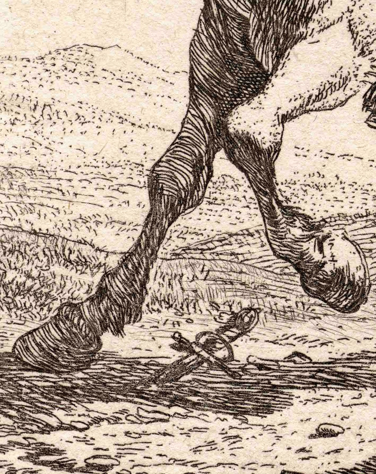
For instance, Dujardin’s different treatment of the front legs of the horse straining away from the foreground corpse illustrates how and why artists use the principle of sequence (see details below).
From my reading of the horse’s legs, Dujardin’s rendering of the leg portrayed in shadow (see upper-left detail), features curved contour marks (i.e. marks that have been shaped to mimic the form of the horse’s leg), but the marks are similar in size and shape. Consequently, my eye is not attracted strongly to any particular spot on the leg. By contrast, the rendering of the leg portrayed in the light, features marks of different sizes and shapes that create a hierarchy of visual importance. This arrangement of different marks guides my eye to the leg’s joints and, in turn, helps to articulate meaning: the animal’s movement.
Although I have proposed that the sequencing of the marks on the lit leg helps to express the horse’s movement, I also wish to propose that the seemingly irregular arrangement of contour marks on the shadow leg connotes the horse’s unease with its surroundings even if no obvious movement is actually represented. This suggestion of unease arises from the conundrum concerning the whereabouts of the viewer's eye-level in terms of the curvature of the lines rendering the shadow leg. By this I mean that artists usually represent contour marks at eye-level with a horizontal line while marks below eye-level are rendered with an increasingly more circular curvature the further they are away from eye level; a principle that also applies to marks above eye-level. Dujardin was fully aware of this principle as demonstrated in his rendering of the tree at the far-left in Dujardin’s Shepherdess Speaking to Her Dog (shown below). For this reason I see the irregular arrangement of marks in the leg as intentional and, from my viewpoint, the arrangement is an analogue for the horse's state of unease.
 |
Karel Dujardin (1622–78)
Shepherdess Speaking to Her Dog [La Bergère Parlant à son chien], 1653
Etching on laid paper
(plate) 18.4 x 21.9 cm
Bartsch 31 (183); Hollstein 32
(See description at The British Museum: http://www.britishmuseum.org/research/collection_online/collection_object_details.aspx?objectId=3068933&partId=1&people=126491&peoA=126491-2-60&page=1 [viewed 3 July 2014])
This print has been sold
  |
Regarding use of the principle of sequence in drawing the figure, I wish to examine tiny details from Harry Carmean’s Study of Arms (shown below) and to compare Carmean’s treatment with that of Dujardin’s drawing of an arm (see details further below).
 |
© reproduced with kind permission of Harry Carmean
Harry Carmean (1922–)
Study of Arms, 1977
Blue and white pastel on tinted wove (pastel) paper, signed “Carmean 77” in brown
64.5 x 50 cm
Condition: Excellent condition (i.e. there are no folds, tears, stains or foxing).
I am selling this drawing and the five other Carmean drawings discussed in this post shown below (i.e. Study of Arms; Study of a Woman; Side View of a Seated Male; Study after Tintoretto; Back View of Male Nude; and, Front View of a Seated Male) for a total cost of [deleted] including postage and handling to anywhere in the world. These are large drawings and will be posted in a tube. Please contact me using the email link at the top of the page if you have any queries or click the “Buy Now” button shown below.
|
In the details of Carmean's pastel drawing shown above, the marks display the artist’s conscious effort to shape his strokes to the arms' surface contours and to sequence the strokes to important points of tension with changes to the length and tonal strength of each line. Dujardin displays similar care in contouring and sequencing the size of his strokes with transitions from dots to short lines and then to longer lines. There is, however, an ingredient missing in Dujardin’s use of sequencing: his etching does not show a tonal transition in the marks. Or to express this in terms of the printmaking process, all the lines in the drawing of the nude figure have been bitten by acid for the same length of time resulting in etched lines of the same depth which in turn produce the same tone (i.e. black without a range of greys). To see the difference that occurs when varying the length of time that a line is etched, compare the tone of the figure with the much lighter tone of the lines depicting the army in the distance. Notwithstanding Dujardin’s choice to use only one tone within the figure, the spacing between Dujardin’s marks changes from wide apart to very close. Interestingly, this variation of spacing creates a similar visual effect of tonal transition as Carmean produced by varying his hand’s pressure when laying strokes.
The idea of sequencing tonal changes leads me to the closely related principle of phrasing lines according to tightness of contour curves addressed in the earlier post, Phrasing of Line (http://www.printsandprinciples.com/2012/10/lowe-legros-boisseau-dore-kollwitz.html). This principle of line phrasing is exemplified in Carmean’s Study of a Woman (shown below) and the master drawing Side View of a Seated Male (shown further below). In both drawings, Carmean varies the pressure in his strokes to connote points on the figure where the skin is stretched taut over bone and where the flesh is under strain. For instance, note how Carmean varies the pressure in the silhouette outline and in the rendering of the figure’s knee in the latter drawing.
 |
© reproduced with kind permission of Harry Carmean
Harry Carmean (1922–)
Study of a Woman, 1972
Charcoal and pastel on thin wove paper, signed “Carmean 72” in charcoal
56 x 43 cm
Condition: good condition with light signs of handling
I am selling this drawing and the five other Carmean drawings discussed in this post shown above and below (i.e. Study of Arms; Study of a Woman; Side View of a Seated Male; Study after Tintoretto; Back View of Male Nude; and, Front View of a Seated Male) for a total cost of [deleted] including postage and handling to anywhere in the world. These are large drawings and will be posted in a tube. Please contact me using the email link at the top of the page if you have any queries or click the “Buy Now” button shown above.
  |
 |
© reproduced with kind permission of Harry Carmean
Harry Carmean (1922–)
Side View of a Seated Male, 1984
pastel on tinted wove (pastel) paper, signed “Carmean 84” in blue
64.5 x 50 cm
Condition: Excellent condition
I am selling this drawing and the three other Carmean drawings discussed in this post shown above and below (i.e. Study of Arms; Study of a Woman; Side View of a Seated Male; Study after Tintoretto; Back View of Male Nude; and, Front View of a Seated Male for a total cost of [deleted] including postage and handling to anywhere in the world. These are large drawings and will be posted in a tube. Please contact me using the email link at the top of the page if you have any queries or click the “Buy Now” button shown above.
    |
Sadly, the principle of phrasing lines is not very evident in Dujardin’s nude figure and I have digitally altered his original drawing of this figure’s feet to demonstrate the potential of employing line phrasing.

Before leaving the principle of line phrasing I also wish to revisit the principle of weighting a line, as discussed in the earlier post, Drawing Corners
(http://www.printsandprinciples.com/2012/09/pymble-orley-swanevelt-drawing-corners.html). The idea of weighting a mark can be very helpful for expressing a subject's weight in the sense of gravity acting on the figure as a mass. Essentially, weighting a mark involves an artist in accentuating the point of contact that a subject makes with the ground plane by making all lines darker and thicker towards the point of contact. Usually artists use this weighting principle as an added subtlety to line phrasing, in that, changes to the shape and tone within a stroke can address simultaneously the subject’s surface tensions and weight. For example, in Carmean's Study after Tintoretto (shown below), use of this principle is demonstrated by the darkening of the rapidly laid contour marks describing the figure's bent leg as the freely looped marks arc towards the ground (see the first detail below). Even the upper body has the same treatment in the sense that there is a transitional change in the strength of the lines down the back towards the figure's hips (see the second detail below).
Again, Dujardin's nude figure is not an ideal exemplar of the use of the principle of weighting a line. Accordingly, I have made an attempt to demonstrate the potential of employing this principle with the digital modifications to the same detail extracted from Dujardin's etching as explored with the last principle.

Before leaving the principle of line phrasing I also wish to revisit the principle of weighting a line, as discussed in the earlier post, Drawing Corners
(http://www.printsandprinciples.com/2012/09/pymble-orley-swanevelt-drawing-corners.html). The idea of weighting a mark can be very helpful for expressing a subject's weight in the sense of gravity acting on the figure as a mass. Essentially, weighting a mark involves an artist in accentuating the point of contact that a subject makes with the ground plane by making all lines darker and thicker towards the point of contact. Usually artists use this weighting principle as an added subtlety to line phrasing, in that, changes to the shape and tone within a stroke can address simultaneously the subject’s surface tensions and weight. For example, in Carmean's Study after Tintoretto (shown below), use of this principle is demonstrated by the darkening of the rapidly laid contour marks describing the figure's bent leg as the freely looped marks arc towards the ground (see the first detail below). Even the upper body has the same treatment in the sense that there is a transitional change in the strength of the lines down the back towards the figure's hips (see the second detail below).
 |
© reproduced with kind permission of Harry Carmean
Harry Carmean (1922–)
Study after Tintoretto [n.d.]
Charcoal on thin wove paper, signed “Carmean” in charcoal
56 x 43 cm
Condition: good condition with light signs of handling
I am selling this drawing and the five other Carmean drawings discussed in this post shown above and below (i.e. Study of Arms; Study of a Woman; Side View of a Seated Male; Study after Tintoretto; Back View of Male Nude; and, Front View of a Seated Male) for a total cost of [deleted] including postage and handling to anywhere in the world. These are large drawings and will be posted in a tube. Please contact me using the email link at the top of the page if you have any queries or click the “Buy Now” button shown above.
 |
Use of the principle of weighting, however, is not limited to subtle variations within a stroke. In Carmean's Back View of Male Nude and Front View of a Seated Male (both shown below), he expresses the tension of the figure's weight through small patches of scribbled tone placed outside of the figure's silhouette outline—tonal patches that some artists describe as exotopic tone. Interestingly, beyond metaphorically anchoring the figure to its surroundings, these tonal patches also accentuate the bulging form of muscles by the perception of visual constriction posed by the exotopic patches of tone below or above the muscles.
 |
© reproduced with kind permission of Harry Carmean
Harry Carmean (1922–)
Back View of Male Nude, 1976
Pastel on thin wove paper, signed “Carmean 76”
56 x 43 cm
Condition: good condition with light signs of handling
I am selling this drawing and the five other Carmean drawings discussed in this post shown above and below (i.e. Study of Arms; Study of a Woman; Side View of a Seated Male; Study after Tintoretto; Back View of Male Nude; and, Front View of a Seated Male) for a total cost of [deleted] including postage and handling to anywhere in the world. These are large drawings and will be posted in a tube. Please contact me using the email link at the top of the page if you have any queries or click the “Buy Now” button shown above.
  |
 |
© reproduced with kind permission of Harry Carmean
Harry Carmean (1922–)
Front View of a Seated Male, 1974
pastel on tinted wove (pastel) paper, signed “Carmean 74”
64.5 x 50 cm
I am selling this drawing and the five other Carmean drawings discussed in this post shown above and below (i.e. Study of Arms; Study of a Woman; Side View of a Seated Male; Study after Tintoretto; Back View of Male Nude; and, Front View of a Seated Male) for a total cost of [deleted] including postage and handling to anywhere in the world. These are large drawings and will be posted in a tube. Please contact me using the email link at the top of the page if you have any queries or click the “Buy Now” button shown above.
   |
In my digital modification of Dujardin’s prostrate nude’s arm (shown below) I have explored the use of similar patches of exotopic tone employed by Carmean. By intention, I have placed them where the arm and hand touch the ground to suggest that the figure is well attached (i.e. “anchored”) to the earth and at critical nodal points where I believe that they help express the bones and musculature of the figure.

For the final principle in this discussion, I will return to another of the guiding principles strongly advocated by the architect Robert Adam as being essential to good design: diversity. Adam explains that this principle is all about variety (i.e. different sizes, shapes and forms) and admonishes his fellow 18th century architects for "paying too little regard to the example of the Ancients ... [and, as a consequence] are apt to fatigue us with a dull succession of similar apartments" (Ibid.).
From the viewpoint of what makes a superb figure drawing, the same principle applies: a good drawing should display a diversity of different lengths and shapes of marks. After all, for most artists, each stroke that they make is a visually encoded crystallisation of an observed subtlety. Consequently, each stroke is unlikely to be exactly the same as the ones next to it.
In terms of Dujardin’s print, application of this principle is easy to see. For instance, note how he has recorded each hair on the fallen warrior’s chest in the detail shown below with distinctively different strokes ranging from dots to gently curved lines.

Although this post has addressed many of the subtle principles guiding artists when drawing figures there are still many more that I will explain in the next post, Figure Drawing (Part 3). Of particular interest, is the principle of using opposing movements to capture a subject's balance. This is an underpinning concept in sculpture, especially in the case of Rodin's artistic practice, and it is an important principle to consider when representing figures.


