Jean-Honoré
Fragonard (1732–1806)
“Saint Luke”, 1763/64. after a pendentive design in the Cathedral
of Naples/Church of the Holy Apostles by Giovanni
Lanfranco (1582–1647)
Etching on laid paper
Size: (sheet) 12.1 x 9.1 cm; (image borderline) 10.8 x 7.9 cm
Inscribed below the image borderline at left: "Lanfranc a naple aux St. Apotre," and at lower right, just inside
the borderline, the minimal trace of a burnished out signature,
"frago."
State i (of ii)
Wildenstein 17, I; Baudicour 1859-1861 20
The British Museum offers the following description of this print:
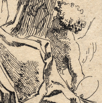
“St Luke, sitting and leaning on the portrait of Virgin Mary,
looking at a book presented by three cherubs on the left; on the right, another
cherub holding palette and brushes. c.1761/65” (http://www.britishmuseum.org/research/collection_online/collection_object_details.aspx?objectId=1357212&partId=1&searchText=Fragonard+Luke&page=1)
See also the description of this print at the Metropolitan Museum
of Art
(http://www.metmuseum.org/collection/the-collection-online/search/369291?rpp=30&pg=1&ft=fragonard+saint+luke&pos=1)
and at Cleveland Museum (http://www.clevelandart.org/art/1926.282?collection_search_query=fragonard&op=search&form_build_id=form-2k5EWZaxN5j2uC0wbjsj_0eShn0Umot5jzkInFdsG1A&form_id=clevelandart_collection_search_form).
Condition: richly-inked and well-printed lifetime impression with
margins around the borderline (i.e. the sheet is trimmed within or on the
platemark). The sheet is slightly age-toned (i.e. it has mellowed to a light
brown) and there is a flattened a diagonal crease. There is also a pinhole in
the upper-centre edge and there are traces of mounting with collector’s pencil
notations (verso).
I am selling this of lifetime/first state impression of
magnificent quality for the total cost of [deleted] including postage and handling to anywhere in the
world.
If you are interested in purchasing this original
Fragonard—mindful that prints of this rarity and quality are seldom seen on the
market place—please contact me (oz_jim@printsandprinciples.com) and I will send
you a PayPal invoice to make the payment easy.
This print has been sold
After posting my previous discussion about stylistic traits of the
Baroque age that I see in Jan de Visscher’s “Shepherds and a Young Woman on an
Ass”, I have decided to showcase a print that takes the spirit of Baroque visual
excess to an even higher level: the Rococo period style of Fragonard’s “St
Luke.”
What makes Fragonard’s seemingly simple and very small print interesting for me is that the original design was by Giovanni Lanfranco (1582–1647) whose stylistic leanings arguably lie between late Italian Mannerism and early Baroque. Mindful that Fragonard’s print is Rocco in style and is based on Lanfranco’s painted pendentive in the Cathedral of Napes/Church of the Holy Apostles that is Baroque in style raises the question: what special artistic ingredient came into play in Fragonard’s etching that shifted the same image from the Baroque period style to what could be described as the Baroque style on steroids typifying the Rococo period? The short answer is all about how Lanfranco’s painting was interpreted and translated by Fragonard into line.
To illustrate the stylistic leap from Baroque to Rococo that
Fragonard has achieved in his interpretative etching, I wish to draw a
comparison between Fragonard’s print with another reproductive print of Lanfranco’s pendentive
design by one of Fragonard’s contemporaries, Charles Étienne Gaucher (1741–
1804) (see: http://www.britishmuseum.org/research/collection_online/collection_object_details.aspx?objectId=1521096&partId=1&searchText=Fragonard+Luke&page=1).
In Gaucher’s translation of the painting into a line etching (with engraving), the
portrayed subject is presented as objective reality (i.e. the figures and clouds
featured in Lanfranco’s painting are rendered with such gentle transitions of light
and shade that the forms are almost tangible—3D solids).
By contrast, Fragonard
uses line sparingly and simplifies the tones of Lanfranco’s painting into a
pattern of shapes. The critical “artistic ingredient”, however, that Fragonard
introduces to his interpretative print is the complicated intricacy of these
tonal patterns which seem even more intricate than they really are because of
the large expanses of untouched paper framing them. For me, this “framing of complicated
intricacy” lies at the heart of the Rococo period style. After all, even the word
“Rococo” is derived from the French word, “rocaille”, which means “rock and shell
garden ornamentation” (see: http://all-that-is-interesting.com/seventeenth-eighteenth-century-art-the-rococo-movement).


No comments:
Post a Comment
Please let me know your thoughts, advice about inaccuracies (including typos) and additional information that you would like to add to any post.