Gallery of prints for sale

Sunday 27 May 2012

Holly & Clover: Earlom & Lorrain


What is a simple way of making a river look shallow or deep?


Before I begin to propose a solution to portraying the relative depth of water—or the depth to any spatial void for that matter—I need to address an important issue concerning the prints examined in the following discussion. When an original drawing is copied onto a printing plate for reproduction, as is the case with Richard Earlom’s mezzotint of Claude Lorrain’s drawing [plate] No. 5 (shown below), invariably some of the subtleties of the original drawing are lost in the translation from one medium into another. While this is probably unavoidable there is also the chance that the reproductive printmaker may make changes to “improve” the original image with slight adjustments. I mention these possibilities as the approach to portraying depth that I now wish to propose could be interpreted as a critique of Lorrain’s drawing when in fact the image I am examining is really the outcome of Earlom’s interpretation of Lorrain’s drawing.


Richard Earlom (1743–1822) after
Claude Gellée known better as Claude Lorrain (1600–1682)
[Plate] No. 5. From the Original Drawing in the Collection of R.P. Knight Esq., c. 1775 from Liber Veritas published by John Boydell, 1807
Mezzotint on wove paper,
23.2 x 31.5 (plate); 30 x 42.8 cm (sheet)
Condition: faint spotting on verso and a 0.5cm tear on left margin well away from the image otherwise in excellent condition with no blemishes.
I am selling this print for [deleted] including postage and handling to anywhere in the world. Please contact me using the email link at the top of the page if you have any queries or click the “Buy Now” button below.
[Deleted] 
One way to represent depth of water is to employ a very simple illusion involving the shape of the body of water. When representing shallow water, artists use outward bulging curves like those of a clover leaf to depict the water’s edge (see clover shape below). When representing deep water, they use inward arcing curves like those of a holly leaf to depict the water’s edge (see holly shape below). This focus on the shape of the body of water involves what perception theorists describe as a “figure and ground” illusion. For theorists, the water is perceived as the “figure” when it is perceived to be on top of the surrounding rocks or earth by virtue of convex curves and as “ground” when it is perceived to be below the surrounding rocks or earth by virtue of concave curves.


(left) clover shape (right) holly shape

To illustrate this phenomenon I have made a schematic drawing of a waterfall with a pool of water at its base (see below). Compare how the perception of the water’s depth changes from shallow water when the pool is constructed with convex curves like those of a clover leaf as opposed to deep water when the pool is constructed with concave curves like those of a holly leaf.


(left) shallow water with clover shape (right) deep water with holly shape

In Earlom’s [plate] No. 5 this perceptual play of representing the water is “figure” (i.e. shallow) and “ground” (i.e. deep) is interesting to examine. If we look at the silhouette edge of the rock closest to the centre of the pool (see detail below), for instance, the water is scalloping its outline leaving the rock as a holly shape. From my viewpoint this is an awkward arrangement as, especially at the more distant aspects of this rock the water appears to be on top of the rock. Going further when the upper edge of the rock is isolated from its context the water could well be interpreted as overlapping the rock like the ocean tide coming over a shoreline (see detail further below).


Detail of No. 5.

Detail of No. 5.

Artists can overcome such a problem by “building” concave curves out of either straight lines or small convex sections. Interesting the same idea of only using straight lines or convex curves is also applicable to drawing people as our bodies are fundamentally bone, tendon and muscle with very few concave areas. To illustrate the difference of how the outline of the rock would appear if the curves were replaced with straight and convex lines see the digital alterations below.

(above) detail of No. 5 with concavities
(below) digitally altered detail of No. 5 without concavities

A good example of the use of a 
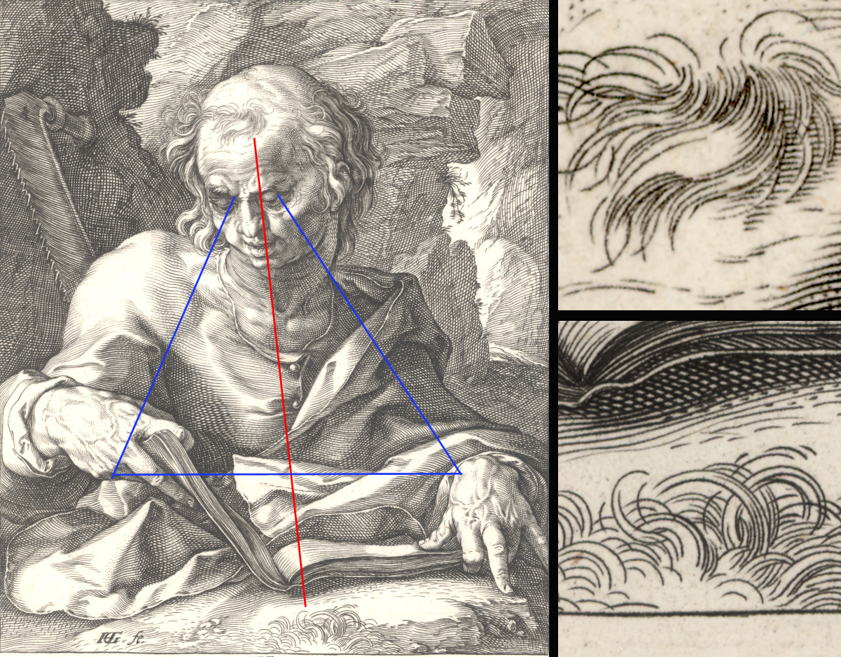
holly-shape configuration of rocks around water can be seen in another mezzotint by Earlom reproducing a different drawing by Lorrain, No. 43 (shown below). Here swirling water is depicted with very few concavities but this print has one other interesting feature with regard to water: it portrays a narrow body of water by the darkening the tone of the water into the more distant reaches of the stream. This is a fascinating visual device as large bodies of water, such as lakes and broad rivers, are portrayed as becoming lighter into the distance whereas the reverse is true for narrow bodies of water like streams and creeks. In the digitally modified images further below the tonal arrangement on the water has been reversed to illustrate this phenomenon.


Richard Earlom (1743–1822) after
Claude Gellée known better as Claude Lorrain (1600–1682)
[Plate] No. 43. From the Original Drawing in the Collection of R.P. Knight Esq., c. 1775
from Liber Veritas published by John Boydell, 1807
Mezzotint on wove paper,
20.7 x 26.3 (plate); 27.2 x 34 cm (sheet)
Condition: Excellent condition with no blemishes. Cut unevenly with 0.5 cm margin on left, 7.3 cm margin on right, 2.5 cm margin on top and 4 cm margin at bottom.
I am selling this print for $85 AUD including postage and handling to anywhere in the world. Please contact me using the email link at the top of the page if you have any queries or click the “Buy Now” button below.

(right) [Plate] No. 43.
(left) digitally altered image showing reversal of tonal gradations on river

Sunday 20 May 2012

3 Key Principles: Goltzius & Piranesi


What are the critical principles underpinning great art?


Like all broad generalisations there will always be exceptions, but if I were to reduce all the factors that come together in the most memorable artworks then three principles are essential:

  • projection (to arrest a viewer’s attention and to invite the viewer to look at the featured subject);
  • visual dialogue (to express meaning by comparison of the centre of interest with another pictorial element); and,
  • alluding to subject material outside of the field of view (to conceptually expand the range of projected meanings beyond the featured subject material).

In the following discussion I will address each of these principles and explain how Hendrick Goltzius and Giovanni Battista Piranesi have applied them.


My choice to use Hendrick Goltzius’ Apostle Simon (shown below) as an example of the first principle—projection—is simple; I love the print. Moreover, I find myself drawn to keep looking at it. For me, the attraction has nothing to do with the physical beauty of the subject as I am sure that there are few viewers who would see Saint Simon as eye candy. I am, nevertheless, attracted by the finely engraved lines rendering the image (see details further below) but this is only a small part of the reason I love the print. The primary attraction lies with Saint Simon’s hands. This is especially true with regard to the saint’s left hand and more specifically with his third finger so emphatically pressing on the ground as if the saint is making a ideological point. This arrangement of the forward projected finger is the element that both arrests my eye and draws me into the image. After this pictorial “introduction” into the image my eye then follows a gently spiralling course. First stop is the saint’s left hand. Next, my eye moves to traverse across the book (bible?) the saint is holding to arrive at his right hand. After pondering the odd way that Saint Simon holds the book—mindful that the saint’s hands is undoubtedly modelled on Goltziius’ own deformed right hand (see drawing in Teylers Museum Haarlem)—my eye is then lead along his right arm to finally “rest” on his face (see diagram of the rhythm below) before making visual forays to examine other pictorial features like the saw of his martyrdom.


Hendrick Goltzius (1558–1617)
Apostle Simon, 1589
From the suite Christ, The Twelve Apostles and St. Paul
15 x 10.3 cm (plate) with margins on fine laid paper with watermark “Crowned Arms”
Marvellous lifetime impression of lll (of Vl). From collection R.S. (not at Lugt)
Bartsch 53; Hollstein, Hirschmann 44 lll (of VI)
Condition: perfect
I am selling this print for $560 AUD including postage and handling to anywhere in the world. Please contact me using the email link at the top of the page if you have any queries or click the “Buy Now” button below.

This print has been sold
(Detail) Apostle Simon, 1589
Diagram of inward rhythm, Apostle Simon, 1589
Although the middle-finger of Saint Simon’s left hand is the point of introduction into the image, there are other elements in the print contributing to an invitation to look. For example the spine of the open book also draws attention inward as do the converging lines of the saint’s arms. To make the point of this discussion clearer in terms of how the eye is invited to engage with the act of looking and thinking, compare the difference in how the eye is not so welcomed by the arrangement of hands and arms in Golzius’ Apostle Bartholomew. This is true even though there are many other pictorial devices inviting the viewer’s eye to gaze into the print’s pictorial depth, such as the flaying knife of the saint’s martyrdom and the saint’s backward tilt of his head.


Hendrick Goltzius (1558–1617)
Apostle Bartholomew, 1589
From the suite Christ, The Twelve Apostles and St. Paul
14.4 x 10.4 cm (plate) right and left with small margins, cut on the platemark at the top, cut slightly inside the platemark at the bottom, on fine laid paper with watermark “Double Eagle”
Marvellous lifetime impression of lll (of Vl)
Bartsch 49; Hirschmann 40 lll (of VI)
Condition: traces of use, otherwise in good condition
I am selling this print for $360 AUD including postage and handling to anywhere in the world. Please contact me using the email link at the top of the page if you have any queries or click the “Buy Now” button below.

This print has been sold
(Detail) Apostle Bartholomew, 1589
Regarding the second principle—visual dialogue—I will return to Goltizius’ Apostle Simon as this print is so cleverly composed and rich in subtle use of visual devices.

To begin at a very fundamental level, even the most cursory look at the image will show a connection between the saint and his book. This relationship between the centre-of-interest—the saint’s head—and the book he is examining is a fine example of visual dialogue.

On a more reflective examination of the image, however, there is more to this visual dialogue than just the saint reading his book. He is also responding to what he is reading and this is signified by the gesture of the middle-finger of his left hand. This hand gesture that I proposed earlier as Saint Simon making an “ideological point” (i.e. a body-language gesture of clear emphatic certainty) does more than depict Saint Simon fully engaged in his reading. This gesture is the punctum point (discussed in an earlier post focused on Dujardin and Dietricy) of the whole image. In short, this single finger is the pivotal feature in the composition that shows the intensity of the saint’s reading of the book.

Even more subtle than the triangulation between the saint’s head, book and finger is the visual dialogue between the saint’s central lock of hair and the tuff or grass in the centre foreground (see diagram below). To my eyes, this visual connection created by the similarity of form between the hair and grass is important to the expression of a decisive moment in the saint’s reading. From my viewpoint, I see the link as establishing a line of separation between the related dual gestures of the saint’s hands.

Diagram of visual dialogue, Apostle Simon, 1589

For the final principle—alluding to a subject outside of the field of view— Piranesi’s etching, The Tomb of the Plautii near Ponte Lucano (shown below) is an excellent example. Here the shadow cast by an unseen structure lying beyond what can be viewed in the image creates a theatrical dimension of an unknown presence. This shadow not only hints at the form of the structure casting it but the shadow’s shape—especially the “extension” of the shadow’s shape into the cloud pattern—creates a window-like effect by framing the far distance.  This principle is a very useful device for giving an artwork pictorial breadth). To illustrate what the print would be like without the shadow, compare the original etching with a view of the same tomb without a shadow (see the digitally manipulated image below).
 

Beyond the use of shadows, another way to connote subject material beyond what is visible is the simple device of cropping the portrayed subject at the framing edge of the artwork. Again, Piranesi’s print is a good example of this approach as the portrayed tomb is not a panoramic view where the whole building can be seen but is cropped by the left and top edges of the format. This cropping ensures that a viewer understands that the image is only a section of a much broader view and this projects the notion and feeling of breadth.


Giovanni Battista Piranesi (1720–78)
Tomb of the Plautii near Ponte Lucano, 1761
From the Vedute di Roma [Views of Rome] series
Etching, 46.6 x 63.2 cm
Hind 83 IV (of IV) with the number 801 at upper right; Focillon 783; Wilton-Ely 216. Cartouche with the Italian inscription “Veduta degl’ avanzi del sepolcro della famiglia Plauzia sulla via Tiburtina vicino al ponte Lugano due miglia lontano da Tivoli”. With fecit note “Cavalier Piranesi F. (ecit)”
Condition: excellent impression on wove paper without watermark, with margin around the platemark, minimal traces of use, browned and foxed with the blind stamp of the Calcografia di Roma
I am selling this print for $960 AUD including postage and handling to anywhere in the world. Please contact me using the email link at the top of the page if you have any queries or click the “Buy Now” button below.

Altered image of Tomb of the Plautii near Ponte Lucano, 1761

Sunday 13 May 2012

Illustration & Referencing: James Brown


What are some of the differences between copying and referencing other artists’ artworks?


To coincide with an exhibition of my drawings presently being shown at the James Cook University, this discussion focuses on my drawing practice and the relationship between copying, translating and interpreting artefacts and prints by other artists.

If there is truth to the view that an artist’s intention for creating artworks is the keystone to his or her art practice, then I had better offer an overview of my aim for this exhibition. Broadly, the primary goal is to create a visual dialogue based on comparison between my perception of featured subjects and other artists’ perceptions of the same subjects.  By this I mean that I like to reflect upon the art practices of other artists (like Piranesi discussed in the earlier post, Artefacts and Meaning), and to see points of difference and congruence between their approach and my own. For example, my drawing, Referencing Jacque (shown below), features the same subject as Charles Emile Jacque’s (1813–94) etching, Mendiant (also shown below), but there are noticeable conceptual and physical differences between both artworks. Whereas Jacque’s print depicts a beggar drawn with confident and quickly laid marks suggesting that the artist was looking directly at the subject, my drawing is clearly a studio-based image constructed over time though a layering of marks, colours and many adjustments. Beyond the pictorial differences, conceptually, Jacque’s unconstrained candour in his rendering of the beggar presents a slice of reality—arguably so authentic a representation that this print could be seen as an iconic representation of a historically fading rural life in nineteenth century France. My drawing, on the other hand, is far from a copy of Jacque’s vision. This is a drawing about a play with light and shade in which soft French light is substituted with stronger and warmer light of the tropics. In short, both Jacque and my images feature the same subject but there is a large gap in the meanings expressed.


James Brown
Referencing Jacque, 2012
Pen and ink on watercolour paper
76 x 57 cm
I am selling this drawing for $850 AUD including postage and handling to anywhere in the world. Please contact me using the email link at the top of the page if you are interested or click the “Buy Now” button below.


Charles Emile Jacque (1813–94)
Mendiant [Beggar], 1846
Etching, chine colle on laid paper
9.5 x 8.3 cm (plate)
(G119)
I am selling this drawing for $97 AUD including postage and handling to anywhere in the world. Please contact me using the email link at the top of the page if you are interested or click the “Buy Now” button below.


In terms of conceptual focus, Referencing Millet (shown below) shares the same exploratory base as the last drawing in that it is also a practical experiment examining how patterns of light and shade can connote differences between France and the tropics. Here, the referencing of Jean-Francois Millet’s etching, Peasant Returning from the Manure Heap (also shown below) introduces changes to the lighting arrangement resulting from an unexpected event. One morning, when contemplating the previous night’s adjustments to the drawing, I noticed light beaming through shutters onto the middle-left of the paper and recognised that the shadows cast by the shutters added the shadow pattern needed. Although such an adjustment may seem minmal, the process of making each alteration to Millet's original image was guided by small models made for the purpose of study (see further below).


James Brown
Referencing Millet, 2012
Pen and ink on watercolour paper,
76 x 57 cm
I am selling this drawing for $850 AUD including postage and handling to anywhere in the world. Please contact me using the email link at the top of the page if you are interested or click the “Buy Now” button below.

Jean-Francois Millet (1814–75)
Peasant Returning from the Manure Heap, 1855–56
[Sold]
(left) plaster model for Referencing Jacque
(right) plaster model for Referencing Millet

Although the above drawings acknowledge their source images reasonably closely the pictorial and conceptual gap between the referenced and referencing artwork can considerable. In Referencing Le Clerc (shown below), for instance, the focus is again on adjusting the lighting of the original print (also shown below) to match my perception of light in the dry tropics, but this drawing goes further. Here, Le Clerc’s figure allegory has been erased and replaced with an image that I see as identifying with George Seddon’s interesting comment that “Australian landscapes are seamless. They rarely compose so neatly into identifiable ‘scenes’” (see Seddon, George 1997, Landsprints: Reflections on Place and Landscape, Cambridge, Cambridge University Press, p. 138).


James Brown
Referencing Le Clerc, 2012
pen and ink on watercolour paper
57 x 76 cm
I am selling this drawing for $850 AUD including postage and handling to anywhere in the world. Please contact me using the email link at the top of the page if you are interested or click the “Buy Now” button below.

Sebastien Le Clerc (1587–1633)
Defespoir de l’amour qui a perdu Psiché et n’en a conservé que le Portrait. Douleur, rage de tout ce qui Laccompagne. Arriveé de Mercure, qui annonce alAmour le changement de sa destinée
Etching, 12 x 17.8 cm
I am selling this print for $120 AUD including postage and handling to anywhere in the world. Please contact me using the email link at the top of the page if you are interested or click the “Buy Now” button below.

This print has been sold 
Of course, the idea of referencing other artist’s practice is not uncommon. In fact there is a tradition of reproducing other artists’ images stretching back to the Renaissance with the Weirix brothers, Hendrick Goltzius and Marcantonio Raimondi amongst many others who translated their peers’ paintings, sculptures and drawings into prints. This tradition culminated with the reproductive engravers of the nineteenth century who offered the only alternative for recording artwork for dissemination in books and folios before the advent of photogravure.

From a personal standpoint, there is a distinct difference between reproductive illustrations intended to be accurate representations of a subject and translations or interpretative illustrations intended to reveal an artist’s perception of a subject. With the former type of illustration the goal is about a object replication of the subject at least with regard to some of the more obvious features of the subject whereas the latter involves subjective transcribing of the subject into a new vision of it.

In the sample of drawings shown below, the process is not so much copying plaster casts taken from early sculptures as a process of translating three-dimensional form into the two-dimensions of a drawing. There is more to the process, however, than measured drawing and tonal rendering of form. Each drawing references another artist but the drawing itself is not a representation of another artist’s practice but rather a conceptual shifting of meanings that personalises it as my own practice.

James Brown
Apollo Belvedere—3 Faces, 2012
Lemon juice and ink
57 x 76 cm
I am selling this drawing for $850 AUD including postage and handling to anywhere in the world. Please contact me using the email link at the top of the page if you are interested or click the “Buy Now” button below.

James Brown
David’s eye, 2012
Lemon juice and ink
76 x 57 cm
I am selling this drawing for $850 AUD including postage and handling to anywhere in the world. Please contact me using the email link at the top of the page if you are interested or click the “Buy Now” button below.


James Brown
David’s Ear, 2011
Lemon juice and ink
76 x 57 cm
I am selling this drawing for $850 AUD including postage and handling to anywhere in the world. Please contact me using the email link at the top of the page if you are interested or click the “Buy Now” button below.


James Brown
David’s Nose, 2011
Lemon juice and ink
76 x 57 cm
I am selling this drawing for $850 AUD including postage and handling to anywhere in the world. Please contact me using the email link at the top of the page if you are interested or click the “Buy Now” button below.


James Brown
Apollo Belvedere—Front, 2011
Lemon juice and ink
76 x 57 cm
I am selling this drawing for $850 AUD including postage and handling to anywhere in the world. Please contact me using the email link at the top of the page if you are interested or click the “Buy Now” button below.


Sunday 6 May 2012

18th century Photoshop: Valentine Green


Mindful that digital manipulation of imagery is a recent phenomenon, what are some of the techniques used by early printmakers to alter images?


One of the more interesting traditions of what is now described in digital terms as “cutting and pasting” began in the seventeenth century with English portrait engravings. Some of the more enterprising (and perhaps less ethical) printmakers and their publishers at this time sought to reduce the labour cost of producing portraits of their clients by erasing the faces portrayed in earlier printing plates and substituting portraits of their new clients. Sometimes these replaced faces were augmented with minor changes to the figures’ surroundings.  For example in John Faber's mezzotint, George Byng, Viscount Torrington, not only is Byng’s face replaced in the altered plate, Edward Vernon, but the ledge on which Byng rests his right hand has been replaced with the barrel of a cannon on which Vernon’s hand rests.


John Faber the elder (c. 1660–1721)
(left) George Byng, Viscount Torrington, 1718 (state I)
(middle and right) Edward Vernon (states IV; V)
Mezzotint, 35.2 x 25 cm
(Layard, George Somes 1927, Catalogue Raisonne of Engraved British Portraits From Altered Plates, From the Notes of George Somes Layard, Arranged by H. M. Latham, Philip Allan, London, p. 16.)

The removal and replacing of imagery in plates such as these is made almost seamlessly by the medium of mezzotint. In a way the process of mezzotint is a bit like the building up of an image by pixels in that the image on the plate is created by tiny dots. In Frank Short’s demonstration print of the mezzotint process The Elements of Mezzotint (shown below) Short explains this engraving process:

The upper portion is intended to exhibit the work of the rocker, and for that purpose it is divided into two parts. The uppermost or lightest part was prepared in the same way as the darker subdivision immediately under it, but it was afterwards scraped quite clear of bur so as to exhibit the effects of the rocker’s teeth in digging into the copper. The nine strong dotted lines are lines of “ways,” showing the direction of rocking.  Here they are etched; in a plate intended for future work they are temporarily marked in chalk [see detail below].

The whole of the lower example was rocked “full,” showing the depth to be obtained by leaving bur untouched and also qualities of shade to be obtained by its partial removal with the scraper [see detail further below]. (Hamerton, PG 1892, Drawing & Engraving: A Brief Exposition of Technical Principles and Practice, Adam and Charles Black, London, p. 148 [tissue guard].)


Frank Short (1857–1945)
The Elements of Mezzotint, 1892
Mezzotint on wove paper
16 x 10.8 cm
Condition: pristine condition
I am selling this print for $75 AUD including postage and handling to anywhere in the world. Please contact me using the email link at the top of the page if you have any queries or click the “Buy Now” button below.
This print has been sold

Detail of upper portion
Detail of lower portion

The alterations to these early plates often went further than a chopping and changing of faces and their surroundings. Like the facility offered by “Exposure” and “Curve” tools in Adobe’s Photoshop software, the mezzotint engravers could also adjust the tonal contrast in the plates by applying the process outlined above by Frank Short to either give or remove a note of theatrical drama produced by lighting. Compare for instance the change in the tonal contrast between R Williams’ Thomas Betterton and the transfiguration to William Faithorne’s Sir William Read (see below). Interestingly, Thomas Betterton (1635–1710) was, according to Layard (1927), the “most eminent tragedian of the Restoration period.” Sir William Read (d. 1715), on the other hand, was “an itinerant quack, and was knighted for curing seamen and soldiers of blindness, and made oculist to Queen Anne” (Layard, George Somes 1927, Catalogue Raisonne of Engraved British Portraits From Altered Plates, From the Notes of George Somes Layard, Arranged by H. M. Latham, Philip Allan, London, p. 9.)


R. Williams
(left) Thomas Betterton (state I)
William Faithorne the younger (1656–1701?)
(right) Sir William Read (state IV)
Mezzotint, 33.9 x 25 cm
(Layard, George Somes 1927, Catalogue Raisonne of Engraved British Portraits From Altered Plates, From the Notes of George Somes Layard, Arranged by H. M. Latham, Philip Allan, London, p. 8.)


Even the most acclaimed and accomplished mezzotint artists engaged in altering their plates to accommodate fresh faces. For instance, Valentine Green (1739–1813) is arguably one Britain’s finest mezzotint portrait artists and yet he too loosened his artistic integrity to allow his print, Isabella, Duchess of Rutland, to be morphed into Frederica, Duchess of York (shown below). In terms of what may be seen as minor changes to the portrayal of Isabella to accommodate Frederica—alterations to the hat, upper section of the gown and, of course, a facial reconstruction (see both images further below)—there is a significant change to the projected meaning of the two portraits. In the portrait of Isabelle, our focus is allowed to move away from her face to dwell on the exquisite rendering of her gown and the composition as a whole. In the portrait of Frederica, however, our eye is held by contact with Isabelle’s attention directed to us. In short, Frederica is looking at us in a way that is difficult to disengage from. This seemingly subtle shift in projected meaning is what makes both images uniquely different even though they are both essentially made of the same pictorial ingredients.


Valentine Green (1739–1813)
Frederica, Duchess of York, 1793
After Sir Joshua Reynolds
Mezzotint, 63.4 x 38.8 cm

Detail of Frederica, Duchess of York


Valentine Green (1739–1813)
(left) Isabella, Duchess of Rutland, 1780 (state I)
(right) Frederica, Duchess of York, 1793 (states IV)
Mezzotint, 35.2 x 25 cm
(Layard, George Somes 1927, Catalogue Raisonne of Engraved British Portraits From Altered Plates, From the Notes of George Somes Layard, Arranged by H. M. Latham, Philip Allan, London, p. 109.)

Although the practice of altering images (i.e. changing an image so that the adjustments present a different interpretation of the subject) seems on the surface to be a straight forward activity in terms of pushing imagery around, the issue is usually more complex than this. For most artists their practice is governed by intention (i.e. a leaning to rationalise one’s practice and to “say” something that goes beyond the creative urge). There is also the problematic issue of ethics (i.e. a set of professional values that determines whether the use of certain imagery is appropriate) and aesthetics (i.e. a personal concern for quality that is lightly married to a concern to be authentic to one’s personal sensitivities). Essentially the practice of altering images is usually underpinned by discipline specific issues guiding an artist’s hand.