Gallery of prints for sale

Tuesday 23 October 2012

Expression by juxtaposition: Kilian, Pintz, Orlik & Carracci


What are some of the most effective ways to express meaning?

At a very fundamental level, visual communication relies on the viewer of an artwork recognising relationships between the portrayed features. If I may push this bold statement a little further, visual communication also relies on the relationships between complementary (i.e. opposite) qualities of the portrayed features.

For example, if an artist wishes to express the concept of strong light (as discussed in the previous post), the viewer would need to see and, importantly, to compare areas of the portrayed subject illuminated by the light against the areas of the subject portrayed in shadow. Based on the compared difference in the two extremes of light and shadow a viewer can then rationalise the light’s level of intensity. Of course, there is a plethora of issues that may interrupt a viewer’s recognition of intended relationships in a clear communication of any idea; even one as simple as showing the effects of bright light.

From my experience, the potential for misreading an artist’s intention is minimised when artists pictorially abut the complementary features underpinning the concept with pictorial emphasis on one of the features; such as juxtaposing large brilliantly lit areas of the subject beside small darkly shadowed areas if the intention was about bright light. Going further, the expression of meaning can be further enhanced if this abutment of opposites is arranged at a pivotal point in the composition—such as abutting areas of black and white at an “eye-catching” line of intersection between light and shadow when communicating the concept of bright light—rather than dispersing the abutment of opposites in a broadly scattered manner.

A fine example of such a juxtaposition of light and dark can be seen in Lucas Killian’s (1579–1637) large engraving, The Miracle of the Loaves and Fishes (shown below). Here, the silhouette edge of a hillock marks a line separating eight figures in the shadowy foreground from a horde of folk further back in the light. From a personal reading, this line differentiates the two figure groups. Those in the foreground I see as restless—perhaps because they are hungry as they are being attended to with food by two apostles—while the figures portrayed in the light are less agitated—perhaps because they have already been fed. Whether my reading is “correct” or not is not the point, but rather that the juxtaposition of opposites (i.e. dark with light and restless figures with relaxed figures) projects meanings that can be deciphered. If this line of demarcation were not such a noticeable feature in the composition I wish to propose that a viewer may have difficulty with framing a reading such as mine.


Lucas Kilian (1579-1637)
Die wundersame Brotvermehrung [The Miracle of the Loaves and the Fishes]; after Jacopo Tintoretto (1518-1594), 1602
Engraving and etching
Lettered at lower right: 'Jacobus Tinctoretus pinxit./ Lucas Kilian Aug.s scalpsit Venetiis.'
46.5 x 37.5 (plate); 48.5 x 385 cm (sheet)
Hollstein: 13.1
Condition: strong impression with traces of handling, a horizontal fold and a few spots commensurate with the age of the print.

Detail of Kilian’s The Miracle of the Loaves and the Fishes, 1602


For the following discussion I will move away from the juxtaposition of strong light and shade and address three other ways that artists use the juxtaposition of complementary attributes of the portrayed subject to express meaning.

As a first approach, I will to return once more to biblical imagery, but the use of juxtaposition in the images that I am about to examine is far from the approach used by Kilian and the artist he copied, Tintoretto. The source of the images is Jacob Scheuchze’s (1672–1733) Physica Sacra (also known as the Kupfer-Bibel) designed to showcase and explain by natural science his conviction that the Old Testament is a true account of our historical past. Sadly Scheuchze’s belief that he had discovered the fossilised remains of a victim of the great Genesis’ flood was later revealed to be that of a large salamander instead.

In Pintz’s illustration for this natural history interpretation of the bible, TAB. CCCCXVIIII. Reg. Cap. IV. V. 33. Cedrus, Hyffopus (shown below) an acorn from the cedar pine, Cedrus Hyssopus, is portrayed as a “real” specimen juxtaposed beside an elaborately framed image of a scene featuring the tree from which it grew. What is expressed by this juxtaposition is clear: the artist is showing the viewer the acorn as a representation of objective physical reality set against a background of pictorial invention. In this image the intersection of where these two realities intersect is the elaborate frame that can be seen as either a solid three-dimensional form (in the sense that Pintz has rendered the frame with light and shade) or as a schematic representation of a frame (in the sense that the frame features volutes that may be read simultaneously as a view from below and from above).


I.G. Pintz [Johann Georg Pintz] (1697–1767)
TAB. CCCCXVIIII. Reg. Cap. IV. V. 33. Cedrus, Hyffopus, 1731
From Scheuchze’s (1672–1733) Physica Sacra
Engraving on laid paper
32 x 20.5 cm (plate); 42.8 x 25 cm (sheet)
Condition: superb impression with no foxing and minor traces of handling. The print has generous borders on three sides but the right side has a 1 cm border from the plate mark.
I am selling this print for $97 AUD including postage and handling to anywhere in the world. This is a large print and will be shipped in a tube. Please contact me using the email link at the top of the page if you are interested or click the “Buy Now” button below.


Detail of Pintz’s TAB. CCCCXVIIII. Reg. Cap. IV. V. 33. Cedrus, Hyffopus, 1731

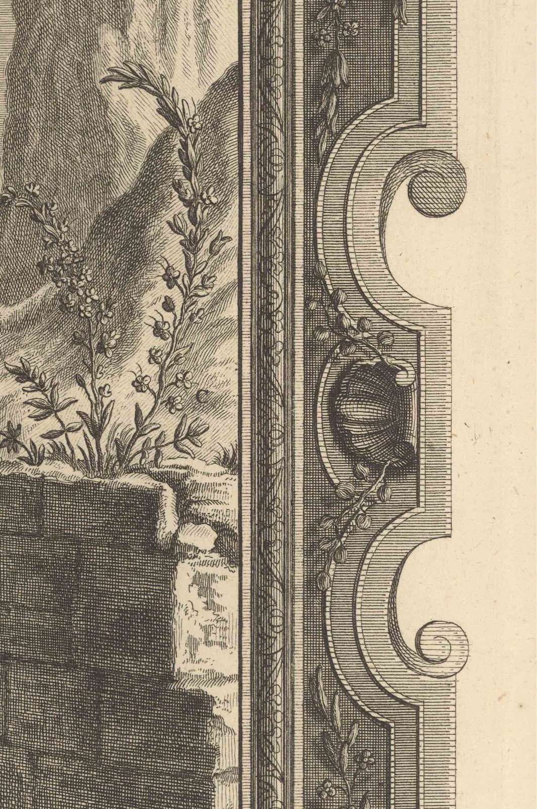
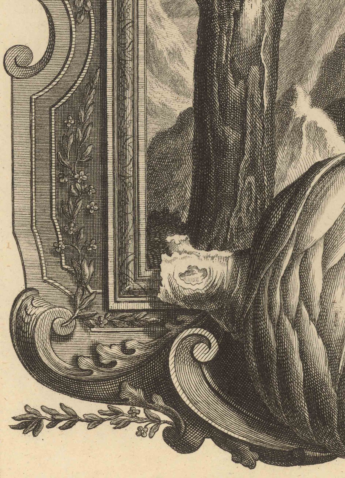
The use of a frame to differentiate two ways of looking (i.e. objective and subjective) is taken a stage further in Pintz’s illustration, TABDXXVI—IOB. Cap. XXX. V.4 Pauperiores Iro. (shown below). Here, the featured frame is adorned with plant specimens from the landscape portrayed within the frame in an even more physically abutting manner than employed in the last print. The abutment, however, goes beyond the frame. Even the pictorial space of the portrayed framed landscape is overlaid with a trompe-l'oeil (i.e. a pictorial illusion designed to “fool” the eye that what is represented is “real”) of a pseudo-scientific illustration showing botanical details on a battered leaf of paper wedged into the frame’s top lip (see details further below). From my reading of the expressed meaning of these visual devices, the juxtaposition of “real” objects (i.e. the plant specimens and the trompe-l’oeil slip of paper) with fabricated reality (i.e. the pictorial space of the landscape within the frame) expresses a conscious intent by the artist to link reality with concept. This intent is made apparent once again by the use of alphabetical inscriptions that would correspond with text-based explanations annotating the illustration. This approach to juxtaposition to express meaning may be intimately connected to Scheuchze’s Physica Sacra but it opens a way forward to other artists exploring links between illusion and reality.


I.G. Pintz [Johann Georg Pintz] (1697–1767)
TABDXXVI—IOB. Cap. XXX. V.4 Pauperiores Iro., 1731

From Scheuchze’s (1672–1733) Physica Sacra
Engraving on laid paper
32 x 20.5 cm (plate); 43 x 25 cm (sheet)
Condition: superb impression with no foxing. The extreme edges of the sheet have browned (probably from dirt accumulating on the outer edges of the book. The print has generous borders on three sides but the left side has a 1 cm border from the plate mark.
I am selling this print for $97 AUD including postage and handling to anywhere in the world. This is a large print and will be shipped in a tube. Please contact me using the email link at the top of the page if you are interested or click the “Buy Now” button below.

This print has been sold
Detail of Pintz’s TABDXXVI—IOB. Cap. XXX. V.4 Pauperiores Iro., 1731

A second way to juxtaposition complementary attributes of the subject also involves different realities but this time these realities are to do with contrast between graphic space (i.e. a conceptualised space represented by the artist’s personal way of making marks such as scribbled lines to represent abstract ideas) and pictorial space (i.e. an illusionary space of superficial appearance). Excellent examples of this type of abutment may be seen in artworks by the Vienna Secessionists like Gustave Klimt (1862–1918) but for this discussion I wish to focus on Emil Orlick’s (1870–1932) lithograph, Porträtstudie [Portrait Study] (shown below). 

Emil Orlick (1870–1932)
Porträtstudie [Portrait Study], 1899
Chine colle colour lithograph on heavy wove paper
Text inscription: “DRUCK K. K. HOF- UND STAATSDRUCKEREI, WIEN.” (lower left); “PORTRÄTSTUDIE. ORIGINAL-LITHOGRAPHIE VON EMIL ORLIK.” (lower centre); 
“VERLAG DER GESELLSCHAFT FÜR VERVIELFÄLTIGENDE KUNST, WIEN.” (lower right)
40 x 30.2 cm (chine colle image); 54.4 x 45 cm (sheet)
Condition: strong impression. The sheet has no tears but there is scattered light foxing on the support sheet. There are two white flicks on the image but these may be part of the print rather than surface damage.
I am selling this print for $285 AUD including postage and handling to anywhere in the world. This is a large print and will be shipped in a tube. Please contact me using the email link at the top of the page if you are interested or click the “Buy Now” button below.


From my standpoint, the intriguing beauty of this profile portrait of a young woman rests with my eye being caught in a visual play between looking at first at the highly refined—almost photographic—grey-toned rendering of her face and then at the largely flat background of red-orange edged with a warm black border. To my eye there are opposing tensions between the three-dimensional treatment of her face—viewed as pictorial space—and the two-dimensional treatment of the space surrounding her—viewed as graphic space. This tension of contrasting opposites presents her face as physically real (in terms of three-dimensional appearance) while at the same time it draws attention to the flat planes upon which her face is set. The important link between the abutment of these two spaces—graphic and pictorial—is the hair. In representing the hair, Orlik uses lightly drawn details of the hair locks over the otherwise flat brown-black shape of the hair mass (see details below). These lightly drawn details act as the conceptual bridge connecting the complementary spaces of three-dimensional form and flat pattern.

Detail of Orlik’s Porträtstudie [Portrait Study], 1899

The last approach I wish to discuss is one that engages the viewer in looking, thinking and responding, consequently it is an important one for visual communication: the juxtaposition of reflexive and reflective responses. To have an image that engages with a viewer in a way that prompts a reflexive response (i.e. an instinctive automatic response) means that the viewer is no longer an impassive spectator. Instead, the viewer is drawn to “participate” (in the sense of unmediated personal involvement) with the meaning projected by the image. After this initial involuntary response (a bit like being tapped on the knee by a doctor when testing one’s reflexes) the viewer may then choose to engage with the image in a reflective way; seeing relationships between portrayed features, deciphering meanings and correlating what is observed with associated experiences from the viewer’s past.

An example of how the juxtaposition of imagery for both readings is set in motion may be seen in Agostino Carracci’s (1557–1602) A Satyr Approaching a Sleeping Nymph (shown below). Here, a satyr portrayed approaching the viewer and a sleeping nymph holds up a finger to his lips in a gesture to the viewer to be quiet (see detail further below). For the viewer—or at least for me—this gesture and the way the satyr’s eyes are directed towards the viewer generates a reflexive response that he is making eye contact with the viewer and to be silent. This reading (for me) is unambiguous and automatic but the reason for the reflexive response is driven by the context where the satyr’s actions are contextualised with the sleeping nymph. The deciphering of the satyr’s need for silence is to involve the viewer in a complicit act of voyeurism with peeping on the sleeping nymph. Not all viewers may respond to the satyr’s “invitation” and at this point of reading is where there is a leap from reflexive response to reflective contemplation

Agostino Carracci (1557–1602)
A Satyr Approaching a Sleeping Nymph c. 1590–95
From the Lascivie series of fifteen prints
Engraving on laid paper
Only state
Bartsch: XVIII, 108.128; Bohlin 184
Condition: slightly grey impression trimmed to plate in pristine condition
I am selling this print for $360 AUD including postage and handling to anywhere in the world. Please contact me using the email link at the top of the page if you are interested or click the “Buy Now” button below.

This print has been sold
Detail of Carracci’s A Satyr Approaching a Sleeping Nymph

The potential to misread the satyr’s intention for lascivious behaviour is minimised nevertheless by the compositional arrangement. By design, the satyr and the nymph are pictorially linked together by the overlapping of their arms; a connection made even more noticeable by the contrast of the satyr’s dark tone juxtaposed with the nymph’s light tones (see detail below).


Detail of Carracci’s A Satyr Approaching a Sleeping Nymph 
All of the above approaches to project meaning using juxtaposition of complementary attributes of the subject rely on how well contextualised the meaning is and how attuned the audience is to read the intended meaning.  Of course, no matter how well orchestrated the image is composed there remains what some may see as the fundamentals of the viewer seeing (in an everyday biological sense) what is portrayed. In this regard I have to remind myself of the down-to-earth quip by the marvellous arts writer Peter Fuller after hearing a formal sociological explanation by a “prominent post-structuralist” as to why the central figure in the classical sculpture, The Laocoon Group, could be interpreted as being in pain: “’But Griselda, he’s being strangled by a sea monster.’ ‘Yes,’ she retorted, ‘but we have no means of knowing whether or not he’s enjoying it. …’” (Fuller, Peter 1983, The Naked Artist: Art and Biology. Writers and Readers, London, pp. 2–3)

Monday 15 October 2012

Representing light: Sadeler, Lalanne, Dananche, Desbrosses & Lepere


What are some of the ways that artists can depict strong light?

Before leaping into a discussion about the various approaches used by artists to represent strong light, I first need to offer an important insight into how meaning is expressed as it impacts on this topic.

Interestingly, one of the oddest conundrums facing artists when they wish to express their ideas in the visual arts is that ideas are best expressed by showing their complement (i.e. the opposite of what is intended to be communicated). This sweeping statement may sound absolutely weird and even completely nonsensical at first, but let me explain. If an artist wishes to convey, for example, the notion of femininity, the artist may choose to feature in the artwork subject material that is commonly considered to exemplify femininity: curvaceous women, cows with big soft eyes or pink fluffy boudoir chairs—my apologies if pink fluffy boudoir chairs are no longer seen as feminine. By simply featuring such subject material in an artwork, however, does not guarantee that a viewer will understand the artist’s intention of expressing the notion of femininity. Indeed, a viewer may only see an objectification of the portrayed subject (i.e. the viewer may see the featured subject as a specimen without any other meanings). To ensure that the viewer moves beyond looking at the subject as raw pictorial data without attached meanings the context surrounding the subject is very important, as it is the specific context that projects the artist’s meaning. For instance, if the artist wishes to show femininity, the subject it needs to be compared to something that does not exemplify femininity: straight lines of architecture may accentuate a curvaceous woman; sharp blades of grass may accentuate the doe eyes of a cow; dirt, grease and tools of manual labour may accentuate the colour and fluffiness of a lady’s boudoir chair—again, my apologies for gender casting. In short, visual expression of ideas is facilitated by juxtaposed contrast of dualities and the clarity of the expression rests with how well orchestrated the contextualisation is managed.


With regard to portraying strong light, the same focus on contextualisation is needed. In Aegidius Sadeler’s (1570–1629) The Rabbit Hunt (shown below) for example, a shaft of light follows the course of a fallen tree angled from the upper left. The light is contextualised as intensely bright by the sharp tonal contrast it makes with the tree and its immediate dark surroundings. Or to express this slightly differently, the brightness of the light is depicted as intensely bright relative to the darkness of the surroundings. Of course, there is more to creating the effect of intense light than employing strong tonal contrast like a bright spotlight on a darkened stage and in the following explanation I will address four visual devices that artists employ: the Holly and Cloverleaf Illusion (i.e. use of convex and concave forms to present the illusion of light as a volume); agitrons (i.e. use animation marks to give the illusion that light is moving in a direction); repoussoir (i.e. use of subject material overlapping the light source to suggest the level of the light’s intensity) and transition of mark attributes (i.e. use of different attributes of line to signify different effects of light on a subject).


Aegidius Sadeler (1570–1629)
Rabbit Hunting, c. 1610–13 from “Six Landscapes” after Roelandt Savery (1576–1639)
Etching and engraving on laid paper with circular watermark
21 x 28 cm (sheet)
Bartsch: 7201.244; Hollstein: 236
Condition: a fine impression of a rare and important landscape. The print is trimmed to the plate border without text line. There is a closed tear in a middle fold reinforced verso at the top and bottom; otherwise in very good condition with no stains. I am selling this print for $780 AUD including postage and handling to anywhere in the world. Please contact me using the email link at the top of the page if you are interested or click the “Buy Now” button.


This print has been sold

Verso of Rabbit Hunting
Detail of Sadeler’s Rabbit Hunting
The mechanics of the first of these visual devices, the Holly and Cloverleaf Illusion, is discussed in the earlier post, Earlom and Lorrain: Holly and Clover. Consequently, rather than revisiting this explanation, I will focus here on how it may be used to represent brilliant light. One dark and brooding image exemplifying the use of the holly leaf representation of light is Maxime Lalanne’s (1827–1886) etching, Baie de Weymouth [Weymouth Bay] (shown below). In this small but striking panoramic view of the beach at Weymouth the bulging shape of this illusion features in the distant patch of sky framed by dark clouds (see the diagram further below where this shape is marked out in red). Resulting from the illusory effect wherein this shape tends to be perceived as laying on top of the dark clouds (i.e. in front of the clouds) the implication is that the effect of light is a thin veneer rather than appearing to possess spatial depth. 


Maxime Lalanne (1827–1886)
Baie de Weymouth [Weymouth Bay], 1873, after Constable (1776–1837)
Published in The Portfolio (vol. 4, p. 161).
Etching on cream laid paper
Villet: 95 iv/iv
16 x 20.7 cm (plate); 35.3 x 24.5 cm (sheet)
Condition: a strong impression in pristine condition. I am selling this print for $87 AUD including postage and handling to anywhere in the world. 

This print has been sold

Lalanne’s Baie de Weymouth showing the Clover Illusion

To demonstrate the difference in effect between this patch of sky with its present arrangement of bulbous convexities like a cloverleaf, to a pattern of concavities like those of a holly leaf, compare the original image (shown above) with the digitally altered image below. From a personal viewpoint, the altered image portrays the light in the sky as behind the clouds and as an illuminated void. By contrast, the position of same area in the original image appears spatially ambiguous and bulging forward rather then receding. Going further, I wish to propose that a convincing representation of light is best expressed with a clover leaf configuration of foreground subject matter. To my eyes this is validated by the detail of Sadeler’s Rabbit Hunting shown further below where the convex shapes created by the roots of the fallen tree pictorially “push” the light behind them while the contrast of the roots’ dark tones creates the illusion of intense brightness.


Lalanne’s Baie de Weymouth showing the Holly Illusion
Detail of Sadeler’s Rabbit Hunting 
Arguably the most often employed visual device for representing strong light is the agitron also called an animation mark. This is especially true for the representation of light emanating from the head of Christ and other religious luminaries and there are many variations of how agitrons are used to portray this radiance. For the present discussion, however, I wish to focus on natural light from the sun, as the representation of this type of light is probably the same for all the different types of light.

Lynd Ward (1905–85) is an ideal exemplar of an artist employing agitrons and his skilful use of them to express the light is epitomised in the untitled illustration (shown below) that I will title for expedience as #44, because it is the forty-fourth full-page illustration in his unpaginated graphic novel, Wild Pilgrimage.

Lynd Ward (1905–85)
[#44] illustration from the graphic novel, Wild Pilgrimage, 1932
Woodcut on wove paper
16.5 x 11.4 cm (image); 24 x 16.2 cm (sheet)
Condition: verso has hinge remnants at the top of the leaf and an ink stamp and signature of a previous collector; otherwise the impression is a strong and clear and the paper is in pristine condition. 

The agitrons in Ward’s #44 express the fading light of the sun in three ways. The most obvious of these ways is the use of radiation, in that the fine radiating lines from the sun represent in graphic terms the brilliance of the sun itself. More subtly, the lines thicken in their size as they move away from the sun. This transition in size functions as linear perspective in disposing the sun into the distance. It also lends the suggestion by virtue of the minimal changes in the width of the lines and, importantly, their length, that the sun’s light is ebbing. The third way that Ward’s agitrons project fading light is very inventive and demonstrates why he is a fine illustrator. Note how he has interrupted the outward flow of lines from the sun with a pattern of vertical blockages ranging from finely hatched vertical strokes and stippling towards the right side of the image and a softly delineated black shape—arguably a cloverleaf shape with all its implications discussed earlier—towards the upper-right corner (see detail below).


Ward’s #44 showing use of agitrons to represent light

Ward’s idea of employing visual interruptions to a viewer’s reading is not in itself an unusual practice even if his application of them is subtle, refined and insightful. For example, repoussoir is a technical term for the practice of arranging visual obstacles (usually trees) on either side of the foreground of a image to frame the viewer’s focus on the centre of interest and to present the illusion of pictorial depth. The use of these visual obstacles can also connote the level of illumination in a scene. For example, in Xavier de Dananche’s (1828–94) Sur L’Eau (shown below), the lace-like visual obstacles posed by his repoussoir treatment of the trees projects the soft light of twilight (see detail further below). 


Xavier de Dananche (1828–94)
Sur l’eau, 1862
Etching on cream chine colle on heavy weight wove paper support
20 x 12.6 cm (plate); 35.2 x 26 cm (sheet)
Condition: rich impression on clean paper without stains or blemishes but the sheet has faint age darkening 4 mm from the top. There are pencil inscriptions about the artist (the dates are incorrect) and the title of the print. I am selling this print for $98 AUD including postage and handling to anywhere in the world. Please contact me using the email link at the top of the page if you are interested or click the “Buy Now” button. 


This print has been sold
Detail of de Dananche’s Sur L’Eau

In much the same way, Leopold Desbrosses’ (1821–1908) diminutive in size, but grandly luminous etching, Femme Assise dans la Forêt [Woman Sitting in the Forest] (shown below) features repoussoir interruptions to the distant soft light. By contrast with de Dananche’s approach to repoussoir, however, this print features a very special device: a transition from positive marks where the trees interrupt a view to the source of illumination to negative marks were the foliage in the darkness of the forest reflects the light (see details further below).

Leopold Desbrosses (1821–1908)
Femme Assise dans la Forêt [Woman Sitting in the Forest] after Corot
Etching on cream laid paper
9.5 x 13.2 cm (image); 13.7 x 18.7 (plate); 17.4 x 22.5 cm (sheet)
Condition: superb impression in pristine condition. I am selling this print for $56 AUD including postage and handling to anywhere in the world.

This print has been sold

Detail of Desbrosses’ Femme Assise dans la Forêt 
showing transition from positive to negative marks
Detail of Desbrosses’ Femme Assise dans la Forêt 

The final approach to representing light that I wish to address in this discussion is all about achieving a transition of mark. Unlike Desbrosses’ approach of changing from positive strokes in the light to negative strokes in the dark, however, the transition that I am interested in here is to do with changing the inherent attributes of mark to signify changing degrees of illumination. In Louis Auguste Lepere’s (1849–1918) La Ferme aux peupliers de Hollande [The Poplars Farm in Holland] (shown below), for example, there is a clear shift in the types of marks used to depict trees observed in the blinding sunlight compared to similar trees observed outside of the vicinity of blinding light (see details of the comparable effects further below). For instance, in the area of intense glare, the marks are short, fine and widely space from one another whereas in the more shaded areas the marks are longer, thicker and so close to one another that they are layered. There is not only separation between these extremes of marks but there is also a sequence of transitional stages linking the two different mark types. 

Closest to the light the marks are notational jottings—a few of the lines in this area are straight but more are like tight squiggles (see detail A below). The next stage away from the light is where the structure of the trees is revealed—some of the lines are outlines and many are curved strokes giving fundamental form to the trees (see detail B below). Following this structural stage is the area of half light where the superficial details of the trees are revealed—here the line attributes mimic the textures, surface tones and superficial details of leaf shapes (see detail C below). In the furthest away region the marks become much looser in the sense of free scribbles made with continuous line suggesting a peripheral view of the trees before the scene extends beyond Lepere’s field of view (see detail D below).

This staged transition of mark attributes, of course, is usually not a device employed on its own to represent light. As can be seen in Lepere's powerful image, all of the principles that I have discussed above can be seen playing an active role in Lepere’s depiction of intensely bright blinding light almost exploding the stand of poplars.

Louis Auguste Lepere (1849–1918)
La Ferme aux peupliers de Hollande, 1914
Etching on fine wove paper
Pencil signed, 13/50
29.8 x 35.8 cm (plate); 37.2 x 44 cm (sheet)
Condition: superb impression. There is faint toning around the plate mark and remnants of mounting hinges on verso. I am selling this print for $460 AUD including postage and handling to anywhere in the world. Be aware that as this is a large print it will be shipped in a tube. Please contact me using the email link at the top of the page if you are interested or click the “Buy Now” button. 


This print has been sold

Detail A of Lepare’s La Ferme aux peupliers de Hollande
Detail B of Lepare’s La Ferme aux peupliers de Hollande
Detail C of Lepare’s La Ferme aux peupliers de Hollande
Detail D of Lepare’s La Ferme aux peupliers de Hollande

Monday 8 October 2012

Phrasing of line: Lowe, Legros, Boisseau, Dore & Kollwitz


What are some of the principles guiding an artist’s hand when making lines?

When discussing any principle, especially in the arts, there is an understanding that the principles guiding an artist’s hand are interconnected. I mention this because the following explanation of the principles behind the phrasing of line (i.e. variations to the attributes of line arising from changes in a stroke’s thickness, opacity and flow) share a role in how lines are phrased with a plethora of other closely related principles, such as those discussed in the last post regarding the representation of corners. In short, the following explanation may seem like there is a set of clearly defined principles underpinning the phrasing of line, but in truth each of the four principles addressed below (viz. the Ingres principle; weighting a line; projecting a line; squishing and stretching a line) does not function in a distinctly different way and independent of other principles.

The first principle that I wish to discuss, the Ingres principle, concerns the phrasing of a subject’s silhouette edge to replicate variations in the subject’s surface contours. For example, if an artist were to apply this principle to portraying a figure’s arm then the sharply angled contours of an elbow may lead the artist to treat the silhouette edge of the elbow with a strong line by comparison with a much softer line where the contours of the arm change to the rounded muscles of the upper arm. In the illustration of an arm shown below, for instance, I have marked the transitional changes to the outer edge of the arm’s underside with most angular contour area marked as point A and the softest contour marked as point D.

James Brown
Illustration showing phrased variations, according to the Ingres principle, in the treatment of the outer edge of an arm.
Point A marks the area at the elbow where most angular contours of the arm are shown by a bold red line delineating the silhouette edge.
Point B is the area of the elbow where there is less of an angular contour than at point A and is shown by a less opaque, cool blue line floating slightly away from the silhouette edge.
Point C is the muscled area of the triceps and as this area has more rounded contours than at point B it is shown with a softly applied line.
Point D marks the area approaching the armpit where the contours are more rounded than any of the previous areas and is shown with a faltering and faintly laid line. 
This painting has been sold
(detail) Illustration of the Ingres principle
Another example would be if an artist were to portray the top edge of a gently curved leaf in a line followed by another line describing the top edge of a tightly curved leaf (see illustrations below). In this scenario, an artist representing the gently curved leaf would almost dissolve the line so that it appeared to be very soft (see upper digitally modified illustration) followed by an emphatically strong line when drawing the tightly curved leaf (see lower digitally modified illustration). The rationale for this difference in the two attributes of line is that the eye can see further around the gently curved leaf and so the line representing this view is accordingly soft whereas the eye is unable to see around a tightly curved leaf and so the line representing it is accordingly  strong and crisp.

Edward Joseph Lowe (1825–1900)
Cordyline (Dracaena) Indivisa, LII, 1891
From Edward Joseph Lowe’s Beautiful Leaved Plants, Being a Description of the Most Beautiful Leaved Plants in Cultivation in the Country
Originally purchased as a woodblock printed in colours and finished by hand (and it may be) but I believe that it is a chromolithograph.
25.4 x 17 cm (sheet)
Condition: Crisp impression in pristine condition with blank verso. There is a pencil inscription on the lower left “New Zealand Native.” I am selling this print for $60 AUD including postage and handling to anywhere in the world. Please contact me using the email link at the top of the page if you are interested.

Digitally altered details of Lowe’s Cordyline (Dracaena) Indivisa, LII, 1891
(upper) use of a soft and pictorially dissolved upper silhouette edge to portray a gently curve
(lower) use of an strong and crisp line to portray a tightly curved leaf

From a personal standpoint, the titling of this principle is a little problematic as the artist I have associated it with, Jean-Auguste-Dominique Ingres (1780–1867), is not the finest exemplar of its use as there are many of his artworks in which it is not evident at all. Nevertheless, as shown in the details below taken from a selection of Ingres’ artworks the phrasing of the silhouette edge is clearly evident. Moreover, until I determine a more appropriate artist with whom to credit the principle as its “father”/progenitor, I will persevere. Later artists have certainly applied the principle in a very clear way, such as Picasso, and I can still remember my pleasure as an art student in examining the skilful play of the silhouette edge in his ravishingly beautiful gouache, La Belle Hollandaise [The Beautiful Hollander] (see detail further below).

Jean-Auguste-Dominique Ingres (1780–1867)
(details) Costume study for the portrait of Madame de Rothschild, 1847
Pencil on paper with touches of white
Musee Ingres, Montauban
Jean-Auguste-Dominique Ingres (1780–1867)
(details) La Grande Odalisque, 1814
Oil on canvas
91 x 162 cm
Louvre
Jean-Auguste-Dominique Ingres (1780–1867)
(details) La Source, 1856
Oil on canvas
163 x 80 cm
Musée d'Orsay, Paris
Pablo Picasso (1881–1973)
La Belle Hollandaise, 1905
Gouache on cardboard mounted on wood
77.1 x 65.8cm
Queensland Art Gallery
The second principle, weighting a line, involves a transition in a line from a pale tone where the line is further away from the ground to a dark tone where the line is closest to the ground. In short, the principle is all about the artist varying the degree of light and shade in a line—usually the outcome of changing the pressure on the drawing instrument—to connote the sensation of gravity. A practical example of this type of line phrasing may be seen in Jean Jacques de Boissieu’s (1736–1810) L’Hiver, d’apres un dessin fait a Saint-Chamond [Winter, after a drawing by Saint-Chamond], 1795 shown below. Here a gnarly tree spans the composition with its upper branches touching the top of the image border and its trunk rooted close to the bottom border. The rendering of the tree itself is where the phrasing of line may be seen. In representing the uppermost tips of the branches de Boisseau employs very lightly inscribed lines to suggest an equivalent lightness in the branches’ physical weight but as the line work rendering the silhouette edges and surface contours of the tree’s trunk progresses towards the ground the marks become increasingly darker and stronger connoting the tree’s solid mass and weight (compare the details further below).

Jean Jacques de Boissieu (1736–1810)
L’Hiver, d’apres un dessin fait a Saint-Chamond
[Winter, after a drawing by Saint-Chamond], 1795
Etching on wove paper with chine appliqué
26.5 x 19.5 cm (chine appliqué); 26.7 x 20 cm (plate); 29.2 x 22.2 cm (sheet)
Perez: 98
Condition: Strong impression with small margins and light pencil inscriptions of a dealer’s stock inventory details on verso otherwise pristine condition. I am selling this print for $210 AUD including postage and handling to anywhere in the world. Please contact me using the email link at the top of the page if you are interested.

Details of L’Hiver showing changes in the attributes of the strokes


In Alphonse Legros’ (1837–1911) masterly, Viel Espagnol [Old Spaniard] (shown below), the phrasing of each line reveals the artist’s active engagement in “feeling” out the figure’s form in terms of its contours and where the form is weighted. For instance, the swelling (i.e. bulging outwards) of each line from a faint beginning and back to an equally faint ending like a lanceolate leaf shape (i.e. a shape that is pointed at each end) gives form to the Spaniard’ gown as it lightly wraps around his front arm. This swelling, however, is not a perfunctory exercise. The point of maximum swelling in the lines is assigned to where the weight of the arm places tension on the fabric of the gown (see details of the lines further below). In essence, this subtle phrasing is the “secret” to using the principle of weight in a line meaningfully. 

Alphonse Legros (1837–1911)
Viel Espagnol [Old Spaniard], 1872
Published in Portfolio, no.27, March 1872
Etching on cream laid paper
27.7 x 18.6 cm (plate); 34.7 x 24.5 cm (sheet)
Condition: Marvellous impression in superb condition with generous margins and minimal handling marks. I am selling this print for $210 AUD including postage and handling to anywhere in the world. Please contact me using the email link at the top of the page if you are interested.
Details of Viel Espagnol showing phrasing of line to connote weight

The third principle, projecting a line, is closely linked to the phrased swelling of line that Legros employs in Viel Espangnol. What I mean by this is that his use of the swelling creates the illusion that the centres of the lines advance towards the viewer. Or to explain this in a different way, the principle of projecting a line as used by Legros is as simple as applying the rules of perspective: the larger the swelling and the darker and more opaque it is, the more it advances. An example of this phenomenon may be seen in the companion print to de Boisseau’s L’Hiver [Winter], Le Printemps, d’apres un dessin fait a Saint-Chamond [Spring, after a drawing by Saint-Chamond]. Here, the eye is directed into the distance by limbs of a weathered tree similar, but in a mirrored position, to the one featured in L’Hiver. In terms of de Boisseau’s phrasing of his lines to express spatial projection, I wish to draw attention to the tonal transition from fine marks at the distant ends of the far right branch to the dark tones and much stronger marks where this limb connects with the trunk of the tree (see details of this change further below).

Jean Jacques de Boissieu (1736–1810)
Le Printemps, d’apres un dessin fait a Saint-Chamond
[Spring, after a drawing by Saint-Chamond], 1795
Etching on wove paper
26.4 x 19.6 cm (plate); 42.2 x 35 cm (sheet)
Perez: 97
Condition: Strong impression with wide margins and handling marks. I am selling this print for $210 AUD including postage and handling to anywhere in the world. Please contact me using the email link at the top of the page if you are interested or click the “Buy Now”


This print has been sold

Detail of Le Printemps showing a transition in line attributes from distance to foreground

The final principle, squishing and stretching a line, has a long pedigree extending back to classical Greece with their sinuous S-shaped (contrapposto) pose for sculpture. The idea of compressing one side of the figure (usually by shifting the weight of the figure to one foot) and countering this compression further up the figure gives vitality to the figure by opposition of tensions. Importantly, however the spectacle of this opposition is inherent in how the artist portrays the complementary effects. In terms of phrasing a line, the physical state of compression is represented by a swelling line. Conversely, the notion of stretching is represented by a thinning line. Usually the use of these complementary effects is not a conscious decision but happens at an intuitive level.

Like all good illustrators—especially cartoonists—the principle of squishing and stretching underpins their work. For example, in Paul Gustave Doré (1832–83) illustration There Minos Stands (Canto V., line 4) (shown below), note how the Mino’s biceps are drawn with a thick and very dark line whereas his triceps are drawn with a much finer line. This phrasing of line may also be seen in Minos’ forearm and hand (see details further below).


designer) Paul Gustave Doré (1832–83);
(engraver) Gaston Raymond Ernest Monvoisin
There Minos Stands (Canto V., line 4) illustration for Dante’s Inferno
Wood engraving

This item has been sold
(detail) There Minos Stands 

Beyond employing this principle as a “natural” practice when drawing, the principle can, of course, be exaggerated to show feelings that go beyond the everyday world. In Käthe Kollwitz’s (1867–1945) powerful and very large etching, Die Pflüger [The Ploughmen] (shown below), the phrasing of line is a fundamental visual device in expressing the extreme physical stresses involved in ploughing. Of course this image is much more than an illustration of farmer labouring. This is an image of desperation and the phrasing of line signifies the almost superhuman tensions of pulling the plough underpinning the image. Note in particular the difference in treatment between the fine and straight lines representing the strain on the harness around the closer figures’ legs and the thicker contoured lines portraying the creases in his clothes (see details further below). 


Käthe Kollwitz’s (1867–1945)
Die Pflüger [The Ploughmen], 1906
Plate #1 of the Bauernkrieg [Peasants’ War] series
Etching, engraving, softground and commercial tonal grids
With von der Becke blindstamp lower right
31.5 x 45.4 cm (plate); 53.4 x 70 cm (sheet)
Knesebeck: 99 Xlll b; Klipstein: 94
Condition: superb impression in pristine condition. I am selling this print for $970 AUD including postage and handling to anywhere in the world. This is a large print and will be shipped in a tube. Please contact me using the email link at the top of the page if you are interested or click the “Buy Now.”

This print has been sold
Detail of Kollwitz’s Die Pflüger showing the squishing and stretching principle in the treatment of line