Gallery of prints for sale

Sunday 26 January 2014

Ugly Beauty: Five Principles (Part 1)

Why do some images appeal to our sense of beauty and yet they may be seen as ugly?


I suspect that we all have partners or friends that appear beautiful to us despite our understanding that their faces and bodies do not match current notions of beauty (e.g. a beautiful person should be symmetrical and with attributes that are the perfect average of everyone’s face and body). Such a perception, of course, does not end with the conundrum of seeing beauty in non-beautiful people. For example, my dog—a Staffy affectionately, but inappropriately, called “Cat”—is beautiful. This clear view of gorgeous beauty exists in spite of my cook’s insensitive assertion to Cat while cuddling him: “You are the ugliest dog in the world. Only your mother could love you.” For the present discussion I wish to extend this very shaky proposition that beauty may be of a kind that transcends superficial appearance and move to a more solid argument that the oxymoron of ugly beauty has manifested itself in art: the art of scholars’ stones1 (called “Gong shí” ["respect stones"/"viewing stones"/”spirit stones”] and “Guai shi” [“grotesque stones”] by the Chinese, “Suseok” by the Koreans and “Suiseki” by the Japanese). 

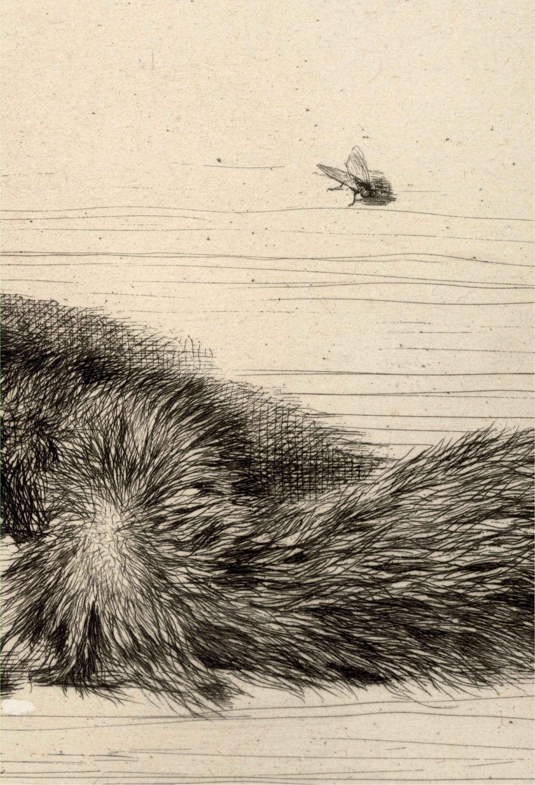
On the shelf in my studio is such a grotesquely beautiful stone (see below). It is petrified wood and for me this fossilised stone projects from within its rugged form an aura of spirit, presence and inexplicable beauty. In short, to my eyes it is one of nature’s masterpieces even though I have been told by an insensitive friend that it is simply an ugly old rock. Like all masterpieces there are five fundamental principles that can be used as a check-list of attributes exhibited when determining the aesthetic quality of such stones and these I will explain in the following two-part discussion: shou (thinness); zhou (wrinkles); lou (hollowness); tou (penetrated); and, qi (life force). 


Scholars' Stone: Petrified Wood
From the Gobi Desert, Inner Mongolia
53 x 16 x 13 cm (including wooden lacquer base); 6.7 kgs

Condition: No chips or wear beyond the natural aged condition and patina of the stone. The hand-crafted and lacquered wooden base is faultless. I am selling this stone for a total cost (including shipping to anywhere in the world) for $1280 AUD. Please contact me using the email link at the top of the page if you have any questions or click the “Buy Now” button below.


This stone has been sold


The first of the principles—shou (thinness)—as Richard Rosenblum insightfully explains in his marvellous book, Art of the Natural World: Resonances of Wild Nature in Chinese Sculptural Art (2001)2, means that a stone should be “literally ‘skinny’ or ‘emaciated’” and, in sustaining this body metaphor, “a rock should reveal a patterned and strong structure” (p. 143). In short, the attribute of shou revealed in a stone (or whatever the artwork may be) should project the dynamic energy and inner spirit—the qi (life force) that I will discuss later—of the object’s internal structure. In terms of the Chinese leaning to valuing such a quality, Kemin Hu’s opening sentence in The Suyhuan Stone Catalogue: Scholars’ Rocks in Ancient China (2002)3 points out that “Chinese in ancient times believed that rocks were the bones of the world, the essence of qi (energy, or universal life force).”

With regard to my piece of petrified wood, shou is expressed by the elegant silhouette line of the stone’s vertical form and by the way that the rutted roughness of the stone’s surface suggests the rhythm and grain of the stone’s crystallised core—a bit like how the sagging skin of very elderly folk hangs from their bones and reveals the form of the bones. Rosenblum (2001) summarises this phenomenon well when describing a piece of his own artwork “… the sculpture was getting its movement not from its contour but from the forms inside it …” (p. 111). The expression of an object’s unseen interior dynamics is of critical importance to a viewer perceiving its structural beauty (assuming that the object possesses the mercurial element of beautiful ugliness). Moreover, the suggestion of interior forces impacting on the outside has deep philosophical roots as Rosenblum (2001) clarifies: “This concept of an infinite world within a finite form resonates throughout Chinese nature art …” (p. 43).

The second principle—zhou (wrinkles)—again draws upon the interior forces within the stone giving form to (i.e. shaping) the stone’s exterior surface, but there is a difference between the related principles of zhou and shou. With the principle of zhou a viewer is invited to contemplate surface attributes of the stone in terms of natural wrinkles that have an intrinsic beauty all on their own. This notion of beauty has led to a host of names for the various types of wrinkles deemed desirable (e.g. jiqu zhou [chicken-bone wrinkles], hutao zhou [walnut wrinkles] and heye zhou [lotus-leaf wrinkles][Rosenblum, 2001, p. 143]), but these variants are only descriptive technical terms created for collectors. The critical attribute of beauty seen in wrinkles lies with the hallmarks of natural forces acting upon the stone’s surface: signs of authentic weathering and patina. According to Rosenblum (2001), “lined, rugged (even ancient looking) texture is best” (p. 145).

Evidence of zhou where the core of the stone shapes its surface contours
My piece of petrified wood, for example, showcases the attribute of zhou by the naturally occurring, but now fossilized, rotted surface of the original timber (see details below). For me, the petrified wood exemplifies very well the desired qualities of “lined,” “rugged” and “ancient looking.” Moreover the twisting—almost spiralling—rhythm of surface corrugations projects outwards the suggestion of rhythms beyond those that may be physically mapped on the stone (see illustration further below). This conception of the stone being seen to connect by its twisting rhythms to the infinite beyond may also help to explain its aura of being “special” in the sense that it embodies the spiritual essence of a world larger than itself. This idea is not of my own concoction, as Vincent Covellow and Yuji Yoshimura (2009) in The Japanese Art of Stone Appreciation: Suiseki and its Use with Bonsai 4 explain:

According to the teachings of Zen, everything finite tells of the infinite, and everything animate and inanimate is the product of the same force. By mediating on the stone, a monk could understand the essence of the stone, the essence of a mountain, and all else in the universe. To experience this essence, to become one with the stone, was to become enlightened. (p. 20)

Digital exploration of the rhythms suggested by the stone
The third and fourth principle—lou (hollowness) and tou (penetrated)—are also inextricably linked with the previous principles and the philosophical concepts underpinning them; related concepts that may be summed up with Rosenblum’s (2001) philosophical insight: “A scholars’ rock … is a little piece of a wrinkle from which you can image the whole wrinkle; it’s a little piece of a rock from which you can imagine the whole rock; it’s a little piece of mountain from which you can imagine the whole mountain—and so on” (p. 39). Based on Ying Bao’s (瑛寶, late 18th–early 19th century) inscription on his, Painting of a Rock from Mt Pan, Rosenblum (2001) clarifies that the literal meaning of lou is “to leak” and the desired attributes of lou is “a pitted surface with depressions and hollows of various sizes is preferred” (p. 143). Taking this notion of hollowness a stage further is the principle of tou, described by Rosenblum (2001) as “holes that reach all the way through, admitting the light and air” (ibid.). The interest behind both of these desirable attributes is the idea that the non-visible inner world of a stone can be tapped into through natural tunnels and hollows so that a viewer may see inside, or, as Rosenblum (2001) proposes, “for a paradise inside” (p. 103).

Taihu Lake stones, such as the example from my collection shown below, are well known for exemplifying the attributes of lou and tou with as many hollows and tunnels as Swiss cheese. When contemplating stones like these, the ugly beauty of their labyrinth of channels that invite the eye to explore, make the difference between the inside of the stone and its outside as irrelevant as a Möbius strip (see http://en.wikipedia.org/wiki/M%C3%B6bius_strip [viewed 25 January 2014]). The idea that the inside of a stone—or any object—and its outside surface are not separate spatial realms but rather intimately connected is reflected in the Eastern concept of orientation, as Rosenblum (2001) explains:
… the Chinese look at the world as having five directions—north, south, east, west, and ‘in.’ And ‘in’ is more important to them than north, south, east and west, because the center—the ‘in-space’—is where all the other directions emanate from. (p. 99)

Scholars’ Stone: Taihu Lake
Mineral composition: Limestone (calcite)
30 x 14.5 x 10 cm (including wooden lacquer base); 2 kgs

Condition: No chips or wear beyond the natural aged condition and patina of the stone. The hand-crafted and lacquered wooden base is faultless. I am selling this stone for a total cost (including shipping to anywhere in the world) for $970 AUD. Please contact me using the email link at the top of the page if you have any questions or click the “Buy Now” button below.


Fascination with capturing the sense of ugly beauty when looking into stone is not, of course, restricted to the Orient. In Part 2 of this discussion I will address how Occidental artists have also engaged with the idea of beauty inside stone.
_________________________

1 Some writers prefer the term “scholars’ rock.” William Benz (1996), in The Art of Suiseki: Classic Japanese Stone Gardening, advises that there is a difference between stones and rocks:
In ordinary language, we use the word ‘stone’ as a general term for all of the solid parts of the earth’s crust. … In the science of geology, however, we speak of minerals and rocks rather than of stones. A rock is an aggregate of several minerals created through a natural process. It is not a homogeneous piece of the earth’s crust. (p. 83)
While not disputing such an important technicality, I choose to use the term “scholars’ stone” for the beauty of the alliteration of the “s” sounds and my belief that few readers are likely to quibble about the difference between a stone and a rock.
2 Rosenblum, Richard 2001, Art of the Natural World: Resonances of Wild Nature in Chinese Sculptural Art. MFA Publications, Boston.
3 Hu, Kemin 2002, The Suyhuan Stone Catalogue: Scholars’ Rocks in Ancient China. Weatherhill, Trumbull.
4 Covellow, Vincent T & Yuji Yoshimura 2009, The Japanese Art of Stone Appreciation: Suiseki and its Use with Bonsai. Tuttle Publishing, Tokyo.

Monday 13 January 2014

Reflexive and Reflective Responses: Bidloo, Sadeler, Jacquemart and Hogarth

What are some of the fundamental ways that viewer’s respond to imagery?


Although there are always issues complicating any simple answer to questions such as how an audience is likely to respond to artworks, at the heart of any discussion on this topic there are two fundamental ways. The first is a viewer’s automatic response to a portrayed subject. This is often described as “reflexive” (i.e. a response that is like an involuntary knee-jerk if one’s knee is tapped with a hammer). The second is a viewer’s conscious and mediated response that is often described as "reflective." This response involves the viewer in negotiating (i.e. “thinking about”) meanings based on associations, projections and interrogation of the visual information observed in the artwork.

Regarding a reflexive response, this is a natural reaction like the wish to wave away the fly engraved in Gerard de Lairesse’s (1640/41–1711) anatomical study, Table 52: Abdomen, Posterior Wall (shown below). Based on my own response, this fly and its proximity to the surgically evacuated abdomen cavity, along with its angled alignment towards the cavity and the fly's resting place on material bordering the cavity, gives me an involuntary shiver of unease. I instinctively want to brush it away so that the exposed diaphragm is uncontaminated by the fly’s presence. 

Engraving by Abraham Blooteling (1640–1690) and Pieter Stevens van Gunst (1659–1724) after an illustration by Gerard de Lairesse (1640/41–1711) published in Govard Bidloo's (1649–1713) famous anatomical atlas, Anatomia humani corporis (Utrecht, van Poolsum, 1734 edition) (see video further below)
Table 52: Abdomen, Posterior Wall, 1690
copper engraving on cream laid paper with 2.5 cm chain-lines
(sheet) 50.4 x 34.6; (plate) 47.5 x 32.1 cm
Description of this print: “Large house fly shown on the specimen. Abdomen, posterior wall, in situ. Viscera removed to show diaphragm, crus of diaphragm around divided aorta and esophagus. Vertebrae and psoas muscle shown.
The splendid anatomical work of Bidloo is considered one of the most beautiful ones ever printed. It became famous because of the very elegant and elaborate engraved tables after drawings by Gerard de Lairesse, carried out by Abraham Blooteling and Pieter Stevens van Gunst.” (http://www.worthpoint.com/worthopedia/abdomen-posterior-wall-house-fly-417303811 [viewed 10 January 2014])


Vassar's Millionth Volume [Anatomia humani corporis by Govard Bidloo] (4.06 mins)

This reflexive response to the fly is also accompanied by an equally reflexive reaction of recoil at the grisly and uncommon subject portrayed—a dissected cadaver. Moreover, I have vacillating instinctive responses of revulsion and fascination with the contrast I see between the portrayed mechanical sheen of the dissection pins and the soft flesh that they hold in place (see details above).

The notion that my response vacillates between one moment of wanting to avert my eyes away from the portrayed scene and, at the next, with wanting to examine it in a searching way, is even more apparent when I look at another engraving from Bidloo’s anatomical atlas, Table 86: Dissected Foot (shown below). Here, the apparatus for displaying the dissected muscles and tendons is even more riveting to my eye in the sense that there is a note of theatricality in the way that the various body tissues are drawn apart by posts, pegs, callipers and pins. For me, I feel a twinge of pain, in terms of a gut reaction, when I see the muscles disassembled in this way.

Engraving by Abraham Blooteling (1640–1690) and Pieter Stevens van Gunst (1659–1724) after an illustration by Gerard de Lairesse (1640/41–1711) published in Govard Bidloo's (1649–1713) famous anatomical atlas, Anatomia humani corporis (Utrecht, van Poolsum, 1734 edition)
Table 86: Dissected Foot, 1690
copper engraving on cream laid paper with 2.5 cm chain-lines and a watermark featuring a crowned coat of arms
(sheet) 51.4 x 33.2; (plate) 47.5 x 30.2 cm
Description of this print from the original text: “Exhibits all the Muscles which Appear in the Bottom of the Foot, after the Expansion of the Plantaris is remov'd.”

Condition: Sharp impression with several dots (stains) to the upper-right corner, a repaired tear (2 cm) to the lower-left side and surface dustiness appropriate to the age of the print, otherwise it is in good condition. I am selling this rare and extraordinarily fine engraving for a total cost of $488 AUD including postage and handling to anywhere in the world. This is a large print and will be shipped in a tube. Please contact me using the email link at the top of the page if you have any queries.


There is another type of reflexive response that goes beyond gut-reaction and this is exemplified in Johannes Sadeler’s (1550–c1600) engraving, The Calling of Abraham (shown below). In this image, illustrating a scene from Genesis, the voice of God is portrayed by the Latin words: Egredere de terra tua (from the Genesis 12:1 verse: "dixit autem Dominus ad Abram egredere de terra tua et de cognatione tua et de domo patris tui in terram quam monstrabo tibi" [“the Lord said unto Abraham, get thee out of thy country and from thy kindred, and from thy father's house to the land that I will show you]). The written text is not the reflexive element in the image; rather it is the need for the audience to turn their heads upside down to read the inscription and in the act of doing this—perhaps blasphemously—to assume the position and role of God making the pronouncement from the heavens above. This device of inverting the text in the image is intentional. Sadeler wants the viewer to interact with the image in a physical way that causes the viewer to be God by an automatic unconscious response.

Johannes Sadeler (1550–c1600)
The Calling of Abraham, c1590
Engraving on fine laid paper with 2.8 cm chain-lines
(sheet) 22 x 26.7; (plate) 21.5 x 26.3 cm
Inscribed: (lower middle of the image) "Cu priuilegio / Sac. Cæs. M."; (lower margin) with two-line dedication to Augustinus de Justis: "IN GRATIAM PERILLVSTRIS COMITIS AVGVSTINI DE IVSTIS, PINXIT IACOBVS DE PONTO BASSAN, / VERONAE" and "Scalpsit autem Joann. Sadeler Belg."
Marvellous lifetime impression of the only state
Described by the British Museum: “The Calling of Abraham. Landscape with a couple making cheese (?) in lower right, their animals beyond, a shepherd resting at the foot of a tree at left, Abraham as a shepherd in background and being addressed by the words 'Egredere de terra tua' emerging from a cloud; after Jacopo Bassano”
Hollstein 53: Bartsch 7001.052
Isabelle de Ramaix offers the following information about this print: “The Jacopo Bassano painting which inspired this engraving is now lost, but at the end of the sixteenth century it was in the Giusti collection in Verona.” (de Ramaix, Isabelle 1999, The Illustrated Bartsch: Johan Sadeler l .001–.223, Vol 70, Part1 (Supplement), Abaris Books, Norwalk, p. 76)

Condition: A superb lifetime impression that is neither bleached nor restored. The sheet is hinged with conservator’s tape but is not glued down onto a support sheet. The print shows signs of handling (bumped corners and a light fold mark across the centre but otherwise it is in good condition. I am selling this marvellous engraving for a total cost of $310 AUD including postage and handling to anywhere in the world. Please contact me using the email link at the top of the page if you have any queries or click the “Buy Now” button below.


This print has been sold


To explain the difference between such reflexive responses and those that are reflective, I will return to my issue with flies.


In Jules Jacquemart’s (1837–80), L’Écurueil et la Mouche? [The Squirrel and the Fly?] (shown below), the subject is again about death but when I look at the depicted fly, it does not arouse a reflexive response for me to brush it away. Instead, I ponder the fly’s relationship to the dead squirrel (i.e. I reflect upon the image) in terms of why Jacquemart choose to depict it. For instance, was Jacquemart simply illustrating a scene in a very objective way and the moment portrayed was when the fly landed on the ground beside the squirrel? Alternatively, did Jacquemart wish to allude to the history of vanitas and memento mori symbolism in art reminding us of the transience of life and that we too will die? Or from a more playful mindset, did Jacquemart have a wicked sense of humour in representing the fly as if it were a ball that the squirrel was toying with? In short, the fly does not trigger a reflective response but rather a reflective one in which my mind concocts reasons for what I observe in the print.

Jules Jacquemart (1837–80)
L’Écurueil et la Mouche? [The Squirrel and the Fly?], 1862
Etching on thick wove paper with wide margins
(sheet) 33 x 50.7 cm; (plate) 24.2 x 31.9 cm
Inscribed within the image (upper-right) “34” and in the margin (lower-left) “J. Jacquemart sculpt.”; (lower middle) L’ÉCURUEIL ET LA MOUCHE? / Paris Publié par A. CADART & CHEVALIER, Éditeurs, Rue Richelieu, 66.”; (lower-right) “Imp. Delâtre, St. Jacques, 303, Paris.”
The print dealers, C & J Goodfriend, add to my questions about the significance of this subject with the proposals: “Or was he [Jacquemart] simply interested in delineating the textures and colors of the fur and a dead squirrel gave a far better opportunity than a live one? But then, why the fly? The ultimate question is: what is the significance of the question mark at the end of the title? Or is that a contribution of the typesetter – who didn’t know how to spell L’Écureuil? An interesting oddity and, as expected, supremely well etched.” (http://www.drawingsandprints.com/CurrentExhibition/detail.cfm?ExhibitionID=11&Exhibition=42 [viewed 13 January 2014])
Béraldi 330; Bailly-Herzberg (1863) 34; Gonse 330

Condition: Rich impression in very good condition but there is a light brown spot (more visible on verso) and a fleck/spot in the lower-left margin. I am selling this print for a total cost of $330 AUD including postage and handling to anywhere in the world. Please contact me using the email link at the top of the page if you have any queries or click the “Buy Now” button below.


This print has been sold


To bring this discussion to a close, I have chosen to illustrate the many levels of reflective response that may be triggered with the example of William Hogarth’s (1697–1764), Time Smoking a Picture (shown below). Portrayed in this image is the worldly advice written in Greek on the upper edge of a framed painting: "Time is not a great artist but weakens all he touches.” To ignite a viewer’s reflective response in attempting to rationalise what this inscription could mean, Hogarth depicts the classical figure of Father Time seated on broken sculpture. For most viewers using their powers of reflective thinking, the placement of Father Time on the smashed sculpture suggests that art is destined to be ruined through misadventure over the passage of time. This reading of the impact of time on art is also sustained by Father Time’s scythe shown cutting into the framed painting. There is also the question that needs answering: why Father Time is blowing pipe smoke onto the painting? This may be harder to rationalise—unless a viewer understands that there was a leaning by collectors in the art market during Hogarth's era to value yellowed paintings (i.e. paintings that are antiques or where the varnish had the golden appearance of age).  Hogarth symbolises the notion of time and the patina of grime that it can give artworks by showing Father Time literally darkening the framed painting inscribed with the curious text with smoke. In essence, Time Smoking a Picture is an allegorical warning to art collectors not to be duped into valuing artworks by the effects of time alone; a point that the Art Galley of NSW in its description of this print sums up succinctly: “time is not a beautifier but a destroyer.” (http://www.artgallery.nsw.gov.au/collection/works/8658/  [viewed 13 January 2013])

William Hogarth (1697–1764)
Time Smoking a Picture, 1761
Etching and aquatint on wove paper with wide margins (as published)
Heath edition, 1822, published by Baldwin, Cradock and Joy. This edition was the last printing from the original plates (later editions are smaller in size and are either reproductions or the plate has been recut). 
(sheet) 65.5 x 50.3; (plate) 23.6 x 18.5 cm
Description by the Art Gallery of NSW: “This is Hogarth's most consciously learned image, using quotations from classical texts to support his challenge to the gentlemanly taste for old and darkened Italian paintings. From the 1730s onwards he railed consistently against the taste for dubious old master paintings authenticated by dealers and 'dark masters'. Time's scythe pierces the canvas, making the point that time is not a beautifier but a destroyer.”
See also the drawing for this print: http://www.artgallery.nsw.gov.au/collection/works/7624/ (viewed 13 January 2013)

Condition: Rich impression from the original plate. The wide margins are free of foxing but there is age-darkening to the edges of the sheet, light dustiness and soiling (mainly verso) and there are signs of handling in terms of bumped corners. I am selling this print for a total cost of $286 AUD including postage and handling to anywhere in the world. Please contact me using the email link at the top of the page if you have any queries or click the “Buy Now” button below.


This print is no longer available


Tuesday 7 January 2014

An Evolution in Representation (Part Four): Bega, Burgkmair, Marini and Morikage

What are some of the historical approaches used by artists to represent what they see?


Over the course of previous three posts the focus has been on different approaches that artists employ when attempting to portray reality. What has been left to this fourth and final discussion in the current series is arguably the most interesting approach of all: the use of visual cues for visual communication where no part of an image is more important than the whole. In short, the following discussion will address how Gestalt psychology has been adapted by artists—often unknowingly—and applied in the representation of reality. More specifically, I aim to explain how artists have employed two laws of Gestalt theory to help viewers to interpret visual information:

Regarding the “law of figure and ground,” Edgar Rubin (1886–1952), who is probably most famous for his face-and-vase illusion 
(see http://en.wikipedia.org/wiki/Figure%E2%80%93ground_(perception) [viewed 11 October 2013]), proposes that there are four attributes in an image which help a viewer to distinguish the figure (i.e. the essential subject) from the ground (i.e. the background) 
(see http://www.preservearticles.com/201102023813/law-of-figure-ground-relationship-of-perceptual-organization.html [viewed 27 September 2013]). With a note of apology for my interpretative rewording of Rubin’s ideas, these may be outlined as:
1. the figure’s shape has a clear edge, whereas the shapes in the background are less defined;
2. the figure is laid on the top of a visual field of background features;
3. the figure is closer to the viewer than the background;
4. the figure’s shape has associations with tangible forms.
To explain the significance and importance of these attributes in practice, I wish to compare Cornelis Bega’s (1631/1632–64) etching, The Singer (shown below) with Hans Burgkmair’s (1473–1531) woodcut, The Battle of Ravenna (shown further below).


Cornelis Pietersz Bega (1631/1632–64) 
The Singer [Le Chanteur]
Published circa 1816 by McCreery from the original plate
State ll (of ll)
Etching on fine wove paper
(Sheet) 11.7 x 7.8 cm; (Plate) 11.2 x 7.4 cm
Bartsch 7.27;  Hollstein 27

Condition: crisp impression with fine margins. The paper is virtually flawless apart from faint discolouration at the corners where the print was once attached to a support sheet.
I am selling this print for a total cost of $96 AUD including postage and handling to anywhere in the world. Please contact me using the email link at the top of the page if you have any questions or click the “Buy Now” button below.


This print has been sold

View of whole sheet
Detail of Bega’s The Singer
Hans Burgkmair the elder (1473–1531)
The Battle of Ravenna, 1514–16.
illustration in Der Weisskunig
Monogram of Burgkmair “HB” on lower-left cannon
Woodcut on laid paper
22.4 x 19.8 cm
Bartsch Vll.224.80; Hollstein 522; Dodgson ll.95.89.

Condition: superb and rare early impression with fine margins. There is a small foxing mark in the sky and a thin area visible only on the back.
I am selling this print for a total cost of $212 AUD including postage and handling to anywhere in the world. Please contact me using the email link at the top of the page if you have any questions or click the “Buy Now” button below.


This print has been sold

Verso view of The Battle of Ravenna
Detail of Burgkmair’s The Battle of Ravenna
In terms of Rubin’s first “rule”—viz. “the figure’s shape has a clear edge, whereas the shapes in the background are less defined”—Bega’s print is an ideal example. Bega not only separates the three primary figures he portrays from the background with an outline, but he also applies subtle differences in the treatment of each figure’s outline to suggest where the three figures stand in space. By this I mean that Bega represents the illusion of spatial depth by making the small boy in the foreground appear to be in front of the other figures through the use of a sharp outline, whereas the most distant figure (i.e. the man holding a sheet of paper while singing) is portrayed with a comparatively freely drawn outline (see details below).


Representation of spatial depth by changes in the treatment of outlines
By contrast to the subtle changing treatment of edges employed by Bega to create spatial depth, Burgkmair’s woodcut displays a singular approach where the representation of figure and ground is not differentiated: the outline edge of subjects portrayed in the foreground have the same sharp quality of line as the outline edge of subjects portrayed in the distance (see detail below). As a consequence, there is a shortfall in applying Rubin’s first rule.

Consistency of approach that does not allow for Rubin’s first rule
Regarding Rubin’s second and third rules—viz. “the figure is laid on the top of a visual field of background features” and “the figure is closer to the viewer than the background”—both prints by Bega and Burgkmair demonstrate how the principle may be applied successfully. For example, both artists employ the principle of overlapping to establish the logic of which figure is in front of which and the relative distance between the various figures. Nevertheless, Burgkmair’s print has problematic areas, such as shown in the detail below featuring a cannon and a figure above it, where the principle of overlapping is not applied. In these areas the lack of overlapping results in spatial ambiguity where a viewer may be uncertain about the logic of relative distances between the cannon and the figure, and the figure and the rest of the battle scene.

Lack of overlapping that does not allow for Rubin’s second and third rule
Rubin’s fourth and final rule—viz. “the figure’s shape has associations with tangible forms”—is a sensible and straight forward rule that does not need too much clarification. After all, most perceptions are framed by past experiences—mindful that there are arguments as to whether our brains are pre-programmed, or evolved by experience, or perhaps a mixture of both. For instance, most viewers would perceive figures in both prints because they “know” what people look like. Moreover they can “read” meaning into how people move and the plethora of observed subtleties, such as body-language, acquired from personal experience. In the case of Bega's print, the plant depicted in front of the songster's legs (see detail below) is likely to be perceived as a plant with all the attributes of a plant simply by association of what plants look like and by the artistic convention of using loose line-work to represent the silhouette shape of plants.


Foregrounding a subject by association
Unlike the first law of Gestalt theory, the second law—the “law of closure”—relies more heavily upon the artist’s intuitive sense of what might be the minimum visual information required to convey meaning. For instance, if an artist wishes to represent a rectangle (see Figure A below), there may not be the need to show all sides of the rectangle. The artist could, for example, choose to only show the corners (see Figure B below) and let audience’s mind fill in the blank lines of the sides without literally inscribing them in the drawing. Alternatively, the artist could choose to show only the centres of the rectangle’s sides (see Figure C below) and leave the audience to imagine the blank corners as a reconstruction (i.e. in “the mind’s eye”). In short, the last two examples are illustrations of how an artist can supply a minimum of amount of visual information and rely on the “law of closure” to assist an audience to “fill in” the complete picture.


Shown below is a fine example of this law in an ink painting of a monkey in a tree by a Japanese artist with whom I am not familiar. This sensitive portrayal of a monkey relies entirely on the viewer being able to perceive connections between freely laid brushstrokes. For instance, in the detail shown further below, the artist has not drawn an outline of the monkey as a clearly defined shape hugging a tree limb. Instead the monkey’s form and how tightly it clutches the branch is suggested by the viewer’s eye seeing a visual bridge-like connection between two critical accents: the pointed brushstroke describing the tree branch above the monkey’s head and another pointed stroke at the monkey’s tail. Amongst many other visual prompts (e.g. the variation of pressure used to represent the monkey’s chin resting on the tree limb), these two marks are like bookends that carry a line of connections between them.


[Unknown artist]
Monkey [in a plum-tree garden], executed in the ‘Year of the Rooster’: 1848(?)
Ink painting on paper
(scroll) 113 x 69 cm; (painting) 31.5 x 63 cm
Mounted as a scroll with wooden scroll ends
Signed with signature and seal
Based on a friend’s translation of the old Chinese script, my understanding is that the painting may be intended as good wish on a birthday for an enlightened and peaceful long life.
I have added my friend’s notes that were made during our discussion and would be happy to hear for other readers who can add more information (see notes below).

Condition: wrinkles, surface dustiness, light stains.
I am selling this hand-painted scroll for a total cost of $246 AUD including postage and handling to anywhere in the world. Please contact me using the email link at the top of the page if you have any questions or click the “Buy Now” button below.

This item is no longer unavailable

Translation notes


Creating the effect of closure through such a line of connections can be a lead to a formulaic approach to applying the second law, but there are meaningful ways to decide what should be shown and what should be omitted.

One approach to using this law is to think in terms of creating psychological democracy in an image. By this I mean, an artist should lessen (i.e. “play down”) the importance of what might be seen as psychologically arresting visual information and increase (i.e. “play up”) the importance of what may be seen as psychologically undemanding visual information. Most artists do this intuitively so that what they portray seems psychologically balanced. For instance, in my life-drawing classes where the focus is on nude models, I am often struck by the interest of many students in the psychologically undemanding areas of the figure—the neck, the waist, armpits and knees—rather than in the psychologically arresting areas—the face, hands, feet and genitals. The outcome of such a focus on incidental details, rather than portraying all the model’s features, gives the viewer’s mind scope to “fill in” the missing or thinly drawn areas so that the subject can be perceived as a coherent form.

An example of an artist displaying a psychologically balanced vision may be seen in Marino Marini’s (1901–80) etching Two Pomonas (shown below). In this image Marini renders a pair of figures with two different treatments. The less psychologically interesting features—the figures’ head-shapes, backs, elbows and knees—he renders with a single fine line, whereas more sexually and psychologically interesting features—breasts, genitals, hands, feet and faces—are blurred with cross-hatching. By intention, Marini gives the viewer sufficient visual information to see both figures despite not portraying in graphic detail the figures in their entirety. Beyond giving the viewer minimal information to complete the image mentally, this balance of the two treatments offers more. It allows the viewer to move beyond the pictorial reality of looking at two figures and to contemplate the image as a well-integrated composition. In short, this approach is about portraying an image as a cohesive whole rather than an image of parts.


Marino Marini (1901–1980)
Zwei Pomonas [Two Pomomas], 1956
From the album Tout près de Marino, plate X
Pencil signed (lower right) and inscribed with edition number 5/65 (lower left)
etching on thick wove paper
(sheet) 56 x 88 cm; (plate) 26.1 x 18.8 cm
(see Klepac, Lou 1980, Marino Marini: Etching and Lithographs, The Art Gallery of western Australia, Perth, Plate 3, p. 34)
Condition: superb impression with wide margins. There light toning from the print having been mounted in the past and the back of the print has light foxing.
I am selling this print for a total cost of [deleted] including postage and handling to anywhere in the world. This is a large print and will be shipped in a tube. Please contact me using the email link at the top of the page if you have any questions or click the “Buy Now” button below.


This print is unavailable


As an experiment (shown below), I have digitally modified Marini’s print with details of figures extracted from several of Hendrick Goltzius’ prints and drawings. My aim is to illustrate how the introduction of these intimate details—a face, breasts, buttocks and feet—can disrupt and visually fragment an image into parts, because such details are psychologically laden with personal meanings that, arguably, inhibit an instantaneous reading. Of course, not all viewers will agree and there is an argument that the proximity of the features may even assist with a viewer's perception of form. From my reading of this digital image, however, I find my eye and brain distracted by the intimate details. In truth, my experience is less about the artwork as a cohesive image and more about finding meaning for the added details.

Digital experiment in visual fragmentation involving elements of Hendrick Goltzius’ prints merged with Marino Marini’s Two Pomonas
An alternative way of employing the law of closure is shown in Kusumi Morikage’s (1620–80) ink painting of an egret (shown below) where the shape and form of the bird is expressed by the background. Here the tone of the background (i.e. the negative space) behind the bird is represented by an insightful use of line that portrays the bird’s physical form (i.e. positive space). For instance, to portray the Egret’s crown feathers Morikage has used a single fluid line with a hook at its top to present the silhouette shape of these feathers, their dazzling whiteness and, interestingly, their latent springiness (see details further below).


Kusumi Morikage (c. 1620–90) (Tokugawa period)
Egret [Sagi]
Ink painting on paper
162.6 x 33.5 cm 
Mounted as a scroll with wooden scroll ends
Signed with signature and seal: “Morikage”
The attribution of early Japanese paintings is difficult unless one is an expert in this area (which I am not). Consequently, I am presenting this painting as either an original painting by Morikage or by one of his followers.

Condition: wrinkles, surface dustiness, light stains and scuffed areas.
I am selling this hand-painted scroll for a total cost of $746 AUD including postage and handling to anywhere in the world. Please contact me using the email link at the top of the page if you have any questions or click the “Buy Now” button below.


This item is no longer available


Underpinning this law is the inexplicable phenomenon described by Gestalt researchers such as Tong-Yee Lee (see 
http://proj.ncku.edu.tw/research/articles/e/20101210/2.html [viewed 7 January 2014]) as “emergence” when a recognisable image is perceived from a collection of what may otherwise be viewed as disparate pictorial fragments. Perhaps the most famous illustration of this phenomenon is R C James’ image of a Dalmatian dog sniffing the ground (see
http://thecuriouspanther.wordpress.com/2012/02/29/gestaltism-a-theory-of-mindand-brain/ [viewed 7 January 2014]) and I have attempted to explore this type of reductive image in my digital experiments with a local stray cat in my garden (see below). Although an exact explanation as to why we are able to synthesise such information has not been advanced (beyond the theory that there are many causes/laws all working together) the effect remains that the brain is able to piece together an image as a whole from fragments if there are visual and psychological triggers for it to perceive forms.

Exploring a three-stage digital reductive process
Before ending this discussion I wish to propose that one of the best examples of our brain's flexibility to negotiate meaning from a mire of fragments is showcased in the art of autostereograms popularised in the Magic Eye books (see an example of an autostereogram at http://en.wikipedia.org/wiki/Autostereogram [viewed 7 January 2013]).