What are some of the principles guiding artists when creating round images?
Before discussing some of the principles guiding artists when they create round images, I wish to explain the subtle differences separating the various round formats that tradition has named tondi, roundels and medallions.
As a broad and simple definition, tondi (plural for the singular term “tondo”) are round compositions designed to be independent of other images, as shown below in Phillips Galle’s (1537–70) spectacular engraving, Samson Smiting the Philistines with the Jawbone of an Ass after van Heemskerck (1498–1574).
 |
Philips Galle (1537–70) after Maarten van Heemskerck (1498–1574)
Published by Hieronymus Cock (c1510–70)
Samson Smiting the Philistines with the Jawbone of an Ass, c1560
From The Story of Samson, a series of six plates (New Hollstein 85–90)
Engraving on fine laid paper, trimmed to borderline
Inscribed lower centre on a shield: "Martin / heems / kerck / inven" and "Philippus gallus fecit H. Cock excu". Numbered below "4"; inscribed upper centre: biblical lines from Old Testament, Judges, Chapter 15:15.
State II
Riggs 121; New Hollstein (Dutch & Flemish) 15 (Philips Galle 227.2); New Hollstein (Dutch & Flemish) 88.I (Maarten van Heemskerck); Bartsch 56
(sheet diameter approximately) 26.5 cm
Description of this print in the
“Samson smiting the Philistines with the jawbone of an ass; a ferocious battle with a heap of bodies below; in the distance a field of wheat is in flames and Samson walks off with some gates; round plate; after Heemskerck Engraving.” (See http://www.britishmuseum.org/research/collection_online/collection_object_details.aspx?objectId=1526043&partId=1&searchText=galle&images=true&lookup-people=e.g.+Hokusai,+Ramesses&people=&lookup-place=e.g.+India,+Shanghai,+Thebes&place=&from=ad&fromDate=&to=ad&toDate=&lookup-object=e.g.+bowl,+hanging+scroll,+print&object=&lookup-subject=e.g.+farming,+New+Testament&subject=&lookup-matcult=e.g.+Choson+Dynasty,+Ptolemaic&matcult=&lookup-technique=e.g.+carved,+celadon-glazed&technique=&lookup-school=e.g.+French,+M [viewed 4 January 2015])
See also a description of this print and others from the same series at Spaightwood Galleries: http://www.spaightwoodgalleries.com/Pages/Bible_Samson.html (viewed 4 January 2015)
Condition: Superb rare impression trimmed to the borderline in the same way as the impression in the
      |
Roundels are also round compositions, but, unlike tondi, roundels are designed to fit into the matrix of larger compositions, such as the inset round image of putti presenting a mirror to Apollo in Jean le Pautre’s (1618–82) architectural design shown below.
 |
Jean Le Pautre (also known as Lepautre, Le Potre and Lepotre) (1618–82)
Plate 5 (Ornamental panel with a roundel featuring putti presenting a mirror to Apollo or Mars), 1751
Etching on fine laid paper with 2 cm chainmarks
Inscribed (lower-left edge): “Inuenté et graué par Le Pautre Avec príuil du Roy"; (lower-right edge): "A Paris chèz Pierre Mariette rue St. Jacques a Lefperane 5"
(sheet) 19.9 x 26.3 cm; (plate) 14.8 x 21.5 cm
State II (of II) (Préaud)
I am uncertain whether this print is part of the series of six plates (desseins d'ornemens et trophées d'armes) bound in Volume IV of Oeuvres published by Pierre II Mariette in 1751 (see http://metmuseum.org/collection/the-collection-online/search/433268?rpp=30&pg=1&ft=Jean+Le+Pautre+plate+5+putti+&pos=1(viewed 14 January 2015) or if it is from Le Pautre’ series, Desseins de Plaphons (Designs for ceilings) (see a related print in this series by Le Pautre at the British Museum:
http://www.britishmuseum.org/research/collection_online/collection_object_details.aspx?objectId=1350026&partId=1&people=117398&peoA=117398-2-60&page=2 [viewed 8 January 2015])
Condition: Strong impression in excellent condition (i.e. there are no tears, creases, stains or foxing) nevertheless, there are four holes from binding on the left. There are collectors’ notes (catalogue numbers) verso. I am selling this etching for a total cost of $97 AUD including postage and handling to anywhere in the world. Please contact me using the email link at the top of the page if you have any queries or click the “Buy Now” button shown below.
        |
Unlike tondi and roundels, medallions, as the name suggests, are formal designs such as those found on coins or medals. They are usually smaller than tondi and roundels, but this is not always the case, as is exemplified by the very large engraving shown below by Bernard de Montfaucon (1655–1741), Largesse de Valentinien II, featuring somewhat worn aspects of a coin found in Geneva.
 |
Bernard de Montfaucon (1655–1741)
Largesse de Valentinien II (reigned 375–92 AD, son of Valentinien I and his wife Justina), 1724
from Montfaucon’s L'Antiquitee Expliquee et Representee en Figures (1719–24)
copper engraving
(sheet) 36.8 x 47.3 cm; (plate) 33 x 42.5 cm; (image) 32 x 41.4 cm
Inscribed (upper edge): “LARTESSE DE VALENTINIEN II”, “XXVII. Pl. du Tom. IV”; \
(lower edge); “Tom. IV. 28”
Note: A fascinating attribute of this engraving is that the background tone of the design is executed by a single spiralling line (see details below).
Condition: Marvellous impression in near pristine condition (i.e. there are no tears, creases, stains or foxing) with the centre fold as issued. I am selling this engraving for a total cost of $76 AUD including postage and handling to anywhere in the world. Please contact me using the email link at the top of the page if you have any queries or click the “Buy Now” button shown below.        |
In the above brief explanations of terms, I have omitted some defining attributes that are not so relevant to prints; for example in a review of Roberta Olson's “The Florentine Tondo” (2000) in The Art Bulletin (Vol. 83, No. 2, June 2001, p. 349), the importance of size in differentiating each format is clarified:
The term [tondi] is usually not used in English for small round paintings, but only those over about 60 cm (two feet) in diameter, thus excluding many round portrait miniatures – for sculpture the threshold is rather lower. (The Art Bulletin, Vol. 83, No. 2, June 2001, p. 349)
Interestingly, The National Gallery also proposes that size may differentiate roundels from medallions: “Small roundels are sometimes called medallions”
(see http://www.nationalgallery.org.uk/paintings/glossary/roundel [viewed 4 January 2015]).
Not wishing to dwell any longer on definitions, let me begin by focusing this first instalment of the discussion about round formats solely on tondi.
Tondi are usually presented contained within a square shape, as seen for example in Johann Elias Ridinger’s (1698–1767) etching, shown below, after Johann Heinrich Roos’ (1631–85) design. One reason is for this arrangement is a straightforward and practical: a square is easier to frame than a circle. Another reason is that a circle is more difficult to cut as a printing plate than is the case with a square. Beyond these technical advantages, a square picture hung on a wall is more likely to be in accord (i.e. “fit in”) with rectangular shaped artworks along with the perpendiculars and horizontals of surrounding architecture.
 |
Johann Elias Ridinger (1698–1767) (also known as Riedinger)
[Circular landscape with ruin, farm animals and a man teasing a dog (BM)] after Johann Heinrich Roos (1631–85), c. 1715–48
From the series Mammals after Roos, published in Augsburg, c. 1715–48
Etching on heavy laid paper
(sheet) 23.3 x 23.5 cm, cut on or within the platemarks
Inscribed (lower left): “Ioh. Heinrich Roos inv. et del. / I Elias Riedinger fe. Aquaforté.”; (lower right): “Cum Priv. Sac. Caes. \ Maj: / Haered. Ier. Wolffӳ exc. Aug.V.”
See related print from the same series at the British Museum: http://www.britishmuseum.org/research/collection_online/collection_object_details.aspx?objectId=1616420&partId=1&people=109921&peoA=109921-2-60&page=5 [26 March 2015]
Condition: a strong impression of a rare print cut on or within the platemarks. There is faint foxing, a dot/mark in the upper sky and light dabs of glue residue from previous mounting (recto); otherwise in very good condition. I am selling this etching for a total cost of $114 AUD including postage and handling to anywhere in the world. Please contact me using the email link at the top of the page if you have any queries or click the “Buy Now” button shown below.
       |
What I find interesting about this “squaring” of the circular format (i.e. framing a tondo within a square) is that this arrangement lends the suggestion of dynamism to the circular image. By this I mean that a tondo composition appears to have more rhythmic life and pictorial vitality when it is framed within a square by virtue of a viewer perceiving contrast—perhaps subliminally—between the calm and stable shape of a square abutting the constantly revolving energy of the tondo’s round shape.
From a more philosophical standpoint, the idea of adding an outer square boundary to a round composition has special significance, as this dual border format has resonance of the yin and yang duality: the union of complementary forces of the negative, dark and feminine energies of the yin (the circle) with the bright, positive and masculine energies of the yang (the square) (see http://www.thefreedictionary.com/yin+and+yang [viewed 1 March 2015]).
Such a philosophical resonance extends far back to Neolithic times as seen, for instance, in the mysterious cong sculptural objects (see photograph of an example and a video clip discussion of cong artefacts below, along with an explanation of these objects at the British Museum:
http://www.britishmuseum.org/explore/highlights/highlight_objects/asia/j/jade_cong.aspx [viewed 1 March 2015]). Interestingly, in these ancient artefacts the yin forces are embodied in the square elements and the cylindrical form embodies the yang forces.
 |
“Jade Cong Liangzhu Culture Neolithic Period (3300 - 2200 B.C.) From the lower Yangzi River Valley, this cong was used in rituals of worship; it has a square outside, symbolizing earth, and round inside, symbolizing heaven. A medium used the cong to communicate with the spirits of heaven and earth. Most congs have been found in large, elaborate tombs, and were likely owned by nobles.” (http://en.wikipedia.org/wiki/Cong_(jade) [viewed 1 March 2015])
"CMOC Treasures of Ancient China exhibit - jade cong" by Editor at Large - Own work. Licensed under CC BY-SA 2.5 via Wikimedia Commons - http://commons.wikimedia.org/wiki/File:CMOC_Treasures_of_Ancient_China_exhibit_-_jade_cong.jpg#/media/File:CMOC_Treasures_of_Ancient_China_exhibit_-_jade_cong.jpg
|
Jade Cong: A conversation with Dr Beth Harris and Dr Steven
(Zucker Smarthistory, Art History at Khan Academy
https://www.youtube.com/watch?v=ld8kHvz1yN4 [viewed 1 March 2015])
Note: Discussion about cong artefacts begins at 2.25 mins into the video
Beyond the inherent symbolism of a squared circle and the practical reality for the printmaker that cutting a square metal plate and inscribing a circular design within it is easier than cutting a circular metal plate, an important principle in creating a tondo is to ensure that there are horizontal and vertical elements within the circular image itself. The need to employ these elements is simple: horizontals and verticals in a tondo give stability, or, to express this differently, they stop a circular composition from appearing to spin.
To demonstrate the importance of employing this principle, in the pair of images of Ridinger’s design shown below, I have juxtaposed Ridinger’s original design (the lower image) with a digitally adjusted version of it (the upper image). In the upper image, all of the horizontal and vertical elements of the original design have been either erased or blurred to illustrate the effect of instability when the principle is not applied. From my viewpoint, the composition of the upper image seems to be visually floppy and sliding in a clockwise direction in the sense that it lacks a supporting skeleton framework. No doubt, a more ruthless culling of horizontal and vertical elements would make the digitally adjusted version appear that it is even less anchored.
 |
(upper) tondo with verticals and horizontals digitally erased/blurred
(lower) Ridinger’s original image
|
I should also mention that even the finely inscribed horizontals defining the square framing the round image have an effect. For me, they not only provide a mid-tone to the overall print so that the pictorially lit areas in the tondo look luminous but they also visually ground the tondo in the sense that they stabilise (i.e. “anchor”) the composition. To demonstrate the importance of Ridinger’s use of this device, once more I have created dual images (shown below) in which Ridinger’s original design (the lower image) is juxtaposed with a digitally adjusted version of it (the upper image) where all trace of the inscribed horizontal lines has been eliminated. Again, my intention is to show how Ridinger’s original composition suffers when denied a support of verticals and horizontals—disregarding in this demonstration the inherent vertical and horizontal format edges of the square plate itself.
 |
(upper) tondo with horizontals digitally erased in the border area
(lower) original image
|
The second principle that artists use to compose a tondo is one that can be applied either intuitively or by careful calculation: placement of the centre-of-interest following Golden Section proportions (also called the Golden Mean, Golden Proportion and for those with a leaning to the divine—Sacred Geometry (see a broad outline of this principle at http://www.crystalinks.com/sg.html [viewed 24 April 2015]).
When a round format is read from left-to-right along its horizontal diameter, there are two critical Golden Section points of focus that a viewer senses intuitively as being the ideal aesthetic “resting” spots for the eye’s journey (see the two points, “A” and “B”, in the diagram below). For geometricians, these points are of profound significance in terms of a correlation of proportional relationship of lengths along the diameter that they mark—a concept that I have attempted to show in the lower part of the diagram using the letters “A”, “B” and “C.”
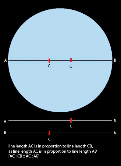
Without relying on intuition to gauge the Golden Section point on the diameter, the following four steps and illustrations shown below may be useful.

The above diagram illustrates how to plot the first Golden Section point that the eye encounters in a left-to-right reading of a tondo’s diagonal. To plot the second point, the same four-step procedure can be mirrored (i.e. flipped horizontally) so that the perpendicular of the first stage is erected from point “B” instead of “A.” Of course, once the proportions have been plotted for the first Golden Section point, the measurements can be simply transposed for a right-to-left reading.
To plot the Golden Section intersections relating to the horizontal and vertical diameters (i.e. the axes) within a tondo, lines need to be extended from the two points on each axis until they intersect as shown in the diagram below. The resulting points of intersection are the four key sites that artists tend to dispose their centres-of-interest in tondo compositions. Only one of these sites, however, are used in a single composition rather than all four. Each site has its own inherent power and I have numbered the sites according to how attention grabbing each site is to the eye.

Golden Section intersection numbered “1” in the above diagram arguably “grabs” most viewers’ attention as an aesthetically appealing site where the eye lingers more than any of the other intersections. The reason for this is linked to most viewers’ tendency to examine images from the lower-left and to then read them in a diagonally direction to the top-right. Consequently, number “1” is the first intersection that the eye encounters and hence it is the strongest in a visual—“eye-grabbing”—sense. Following the same logic, the remaining three intersections all have their own unique attention grabbing strength and I have numbered them in the above diagram according to this principle.
In Gabriel Perelle’s (1603–77) Plate 21 (shown below), for example, the artist has arranged his composition around the Golden Section intersection numbered “1” (see diagram further below) by placing a comparatively isolated grove of trees on this spot. As a consequence of being placed in this position, the grove of trees is the key point of focus in the composition. From my reading of this image, it is a focal point arrived at following a pathway of light patches of land arranged as if they were stepping-stones leading into the distance. Also from my reading, the grove of trees marks the furthest aspect of the relatively flat lie of the land before it rises into mountainous terrain. Or to express this with a slight leaning to the poetic: the grove of trees marks the point of transition from the temporal plane inhabited by the three groups of travellers to the spiritually transcendent plane punctuated with estate buildings and distant mountains. In short, the position of the grove of trees is both a natural spot for the eye to linger, but it is also a spot that has meaningful importance.
 |
Gabriel Perelle (1603/4–77)
Plate 21 [tondo landscape with three pairs of travellers on a sunlit road], 17th century
From an unidentified set (see British Museum for another print, plate 9, from the same set [?]: http://www.britishmuseum.org/research/collection_online/collection_object_details.aspx?objectId=1494210&partId=1&people=111838&peoA=111838-2-60&page=1 [viewed 4 May 2015])
Etching on laid paper with 3 cm chainmarks
(sheet) 32.5 x 25.6 cm; (plate) 20.8 x 20.8 cm; (image) 20.4 cm dia.
Inscribed (lower-left) “Inventé et gravé par Perelle.”; (lower-right) “21”
Condition: crisp strong impression with wide margins. There is a faint dot/mark in the upper right corner of the margin otherwise in near pristine condition. I am selling this large and superb etching for a total cost of [deleted] AUD including postage and handling to anywhere in the world. Please contact me using the email link at the top of the page if you have any queries or click the “Buy Now” button shown below.       |

A third and final principle that I wish to address may at first seem like a game of semantics, but the way that artists can translate their perception of a tondo is critical to the type of tondo presented: a circular format composition (i.e. a composition conceived as being contained by a circle shape) and a round format composition (i.e. a composition conceived as having an outer edge that defines a sphere or otherwise rounded form).
These two descriptive terms (“circular” and “round”) for a tondo format may seem interchangeable with only pedantic writers concerned about the difference. Moreover, even the British Museum uses the word “circular composition” in their description of Johann Elias Ridinger’s etchings from the series, Mammals after Roos (see http://www.britishmuseum.org/research/collection_online/collection_object_details.aspx?objectId=1616420&partId=1&people=109921&peoA=109921-2-60&page=5 [viewed 5 May 2015]) to describe a format that is clearly a composition conceived as a sphere (i.e. a round composition). While not wishing to be firm that writers need to choose the appropriate word, for artists, the need to be certain about what they are intending to project is important.
In the case of Galle/van Heemskerck’s Samson Smiting the Philistines with the Jawbone of an Ass (see the first tondo in the present discussion) I am ambivalent as to whether the composition was conceived as an image formatted with a circular edge or whether the composition was envisaged to show a scene contained within a sphere with a resultant round edge. From my viewpoint the size and foreshortening of Samson shown towards the centre of the composition suggests that the scene was intended to be perceived by viewers as spherical. As an experiment shown below, I have digitally morphed Galle/van Heemskerck’s print to enhance the illusion that its composition is spherical.
 |
(upper) Galle/van Heemskerck’s tondo with features digitally morphed/spherised
(lower) original image
|
As an extension of the digital experiment, I have added colour and tone to the spherised image, as shown below. By intention, the warm golden colours applied to the centre area of this digitised image visually project Samson towards the viewer while the combination of light tones on the upper-left and dark tones on the lower-right help to portray the whole scene as if it were embedded in a glass sphere.
 |
(upper) Galle/van Heemskerck’s tondo with features digitally morphed/spherised
(lower) original image
|
Although I have only lightly touched upon some of the key principles underpinning tondi compositions, in the next instalment (Part 2), which focuses on roundel compositions, many of the principles discussed are also applicable to tondi. The essential difference, of course, between the principles used in tondi and those used in roundels is all about context. By this, I mean that in roundels the principles work in collaboration with the larger composition of which the roundel is only a component.