Sunday, 29 July 2012

Pictorial Transitions: Crome


What is a simple way that artists use to sustain a viewer’s interest when looking at an image?


Often artists rely on the choice of subject to catch a viewer’s eye and sustain interest. For instance, an image featuring shameful humour (schadenfreude) or extraordinary phenomena may be riveting at first but the attraction relies on novelty and once the intrigue of a particular subject diminishes so to does the ability to attract and hold a viewer’s attention. As an alternative to relying on the choice of subject to captivate a viewer, the following discussion explores a tried and tested approach to keeping a viewer’s interest with the focus on the etchings of John Crome.

One way that some artists compose their images is to ensure that their arrangement of subject material takes into account the different perceptual propensities of the viewer’s divided brain (i.e. the conscious and calculated machinations of the analytical left hemisphere of the brain and the intuitive responses of right hemisphere) by using the Foote, Cone and Belding Grid as a guide (see the earlier post, Daniel Heimlich: Foote, Cone and Belding Grid). Another approach is to invite the viewer to read an image in incremental stages from left-to-right—the direction Western readers (i.e. as opposed to Hebrew, Arabic and traditional Oriental readers) are acculturated to contemplate images.

Betty Edwards in her marvellous book Drawing on the Artist Within (1986) discusses the evolution of ideas about these incremental stages with regard to creativity (see pages 2–5) but they may also have a practical application as a means for catching and sustaining the eye’s interest. With a small quiver of trepidation, I wish to propose that these stages have a long tradition of being an integral part of picture construction which I will explain with reference to Crome’s prints. Moreover, the stages are laid out literally as part of the image in terms of pictorial zones that act like visual stepping-stones for the viewer’s eye to recognise, rationalise and ultimately to negotiate meanings projected by the image.

In this scaffolding of incremental stages an image is broken into four pictorial zones starting from the far left. The first of these zones is the equivalent of the stimulation stage (the phase that the physiologist and physicist Herman Helmholtz terms “saturation” [Edwards 1986, p. 3]) where an artist presents the immediate sensations of an initial look at the subject without conscious comprehension of what is observed. In Crome’s etching At Heigham (shown below) this area extends from the left side of the image to the first tree on the left (see detail further below). Here, seemingly random jabbed short strokes suggest that the artist is portraying his first glimpse of the landscape as if he is searching for details to depict. From my viewpoint, these patterned staccato-like strokes hint at what he is seeing as a sensory impression rather than a pictorial replication of what he is viewing.

John Crome (1768–1821)
At Heigham [now know as Hingham], c. 1812
Etching (appears to be chine colle) on cream wove paper
From the first edition of 60 impressions as issued by Mrs Crome in 1834 before retouching and the addition of the title.
First state (of ii)
5.7 x 18.7 cm (plate); 9.5 x 22 cm (sheet)
Theobald 22; Goldberg 233
Condition: a rare and very delicate silvery impression with margins in excellent condition. This state is described by Goldberg “A most delicate silvery etching, it is only fine in early impressions, as the delicate distance on the left soon disappeared” (Goldberg, Norman 1978, John Crome the Elder: 1. Text and a Critical Catalogue, New York University Press, New York, p. 283.)
I am selling this print for $370 AUD including postage and handling to anywhere in the world. Please contact me using the email link at the top of the page if you are interested or click the “Buy Now” button.


This print has been sold

Helmoltz’s “saturation” stage
(detail) John Crome, At Heigham, c. 1812

In the second zone, the area extending from the first tree on the left to the third tree away from the first (see detail below) the portrayal of the landscape details are shown by positive (black) lines where the silhouette edges of the tree forms and house are presented in their essential structural framework. This is formulation stage, or what Helmholtz terms as the “incubation” phase (Edwards 1986, p. 3), where the first impressions of the last stage are being synthesised. Here the strokes are clustered to represent conscious deliberations about what is observed and the clustering becomes progressively more frequent and denser towards the right.


Helmoltz’s “incubation” stage
(detail) John Crome, At Heigham, c. 1812


The third zone extends from the last zone to the further edge of the open shed at the water’s edge (see detail below). This is the stage where the artist’s perception is fully developed or what Helmholtz terms as the “illumination” phase (Edwards 1986, p. 3). Here, Crome’s portrayal of the scene moves from the structural marks of the former stage to mimetic marks drawing upon both positive and negative strokes to represent full recognition and understanding of the observed landscape features. From a personal viewpoint, Crome has now moved his approach to rendering (i.e. shading the subject) to a virtual elimination of individually important strokes and now employs tonal transitions as if portraying the surface of the subject rather than essential structures.

Helmoltz’s “illumination” stage
(detail) John Crome, At Heigham, c. 1812

In the fourth and final zone, extending from the last zone to the right side of the image (see detail below), the comparatively detailed rendering of the former stage is replaced with a broader handling of the portrayed scene. This is a stage where Crome anticipates what he is about to see next and has allowed the image to diminish in focal acuity so that the image does not draw a viewer’s eye “out” of composition. In a way, this last stage could be termed the “prognostication” phase. It may be viewed as a conceptual bookend to the very first stage in that the diminishing rendering of the landscape mirrors broadly the fuzziness of the first stage. The diminishing focus also completes the cycle in that the loss of focal definition may imply a shift to the artist’s next view of the landscape as an ongoing panorama.


The “prognostication” stage
(detail) John Crome, At Heigham, c. 1812

Of course I do not believe that Crome consciously planned any of his images to show sequential stages in his developing perception of landscape. Such an idea would be nonsense. What I am proposing, however, is that the sequence outlined above is a very natural way that many historically memorable artists have laid out their compositions to sustain a viewer’s interest—and the artist’s own interest during the execution of an image. After all, to evenly distribute pictorial information over an entire composition can result in visual indigestion where too much information competes for attention. 

There may be an argument that the above layout of a composition in sequential stages works best in long rectangular formats like At Heigham but this is not the case. To illustrate how this “natural” (i.e. subconscious) disposition is also applicable to more square-shaped formats, I will offer a personal interpretation of how the four pictorial zones can be seen in Crome’s etching, At Hackford, Norfolk.


John Crome (1768–1821)
At Hackford, Norfolk, 1812
Etching wove paper
Fifth state (of v)
17.4 x 22.7 cm (plate); 21.7 x 26.7 cm (sheet)
Theobald 14; Goldberg 225
Condition: the impression is crisp and has been cleaned but not bleached. As a result of the cleaning process the plate mark has been flattened and is no longer evident. The print has been professional lined with thin Japanese paper. There are indications that the print has old creases but these are no longer evident. There is a mark in the sky to the right of the centre tree. This state is described by Goldberg “The title, At Hackford, is added in etched letters underneath. The plate was not much altered. The reflections in the water were darkened and the sky, as a rule, is hardly visible” (Goldberg, Norman 1978, John Crome the Elder: 1. Text and a Critical Catalogue, New York University Press, New York, p. 281.) In this impression the drawn horizontal line between the trees are clearly visible.
I am selling this print for $270 AUD including postage and handling to anywhere in the world. Please contact me using the email link at the top of the page if you are interested or click the “Buy Now” button.

This print has been sold


The “saturation” zone on the far left of At Hackford, Norfolk extends from the border to include the pair of large trees on the left (see detail below). From my viewpoint, the plethora of details in the rendering of the dark tree and the ambiguity regarding where the lighter tree is grounded in space gives me the impression that I am not supposed to dwell in contemplative looking at this area of the composition. Going further, the spiralling form of the darker tree creates an “X” intersection with the lighter tree that psychologically advises me not to look there. Although such a reading of this zone is a personal interpretation, I see the first zone as a space framing the landscape features at the centre of the composition. In short, Crome uses this zone to offer an amalgam of pictorial details about landscape—a narrow screen of organically twisted forms in a flickering light created by positive and negative spaces—representing a developing but as yet an unclear vision of what he is showing the viewer.


Helmoltz’s “saturation” stage
(detail) John Crome, At Hackford, Norfolk, 1812

In the second zone, Helmoltz’s “incubation” stage, extending from the last zone to midway between the two centre sets of paired trees (see detail below), Crome clearly grounds the landscape features shown in this area. These features are also rendered with focus on their silhouette shapes and their structures are presented in an unambiguous way (i.e. a viewer should have no difficulty in understanding the form of the trees and the contours of the terrain). The treatment of the features in this zone fit well with the idea of showing the essential characteristics of the subject.

Helmoltz’s “incubation” stage
(detail) John Crome, At Hackford, Norfolk, 1812


The third zone, Helmoltz’s “illumination” stage, extends from the last zone to the far reaches of the second set of paired trees (see detail below). In this area Crome shows the superficial “skin” of his subjects such as the detailed rendering of textures in the foreground and the careful tonal gradations in the rendering of the road. In keeping with this degree of focal resolution, the treatment shows Crome’s fully resolved vision of the landscape at this point.


Helmoltz’s “illumination” stage
(detail) John Crome, At Hackford, Norfolk, 1812


To conclude the transition of pictorial zones, the fourth zone representing the “prognostication” stage extends from the third zone to the right side of the image (see detail below). In this area Crome diminishes the harsh tonal contrast portraying the landscape of the previous zones and by so doing diminishes the focal clarity of what a viewer can see. Crome also softens the tight knotting of rhythms of the previous zones so the eye can now to wander unimpeded along the course of the road as it slopes gently downwards from the centre trees to the lower right corner and the eyes can also traverse unimpeded down the soft contours of the terrain. This shift from closed to open space (i.e. from constrained window-like views of landscape in the preceding zones to an unconstrained view) is important as this is the zone where the artist foreshadows what he may be seeing in his next view of the landscape.


The “prognostication” stage
(detail) John Crome, At Hackford, Norfolk, 1812

The idea of creating prints in such a way may at first seem to be a counter-creative challenge but the real issue is that the approach provides a simple way of giving order and logic to a viewer’s reading of an image. From personal experience, if the lighting on a subject comes from the top-front-left (in accordance with the Western lighting convention) then the four zone approach discussed above is naturally geared to portray the lighting effect without a major challenge. Consider how Crome’s angle of lighting in A Composition (shown below) lends itself perfectly to this approach.


John Crome (1768–1821)
A Composition, c. 1812
Etching (appears to be chine colle) cream wove paper
Second state (of iii)
17 x 16 cm (plate); 19.8 x 18.1 cm (sheet)
Theobald 17; Goldberg 228
Condition: an exceptionally fine and rare impression with the characteristic “silvery” quality of the first issue in the Mrs Crome edition of 60 impressions in 1834. The print has a slight age toning and has conservator’s tape hinging. Overall it is in virtually pristine condition. This state is described by Goldberg “Black lines are drawn round the plate, lines are added in the sky to the right, and work is added on the mound to the left. In this state the plate was left by Crome, and was published in Mrs. Crome’s set. In the left corner bottom, J. Crome fecit, is in etched letters” (Goldberg, Norman 1978, John Crome the Elder: 1. Text and a Critical Catalogue, New York University Press, New York, p. 282).
I am selling this print for $430 AUD including postage and handling to anywhere in the world. Please contact me using the email link at the top of the page if you are interested.

This print has been sold 

(detail) John Crome, A Composition, c. 1812

Sunday, 22 July 2012

Fibonacci Spatial Intervals: Sadeler & Strang


How can artists use the Fibonacci sequence of numbers in a composition?


Interestingly, the Italian Renaissance mathematician Leonardo Fibonacci (c. 1170–c. 1250) used the expediential growth in a rabbit population to showcase his now famous sequence of numbers often referred to as the Fibonacci Numbers: 0, 1, 1, 2, 3, 5, 8, 13, 21, 34, … (the sequence may be continued by adding the two preceding numbers to arrive at the next which at this point would be 21+34=55). This discussion however moves away from the breeding habits of rabbits by proposing a way that artists can use the sequence to give order and logic to their placement of key features in an image. More specifically, the focus of this discussion is on how the sequence may be employed to create the illusion of spatial depth.

As a practical example of how the Fibonacci numbers assists in giving pictorial depth to an image, I wish to draw attention to Aegidius Sadeler’s darkly moody engraving, Woodland Landscape with a Waterfall (shown below).  Here, a view to the far distance along the course of a river framed by cliffs is interrupted by a sequence of rocky ridges acting like stepping-stones for the eye. The space between each of these rocky ridges is where the Fibonacci sequence of numbers plays a role. By measuring and comparing the distance between each of these ridges (see diagram further below) the pattern of spatial intervals becomes apparent: 1 (the spatial zone between the horizon and the first red line), 2, 3, 5, 8.  

Aegidius Sadeler II (1570–1629)
Woodland Landscape with a Waterfall, c 1600
from the series of six mountainous landscapes in Tyrol after a drawing by Roland Savery
20 x 26.5 cm (sheet)
II (of II) with address of Marco Sadeler (lower right) on laid paper from an unknown collection (not at Lugt).
Hollstein 227; Bartsch (Sup.) 7201.235 S2
Condition: marvellous strong impression. There is a closed tear at top at the dryfold and with a fold along the dryfold. There is also slight foxing but otherwise in good condition.
I am selling this print for $430 AUD including postage and handling to anywhere in the world. Please contact me using the email link at the top of the page if you are interested or click the “Buy Now” button below.


This print has been sold

Verso of Woodland Landscape with a Waterfall, c 1600
Diagram of spatial intervals in Woodland Landscape with a Waterfall, c 1600
In Johan Sadeler’s Rocky Landscape (shown below) a similar sequence of spatial intervals can be seen (see diagram further below). Here, each of the four critical intervals is pictorially marked by a horizontal line with the most distant lines delineating the horizontal aspects of the terrain and the closer lines outlining a band of shadow.  Although the placement of these pictorially important lines matches the sequence of the Fibonacci numbers there is a problem with the arrangement of spatial intervals in the sky with regard to eye-catching cloud features (see the same diagram with intervals marked with blue lines). By this I mean that the intervals in the clouds on the left side of the image are almost evenly spaced with virtually no spatial recession, while the intervals in the clouds on the right are larger towards the horizon—a reversal of perspective.  

Johan Sadeler (1550–1600)
Rocky Landscape with Antique Buildings
From the eighth print in a series engraved by Adriaen Collaert and similar to a composition by Hendrick van Cleve. Part of the Emblemata copied after Andrea Alciati (Venice, 1599) (notes from TIB, p. 136).
Engraving on laid paper
21.5 x 26.9 cm (plate); 27.7 x 37 cm (sheet)
Hollstein 581 (only state); Bartsch 7001.534
Condition: A dark impression with flattened dryfold and small closed tears with conservator’s tape reinforcing (verso) in the bottom margin far away from the image. An inscription, “120”, is written by an old hand on the upper-right corner outside the plate mark. On the back there are pencil inscriptions by previous collectors along the bottom edge and ink smudges 3.5 in length on the lower left otherwise the print is in good clean condition.
I am selling this print for [deleted] including postage and handling to anywhere in the world. Please contact me using the email link at the top of the page if you are interested or click the “Buy Now” button below.
[deleted]

Verso of Rocky Landscape with Antique Buildings
Diagram of spatial intervals in (detail) Rocky Landscape with Antique Buildings
An artist’s arrangement of subject matter in a composition to present a regular progression of diminishing spaces is driven undoubtedly by intuition and good judgement. Nevertheless there is very calculated way that can layout the Fibonacci sequence of numbers. First, the horizon line for the composition is established (see first image in the diagram below). Next, an angled line is drawn from where this horizon line meets either the left or right side of the composition (see second image). Along this angled line the sequence of the Fibonacci numbers are then marked out using any unit of measure with the lowest number placed at the horizon (see third image). For example, if the unit of measure were a centimetre then the distance between the first mark away from the horizon and the second mark would be two centimetres and the gap between the second mark and the third would be three centimetres. The next stage is to connect the last mark to the lowest corner of the composition directly below the beginning point on the horizon and to use the angle of this connection as a guide to run parallel lines from all the remaining Fibonacci marks to the same side of the composition (see fourth image). Finally, from the points now established on the side of the composition, horizontal lines are drawn setting the “stepping stones” for the composition’s key features (see fifth image). With the disposition of these features now set an artist can then adjust the tonal and colour transitions (see sixth image).

Diagram of the step-by-step process of establishing Fibonacci spatial intervals
To show the difference to the illusion of spatial depth that Fibonacci spatial intervals can make to an image, compare the two lower images. The first image shows a very noble etching by William Strang of women engaged in manual labour. Here, Strang’s arrangement of the two women does not align with the sequence of Fibonacci spatial intervals. In the second image I have altered the arrangement of the women so that their placement on the ground is in accord with the Fibonacci intervals (i.e. there is a larger space in the immediate foreground and the more distant woman is placed further away. I am not proposing that the compositional arrangement of the second (digitally altered) image is better than Strang’s original composition but rather that the second presents a greater degree of spatial depth.

William Strang (1859–1921)
Potato Lifting, 1882
Commissioned by Philip Gilbert Hamerton forThe Portfolio and published by Seeley & Co London, 1882
Etching on wove paper with The Portfolio MBM watermark.
25.2 x 17.6 cm (plate); 35.6 x 26 cm (sheet)
Condition: strong impression in pristine condition
I am selling this print for [deleted] including postage and handling to anywhere in the world. Please contact me using the email link at the top of the page if you are interested or click the “Buy Now” button below.

Digitally rearranged placement of the figure’s feet
Left image, (detail) Potatoes Lifting, 1882
Right image, digitally altered with Fibonacci spatial intervals

Sunday, 15 July 2012

Sheep and Shadows: Jacque


How do artists portray shadows on surfaces that are not smooth, such as the fleece on sheep and the hides of other animals?


Essentially there are four principles assisting artists to render shadows cast on animals:
·         Portraying the animal’s superficial details in the half-light of shadows (i.e. details in the strongly lit areas or in the darkest shadows should not feature details of the animal’s surface). For example, the texture of the animal’s hide and incidental features such as colour patterns and the shape of individual strands and locks of hair should only be portrayed in the mid tones.
·         Noetic space (i.e. leaving virtually blank areas of paper in the space surrounding the animal’s shadow side—see the earlier post Grimaldi: Landscape Conventions).
·         Making subtle adjustments to tonal gradations in the shadows taking into account the related principles of:
o        simultaneous contrast (i.e. the optical phenomenon where a dark or light toned area abutted beside its complement will create the illusion of a greater contrast between the two areas than there really is),
o        reflected light (i.e. creating the effect of reflected light on rounded forms so that there is a transition on the shadow side from dark to a comparatively lighter area of tone at the silhouette edge),
o        aerial perspective (i.e. a gradual loss of focal resolution towards the distance),
o        weighting the animal (i.e. adding an accent of tone at the points of the silhouette edge where the weight of the leg makes contact with the ground—see the earlier post Dujardin: Sheep Legs),
o        Inverse-Square Law (i.e. establishing a correlation between the degree of illumination on the animal and the distance that it is away from the light source—see the earlier post Berchem: Inverse-Square Law),  
o        the intrinsic properties of shadows (i.e. umbra, penumbra and antumbra).
  • Western lighting convention (i.e. lighting the animal from the top-front-left because Westerners scan images from left-to-right following the direction they read—see the earlier post Muller, Calame and Waterloo: Portraying Trees).
The following discussion addresses how these four principles can be seen in a suite of charcoal drawings by the famous nineteenth-century Barbizon animalier, Charles Emile Jacque.

Application of the first principle can be seen in Jacque’s drawings, Sheep’s Head “A” and Sheep’s Head “B” (shown below). In both drawings, strong light illuminates the top of the sheep’s ear while its brow and snout are portrayed with a transition from light into shadow. These areas of transition (mapped digitally further below) are the mid-tones where Jacque has drawn the surface contours of the head and, in the case of Sheep’s Head “B,” coarse tuffs of fleece. The convention of only showing surface details in the mid-toned areas helps to simplify the amount of visual information for a viewer to digest. After all if a plethora of detail where to be shown in all areas from the most strongly lit to the darkest shadows the eye may be distracted from seeing the artist’s vision as a holistic totality—“the big picture.” 

Charles Emile Jacque (1813–94)
(upper) Sheep’s Head “A”
Charcoal on brown laid paper
8.4 x 11 cm
Unsigned
Condition: the drawing has been cut by a previous collector from a leaf of drawings by Jacque. There are two pin holes on the upper and lower left corners otherwise the drawing is in pristine condition.
(lower) Sheep’s Head “B”
Charcoal on brown laid paper
9.5 x 12.4 cm
Unsigned
Condition: the drawing has been cut by a previous collector from a leaf of drawings by Jacque. There is a length of conservator’s tape (?) on the upper edge from previous mounting otherwise the drawing is in pristine condition.
I am selling the pair of drawings for the total amount of $430 AUD including postage and handling to anywhere in the world. Please contact me using the email link at the top of the page if you are interested.
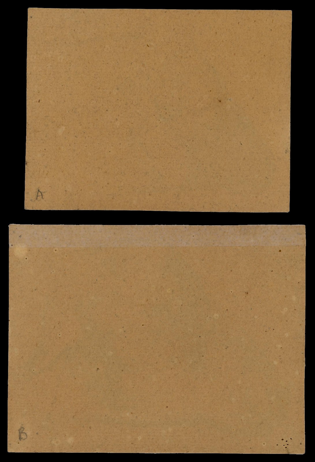
Verso of Sheep’s Head “A” and Sheep’s Head “B”
Digital mapping of the mid-tone areas featuring surface details in Jacque’s Sheep’s Head “A” and “B”

Regarding the second principle, noetic space, Jacque’s use of a blank gap between his subject’s silhouette edge on the shadow side and the subject’s immediate background can be seen in his drawings. For instance, in Sheep’s Head “C” (shown below) Jacque has left break in the outline describing the lower section of the sheep’s ears rather than allowing the outline to connect fully with the side of the sheep’s face (see digital mapping of noetic space further below). This subtle but important break is an example of noetic space as the gap functions as conceptually abstract space separating the further away plane of the ear from the projecting plane of the sheep’s face. Arguably, Jacque’s use of this principle is guided more by intuitive good judgement—a subconscious understanding of what is needed to portray spatial distance—than by conscious planning. I mention this as a drawing from the same leaf Sheep’s Head “D” (also shown below) does not reveal use of the principle. To show how the principle could have been applied, I have digitally altered the drawing to add the gap of neotic space on the shadow side of the ear. An important issue with using this principle is that the background should connect with (i.e. “touch”) the subject on its lit side (in Jacque’s drawing the background on the lit side of the ear would be any strokes rendering the neck) and the noetic space gap should be shown only on the shadow side (in Jacque’s drawing the background on the shadow side is the jaw). 


Charles Emile Jacque (1813–94)
(upper) Sheep’s Head “D”
Charcoal on brown laid paper
7 x 9.2 cm
Unsigned
Condition: the drawing has been cut by a previous collector from a leaf of drawings by Jacque. There is a notational drawing on verso (presumably by Jacque) otherwise the sheet is in pristine condition.
(lower) Sheep’s Head “C”
Charcoal on brown laid paper
10.2 x 16 cm
Unsigned
Condition: the drawing has been cut by a previous collector from a leaf of drawings by Jacque and there is a rectangular section (2 x 3.8 cm) cut from the lower right corner. There is a 1 mm hole towards the upper right (this may be an intrinsic part of the paper) and a smudge of charcoal crossing the left ear of the sheep (perhaps created during the execution of the drawing).
I am selling the pair of drawings for the total amount of $430 AUD including postage and handling to anywhere in the world. Please contact me using the email link at the top of the page if you are interested.
Verso of Sheep’s Head “C” and Sheep’s Head “D”

Digital mapping of the areas of noetic space in Jacque’s Sheep’s Head “C”
(upper) Jacque’s Sheep’s Head “D”
(lower) Digital manipulation of the sheep’s ear with noetic space

The next principle—adjusting the tonal gradations in shadows to take into account simultaneous contrast, reflected light, weighting, the inverse-square law and the intrinsic properties of shadows—involves a multifaceted view of shadows as each issue that needs to be consider conceptually overlaps with the next. For instance, with regard to the impact of simultaneous contrast on tonal gradations, a fine example of how Jacque has adjusted the transitions from dark to light can be seen in the detail of his superb drawing, Three Hooves that are both shown below. Here the abutment of strong light and shade on the inner surface of the left hoof is rendered with the gradation on the shadow side that clearly darkens towards the light. Conceptually overlaying this principle is the effect of reflected light that can be seen in the same detail with the sharp change in the transition from dark to a much lighter tone towards the silhouette edge.


Charles Emile Jacque (1813–94)
Three Hooves
Charcoal on brown laid paper
20.5 x 29.4 cm
Unsigned
Condition: the drawing has been cut by a previous collector from a leaf of drawings by Jacque. There is a notational drawing on verso (presumably by Jacque), a 1 mm hole towards the middle right (this may be an intrinsic part of the paper) and a band of conservator’s tape (?) along all edges from previous mounting.
I am selling this drawing for the total amount of $430 AUD including postage and handling to anywhere in the world. Please contact me using the email link at the top of the page if you are interested. 

Verso of Three Hooves
Detail showing reflected light

With regard to the related principle of weighting the subject (i.e. adding a dotted accent of tone where the subject makes a connection with the ground) Jacque has varied the pressure he places on the charcoal at the two critical points shown in the detail below. Again, this accent also plays a role in denoting an intrinsic element of how shadows are formed in the sense that the accent is also the precise point where the shadow is at its darkest.

Detail showing the accent points where the hoof contacts the ground

In this same detail of the hoof, note how Jacque uses reflected light to denote the sheen of the hoof and how he has added to his pictorial description of reflected light a stronger degree of contrast between the right section of the hoof compared to the left section. Again, this is an overlapping of principles. In this instance Jacque is addressing the phenomenological attribute of the inverse-square law in that as the right side of the hoof is closer to the light it must show a stronger degree of contrast. Of course, few artists have to ponder the intricacies of related principles such as these as a meaningful working approach is well-ingrained from years of practice.

Regarding the final principle—the Western lighting convention of illuminating subjects from the top-front-left—Jacque’s drawings display varying lighting angles that are appropriate for studies executed while looking at real sheep with equally real lighting effects. What is an interesting experiment to contemplate and judge which lighting angle portrays the three-dimensional form of sheep most convincingly is to compare the two images below: Jacque’s study of the sheep’s head C with light angled from the top-front-left and the digitally mirrored image resulting in light angled for the top-front-right. 


(upper) Jacque’s Sheep’s Head “C”
(lower) digitally mirrored image with light angled from the top-front-right


Saturday, 30 June 2012

Three Analogues: Brown & Kollwitz


How do artists express emotions when these feelings are non-visual?


In literature, TS Eliot popularised the term “objective correlative” for describing emotions and other intangible feelings in terms of the circumstances supporting them. In the visual arts, the representation of such non-visual experiences can be approached in a similar way. For example, to portray melancholy an artist can allude to the condition by the symbolism of setting, lighting, colour and body language (if a figure is featured). More exciting than relying on pictorial tropes, however, artists can also employ the essential structure of such experiences as an analogue configuration (i.e. a non-representational pattern of lines matching what the experience “feels” like) as the compositional structure for an image. The following discussion focuses on the use of analogues to express meaning through three compositional arrangements:

  • configuring an image to match a predetermined analogue of an emotion;
  • superimposing an analogue of an emotion on top of a subject; and,
  • using imagery that matches the essential constructs of a predetermined analogue of an emotion.

Let me begin with the first approach where an image is reconfigured (i.e. warped) to resemble an analogue drawn as a reflexive response (i.e. an instinictive automatic response) to an experience. If an artist were to conceive that the feeling of depression is like a v-shape (see diagram below)—mindful that not all artists would necessarily see this dreadful mental state in such a simplistic structure—then this schematic arrangement of converging lines descending to a low point would be the compositional arrangement that the chosen image would be configured to replicate. Of course the degree of the distortion of the original image is the variable where artistic sensitivities play a role in what otherwise would be a simple game of anamorphic distortion.

Analogue of depression

In my drawing of a very corroded lock plate—a relic found in an architectural excavation by the Archaeology Department at James Cook University—I have digitally manipulated the original drawing (shown below) through three stages of reconfiguration to demonstrate the process and outcomes. Of course, the “success’’ of communicating a state of depression from these adjustments can only be determined by each viewer’s reading and there are far too many variables to ever be certain that meaning can ever be express clearly. For instance, not all viewers will sense that depression is a downward flow. Moreover, some will not have the “right” mindset to wish to negotiate any meanings let alone depression and some may never have experienced the feeling at all to be able to pass judgement. If I may stretch this point even further into territory that I fear the most: some viewers may not have been acculturated to looking at art to know what they are looking at and have the skills to negotiate any meaning.


James Brown
Door Lock Plate (an architectural feature from the old East Flinders Street printery and excavated from the site by the JCU archaeological team), 2012
Pen and ink on watercolour paper, 76 x 57 cm
I am selling this drawing for $850 AUD including postage and handling to anywhere in the world. Please contact me using the email link at the top of the page if you are interested.

James Brown, Door Lock Plate
Three stage distortion to match a v-shaped analogue of depression

As a corollary to the analogue structure of depression I have reconfigured the original drawing to match an inverted v-shape compositional structure (see diagram below) envisaged to be the complementary emotion to depression: joy. In the three drawings shown further below, hopefully the different degrees of skewing the original drawing to match the inverted v-shape expresses in each of the three consecutive stages of distortion a heightening of this uplifting feeling.

Analogue of joy
James Brown, Door Lock Plate
Three stage distortion to match an inverted v-shaped analogue of joy

The second approach involving the superimposition of an analogue on top of the portrayed subject may seem like a simple task of unceremoniously drawing the abstract pattern of an analogue as a final layering of marks. Although this is essentially true, the real art of employing this approach is to integrate the lines of the analogue with the underlying image. This is not easy. Ideally, the outcome should be an inseparable “marriage” of the analogue with the underlying image to the extent that a viewer will only see the analogue pattern subliminally and not wonder what the analogue pattern is “doing there.”

In the three-stage superimposition of the analogue of joy (the inverted v-shaped pattern) shown below, the upper image blends into the original drawing to some extent by virtue of the colour of the analogue. In the lower two images the analogue is softened so that the pattern is barely discernable.

James Brown, Door Lock Plate
Three stage superimposition of an inverted v-shaped analogue of joy

For the third and final approach to using an analogue as a compositional structure, the subject itself is explored until certain arrangements of its features are found that resemble the analogue pattern. As an example of this approach a small section of the original drawing of the door plate has been extracted (see image below) that has the same the essential upward converging lines in its compositional structure as those in the inverted v-shaped analogue of joy. By intention this small section as an artwork on its own will embody and project the feeling of joyful elation. Of course this image is simply a cropped part of the larger image and to truly communicate the feeling of joy then a plethora of other visual devices will need to be brought into play to assist in the projection of meaning.

James Brown, Door Lock Plate
A fragment of the original drawing resembling an inverted v-shaped analogue of joy

A prime example of how an artist uses other devices to supplement a fundamental analogue structure is Kathe Kollwitz’s very beautiful and emotionally resonant etching Betendes Madchen [Woman Praying] (shown below). Here the underpinning compositional structure fits broadly with the first v-shaped analogue discussed above that arguably projects a sombre mood. In addition to this structure, however, the contrast of a mechanical style of cross-hatching, raised in strong relief by the intaglio process rendering the background, juxtaposed beside the delicate lines portraying the woman’s hands and face presents the praying figure as spiritually removed from the temporal world. Interestingly, this print also features lightly inscribed lines laid over the rendering of the figure’s torso. These loosely-made gestural lines may be viewed as the equivalent of the second approach of superimposing an analogue pattern on an image.


Kathe Kollwitz (1867-1945)
Betendes Mädchen [Woman Praying), 1892
From the 1931 von der Becke edition with blindstamp (Klipstein 11: IV b)
Etching, drypoint, aquatint and sandpaper in dark brown ink on thick cream wove paper
19.4 x 14.9 cm (plate); 31.4 27 cm (sheet)
Condition: very strong impression in excellent condition. There is a tiny fox mark on the upper left edge and faint toning from the print having been mounted.

This print is no longer available
Kathe Kollwitz, (detail) Betendes Mädchen, 1892

Perhaps an even more powerful image by Kollwitz and one in which the subject is clearly modelled on an analogue structure is the very large etching, Inspiration (shown below). In this image, an elderly woman seen with her back nestled into a crouching man has the man’s arm stretched across her front in a protective way by virtue of the implement he grasps—a hoe? The angle of his protective arm and its grasped implement, when seen in combination with the angles of his legs, create downward converging wedge-shaped arrangement expressing a heavy mood. Such a reading rests not only on the directional thrust of this wedge shape. The point where the critical lines converge—the tool head of the implement—is the punctum point (see the earlier post “Dujardin & Dietricy: Punctum”) that projects the layering of implicit symbolic meanings of this point: rural life, hard labour, grim determination and, with insight into Kollwitz’s other prints, revolt and war.


Kathe Kollwitz (1867-1945)
Inspiration, 1905
Originally created for The Peasants' War, but ultimately not included in the cycle.
From the 1945 von der Becke edition with blindstamp (Klipstein 91: IX b)
Etching, drypoint and soft ground etching in dark brown ink on thick cream wove paper
56.8 x 29.5 cm (plate); 78 x 45.8 cm (sheet)
Condition: very strong impression in excellent condition.

Kathe Kollwitz, (detail) Inspiration, 1905

Kollwitz’s prints are so rich in visual devices designed to express meaning that this discussion could be ongoing. Nevertheless, there is one print that should not be ignored when looking at ways of using analogues of emotions: Woman with Folded Hands (shown below).


Kathe Kollwitz (1867-1945)
Woman with Folded Hands, 1898
From the 1931 (?) von der Becke edition with blindstamp (Klipstein 41: VI)
Etching, in dark brown ink on thick cream wove paper
29 x 23 cm (plate); 42 x 33.7 cm (sheet)
Condition: very strong and crisp impression. There are two moisture stains well away from the image and a roughen strip in the paper, again well away from the image, at the top of the margin from a previous mounting.
I am selling this print for [deleted] including postage and handling to anywhere in the world. Be aware that as this item is large it will be rolled and posted in a cylinder. Please contact me using the email link at the top of the page if you are interested.


This image, with its centrally placed figure dramatically lit with chiaroscuro lighting, is a fine example of how to use a flow of emotionally charged lines that may be read as analogues generated by deep emotion. These lines seen as a downward curving flow from the upper right edge of the image down the shadow side of the figure (see these lines in the details below) to my eyes show a dark concern weighing down on this pregnant woman—or a woman that I assume is pregnant based on the way that her left hand gentle rests on her belly. With regard to the above three approaches to using analogues, this treatment falls into the approach of superimposition of analogue patterns where the graphic space of the analogue marks are integrated with the pictorial space of the portrayed women (see the earlier post “Haden & Brangwyn: Graphic & Pictorial Space” concerning these two spaces).

Kathe Kollwitz, (details) Woman with Folded Hands, 1898
For an excellent explanation of analogues I recommend looking at Betty Edwards’ Drawing on the Artist Within.