Sunday, 7 April 2013

Two-colour & three-colour images: Clouet, Watteau, Julien & Zeyang Jiang


What are some approaches to using colour for portraying form?


There is a long tradition in drawing extending back at least to the sixteenth century with artists like Jean Clouet (c.1475/85–1540) of using black and sanguine chalks on a buff coloured ground, as can be seen in Clouet’s study, Portrait of a Woman [Queen Marguerite of Navarre?] (shown below). Here, Clouet’s refinement of using a touch of colour to this otherwise grey drawing adds colour warmth and full-blooded life to the portrait. Colouet’s subtle use of colour is also matched by his sensitivity in applying the chalk, as Perrin Stein (curator of the 2005 exhibition at the British Museum, French Drawings: Clouet to Seurat) insightfully explains:
Clouet's style is characterized by a delicate handling of the chalk; the planes of the face are typically modelled in soft diagonal hatching, from upper right to lower left, blending black and red to produce naturalistic flesh tones, effects that have been compared to the sfumato of Leonardo. In addition, the British Museum drawing uses graining—a manner of shading with chalk that exploits the texture of the paper to create a half-tone—for the shadows beneath the jawline, the nostrils and the lips.

1908,0714.46
© The Trustees of the British Museum
Jean Clouet (c.1475/85–1540)
Portrait of a Woman [Queen Marguerite of Navarre?], 1486–1540
Black and red chalk
18.9 x 19.6 cm
=1&searchText=1908,0714.46 [viewed 30 March 2013])

In the eighteenth century, artists such as Antoine Watteau (1684–1721) applied the use of three differently coloured chalks—usually white, black and sanguine—on a mid-toned and often coloured sheet of paper to render their chosen subjects in an approach termed, aux trois crayons (French translation for “with three pencils/crayons/chalks”). The principle behind this approach is that the toned support sheet for the drawing acts as a mid-tone while the white and black chalks allow for the extremes of a tonal range from white to black in a drawing. Augmenting this tonal spectrum is the use sanguine chalk—a blood red colour—designed to add a touch of colour and to anoint the portrayed subject with the suggestion of life. Watteau’s use of the aux trois crayons approach may be seen very clearly in his drawing, Five Studies of a Woman's Head (shown below). 

AN244844001
© The Trustees of the British Museum
Antoine Watteau (1684–1721)
Five studies of a woman's head, one lightly sketched, c.1716–17
Two shades of red, black and white chalk, on buff paper
33.1 x 23.8 cms
&images=on&numpages=10&currentPage=18 [Viewed 30 March 2013])

The evocation of a full range of colours that a viewer may perceive when looking at a drawing executed with the extremely limited palette of the aux trios crayons  approach can be explained with reference to the fascinating phenomenon termed the “Land Effect” (see earlier post, Colour and spatial depth). Nevertheless, even a drawing executed in sanguine chalk alone can connote a wide range of colours for a receptive viewer. For example, some sensitive folk may perceive a range of mind-generated colours when looking at the effect of the single colour, sanguine, in Watteau’s drawing of an engraver at work (shown below). This capacity of the mind’s eye to manufacture colours beyond what is provided by the artist is assisted even more when a neutral tone especially the mid-tone of grey is added to an artwork executed in a single colour. This capacity can be tested by looking at the somewhat muddy drawing, View of a North Italian Town, attributed to either Watteau or Nicolas Vleughels shown further below). With this facility of the mind’s eye to see “more” colours than what is offered physically by an artist in an artwork, the motivation for artists to employ the aux trios crayons approach is not surprising. After all, theories that are proven to work in practice are very attractive.

AN244844001
© The Trustees of the British Museum
Antoine Watteau (1684–1721)
An engraver working at his table [M. Baron or Nicolas Dorigny?], c.1717 (?)
Red chalk
23.5 x 30.4 cms
Page=12 [Viewed 30 March 2013])
AN245790001
© The Trustees of the British Museum
Attributed to Antoine Watteau (1684–1721)
also attributed to Nicolas Vleughels (1668–1737)
View of a north Italian town, with a campanile and distant mountains;
bell tower and various buildings within the town walls, boats on water
in the foreground and mid-distance, mountains behind,
tree at left foreground, c. 1684–1721
Red chalk, and grey wash
14.3 x 21 cms
currentPage=15 [Viewed 30 March 2013])
The colour of the ground (i.e. the colour of the paper) also plays a significant role in how an image is perceived. This is especially true for artworks executed using the aux deux crayons (French translation for “with two pencils/crayons/chalks”) approach. For example, the warm neutral tint of the paper in Bernard-Romain Julien’s (1802–71) exquisite renderings, Etude aux deux crayons N°13 after Perignon, Etude aux deux crayons N°60 after Brune and Etude aux deux crayons N°78 after Rougel (shown below, see also the equally fine rendering of a child discussed in the earlier post, Five key responses to art) makes a significant contribution to the meanings that these prints project.

Bernard-Romain Julien (1802–71)
Etude aux deux crayons N°13 (after Perignon)
Lithograph on cream wove paper (vellum)
45.5 x 30.8 cm
Condition: strong impression with light surface soiling and signs of use (two pin holes on the far left that are probably binding marks).
I am selling this print for a total cost of [deleted] including postage and handling to anywhere in the world. This is a large print and will be posted in a tube. Please contact me using the email link at the top of the page if you have any queries or click the “Buy Now” button below.

This print is no longer available 

Detail of Julien’s Etude aux deux crayons N°13 (after Perignon)

Bernard-Romain Julien (1802–71)
Etude aux deux crayons N°60 (after Brune)
Lithograph on cream wove paper (vellum)
48.5 x 31.3 cm
Condition: strong impression with light surface soiling and signs of use (pin holes in top corners and abrasion under centre text lines.
I am selling this print for a total cost of [deleted] including postage and handling to anywhere in the world. This is a large print and will be posted in a tube. Please contact me using the email link at the top of the page if you have any queries or click the “Buy Now” button below.
This print is no longer available
Detail of Julien’s Etude aux deux crayons N°60 (after Brune)
Bernard-Romain Julien (1802–71)
Etude aux deux crayons N°78 (after Rougel)
Lithograph on cream wove paper (vellum)
47.7 x 31.3 cm
Condition: strong impression with light surface soiling and signs of use.
I am selling this print for a total cost of $178 AUD including postage and handling to anywhere in the world. This is a large print and will be posted in a tube. Please contact me using the email link at the top of the page if you have any queries or click the “Buy Now” button below.

This print has been sold
Detail of Julien’s Etude aux deux crayons N°78 (after Rougel)

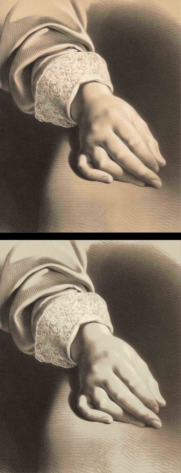
Essentially, the ground colour lends the suggestion that the portrayed subject is a living entity in the same way that the colour, sanguine, projects a sense of life in aux trios crayons images. Compare, for example, how the projected meaning changes significantly in Etude aux deux crayons N°13  when the original colour of the ground (shown in the detail below) is cooled to a dull green-blue by digital modification (as shown in the detail further below). From a personal reading of the same print on a cool ground, the meaning is now about a non-living entity, such as a detail of a stone mortuary statue.

(above) detail of Julien’s Etude aux deux crayons N°13 (after Perignon)
(below) digital alteration of the original warm ground colour to a cool colour

Beyond the colour of the ground, a fascinating field for study is the effect that the tone of the ground (i.e. the shade of the sheet of paper/drawing support) can have on projected meanings. For instance, to appreciate a common—but important—phenomenon regarding the effect of background tone on colour, see the photograph below showing the smoke from a lit stick of incense in front of a white and black sculpture. The grey smoke in front of the white sculpture—a plaster cast of Rodin’s Head of Balzac—appears dark in tone and takes on a warm colour cast (i.e. the smoke looks pinkish) whereas in from of the black sculpture—a bronze bust by an unknown sculptor of Euclid or perhaps Plato—the smoke appears to be light in tone and takes on a cool colour cast (i.e. it looks bluish). By extension of such an everyday observation, a colour drawing on a white background will appear to be darker and warmer in colour bias than the same drawing on a black background. Just as interesting, but harder to explain in a definitive way, on a white ground the “humidity” of the colour is dry whereas on a black ground the colour is wet. Sadly, few theorists recognise or discuss this variable that I have called “humidity,” even though I suspect that I am not alone in seeing this mercurial attribute that seems to be an amalgam of effects (e.g. saturation of hue, opacity of the colour, sheen of the colour layer and viscosity of the colour stroke).

Effects of dark and light-toned backgrounds

Another equally problematic effect arising from the tone of the ground colour is the curious attribute of spatial depth. This effect is noticeable when looking at black text on a white ground compared to looking at the same text displayed as white on a black background. From personal experience, of writing with black marker pens on a whiteboard in the classroom, the relationship of the black text on the white ground is within a very shallow notion of space. By this I mean that a viewer understands (and sees clearly) that the black marker pen strokes are drawn on top of the white board and, accordingly, there is very little room for the suggestion of spatial depth between the black text and the white board. By contrast, and again from personal experience, white chalk marks on a blackboard are spatially ambiguous as the viewer is less able to understand the spatial relationship between the chalk marks and the perceptual conundrum of a spatial void created by the black background. The observation also extends to PowerPoint presentations where white text on a black background appears to “float” whereas back text on a white background is spatially flat.

With regard to the effect of this phenomenon in imagery, a coloured drawing made on a white ground is usually viewed with a clear understanding of the spatial relationship between a portrayed subject and the white ground. The same portrayed subject on a black ground, however, may be perceived as spatially ambiguous. As an illustration of both effects, compare Zeyang Jiang’s study on white paper of Rodin’s plaster Head of Balzac (shown below) with the same drawing digitally modified so that it is displayed on a black ground (shown further below). From my standpoint, Zeyang Jiang’s original drawing is far easier to understand in term of the portrayed form than the digitally modified black background version. 

Zeyang Jiang
Study of Rodin’s Head of Balzac, 2012
Pen and ink with watercolour
25 x 20 cm
Zeyang Jiang’s Study of Rodin’s Head of Balzac with digitally blackened ground

Of course, the colour of the ground is usually an integral colour component in two and three-colour images. But when artists incorporate the ground colour as part of their palette of colours, they tend to use the colour of the ground sparingly so that its relationship to the other colours is meaningful. For example, in the two lithographs by an unidentified nineteenth-century artist shown below, the white paper is used with restrained precision to portray only those elements in the architecture where light is at its strongest.


Unidentified artist
Le Jubé de St. Pierre à Louvain [The rood screen of St. Peter at Louvain], c.1850
Colour lithograph on heavy wove paper
Inscribed above the image (top right corner): “No 4” the image (top right corner)
Inscribed below the image (centre): “LE JUBE DE ST. PIERRE A LOUVAIN” 
28.2 x 38.6 cm (image); 36.8 x 55.1 cm (sheet)
Condition: strong impression with minor signs of use.
I am selling this print and the print below—Le Jubé de L’Église Dixmude—(i.e. two lithographs) for a total cost of $147 AUD including postage and handling to anywhere in the world. These are large prints and will be posted in a tube. Please contact me using the email link at the top of the page if you have any queries or click the “Buy Now” button below.

These prints have been sold

Detail of Le Jubé de St. Pierre à Louvain
Unidentified artist
Le Jubé de L’Église Dixmude [The loft of the Church of Dixmude], c.1850
Colour lithograph on heavy wove paper
Inscribed above the image (top right corner): “No 15” (crossed in pencil)
Inscribed below the image (centre): “LE JUBE DE L’ÉGLISE DIXMUDE” 
38.7 x 27.1 cm (image); 54.4 x 36.8 cm (sheet)
Condition: strong impression with minor signs of use.
I am selling this print and the print above— Le Jubé de St. Pierre à Louvain —(i.e. two lithographs) for a total cost of $147 AUD including postage and handling to anywhere in the world. These are large prints and will be posted in a tube. Please contact me using the email link at the top of the page if you have any queries or click the “Buy Now” button above.
Detail of Le Jubé de L’Église Dixmude
As a final example of using the ground as an integral additional colour and tone in an two-colour image I wish to draw attention to the highly refined use of ground colour in Julien’s Grande etude aux deux crayons, No. 15 (shown below). Of special interest, note the subtle gradation of tone in the foreground figure’s shoulder and how the ground colour is seamlessly integrated into the neutral tones rendering the shoulder’s contours.


Bernard-Romain Julien (1802–71)
La Lecon Mutuelle [The Mutual Lesson]
Grande etude aux deux crayons N°15 (after de Rudder)
Lithograph in two colours on wove paper
58 x 44.3 cm
Condition: this is a beautiful impression but there are signs of handling and light surface soiling. There are repaired tears to the bottom edge of the sheet and chipping to the top edge of the sheet. There is a repaired tear on the right side of the sheet and the lower right corner is restored.
I am selling this print for a total cost of $188 AUD including postage and handling to anywhere in the world. This is a large print and will be posted in a tube. Please contact me using the email link at the top of the page if you have any queries or click the “Buy Now” button below.

This print has been sold

Detail of Julien’s La Lecon Mutuelle

Wednesday, 27 March 2013

From “Liber Veritatis” to “Liber Studiorum” (Part 3): Turner & Cotman


What are some of the traditional approaches to reproducing artworks?


This is the final instalment in the three-part discussion addressing various reproductive approaches employed by artists starting with Claude Lorrain’s reproduction of his paintings in drawings for his Liber Veritatius [Book of Truth] and concluding with John Sell Cotman’s Liber Studiorum [Book of Studies]. In the last post I proposed some motivations driving Turner and his fellow collaborators in their choice of the printing mediums: mezzotint, aquatint, etched line and steel engraving. For this instalment, the aim is slightly different. Tuner and Cotman both produced their own versions of a Liber Studiorum but the essential purpose of each of these artists’ compendiums of prints is very different. Mindful of that there is a difference, my intention is to offer insights into their respective Liber by comparing their underpinning motivations, purposes and approaches to creating images.

For Cotman, the motivation driving him to create prints was, by comparison to Turner, quite simple: Cotman wished to record his observations and to engage in the sheer joy of creative invention with the drawing and printing process. In short, his vision of creating a Liber was not so much about a predetermined goal but more the by-product outcome of on-going consistent disciplined practice, as the National Gallery of Australia’s website for Cotman’s Liber makes clear: “The etchings were all done by the artist for his own pleasure between 1805 and 1814 and were not really intended for publication” (http://artsearch.nga.gov.au/Detail.cfm?IRN=190644 [viewed 15 March 2012]). Despite Cotman’s less than grand plan for his prints, in 1838 George Bohm published forty-eight of Cotman’s plates under the title of Liber Studiorum: A Series of Sketches and Studies. It is Bohm’s last published portfolio of Cotman’s graphic work and envisaged as an independent—“stand alone”—publication (see the full set of Cotman’s Liber Studiorum prints at the Tate Gallery’s website: http://www.tate.org.uk/art/artworks?gid=66050!&ws=acno&wv=list [viewed 15 March 2012]).


John Sell Cotman (1782–1842)
The Devil’s Bridge, Cardiganshire, c.1805-14
from Liber Studiorum: A Series of Sketches and Studies
Soft ground etching on cream wove paper with full margins as issued by Bohm
18.5 x 12.2 cm (image); 18.8 x 12.6 cm (plate); 46.9 x 32 cm (sheet)
Tate Gallery: T11496
Condition: a rare impression in very good condition.
I am selling this etching for $120 AUD including postage and handling to anywhere in the world. This is a large print and will be shipped rolled in a tube. Please contact me using the email link at the top of the page if you are interested or click the “Buy Now” button below.

This print has been sold


The Devil’s Bridge, Cardiganshire (shown above) is a fine example of Cotman’s fascination with recording his observations of well-known English landmarks and, importantly, his creative reconstruction of them. Here, Cotman’s low viewpoint in looking up to the twin bridges (before the third iron bridge was added in 1901) gave him the opportunity to apply his creative eye in making visual connections between the arches of the bridge at the top of the image and the arching forms of a fallen tree (or perhaps exposed tree-roots?) at the bottom of the image (see details below). This connection is important. The echoed motif of the bridge’s arches and the many mini-arches of the tree helps the viewer’s eye to scan the image vertically and to sense unity in the composition by the framing effect—what I term as “bookending”—created by the arch motif. Equally important, the link between the two sets of arches draws attention to the deep ravine below the bridge. Consider, for instance, how the silhouette shape of the foreground tree-form that ends in a flurry of small arches towards the ravine edge may be interpreted subliminally as an analogue (i.e. a visual equivalent) for the sound and movement of the flowing water in the rapids far below. Note also how this expression sound and movement of a hidden realm in the ravine is sustained by the arrangement of lines portraying foliage and rock in that virtually all the lines are angled to the chasm’s hidden depth.

Detail of Cotman’s The Devil’s Bridge, Cardiganshire

Of course, not all viewers will see this orchestration of visual devices—the echoed motif of the arches and the converging lines rendering the scene—in the same way that I have described. Nevertheless, my intention is not to presumptuously explain how Cotman perceived the bridge and its surroundings. Rather, my goal is to give an insight into the sort of thoughts and creative play that occur to artists when framing their ideas into an image. Moreover, I wish to explain how Cotman’s approach to making images was far more of a spirited engagement than a clinically objective topographical rendering of the same scene.

Perhaps even more revealing in terms demonstrating Cotman’s pleasure in transfiguring a scene to suit his personal proclivities is his View of Clifton (shown below). What I find curious about this print is Cotman’s choice to add a figure dressed anachronistically in classical attire—a toga? (see detail further below)—in the near foreground while in the far distance Cotman portrays a modern township with multi-storey buildings.

John Sell Cotman (1782–1842)
View of Clifton, c.1805-14
from Liber Studiorum: A Series of Sketches and Studies
Soft ground etching on wove paper
19.7 x 17.3 cm (image); 20.2 x 17.5 cm (plate); 34.5 x 25 cm (sheet)
Tate Gallery: T11488
Condition: strong impression in good condition. The paper shows minimal age toning. There is a 1 cm closed tear on the left side (2 cm from the plate mark) and minor chipping of the lower right corner.
I am selling this etching for $120 AUD including postage and handling to anywhere in the world. Please contact me using the email link at the top of the page if you are interested or click the “Buy Now” button below.


This print has been sold


Also showcased in this print is Cotman’s propensity to look at a scene through a man’s eye. By this curious comment I am referring to the outlook of the generic man—the primordial hunter—whose field of vision is clear and fully focused at the centre while vision around the peripheral rim is focally blurred. From the author’s personal experience, as a man suffering from a primordial hunter’s vision, I can speak with great authority that a tasty morsel of chocolate is easy to find in a cluttered refrigerator when it is in the centre of the fridge; the same chocolate is difficult to fine if it is placed in the trays above, below or to the sides. In Cotman’s presentation of this propensity, the centre of the image is portrayed using fine wiry lines connoting focal clarity matching where Cotman’s eye was focused while the peripheral rim of the image is portrayed using thicker lines connoting blurred vision where his attention was not drawn (see details below).

Detail of Cotman’s View of Clifton

When comparing Cotman’s vision with that of Turner’s, in terms of capturing a man’s perception, theoretically they should be the same. After all they are both men and this also applies to the printmakers that Turner commissioned to assist him. From my standpoint, however, there is a notable difference when looking broadly at both artists’ prints. Cotman’s vision is about portraying what he sees with only minor creative reconstruction of observable detail. By contrast, Turner’s vision is about creating meta-narratives involving substantial modifications of what he observes to fit with a grander view of landscape; for instance, Turner leans towards showing mood and natural forces in landscape. (My apologies to readers who do not like sweeping generalisations and I admit there are exceptions to my proposed theory in both artists’ Libers.)

Cotman’s leaning to personal satisfaction—key components of his motivation and purpose—when creating his prints is far removed from Turner’s ambition summed up by Renee Free (1993): “… to show his contemporaries and posterity his concept of landscape composition” (Liber studiorum: etchings and mezzotints of types of landscape: J. M. W. Turner: from the collection of the Art Gallery of New South Wales, p. 1). To achieve this goal, Turner structured his Liber with six categories of landscape—Historical landscape (8 plates); Marine landscape (11 plates); Mountainous landscape (12 plates); Architectural landscape (11 plates); Elevated Pastoral landscape (14 plates); Pastoral landscape (14 plates)—with the prints in each of these categories designed as exemplars of compositions demonstrating what Free (1993) describes as “the possibilities” (ibid.) within each the category.

By contrast with the categorisation of landscape addressed by Turner, Cotman’s interests did not extend to pedagogical pursuits. Nevertheless, Cotman did engage with a personal pursuit of finding congruence between his approach to watercolour and his approach to printmaking. For instance, Cotman’s approach to watercolour is summarised well by Richard T Godfrey (1978) in Printmaking in Britain, in that Cotman’s watercolours are “constructed by the harmonious disposition of blocks of cool tone, washed on smoothly in flat areas to create beautiful patterns of interlocking shapes” (p. 94). In finding congruence with printmaking, Godfrey then proposes that Cotman’s “tones of wash drawing were translated into a restless surface of wiry, scratched line, delighting in varied details of textures” (ibid.).

Regarding Cotman’s approach by using such “wiry” etched lines, a superb example of this attribute is A Study (shown below). Although diminutive in size, this print projects a grand scale through its bold—almost posterised—tonal treatment and latent energy expressed by Cotman’s “restless surface” treatment of observed textures.


John Sell Cotman (1782–1842)
A Study, c.1805-14
from Liber Studiorum: A Series of Sketches and Studies
etching on cream wove paper with full margins as issued by Bohm
10.4 x 7.7 cm (image); 11 x 8.1 cm (plate); 47 x 32 cm (sheet)
Tate Gallery: T11502
Condition: a rare impression in good condition. There is a 1.2 cm closed tear at the top of the sheet (17 cm from plate mark) and very pale scattered foxing towards the edges of the sheet.
I am selling this etching for [deleted] including postage and handling to anywhere in the world. This is a large print and will be shipped rolled in a tube. Please contact me using the email link at the top of the page if you are interested or click the “Buy Now” button below.

[deleted] 
Detail of Cotman’s A Study

By comparison to Turner’s fascination with the landscape tradition extending back to Claude Lorrain, Cotman is seen by Michael Pidgley (1982) in John Sell Cotman 1782–1842 (ed. Miklos Rajnai) as an artist who “looks forward” (p. 18), in the sense that Cotmant sought to extend his art practice with a fresh outlook. This broad categorisation, however, does not mean that Cotman was not guided by past traditions, as Pidgley (1982) advises:

… he also, evocatively looks back. Derived as it is from a topographical tradition, much of that looking back involves a late eighteenth-century taste for the picturesque. (ibid.)

Indeed, even a brief overview of Cotman’s oeuvre shows his disposition for framing compositions with what Adele Holcomb describes as his “poetry of entrances” (ibid.). For example, in Conway Castle (shown below) the viewer is invited to look through an entrance of stone arches spanning the castle’s derelict great hall. For me, the “poetry” of this entrance is partly to do with the suggestion of hidden mystery beyond the hall’s trefoil window at the farthest end of the hall. Also adding a note of poetic symbolism to the arched entrance is the notion of vanitas (i.e. the symbolism that all things will pass/change) posed by the skeleton-like arches and the black and white goats standing confidently as if the ruin were their home. This everyday glimpse into the castle laced with a light hint of implied meanings is in stark contrast with Turner’s forbidding images of the same castle; for example Turner’s Conway Castle, c. 1789 see (http://www.tate.org.uk/art/artworks/turner-conway-castle-tw0308 [viewed 25 March 2013]) and similar romantic images such as Samuel Prouts’ moody watercolour (see further below) composed from a similar angle of view as Cotman’s viewpoint. 


John Sell Cotman (1782–1842)
Conway Castle, c.1805-14
from Liber Studiorum: A Series of Sketches and Studies
Soft ground etching on cream wove paper
18 x 12.3 cm (image); 18.8 x 12.7 cm (plate); 34.5 x 24.6 cm (sheet)
Tate Gallery: T11519
Condition: strong impression in very good condition. The paper shows minimal age toning. There is a small (6 mm) closed tear on the bottom right side (7.7 cm from the plate mark).
I am selling this etching for [deleted]  including postage and handling to anywhere in the world. Please contact me using the email link at the top of the page if you are interested or click the “Buy Now” button below.
[deleted] 
Detail of Cotman’s Conway Castle
© The Trustees of the British Museum
Samuel Prout (1783-1852)
(Inscribed on verso)  The Great Hall, Conway Castle / By Moonlight, 1810 (?)
Watercolour and bodycolour with gum, graphite and scratching out
42.5 x 30.5 cm
The British Museum: AN949041001
The British Museum curator’s description: “Here in Prout's watercolour,
a shaft of moonlight picks out the east window of the hall and falls on 
a block of stone as if it were an altar and heralds the tones and atmosphere 
found in Caspar David Friedrich's depictions of ruins.“

Cotman’s approach of framing many of his images with the “poetry of entrances” sometimes goes further than a nominal suggestion of an entrance. For example, in the earlier prints before those of the Liber, Interior View of St Mary's Chapel at Stourbridge near Cambridge, A Doorway South Side Shingham Church Norfolk, Interior of South-Runcton Church and Norman Castle, Rising Castle (all shown below), the visual device of portraying a doorway entrance is the pivotal feature of these images. Beyond this visual device is another hallmark of Cotman’s approach to illustrative reproduction: mimetic rendering of textured surfaces as can be seen in the details of the prints shown below.


John Sell Cotman (1782–1842)
Interior View of St Mary's Chapel at Stourbridge near Cambridge, 1818
Etching on wove paper
Inscribed below the image: “INTERIOR VIEW OF ST MARY'S CHAPEL AT STOURBRIDGE NEAR CAMBRIDGE.” / “Drawn, Etched & Published by J.S.Cotman 1818”
26.9 x 21.8 cm (image); 30 x 22.5 cm (plate); 32.8 x 25.5 cm (sheet)
Condition: very strong impression in virtually pristine condition. The paper shows minimal age toning.
I am selling this etching with the three other prints shown below—A Doorway South Side Shingham Church Norfolk, Interior of South-Runcton Church and Norman Castle, Rising Castle (i.e. four prints) for $300 AUD including postage and handling to anywhere in the world. The four prints will be shipped rolled in a tube. Please contact me using the email link at the top of the page if you are interested or click the “Buy Now” button below


These four prints have been sold
Detail of Cotman’s Interior View of St Mary's Chapel at Stourbridge near Cambridge

John Sell Cotman (1782–1842)
A Doorway South Side Shingham Church Norfolk, 1811
from Architectural Antiquities of Norfolk
Etching on wove paper
Inscribed above the image (upper right): “XLI”
Inscribed below the image: “A DOORWAY SOUTH SIDE SHINGHAM CHURCH NORFOLK, 1811” / “Drawn, Etched & Published by J.S.Cotman 1817”
25 x 18.9 cm (image); 30.2 x 20.1 cm (plate); 49 x 32 cm (sheet)
Condition: very strong impression in very good condition. The sheet shows a bump to the upper left corner (well away from the plate marks). There is slight age toning at the right edge and two faint foxing marks.
I am selling this etching with the print shown above—Interior View of St Mary's Chapel at Stourbridge near Cambridge—and the two prints shown below—Interior of South-Runcton Church and Norman Castle, Rising Castle—(i.e. four prints) for [deleted]  including postage and handling to anywhere in the world. The four prints will be shipped rolled in a tube. Please contact me using the email link at the top of the page if you are interested or click the “Buy Now” button below the print, Interior View of St Mary's Chapel at Stourbridge near Cambridge.
Detail of Cotman’s A Doorway South Side Shingham Church Norfolk

John Sell Cotman (1782–1842)
Interior of South-Runcton Church, 1812
from Architectural Antiquities of Norfolk
Etching on wove paper
Inscribed below the image (lower left): “Pub as the act directs April 1 1812” [there may be errors in my reading of this text line as the script is not clear]
Inscribed below the image (lower right): “XXL”
Inscribed below the image (centre): “INTERIOR OR [sic] SOUTN [sic]-RUNCTON CHURCH / To the Rev.d Robert Forby MA / This Plate is most Respectfully Dedicated by his Obedt. [text difficult to decipher but may be “Obt. St.” for obedient servant] J.S.Cotman”
28.2 x 21.8 cm (image); 30.3 x 22.6cm (plate); 49 x 32.8 cm (sheet)
Condition: very strong impression in excellent condition within the plate area and 2 cm on all sides surrounding the plate area. In the margins there are closed tears (none extending closer than 2.2 cm from the plate mark), bumps and light staining extending 2 cm from the top edge of the sheet. The sheet shows a bump to the upper left corner (well away from the plate marks).
I am selling this etching with the two prints shown above—Interior View of St Mary's Chapel at Stourbridge near Cambridge and A Doorway South Side Shingham Church Norfolk—and print shown below—Norman Castle, Rising Castle —(i.e. four prints) for [deleted]  including postage and handling to anywhere in the world. The four prints will be shipped rolled in a tube. Please contact me using the email link at the top of the page if you are interested or click the “Buy Now” button below the print, Interior View of St Mary's Chapel at Stourbridge near Cambridge.

Detail of Cotman’s Interior of South-Runcton Church
John Sell Cotman (1782–1842)
Norman Castle, Castle Rising, 1812
Etching on wove paper
Inscribed within the plate image (lower left): “Castle Rising. Castle” / … [I cannot decipher the word in the text line but I presume it is “Norwich”] Etched & Published by J. S. Cotman / January 1812”
Inscribed below the image (lower right): “XLVI”
29.6 x 20.8 cm (image); 35 x 21.4 cm (plate); 49 x 31.8 cm (sheet)
Condition: very strong impression in very good condition. In the margins there are closed tears (none extending closer than 4 cm from the plate mark), a chipped corner (upper left) and age toning to the far extremities of the sheet.
I am selling this etching with the three prints shown above—Interior View of St Mary's Chapel at Stourbridge near Cambridge, A Doorway South Side Shingham Church Norfolk and Interior of South-Runcton Church (i.e. four prints) for [deleted]  including postage and handling to anywhere in the world. The four prints will be shipped rolled in a tube. Please contact me using the email link at the top of the page if you are interested or click the “Buy Now” button below the print, Interior View of St Mary's Chapel at Stourbridge near Cambridge.

Detail of Cotman’s Norman Castle, Castle Rising

As a final point of separation in the approaches of both Cotman and Turner in executing their Liber prints, I wish to draw attention to how both artists portray textures. In Cotman’s Liber prints the use of soft-ground etching replicates in a direct way the crumbly aspect of his pencil rendered textures (see detail below) as this is an intrinsic attribute of the soft-ground process of etching. By contrast, Turner’s approach to representing textures relies on delicately manipulation of the mezzotint prepared plate so that by scraping and burnishing he can emulate subtle changes of texture in his chosen subject.

In Cotman’s soft-ground etching from his Liber prints, Capel-Carrig, Caernarvonshire (shown below), this unique quality of the soft-ground process is revealed very clearly and to my eyes the type of marks that the process creates makes his images tactilely appealing.

John Sell Cotman (1782–1842)
Capel-Carrig, Caernarvonshire, c.1805-14
from Liber Studiorum: A Series of Sketches and Studies
Soft ground etching on cream wove paper
12.3 x 18.2 cm (image); 12.8 x 18.7 cm (plate); 24.9 x 34.5 cm (sheet)
Tate Gallery: T11528
Condition: a rich impression in good condition. There is scattered grey spotting in the margins (these may be the result of conservation eradicating foxing but the print does not appear to be bleached as the sheet has light age toning). There is a closed tear (1 cm) lower left edge (6.5 cm from the plate mark).
I am selling this etching for [deleted] including postage and handling to anywhere in the world. Please contact me using the email link at the top of the page if you are interested or click the “Buy Now” button below.

[deleted] 
Detail of Cotman’s Capel-Carrig, Caernarvonshire