What are some of the historical approaches used by artists to represent what they see?
Over the course of previous three posts the focus has been on different approaches that artists employ when attempting to portray reality. What has been left to this fourth and final discussion in the current series is arguably the most interesting approach of all: the use of visual cues for visual communication where no part of an image is more important than the whole. In short, the following discussion will address how Gestalt psychology has been adapted by artists—often unknowingly—and applied in the representation of reality. More specifically, I aim to explain how artists have employed two laws of Gestalt theory to help viewers to interpret visual information:
- The “law of figure and ground”—a set of rules governing how the viewer distinguishes the figure (i.e. “the pattern that is most clearly perceived at a given time”) from the ground (i.e. the background or “the rest of the perceptual field”)—see http://www.preservearticles.com/201102023813/law-of-figure-ground-relationship-of-perceptual-organization.html (viewed 27 September 2013); and,
- The “law of closure”— a rule that the viewer has the propensity to find linear connections that define a subject's shape and form (i.e. to see complete figures even when part of the information is missing.")—see http://facweb.cs.depaul.edu/sgrais/gestalt_principles.htm (viewed 27 September 2013).
Regarding the “law of figure and ground,” Edgar Rubin (1886–1952), who is probably most famous for his face-and-vase illusion
(see http://en.wikipedia.org/wiki/Figure%E2%80%93ground_(perception) [viewed 11 October 2013]), proposes that there are four attributes in an image which help a viewer to distinguish the figure (i.e. the essential subject) from the ground (i.e. the background)
(see http://www.preservearticles.com/201102023813/law-of-figure-ground-relationship-of-perceptual-organization.html [viewed 27 September 2013]). With a note of apology for my interpretative rewording of Rubin’s ideas, these may be outlined as:
1. the figure’s shape has a clear edge, whereas the shapes in the background are less defined;
2. the figure is laid on the top of a visual field of background features;
3. the figure is closer to the viewer than the background;
4. the figure’s shape has associations with tangible forms.To explain the significance and importance of these attributes in practice, I wish to compare Cornelis Bega’s (1631/1632–64) etching, The Singer (shown below) with Hans Burgkmair’s (1473–1531) woodcut, The Battle of
 |
Cornelis Pietersz Bega (1631/1632–64)
The Singer [Le Chanteur]
Published circa 1816 by McCreery from the original plate
State ll (of ll)
Etching on fine wove paper
(Sheet) 11.7 x 7.8 cm; (Plate) 11.2 x 7.4 cm
Bartsch 7.27; Hollstein 27
(
Condition: crisp impression with fine margins. The paper is virtually flawless apart from faint discolouration at the corners where the print was once attached to a support sheet.
I am selling this print for a total cost of [deleted] including postage and handling to anywhere in the world. Please contact me using the email link at the top of the page if you have any questions or click the “Buy Now” button below.
|
 |
| View of whole sheet |
 |
Detail of Bega’s The Singer
|
 |
Hans Burgkmair the elder (1473–1531)
The
illustration in Der Weisskunig
Monogram of Burgkmair “HB” on lower-left cannon
Woodcut on laid paper
22.4 x 19.8 cm
Bartsch Vll.224.80; Hollstein 522; Dodgson ll.95.89.
(See British Museum http://www.britishmuseum.org/research/collection_online/collection_object_details.aspx?objectId=1440535&partId=1&searchText=Hans+Burgkmair&page=3)
Condition: superb and rare early impression with fine margins. There is a small foxing mark in the sky and a thin area visible only on the back.
I am selling this print for a total cost of [deleted] including postage and handling to anywhere in the world. Please contact me using the email link at the top of the page if you have any questions or click the “Buy Now” button below.
|
 |
Verso view of The
|
 |
Detail of Burgkmair’s The
|
 |
Detail of Burgkmair’s The
|
In terms of Rubin’s first “rule”—viz. “the figure’s shape has a clear edge, whereas the shapes in the background are less defined”—Bega’s print is an ideal example. Bega not only separates the three primary figures he portrays from the background with an outline, but he also applies subtle differences in the treatment of each figure’s outline to suggest where the three figures stand in space. By this I mean that Bega represents the illusion of spatial depth by making the small boy in the foreground appear to be in front of the other figures through the use of a sharp outline, whereas the most distant figure (i.e. the man holding a sheet of paper while singing) is portrayed with a comparatively freely drawn outline (see details below).
 |
Representation of spatial depth by changes in the treatment of outlines
|
By contrast to the subtle changing treatment of edges employed by Bega to create spatial depth, Burgkmair’s woodcut displays a singular approach where the representation of figure and ground is not differentiated: the outline edge of subjects portrayed in the foreground have the same sharp quality of line as the outline edge of subjects portrayed in the distance (see detail below). As a consequence, there is a shortfall in applying Rubin’s first rule.
 |
Consistency of approach that does not allow for Rubin’s first rule
|
Regarding Rubin’s second and third rules—viz. “the figure is laid on the top of a visual field of background features” and “the figure is closer to the viewer than the background”—both prints by Bega and Burgkmair demonstrate how the principle may be applied successfully. For example, both artists employ the principle of overlapping to establish the logic of which figure is in front of which and the relative distance between the various figures. Nevertheless, Burgkmair’s print has problematic areas, such as shown in the detail below featuring a cannon and a figure above it, where the principle of overlapping is not applied. In these areas the lack of overlapping results in spatial ambiguity where a viewer may be uncertain about the logic of relative distances between the cannon and the figure, and the figure and the rest of the battle scene.
 |
Lack of overlapping that does not allow for Rubin’s second and third rule
|
Rubin’s fourth and final rule—viz. “the figure’s shape has associations with tangible forms”—is a sensible and straight forward rule that does not need too much clarification. After all, most perceptions are framed by past experiences—mindful that there are arguments as to whether our brains are pre-programmed, or evolved by experience, or perhaps a mixture of both. For instance, most viewers would perceive figures in both prints because they “know” what people look like. Moreover they can “read” meaning into how people move and the plethora of observed subtleties, such as body-language, acquired from personal experience. In the case of Bega's print, the plant depicted in front of the songster's legs (see detail below) is likely to be perceived as a plant with all the attributes of a plant simply by association of what plants look like and by the artistic convention of using loose line-work to represent the silhouette shape of plants.


 |
Foregrounding a subject by association
|
Unlike the first law of Gestalt theory, the second law—the “law of closure”—relies more heavily upon the artist’s intuitive sense of what might be the minimum visual information required to convey meaning. For instance, if an artist wishes to represent a rectangle (see Figure A below), there may not be the need to show all sides of the rectangle. The artist could, for example, choose to only show the corners (see Figure B below) and let audience’s mind fill in the blank lines of the sides without literally inscribing them in the drawing. Alternatively, the artist could choose to show only the centres of the rectangle’s sides (see Figure C below) and leave the audience to imagine the blank corners as a reconstruction (i.e. in “the mind’s eye”). In short, the last two examples are illustrations of how an artist can supply a minimum of amount of visual information and rely on the “law of closure” to assist an audience to “fill in” the complete picture.
Shown below is a fine
example of this law in an ink painting of a monkey in a tree by a Japanese
artist with whom I am not familiar. This sensitive portrayal of a monkey relies
entirely on the viewer being able to perceive connections between freely laid
brushstrokes. For instance, in the detail shown further below, the artist has
not drawn an outline of the monkey as a clearly defined shape hugging a tree
limb. Instead the monkey’s form and how tightly it clutches the branch is suggested
by the viewer’s eye seeing a visual bridge-like connection between two critical
accents: the pointed brushstroke describing the tree branch above the monkey’s
head and another pointed stroke at the monkey’s tail. Amongst many other visual
prompts (e.g. the variation of pressure used to represent the monkey’s chin
resting on the tree limb), these two marks are like bookends that carry a line
of connections between them.
 |
[Unknown artist]
Monkey [in a plum-tree garden], executed in the ‘Year of the Rooster’: 1848(?)
Ink painting on paper
(scroll) 113 x 69 cm; (painting) 31.5 x 63 cm
Mounted as a scroll with wooden scroll ends
Signed with signature and seal
Based on a friend’s translation of the old Chinese script, my understanding is that the painting may be intended as good wish on a birthday for an enlightened and peaceful long life.
I have added my friend’s notes that were made during our discussion and would be happy to hear for other readers who can add more information (see notes below).
Condition: wrinkles, surface dustiness, light stains.
I am selling this hand-painted scroll for a total cost of $246 AUD including postage and handling to anywhere in the world. Please contact me using the email link at the top of the page if you have any questions or click the “Buy Now” button below.

Translation notes
|


Creating the effect of closure through such a line of
connections can be a lead to a formulaic approach to applying the second law,
but there are meaningful ways to decide what should be shown and what should be
omitted.
One approach to using
this law is to think in terms of creating psychological democracy in an image.
By this I mean, an artist should lessen (i.e. “play down”) the importance of
what might be seen as psychologically arresting visual information and increase
(i.e. “play up”) the importance of what may be seen as psychologically
undemanding visual information. Most artists do this intuitively so that what
they portray seems psychologically balanced. For instance, in my life-drawing
classes where the focus is on nude models, I am often struck by the interest of
many students in the psychologically undemanding areas of the figure—the neck, the
waist, armpits and knees—rather than in the psychologically arresting areas—the
face, hands, feet and genitals. The outcome of such a focus on incidental
details, rather than portraying all the model’s features, gives the viewer’s
mind scope to “fill in” the missing or thinly drawn areas so that the subject
can be perceived as a coherent form.
An example of an artist displaying a psychologically balanced vision may be seen in Marino Marini’s (1901–80) etching Two Pomonas (shown below). In this image Marini renders a pair of figures with two different treatments. The less psychologically interesting features—the figures’ head-shapes, backs, elbows and knees—he renders with a single fine line, whereas more sexually and psychologically interesting features—breasts, genitals, hands, feet and faces—are blurred with cross-hatching. By intention, Marini gives the viewer sufficient visual information to see both figures despite not portraying in graphic detail the figures in their entirety. Beyond giving the viewer minimal information to complete the image mentally, this balance of the two treatments offers more. It allows the viewer to move beyond the pictorial reality of looking at two figures and to contemplate the image as a well-integrated composition. In short, this approach is about portraying an image as a cohesive whole rather than an image of parts.
 |
Marino Marini (1901–1980)
Zwei Pomonas [Two Pomomas], 1956
From the album Tout près de Marino, plate X
Pencil signed (lower right) and inscribed with edition number 5/65 (lower left)
etching on thick wove paper
(sheet) 56 x 88 cm; (plate) 26.1 x 18.8 cm
(see Klepac, Lou 1980, Marino Marini: Etching and Lithographs, The Art Gallery of western Australia,
Condition: superb impression with wide margins. There light toning from the print having been mounted in the past and the back of the print has light foxing.
I am selling this print for a total cost of [deleted] including postage and handling to anywhere in the world. This is a large print and will be shipped in a tube. Please contact me using the email link at the top of the page if you have any questions or click the “Buy Now” button below.
 |


As an experiment (shown below), I
have digitally modified Marini’s print with details of figures extracted from
several of Hendrick Goltzius’ prints and drawings. My aim is to illustrate how the
introduction of these intimate details—a face, breasts, buttocks and feet—can
disrupt and visually fragment an image into parts, because such details are
psychologically laden with personal meanings that, arguably, inhibit an instantaneous reading.
Of course, not all viewers will agree and there is an argument that the
proximity of the features may even assist with a viewer's perception of form. From
my reading of this digital image, however, I find my eye and brain distracted
by the intimate details. In truth, my experience is less about the artwork as a
cohesive image and more about finding meaning for the added details.
 |
Digital experiment in visual fragmentation involving elements of Hendrick Goltzius’ prints merged with Marino Marini’s Two Pomonas
|
An alternative way of employing the law of closure is shown in Kusumi Morikage’s (1620–80) ink painting of an egret (shown below) where the shape and form of the bird is expressed by the background. Here the tone of the background (i.e. the negative space) behind the bird is represented by an insightful use of line that portrays the bird’s physical form (i.e. positive space). For instance, to portray the Egret’s crown feathers Morikage has used a single fluid line with a hook at its top to present the silhouette shape of these feathers, their dazzling whiteness and, interestingly, their latent springiness (see details further below).
 |
Kusumi Morikage (c. 1620–90) (Tokugawa period)
Egret [Sagi]
Ink painting on paper
162.6 x 33.5 cm
Mounted as a scroll with wooden scroll ends
Signed with signature and seal: “Morikage”
The attribution of early Japanese paintings is difficult unless one is an expert in this area (which I am not). Consequently, I am presenting this painting as either an original painting by Morikage or by one of his followers.
(See references to Morikage: http://www.britannica.com/EBchecked/topic/325540/Kusumi-Morikage; http://www.artgallery.nsw.gov.au/collection/works/246.1984.a-b/;
Condition: wrinkles, surface dustiness, light stains and scuffed areas.
I am selling this hand-painted scroll for a total cost of $746 AUD including postage and handling to anywhere in the world. Please contact me using the email link at the top of the page if you have any questions or click the “Buy Now” button below.
 |


http://proj.ncku.edu.tw/research/articles/e/20101210/2.html [viewed 7 January 2014]) as “emergence” when a recognisable image is perceived
from a collection of what may otherwise be viewed as disparate pictorial fragments.
Perhaps the most famous illustration of this phenomenon is R C James’ image of
a Dalmatian dog sniffing the ground (see
http://thecuriouspanther.wordpress.com/2012/02/29/gestaltism-a-theory-of-mindand-brain/
[viewed 7 January 2014]) and I have attempted to explore this type of reductive
image in my digital experiments with a local stray cat in my garden (see
below). Although an exact explanation as to why we are able to synthesise such
information has not been advanced (beyond the theory that there are many
causes/laws all working together) the effect remains that the brain is able to
piece together an image as a whole from fragments if there are visual and psychological triggers for it
to perceive forms.
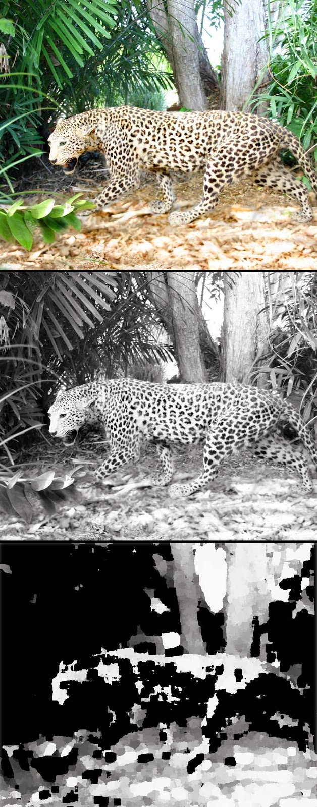 |
Exploring
a three-stage digital reductive process
|
Before
ending this discussion I wish to propose that one of the best examples of our
brain's flexibility to negotiate meaning from a mire of fragments is showcased
in the art of autostereograms popularised in the Magic Eye books (see an
example of an autostereogram at http://en.wikipedia.org/wiki/Autostereogram
[viewed 7 January 2013]).
No comments:
Post a Comment
Please let me know your thoughts, advice about inaccuracies (including typos) and additional information that you would like to add to any post.