Showing posts with label Agar (John Samuel). Show all posts

Sunday, 15 January 2017

John Samuel Agar’s stipple engraving of a marble sculpture


John Samuel Agar (1773–1858)
 “Plate XXX”, 1808, printed by T Bensley, published by T Payne and J White in 1809 for the Society of Dilettanti in “Specimens of Ancient Sculpture, Aegyptian, Etruscan, Greek, and Roman”, London. According to Christie’s catalogue for Sale 7725, Lot 151, most of the illustrations in this two-volume book were made from the collections of Richard Payne Knight and Charles Townley. Christie’s also advise that there were 133 engraved plates in an edition of 200 copies.

Stipple engraving on chine-collé on thick laid paper lined on a fine washi paper support sheet.
A proof impression before lettering for publication.
Size: (sheet) 43.6 x 33.2 cm; (plate) 35.9 x 31 cm; (chine-collé) 29.7 x 23 cm
Condition: strong impression with margins. There are light surface marks and a minor spot of discolouration; otherwise the sheet is in good condition (i.e. there are no tears, holes, significant stains or foxing).

I am selling this rare stipple engraving, for the total cost of [deleted] including postage and handling to anywhere in the world.
If you are interested in purchasing this original engraving, please contact me (oz_jim@printsandprinciples.com) and I will send you a PayPal invoice to make the payment easy.

This print has been sold


Even a quick glance at this superb study will leave little doubt that it has more than a little leaning towards neoclassical tastes. Such an assessment is correct, as this engraving was commissioned by the Society of Dilettanti that had taken on (according to what I have gleaned from Wikipedia) the full moral duty in London “to correct and purify the public taste of the country” by exposing the impressionable to artefacts from the classical world. Although the ambition of the society may seem a little haughty in its conceit, the outcome is that the society funded archaeological expeditions, Italian opera and, with the help of Sir Joshua Reynolds, helped to establish the Royal Academy, as well as publishing the two-volume book in which this print is featured. (Note that this impression is likely to be a proof before publication as it does not have the lettered details of the published prints).

Although the grand vision and mission of the Society of Dilettanti may not be served very well by Horace Walpole’s (1743) caustic comment: "...a club, for which the nominal qualification is having been in Italy, and the real one, [is] being drunk: the two chiefs are Lord Middlesex and Sir Francis Dashwood, who were seldom sober the whole time they were in Italy” (Jeremy Black (1985), “The British and the Grand Tour”, p.120), there were members of the Society that had a very interesting outlook on art. For example, one of the luminaries of the Society and a central figure in the publication of this book is Richard Payne Knight (1750–1824)—an authority on classical art and an active archaeologist. My understanding of Knight’s vision of art is that he saw paintings and music—and no doubt Agar’s print—as addressing “the organs of sight and hearing." By contrast, the art of poetry and sculpture appeal "entirely to the imagination and passions." More interesting with regard to this print, Knight had the curiously interesting belief that (again, according to Wikipedia) “artists should seek to reproduce primal visual sensations, not the mental interpretative processes which give rise to abstract ideas.” (https://en.wikipedia.org/wiki/Richard_Payne_Knight). In other words, the neoclassicism of Agar’s print.


Wednesday, 13 July 2016

John Samuel Agar’s stipple engraving (1808) for the Society of Dilettanti


John Samuel Agar (1773–1858)
“Plate LXVII”, 1808, printed by T Bensley, published by T Payne and J White in 1809 for the Society of Dilettanti in “Specimens of Antient Sculpture, Aegyptian, Etruscan, Greek, and Roman”, London. According to Christie’s catalogue for Sale 7725, Lot 151, most of the illustrations in this two-volume book were made from the collections of Richard Payne Knight and Charles Townley. Christie’s also advise that there were 133 engraved plates in an edition of 200 copies, of which 60 were on large-paper reserved for members of the society. This print is from the reserved edition of 60 elephant folio prints.

Stipple engraving in sepia on thick laid paper, watermarked “J Watman 1809”, with extremely large margins (as published in the rare limited edition of 60 reserved for members of the Society of Dilettanti in 1809).
Size: (sheet) 54.5 x 37 cm; (plate) 28 x 22.8 cm
Lettered (lower left) “J. Agar del et sc.”; (lower centre) “BRASS. / same size / R.P. KNIGHT, Esq. / Published by T.Payne & I.White London, Jan 1st 1808.”; (upper left) “Plate LXII.”

Condition: crisp and strong impression with full margins (as published) in marvellous condition for its age.

I am selling this remarkably rare stipple engraving from 1808, published in the very small edition of only 60 prints, for the total cost of  [deleted] including postage and handling to anywhere in the world.
If you are interested in purchasing this original engraving, please contact me (oz_jim@printsandprinciples.com) and I will send you a PayPal invoice to make the payment easy.

This print has been sold


For those who may be unfamiliar with the remarkable achievements of the Society of Dilettanti, I need to go back to its London roots in 1732 when the group had its first meetings as little more than a dining club with membership restricted to those who had made the grand tour of Europe. By 1736 the group had begun taking minutes of its meetings and the Society of Dilettanti was formed with the mission to give fellow Londoners a touch of culture—or to quote from Wikipedia: “to correct and purify the public taste of the country.”

At this point I should give a quote from none other than Horace Walpole who, in 1743, offered the following cutting insight about the society: "...a club, for which the nominal qualification is having been in Italy, and the real one, being drunk: the two chiefs are Lord Middlesex and Sir Francis Dashwood, who were seldom sober the whole time they were in Italy” (Jeremy Black (1985), “The British and the Grand Tour”, p.120).

Notwithstanding the willingness of some members of the society to indulge themselves with the finer things of life, the society funded archaeological expeditions, Italian opera and, with the help of Sir Joshua Reynolds, helped to establish the Royal Academy.

This print is from the Society of Dilettani’s major two-volume publication of classical antiquities and the elephant folio in which it was bound was limited to an edition of 60 copies available only to the members. It is very rare. 


Saturday, 21 May 2016


John Samuel Agar (1773–1858)

(left image) "Plate VII", 1809
(right image) "Plate XLII", 1809

Stipple engravings in sepia on thick laid paper
Size: (sheet) 55.7 x 38 cm; (plate) 27.8 x 22.5 cm
Published by T Payne and J White (presumably as part of the folio, "Specimens of Ancient Sculpture…" published by T Bensley).

Condition: crisp impressions with wide margins. "Plate VII" has three light surface marks (dirt?) towards the middle-left side within the plate mark. There is a repaired 7 cm margin tear that is 1.5 cm away from the plate mark. The paper is clean and in good condition. "Plate XLII" has minor wrinkling. The paper is clean with minor handling marks and 1 cm edge cracks on the lower and right edges.

I am selling this pair of large stipple engravings [deleted] at the time of posting these prints) including postage and handling to anywhere in the world. 
If you are interested in purchasing these remarkable renderings of antique sculptures, please contact me (oz_jim@printsandprinciples.com) and I will send you a PayPal invoice to make the payment easy.

These prints have been sold


Agar's choice to use stippling (i.e. fine dots) to shade his renderings of classical sculptures may be a time consuming process but it is an approach to illustration that allows for sensitive moulding of a sculpture's features. I must point out, however, that one essential principle that Agar uses to create the visual illusion of form is his choice of lighting direction: a light cast from the top-front-left. This angle of lighting is the basis of all great classical drawings as it is the direction that Western viewers read—from left to right. Of course, if an artist were creating an illustration for Arabic/Hebrew viewers then the angle of lighting would be from the reverse side.


Sunday, 26 August 2012

Analogue & Digital Lighting: Boissieu, Agar, Wild & Foster


How does an audience that is fully immersed in the digital age look at images?


Interestingly, the direction we read (e.g. Westerners read from the left side of a line of text to the right side) has a big impact upon the way we look at images and, in turn, how artists arrange the lighting on their portrayed subject. For instance, artists wishing to cater for a left-to-right reading direction of a Western audience portray their subjects with a top-left lighting angle as the Western eye is attuned to perceive a subject’s form when it is lit from this direction. In Jean-Jacques de Boissieu’s (1736 –1810) Saint Jerome shown below, for example, Western eyes see the body of the saint as far more three-dimensional when he is lit from the left than if his body were lit from the right as shown further below when the print is “flipped” horizontally. For academic artists the arrangement of light is more exacting: a top-front-left angle convention as can be seen in John Samuel Agar’s (1773–1858) stipple engraving of antique heads (also shown below). 

Jean-Jacques de Boisseau (1736–1810)
St Jerome, 1797
Etching, drypoint, engraving and roulette, chine colle.
49 x 35 (plate); 42.7 x 31 cm (image); 63 x 45.7 cm (sheet)
Perez: 104
Condition: Rich impression with toning (oxidation) in the margins. There are also handling marks and many tears in the margins, some of which are restored.

Jean-Jacques de Boissieu, (detail) St Jerome, 1797
(left) Boisseau, St. Jerome, 1797
(right) horizontally flipped image of St. Jerome
(click the image to enlarge)
John Samuel Agar (1773–1858)
Plate VII, 1809
Stipple engraving in sepia on laid paper
27.8 x 22.5 cm (plate); 55.7 x 38 cm (sheet)
Published by T Payne and J White (presumably as part of the folio, Specimens of Ancient Sculpture… published by T Bensley)
Condition: crisp impression with thee light surface marks (dirt?) towards the middle-left side within the plate mark. There is a repaired 7 cm margin tear that is 1.5 cm away from the plate mark. The paper is clean and in good condition.
John Samuel Agar, (detail) Plate V1I, 1809 
John Samuel Agar (1773–1858)
Plate XLII, 1809
Stipple engraving in sepia on laid paper
27.6 x 22.5 cm (plate); 55 x 38 cm (sheet)
Published by T Payne and J White (presumably as part of the folio, Specimens of Ancient Sculpture… published by T Bensley) 
Condition: crisp impression minor wrinkling. The paper is clean with minor handling marks and 1 cm edge cracks on the lower and right edges.
I am selling this print (Plate XLII) and the other Agar stipple engraving further above (Plate VII) for a total cost of [deleted] including postage and handling to anywhere in the world. (Note: these are large prints and will be shipped in a tube.) Please contact me using the email link at the top of the page if you have any queries or click the “Buy Now” button below.


These prints have been sold

John Samuel Agar, (detail) Plate XLII, 1809 

This lighting arrangement has become so much a part of the Occidental way of looking at images that even digital buttons in computer programs (i.e. “pop-up” display keys shown on the monitor rather than physical buttons we can touch) have a top-front-left lighting arrangement enabling the viewer to see if a displayed button is raised or lowered. By contrast, artists wishing to cater for a right-to-left reading direction of an Arabic or Jewish audience will light their portrayed subject in the reverse direction so that light is cast on a subject from the top-front-right. The importance of this seemingly simple principle became apparent to me after contemplating advertisements in an Israeli newspaper and intuitively knowing that the compositions were aesthetically awkward (i.e. “wrong”) for my Western eyes.

My awakening to the importance of the angle of lighting in these newspaper advertisements impacted also on my understanding of images in general that I knew deep down were unsettling. One of these is another of de Boisseau’s rich and moody prints, The Fathers of the Desert (shown below). I had originally acquired this print as I had (and still have) a fascination with hermits and this particular image is truly haunting. For me, a lot of its attraction rests with the standing figure’s facial expression of transcendent rapture (see the same facial expression in Zurbaran’s painting, St Francis, upon which this figure is modelled). There is also the hint of the unknown conjured by the landscape setting outside the dark void of the open cave. But to my eyes the really riveting attraction is the dramatic lighting (termed chiaroscuro) that is cast on the figure like a spotlight from the right. I suspect that if the lighting had been from the left, the figures and landscape features may have appeared more three-dimensional as is the case with St Jerome, but the peculiarly otherworldly mood of the image would not have been the same.

Jean-Jacques de Boisseau (1736–1810)
The Fathers of the Desert, 1797
Etching, chine colle.
49 x 35 cm (sheet)
Perez: 103
Condition: cut within the plate marks but with a border around the chine colle of the image. There are handling marks and tears in the support sheet otherwise good condition.
I am selling this print for $180 AUD including postage and handling to anywhere in the world. (Note: this is a large print and will be shipped in a tube.) Please contact me using the email link at the top of the page if you have any queries or click the “Buy Now” button below.


This print is no longer available
Jean-Jacques de Boisseau, (detail) The Fathers of the Desert, 1797

Of perhaps surprising importance to the following discussion is how artists arranged the lighting for early Oriental eyes where text is read vertically. The convention for Eastern artists was not to impose a sideways lighting on their subject at all but rather to portray spatial depth in terms of disposing each featured subject in its own spatial zone from foreground to distance. Often these zones are differentiated from each other with white space (or to use the term I have applied to Western art, noetic space; see post Jacque: Sheep and Shadows) and the suggestion of mist separating each zone but, or course, each subject demands its own requirements for spatial placement.

How this Oriental approach of vertical reading has relevance to the digital age is again by being linked to reading habits. In the past, the direction of reading also applied to how books and other collections of text were negotiated in terms of turning the pages. First, the reader would view the top page (in the West this is signified by the bound edge of the book being on the left whereas in the East it is on the right) and then would turn the page over following the culture’s reading direction to see the next page or, alternatively, move the eye to the adjacent page. In short, there is a convention of where the next page is to be found. In the digital world things are beginning to change. For screen-based text the “top” of the page is to be found with the document scrolled upward and the pages that follow are to be found by scrolling the document downward. At first such an arrangement is sensible and unproblematic. But there is a subtle shift in the way the digital audience is now beginning to view images and it is different to the ways of the past.

This subtle shift in reading only occurred to me after hearing about the conundrum encountered by advertisers concerned with making money from the social networking site, Facebook. The concern is that the viewers tend to not look at information placed on the sides of the screen as they have become conditioned to see this area as being for advertisements (as is the case with many blog sites). To express this differently, unlike readers holding a book or newspaper where the viewing field is the whole page, for viewers looking at Internet pages (as opposed to digitalised pages on eReaders like Kindle) the viewing field has arguably become more localised to the centre of the screen. In essence, the culture of digital reading is morphing our gaze to a vertical stream of reading from zenith to nadir. The interesting question that this poses is whether this focus impacts on the way digital artists compose their images and there is evidence that this may be the case.

I posed this question to a former Honours student, Gareth Wild, for insights into his artistic practice and the following response highlights a change in attitude to the conventions of composition for at least one of the rising digital stars. Regarding Gareth’s first digital image, Zoombified Pirate (shown below), Gareth advises me that the image is top lit but he does not believe that the lighting is “an integral component to the overall impact of the image.” Although Gareth’s view of his image may be interpreted as negating the importance of the vertical lighting arrangement his following comment is very revealing: “The composition is vertically linear—not unlike the design of a webpage, and the ominous background smog creates a subtle vignette effect—again reinforcing the centralised composition reflected in our reading of a webpage. In Gareth’s digitally created image, Large Crustacean (shown further below) his insight is that this print is “less vertically linear than the former image, but again is top/back lit.” Going further, he points out that the “important information is central and a subtle vignette effect is also apparent.”

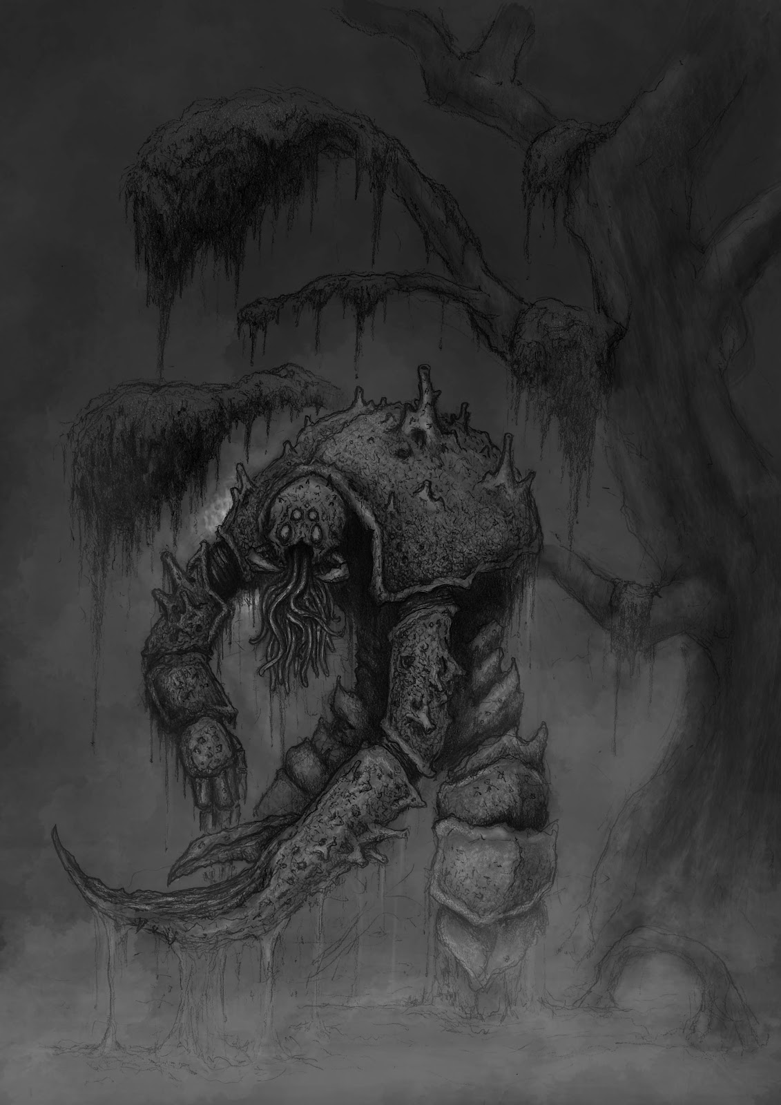
Gareth Wild, Zoombified Pirate, 2011, digital image
Gareth Wild, Large Crustacean, 2011, digital image
From a personal standpoint there seem to be three ways that digital artists have morphed conventional principles of image making. The first is that the notion of a light source illuminating the portrayed subject from the top-front-left is changing to a system of immersive lighting where the effects of light are not so much “on” the surface of the subject but is within the portrayed subject. An example of this phenomenon is a painting by one of my first-year students, Sue Foster, who began her painting of a still life (shown below) as a watercolour and then “worked” on it digitally to refine the principles addressed in the class. Beyond the scattering of light, note also how Sue’s compositional arrangement echoes Gareth’s reflections on his approach discussed above.

Sue Foster, Watercolour—Fruit, 2012 
digitally manipulated watercolour
The second way is to do with colour. In analogue paintings (i.e. paintings made using traditional materials) artists have the resources to make subtle adjustments to colour by applying a layering of glazes to produce an amalgam of tone, chroma, opacity, sheen and surface facture that—arguably—cannot be duplicated with screen colours (RGB) or with the colours of the print industry (Pentone spot colours and CMYK). This in itself is not a problem as a very close approximation of colour can be achieved but this screen colour approximation may lead to a fresh way of seeing imagery. By this I mean that there is a conceptual leap from Arthur C Danto’s notion of an audience’s engagement with the imagery of Giotto, Leonardo and Raphael “like a disembodied eye” (1990, p. 186) to the potential of viewer’s interactive and immersive presence in digital imagery.

The third way is best described as the male vision of the hunter and gatherer where focus is literally targeted on the central area of the image. This pattern of where a viewer’s gaze rests returns us to the conundrum faced by the Facebook advertisers: digital viewers are not looking at the periphery of their field of view.

_____________________
Danto, Arthur C 1990, Encounters and Reflections. Toronto, Harper & Collins