Showing posts with label Venne (Adriaen van der). Show all posts

Tuesday, 26 May 2020

Swelinck’s engraving, “Sibe Nequam Cui Bonus?”, 1712


Jan Gerritsz Swelinck (1601–c.1649) after the design by Adriaen van der Venne (aka Adriaen Pietersz. van de Venne) (1589–1662)

“Sibe Nequam Cui Bonus?” (“Who is hurtful to himself, benefits no one”; “To whom is one good who is bad for himself?”; “He is a fool that forgets himself”—an old English proverb (c.1270) revived in Chaucer’s “Troylus”: “He is a fool that wol for-yete himselve” [1611]), 1712 (note that there are earlier versions of this design), plate XXXIV (34) in Jacob Cats’ (1577–1660)—known with respect and affection as “Father Cats”—1712 edition of “Alle de Wercken van den heere Jacob Cats …” (Complete Works of Jacob Cats) (aka “Alle de wercken van den Heere Jacob Cats. De laatste druck: war in het Twee-entachtig jaarig leeven des dichters, beneffens desselfs slaapeloose nachten, met printverbeeldingen sijn verrijkt”), published in Amsterdam by J. Ratelband, p. 68.

The publication (“Alle de Wercken van den heere Jacob Cats …”) in which this print features may be viewed online or downloaded free-of-charge from archive.org (this print features in the text on page 68 and online on page 98):

My understanding of this proverb (“Sibe Nequam Cui Bonus?”)—which may be far from the intended meaning—is that one should not place oneself in unnecessary danger as the outcome is not helpful to anyone, but rather one should enjoy life and let your pleasure spread to others. Regarding the image of the small bird within the jaws of a crocodile, the composition may be understood in terms of the following crude translation from a similar emblem print: “Do as the pretty bird that satisfies its fill on the banks of Nile without offering service to the Crocodile.” (My apologies to those who know the true meaning.)

Engraving on heavy laid paper with letterpress text recto and verso in Dutch, Latin and French and full margins as published.
Size: (sheet) 45.6 x 27.8 cm; (plate) 12.5 x 12.5 cm; (image borderline) 12.1 x 12.1 cm.
Numbered and lettered above the plate: (left) "68"; (centre) “SIBE NEQUAM CUI BONUS?/ XXXIV.”
Lettered in two columns below the plate (and verso) in lines of Dutch, Latin and French.

A brief description of this print is offered by the New York Public Library (digital collection):

Condition: full page (as published) in pristine condition apart from several printer’s creases created in the printing process.

I am selling this magnificent, museum-quality leaf for the total cost of AU$197 (currently US$131.06/EUR119.50/GBP106.35 at the time of this listing) including postage and handling to anywhere in the world.

If you are interested in purchasing this superb engraving of the highest quality on the huge, double-sided, lettered sheet as published, please contact me (oz_jim@printsandprinciples.com) and I will send you a PayPal invoice to make the payment easy.


Saturday, 1 September 2018

A double-sided pair of engravings, 1627/59, designed by Adriaen van der Venne as illustrations to Jacob Cat’s proverbs


Designed by Adriaen van der Venne (1589–1662)

(Recto: page 135) Plate XXVII “Niet en kander beter passen, als dat t’samen is gewassen” (Nothing fits better, than what grew together), 1627/59

(Verso: page 136) Plate XXIX: “Non te quæsiveris extra” (Do not seek for things outside of yourself), 1627/59

Illustrations to Jacob Cats’ (1577–1660) (known with respect and affection as “Father Cats”) “Proteus”, first published in 1618, and “Sinne- en minnebeelden” (“Portraits of morality and love” or “Images of mind and memory”), first published in 1627. This engraving is from the 1659 edition of “Alle de Wercken van den heere Jacob Cats …” (Complete Works of Jacob Cats), pages 135 (recto) and 136 (verso), with reversed images rendered with finer engraved craftsmanship than the first editions and with engraved illustrations and printed text on both sides (as published).

Double sided letterpress printed page with an engraving recto and verso on laid paper.
Size: (sheet) 37.9 x 21.7 cm; (recto plate) 12.5 x 12.1 cm; (image borderline) 12.1 x 12 cm
Condition: faultless impressions in pristine condition.

I am selling this magnificent, museum-quality leaf for the total cost of AU$187 (currently US$134.55/EUR115.93/GBP103.84 at the time of this listing) including postage and handling to anywhere in the world (but not, of course, any import duties/taxes imposed by some countries).

If you are interested in purchasing these double-sided engravings of the highest quality, please contact me (oz_jim@printsandprinciples.com) and I will send you a PayPal invoice to make the payment easy.

This print has been sold


I suspect that the expressed meaning to the recto engraved illustration, “Niet en kander beter passen, als dat t’samen is gewassen” (i.e. Nothing fits better, than what grew together), may be self-explanatory. After all the hands protruding from the clouds hold two shells of a walnut that clearly do not “fit” together. The inference, however, is not about walnuts but rather about love, in the sense that lovers that spend time together—perhaps even “wassen” (wash) together to conserve water—are perfectly matched for life.

Of course what may seem self-explanatory proverb to one viewer may not be understood the same way by the next viewer and Jacob Cats (affectionately known as “Father Cats” even though he was a grumpy chap) was well aware of this and so he footnoted his illustrated proverbs with (according to the Editors of “Encyclopaedia Britannica”) “text in Dutch, Latin, and French” offering “a threefold interpretation, expressing what were for Cats the three elements of human life: love, society, and religion” (https://www.britannica.com/biography/Jacob-Cats#ref49086)

After having written this rather brief explanation of what I thought was an engraving projecting a “self explanatory” meaning, I read another print dealer’s explanation of what is portrayed which shows that nothing can ever be straight forward:
“This plate #28 [sic] shows someone trying two fit two different shell halfs [sic] to make a whole one. The meaning of this emblem is that the first love in a person's life is to be cherished and even after two or more marriages the first is always special.” (https://www.amazon.com/Antique-Print-SHELL-LOVE-MARRIAGE-Venne-Cats-1655/dp/B00DJSQF3Q). Wow! I guess that I didn’t understand the meaning at all!


Tuesday, 14 August 2018

Emblem illustration to Jacob Cats’ proverb, “Sensim amor sensus occupat” (Slowly sense of love takes over), 1627/59


Circle of Abraham Bloemaert (1564–1651) and Adriaen van der Venne (1589–1662)

“Sensim amor sensus occupat” (Slowly sense of love takes over), 1627/59, illustration to Jacob Cats’ (1577–1660) (known with respect and affection as “Father Cats”) “Proteus”, first published in 1618, and “Sinne- en minnebeelden” (Images of mind and memory), first published in 1627. This engraving is from the 1659 edition of “Alle de Wercken van den heere Jacob Cats …” (Complete Works of Jacob Cats), pages 11–12, with reversed image rendered with finer engraved craftsmanship than the first editions and with printed text on both sides (as published).

Engraving on fine laid paper with letterpress text recto and verso.
Size: (sheet) 35.5 x 20.9 cm; (plate) 12.3 x 12.8 cm; (image borderline) 12 x 12 cm

Inscribed on plate within the image borderline: (on tree trunk) “Crescent illæ / crescetis amores” (They grow love); (on pumpkin/marrow) “Phyllida amo / ante alias.” (Phyllida I love / before alias.)
Numbered and lettered above the plate: (left) "12"; (centre) “SENSIM AMOR SENSUS OCCUPAT. / VI.”
Lettered in two columns below the plate: “’tNeemt toe, men weet niet hoe. …” ("It's important, people do not know how. …)

Condition: faultless impression in pristine condition.

I am selling this magnificent, museum-quality leaf for the total cost of AU$187 (currently US$135.82/EUR119.16/GBP106.36 at the time of this listing) including postage and handling to anywhere in the world.

If you are interested in purchasing this superb engraving of the highest quality, please contact me (oz_jim@printsandprinciples.com) and I will send you a PayPal invoice to make the payment easy.


                                                   This print has been sold


My interest in the emblem prints associated with Jacob Cats—affectionately called “Father Cats” by the Dutch—is a sad story. What happened is that a couple of years ago I set out on a personal mission to visit the rather small church named, Kloosterkerk, in The Hague (Belgium), where Jacob Cats is supposed to be buried. The reason that my story is sad is not that I failed to find his burial site in the church, but that when I asked a very helpful church attendant where the great writer was buried I was first asked where I was from and on replying, “Australia”, I was then quizzed as to why any Australian would have an interest in the great writer … to which I answered with eyes bulging and truly shocked that "ALL Australians know about Father Cats as his proverbs are EVERYWHERE!" Mmm … a little bit of a stretched truth but I did discover that what remains of marvellous Jacob Cats is only a commemorative plaque on a column. Now that is VERY sad!
My understanding of this illustration and the accompanying text on the page is a synthesis of commentary explanations offered by the “Emblem Project Utrecht” (http://emblems.let.uu.nl/c162706.html#tr) and from tonight’s after-dinner conversation with our family polymath. The short version is that image shows the memory of a chap (hence the clouds around his hand) cutting the name of his lover, Phyllis (Phyllida)—the Greek name for leafy foliage or green bough—into the trunk of a lime tree. Over time the lover sees that his carved lady-love’s name grows in size as the tree “heals” itself in a similar way that his love has also grown. Interestingly, the growth of such an inscription on a tree does not “grow” higher but rather grows wider following the radial expansion of the trunk.

I should mention at this point that there are significant additional meanings, such as the moral imperative to parents to ensure that their vices are not introduced to their children or the vices will grow like the proverbial marks on trees shown here.


Sunday, 27 April 2014

Trees as Metaphors (Part 4)

There is a long history of trees symbolising attributes such as strength, resilience and the essence of nature, but how have trees been used metaphorically in images (i.e. used pictorially to “explain” ideas)?


For this final discussion about artists’ use of trees to communicate ideas I wish to focus on the curiously enigmatic meanings of trees often featured in early emblem prints, such as Otto van Veen’s (c.1556–1629) Bene qui latuit bene vixit (shown below). Rather than attempting to interpret a specific meaning for the artists’ use of trees in these prints, all the signifying elements need to be read in relation to one another along with meanings that may be projected by the title.

For instance, the title of van Veen’s print is Ovid’s well-know adage from Tristitia: “He who has kept himself well hidden has lived well.” In the time of van Veen, however, it had been embodied by John Owen (1612) to: "Si bene qui latuit, bene vixit, tu bene vivis: Ingeniumque tuum grande latendo patet." ["Thou livest well if one well hid well lives, and thy great genius in being concealed is revealed"] (see William T. Smedley’s [1912] The Mystery of Francis Bacon
https://archive.org/stream/mysteryoffrancis00smed/mysteryoffrancis00smed_djvu.txt [viewed 15 April 2014]). When the meaning of this text is understood in this context, van Veen’s use of trees and other featured symbols can be synthesised into a full visual metaphor that explains the important moral lesson—in my words: if you live your life without attracting attention to yourself you will experience a good life and your efforts will be recognised. In terms of the portrayed trees on the upper-right of the image, I perceive that the meaning of the text is captured metaphorically by the broken tree concealed within the grove that the broken tree lives on even though a part of it is dead: the moral themes of vanitas  and memento mori reminding the view of the inevitability of death (see http://en.wikipedia.org/wiki/Vanitas and http://en.wikipedia.org/wiki/Memento_mori [viewed 15 April 2014]). Essentially, van Veen’s use of trees should not be viewed out of context with the other portrayed features in the print or the meaning will be lost and the depicted trees will be nothing more than trees in a scene.

Otto van Veen (also known as Otto Venius or Octavius Vaenius) (c.1556–1629)
Bene qui latuit bene vixit, 1683
Published (1683) in Zinnebeelden uit Horatius Flaccus 
[Emblems of Horatius Flaccus], pp. 91–2.
Engraving on fine wove paper with 2.4 cm chainlines
(leaf) 18 x 15 cm; (plate) 12.2 x 9.5 cm
See this book online and download it from archive.org:

Condition: Strong and well-inked impression on whole leaf printed on both sides with minor signs of use and toning appropriate to the age of the print (1683).


The origin of  what are termed “emblem prints” lies with the early alchemists and their quest for the legendary Philosopher’s Stone—an agent that could turn lead and other base metals (i.e. those that oxidise/corrode like iron and copper) into gold or silver, as well as being an elixir of life. According to Stanislas Klossowski de Rola (1988) in his fascinating book, The Golden Game: Alchemical Engravings of the Seventeenth Century, the alchemists revered Egypt as they believed that in Egypt “the gods  revealed their wisdom in visions to the ancient sages, who consigned it to the mysterious pictures which they called hieroglyphs—sacred signs” (p. 8). De Rola explains that the ancient Greeks had the misconception that “hieroglyphs bore no relation to ordinary language but were the pictorial and allegorical expression of sacred knowledge” (p. 9). This misconception is of pivotal importance in the development of emblem prints as outlined succinctly in the Emblem Books webpage, http://www.netnik.com/emblemata/ (viewed 3 April 2014):
In 1419, a monk discovered a manuscript from the fifth century known as the "Hieroglyphica" of Horus Apollo or Horapollo on the Greek island of Andros. It was alleged to be a Greek translation of an Egyptian work which explained the hidden meaning of Egyptian hieroglyphs. It stirred up great interest among the learned when it arrived in Florence in 1422. Although much of the information in this work was later proved false, it none the less had a great impact on Renaissance thought and in fact was one of the inspirations for the Emblem books.
To illustrate the impact that the discovered manuscript had upon image and text during the Renaissance, de Rola offers the following enlightening insight by Marsilio Ficino (1433–99):
Our way of thinking about ‘time’ is complex and shifting. For example, ‘time goes quickly’, ‘time revolves and ends up where it began’, ‘time teaches prudence’, ‘time gives and takes away’. This whole range of thought was comprehended in a single firm figure by the Egyptians when they drew a winged serpent with its tail in its mouth. (de Rola 1988, p. 9)
In short, the concept of emblematic images with its roots in ancient Egyptian prototypes perceived to underpin the text, Hieroglyphica, gave artists an approach to crystallise complex and multilayered ideas into a visual language of a single motif or related motifs that informed viewers could read (i.e. those who had a lexicon of explanations for the motifs used).

From a contentious twenty-first century standpoint, the flourishing of emblem books and prints was driven by the shameful desire by collectors for texts and images that would set the learned few who were able to decipher esoteric information apart from those who did not possess “secret knowledge” and “ancient wisdom.” By this I mean that the emblem images were fashioned to appeal to the intellectual elite. Of course, in today’s world where explanations of symbols and forums to share information are just a mouse click away, there is no room for intellectual snobbery. Consequently, now these intriguing prints and their metaphorical meanings are accessible to everyone. Of course, mystery still surrounds the meanings of many emblem prints and even the vast resources of the internet cannot explain the often strange images with comical titles—from a contemporary viewpoint—such as the following by Albert Flamen (1620–1674/93) (extracted from The Illustrated Bartsch, Volume 6: Commentary [1986]):
  • Caterpillars Dropping on Man Under Tree (Bartsch 0608.418; p. 361);
  • Man Attacked by Ball-Shaped Animal (Bartsch 0608.415; p. 360);
  • Man Surprised by Cone-Shaped Meteor (Bartsch 0608.417; p. 361);
  • Man Astride a Seal in the Sea (Bartsch 0608.413; p. 360);
  • Man Offers Precious Stone to a Serpent (Bartsch 0608.416; p. 360);
  • Two Figures Asleep in Moonlight with Swarming Bees (Bartsch 0608.426; p. 363).

Like all good illustrations designed to communicate an idea, emblem prints capture, in the sense of “freeze framing,” a pivotal point in a narrative or line of thought. Sometimes the choice of this pivotal point may be so important that it even becomes an element in a game, as is the case with the large composite print by Henri Abraham Chatelain (1684–1743), Carte Pour a l’ Intelligence De La Fable et Servir De Secours a la Connoissance de l’ Histoire (shown below). In this print, the pivotal point in Ovid’s allegories are pictorially captured in image cells used as memory aids for recalling the myths in the context of a test; a type of print known as a “catchpenny-print.” For example, the myth of Apollo and Daphne is crystallised at the moment of Daphne’s metamorphosis into a tree to escape the ardent pursuit of love-struck Apollo (see detail further below and for an account of the myth: http://en.wikipedia.org/wiki/Apollo_and_Daphne [viewed 23 April 2014]).

Henri Abraham Chatelain (1684–1743)
Carte Pour a l’ Intelligence De La Fable et Servir De Secours a la Connoissance de l’ Histoire, 1722
Published in the encyclopaedic seven volume 'Atlas Historique'. Koeman II p. 33; Shirley 'Atlases in the BL' T.Chat-1a; Van Waning 'Chatelain's Atlas Historique' in IMCoS Journal 120 pp. 7-15. (see http://bookbase.com/antiquemap/only/caburden/search/result?submit=Open+Page&page=20&dealerId=1010&upStart=0&upEnd=9223372036854775807&length=20 and http://www.maphist.com/artman/publish/article_187.shtml [viewed 16 April 2014])
Engraving on laid paper with 2.8 cm chainlines
(sheet) 51.3 x 60.5 cm; (plate) 59.8 x 49.5 cm
See description of this print at:
http://ovid.lib.virginia.edu/mythcards.html and view details of each of the emblems by either clicking the directional figures or the page tabs: http://ovid.lib.virginia.edu/cpc/0001.html [viewed 16 April 2014]).
Condition: Excellent impression of this rare and large print with its margins as published. The sheet is in fair condition with backed-up holes and losses (i.e. imperfections have been restored). I am selling this engraving for a total cost (including shipping to anywhere in the world) [deleted]. As the print is a large size it will be rolled in a tube for shipping. Please contact me using the email link at the top of the page if you have any questions.

This print has been sold


This principle of choosing a pivotal point in a narrative or line of thought is all about synthesising critical information in a timeless moment rather than a split-second temporal moment. Or, to express this from a different perspective, like all the principles underpinning emblem prints, the key aim is to present essential visual information in a formal way wherein notions of time are inconsequential and the calculated juxtaposition of symbols and motifs alone project meaning. For instance, in the image shown above of poor Daphne turning into a tree, the essential visual information is the depiction of Daphne as part lady and part tree. Moreover, the way that Chatelain portrays her presence, Daphne is in a timeless state: pictorially frozen in an everlasting state of being morphed. Chatelain also contextualises Daphne’s everlasting moment as a happy state for her in that the figures surrounding her are engaged in music making and dance.

Regarding three other principles underpinning emblem prints—viz. visual dialogue, spatial flattening and foregrounding of imagery—I wish to explain them with reference to some of the emblem prints taken from Jacob Cats’ (1577–1660) famous book, Alle de Wercken van den heere Jacob Cats … [Complete Works of Jacob Cats] illustrated by Adriaen van der Venne (1589–1662). (To view this book online or to download a pdf copy of it, see archive.org: https://archive.org/details/alledewerckensoo00cats [viewed 23 April 2014].)

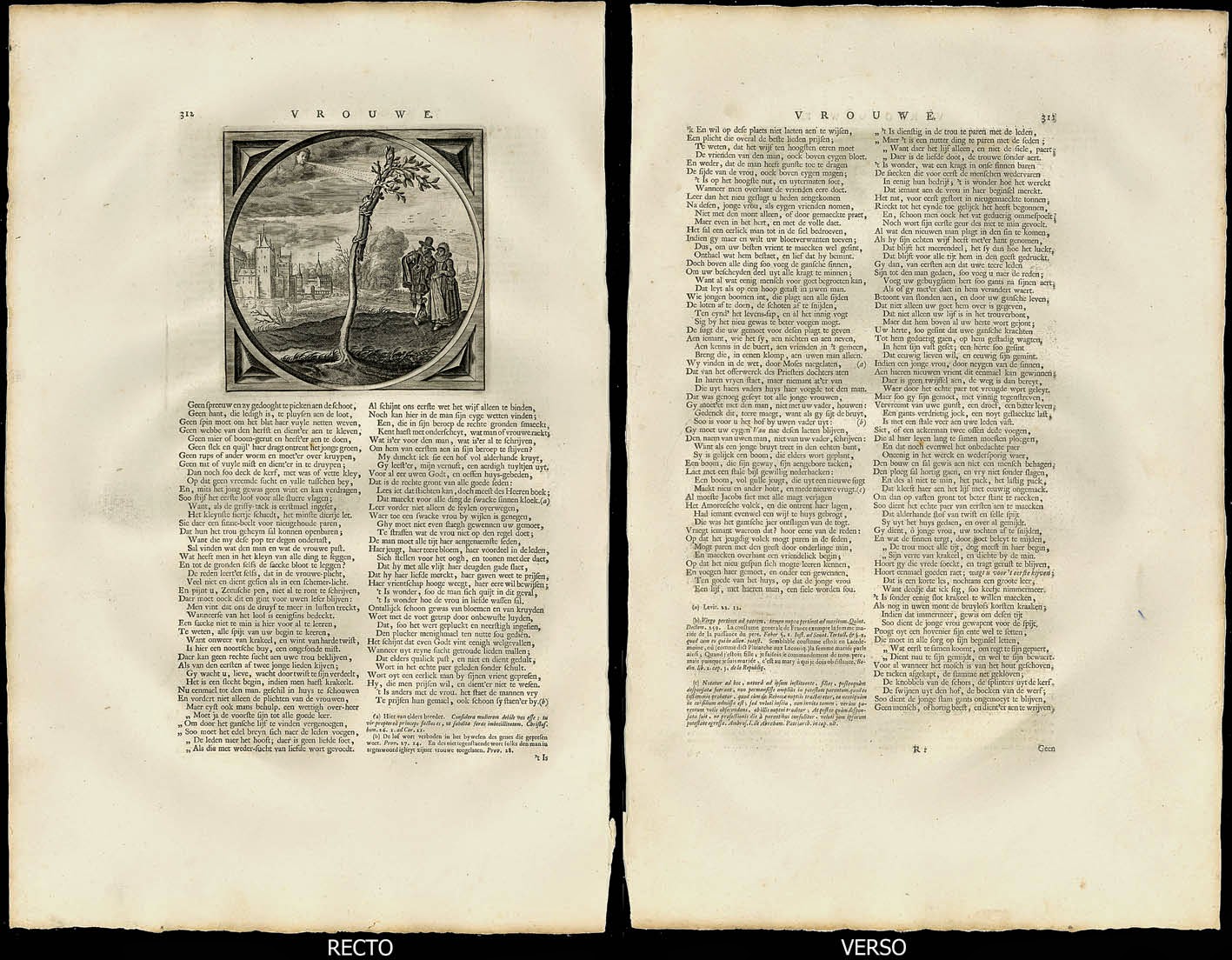
A fine illustration of the principle, visual dialogue—a principle discussed in the earlier post, 3 Key Principles: Goltzius & Piranesi (http://www.printsandprinciples.com/2012/05/goltzius-piranesi-3-key-principles.html)—can be seen in van der Venne’s engraving, Vrouwe (shown below), printed in a leaf from Cat’s Alle de Wercken van den heere Jacob Cats … . The visual dialogue here is between a tree trunk with a grafted section of another tree and a married couple approaching the grafted tree.

Jacob Cats (1577–1660) (known with respect and affection as “Father Cats”)
Designed/Engraved by Adriaen van der Venne (1589–1662)
Vrouwe [Lady] An emblem print comparing a married couple to a grafted tree.
From Alle de Wercken van den heere Jacob Cats[Complete Works of Jacob Cats] for full title see http://www.cyclopaedia.org/1726cats/1726cats.html, 1655
This engraved leaf is from the 1659 edition.
Engraving on full sheet of laid paper (2.8 cm chainlines) printed on both sides as published.
(sheet) 45.5 x 29.3 cm; (plate) 13.4 x 13.2 cm
Condition: Superb impression of this early print with its margins as published in near pristine condition. The sheet has wrinkling from the printing process and there is faint age toning at the extreme edges. 


When viewed in the context of an emblem print, the relationship between the grafted tree and the approaching couple may be read as a simple comparison between a symbiotic union of two trees grafted together with the similar union of a couple in love. As with most emblem prints, of course, the imagery may be read with more profound meanings such as proposed by the website, The Prints Collector (http://www.theprintscollector.com/):
This plate shows a married couple and a young tree inoculated on an old stem strengthened from the wind by a branch attached to it. The meaning of this emblem is that marriage creates the bond to make man and wife stronger. (http://www.theprintscollector.com/Article/Antique-Satire-Print-TREE-COUPLE-INOCULATION-Cats-1655 [viewed 23 April 2014])
Going further with additional readings, I see the “old stem” as the masculine element in the grafted trees and that it supports the well-foliaged “branch” which is the female element in the union. My perception of gender roles is not arbitrary. Instead it is the result of seeing the man on the left side of the lady and finding visual correspondence with the “old stem” on the left side of the “branch.” This reading also has cultural resonance as the arrangement matches the Western tradition of showing men on the left of women, such as shown in Albrecht Dürer’s Adam and Eve (see http://commons.wikimedia.org/wiki/File:Adam_Eva,_Durer,_1504.jpg) and Jan van Eyck’s  Portrait of Giovanni Arnolfini and his Wife (see http://en.wikipedia.org/wiki/File:Van_Eyck_-_Arnolfini_Portrait.jpg).

To illustrate the principle of spatial flattening (i.e. pictorially squashing the illusion of space in an image so that there is little depth), the engraving, Repete (shown below), displays Adriaen van der Venne’s treatment very well. Certainly the illusion of shallow space is helped by the simplicity of his compositional arrangement: a woodpecker perched in a tree with a view of open sky beyond. On close inspection of his way of rendering the foliage as shown in the detail further below, van der Venne employs a play of deep shadows and highlights to present the leaves as if they were in the shallow space of a bas relief. Note also that the tree limbs share in this compression in the sense that none of the limbs advance or recede in a fully three-dimensional way.

Jacob Cats (1577–1660)
Designed by Adriaen van der Venne (1589–1662)
Engraved by Jan Gerrits Swelinck (1601–1699)
Repete [Repeat (?)]. This emblem print references proverbs such as “Rome wasn’t built in a day” in relation to the slow endeavours of a woodpecker trying to make an impression on an oak tree. This personal interpretation is based on the couplet inscribed beneath the print:
Gheen boom en wast op eenen dagh,
Gheen boom en valt ten eersten slagh. 

[No tree falls at one blow, we say,
Nor city was built in one day.]  


From Proteus, 1618 and Sinne- en minnebeelden, 1627 (see text from this page: http://emblems.let.uu.nl/catsretorica/html/c162707.html [viewed 24 April 2014]) and Alle de Wercken van den heere Jacob Cats … [Complete Works of Jacob Cats], 1655,
This engraved leaf is from the 1659 edition. Note that in some editions the plate has been is cut in reverse (i.e. the image is mirrored).
Engraving on full sheet of laid paper (2.8 cm chainlines) printed on both sides as published
(sheet) 45.6 x 28.8 cm; (plate) 12.6 x 12.6 cm
Below the print, the following text is written in Dutch (see English translation further below):
Soo haest ick my bevont in Venus net ghevanghen,
Seyd’ ick het Rosemont. Waer toe veel kromme gangen?
En siet! My docht terstont de vryster was ghereet;
Maer op soo mallen waen ontfingh ick dit bescheet:
De Specht, het grillich dier, die pickt in alle boomen,
Maer wat de geck begint, ten zijn maer rechte droomen;
Hy meynt, daer is een gat: maer t’hout is al te dick:
O vrient, een eyken boom vereyst al harder pick.


[No sooner was dame Venus yoke about my neck but I
Did grapple with my love forthwith: what need I then to lye.
I thought, that at that instant shee for mee had bene preparde;
But ere I went from her, I gott this lesson to regarde,
The Spitt pickt at the Oaken tree, but saw it no whit mooved.
Yet neverthelesse shee stood and gaept and never once more prooved,
But thought sh'had pickt it through, no foole, I say doe not mistake
For one pick by a folish byrde in th'Oake no hole can make.]

Condition: Superb impression of this early print with its margins as published in near pristine condition. The sheet has wrinkling from the printing process and there is faint age toning at the extreme edges.


The principle of flattening the illusion of space is linked closely to the third principle that I wish to discuss: foregrounding of imagery. I mention this in the sense that by compressing the key features of an emblem print within the shallow confines of the foreground, a viewer’s attention is focused on the relationships between the critical features. In the engraving, Sufficit Una (shown below), for example, a viewer would have difficulty in ignoring the activity on the left-side of the image involving a cloud-borne hand slicing into a tree with a grafting knife. After this visually arresting initial reading, however, a viewer is then able to freely contemplate the distant landscape features on the right side of the image. This arrangement of foregrounding the key features gives emblem prints visual impact for their didactic role; namely, a web of symbols designed to communicate moral truths, virtues and wisdom.


Jacob Cats (1577–1660)
Designed/Engraved by Adriaen van der Venne (1589–1662)
Sufficit Una [One Suffices]. This emblem print references proverbs such as “Enough is as good as a feast”.
From Emblemata Moralia et Oeconomica [Moral and Domestic Emblems], 1627, in Alle de Wercken van den heere Jacob Cats … [Complete Works of Jacob Cats], 1655, p. 152 (https://archive.org/details/alledewerckensoo00cats [viewed 23 April 2014]).
This engraved leaf is from the 1659 edition.
Engraving on full sheet of laid paper (2.8 cm chainlines) printed on both sides as published
(sheet) 45.8 x 28.8 cm; (plate) 12.5 x 12.7 cm

Condition: Superb impression of this early print with its margins as published in near pristine condition. The sheet has wrinkling from the printing process and there is faint age toning at the extreme edges. There is also a small dark dot imperfection in the paper to the left of the image and the left and right edges of the sheet have irregularities: the lower-left corner is missing and the right edge has been trimmed unevenly. 


Although many of the early emblem prints and books were designed to appeal to an audience of the privileged few who were able to decipher meanings from esoteric symbols, this was not the case with Jacob Cats. He earned his affectionate title of “Father Cats” because his books were accessible in terms of being decipherable to general readers of the time and because the images in his books were engaging to look at and projected meaningful content that we now call euphemistically: home truths. In fact, the impact of Cats’ emblem books was so profound in the Netherlands that Marijke Spies (1999) in Rhetoric, Rhetoricians and Poets: Studies in Renaissance Poetry and Poetics proposes that with regard to Cats “in his endless verses [that] propagated the characteristics, virtues, and duties of the Dutch burgher housewife … No books, apart from the Bible, were so widely read—and listened to when read—as his” (Spies 1999, p. 120).