Showing posts with label Orley II (Richard van). Show all posts

Thursday, 23 April 2026

Richard van Orley II, “Wedding of Amaryllis and Mirtillo”, c. 1700

Richard van Orley II (1663–1732)

“Wedding of Amaryllis and Mirtillo” (or “Huwelijk van Amaryllis en Mirtillo”), c. 1700 (c. 1695–1705)

Technical Details & Condition:

Etching with engraving on fine laid paper, trimmed with a thread margin around the image borderline on the top and sides, but retaining the writing edge. The sheet has been professionally supported on washi paper, providing wide margins. It is the second plate in a series of 12 prints titled Il Pastor Fido, illustrating scenes from Giovanni Battista Guarini’s play Il Pastor Fido (c. 1584). 

This particular print depicts the ninth scene of the fifth act, where the priest Montanus blesses the marriage of Amaryllis and Mirtillo in front of a circular temple dedicated to Diana. The impression is strong, crisp, and well-printed, showing no signs of wear to the printing plate—evidence that it is a lifetime impression, with guide lines for the lettering still visible. The sheet is in excellent condition, free of tears, holes, folds, abrasions, or significant stains. 

Dimensions:

• Sheet: 25.7 x 19.1 cm
• Image Borderline: 24.7 x 19 cm

In-Plate Numbering:

• Lower left: “R.V. Orleÿ fecit.”

References:

• Jacobs G15 (Alain Jacobs, Richard van Orley [Brussels 1663–Brussels 1732]), 2003, Brussels, Royal Library of Belgium, pp. 96–103, cat. nos. 66–78 [G4–G15])
• Hollstein Dutch 48–59 (FWH Hollstein, Dutch and Flemish etchings, engravings and woodcuts ca. 1450-1700, Amsterdam, Menno Hertzberger, p. 192, cat. nos. 48–59)
• Rijksmuseum: https://id.rijksmuseum.nl/200239334

Price & Shipping:

AU$302 (approximately US$216.01 / €184.47 / £160.09), including worldwide express shipping. Import duties (if any) are the buyer’s responsibility.

If you’re interested in acquiring this lively scene, which captures the transition from late 17th-century Baroque to 18th-century Classicism—note the dynamic chain-like rhythms connecting the figures, the dramatic lighting (highlighting that the scene is staged), and the classical setting—please contact me at oz_jim@printsandprinciples.com. I will be happy to provide a PayPal invoice for a smooth and secure transaction.

This print has been sold 


Saturday, 15 January 2022

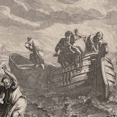
Richard van Orley’s etching with engraving, “Christ and St Peter Walking on the Water”, c1685

Richard van Orley (1663–1732)

“Christ and St Peter Walking on the Water” (aka “Christ walks on water”; “Christus loopt over het water”), c1685, after the design by Jan van Orley (1665–1735) from the series of twenty-eight prints made by the brothers, Richard and Jan van Orley, “Scenes from the New Testament” (aka “Scènes uit het Nieuwe Testament”). Regarding the series in which this print features, the Rijksmuseum advises that originally “the series would consist of 32 prints; therefore numbers from 1–32 may appear below the prints (see inv. no. RP-P-OB-24.326).

Etching and engraving on laid paper, trimmed with a narrow margin around the image borderline and the text lines and backed with a support sheet.

Size: (sheet) 21.1 x 25.4 cm; (image borderline) 19.4 x 25 cm.

Numbered and lettered in plate below the image borderline: (left) 27/ J.v. orley inventor”; “Domine Salvum me fac, et Continuo Jesus extendens Manum aprehendit eum Math: 14” [(transl.) Lord, save me, and immediately Jesus stretching out his hand takes hold of him (Mathew: 14)]; (right) R.v. orley fecit”.

Hollstein 3–30 (FWH Hollstein 1956, “Dutch and Flemish Etchings, Engravings and Woodcuts ca. 1450–1700: Meer–Ossenbeeck”, vol. 14, Amsterdam, Menno Hertzberger, p. 191, cat. no. 3–30); Jacobs G49 (Alain Jacobs 2003, “Richard van Orley [Brussel 1663–Brussel 1732]”, exhib. cat., Brussel, Koninklijke Bibliotheek van België, pp. 60–67, cat. no. 35 [G49]).

The Rijksmuseum and the British Museum offer the following descriptions of this print: “The apostles' boat has come into a great storm, and Christ is coming to help them. He walks with Peter on the water. Peter is afraid and clings to Christ's hand. Below the image a Latin verse from Math. 14.” (http://hdl.handle.net/10934/RM0001.COLLECT.159749); “Christ and St Peter walking on the water; Christ at left pulls St Peter by the arm, St Peter's arms are raised, one fisherman on a boat at right, mountains and a castle in the left background
Etching and engraving” (
https://www.britishmuseum.org/collection/object/P_1868-0612-380).

Note that the British Museum holds a cut fragment of this etching rather than the whole image and the Rijksmuseum holds the whole print.

Condition: a well-printed early impression (based on the scratch guidelines for the inscribed text being visible and have not worn away as would be the case with later impressions), trimmed within the platemark on the top and sides and laid upon an archival support sheet of millennium quality washi paper. Beyond minor age toning, the sheet is in very good condition with no tears (?), holes, folds, abrasions, significant stains or foxing.

I am selling this rare and very beautiful etching (with engraving) showing Jesus walking on the sea with the faith-challenged St Peter—note how St Peter’s left foot is slightly submerged in the water as Jesus pulls him to the surface and the very subtle suggestion of a halo around Jesus’ head—for the total cost of AU$286 (currently US$206.22/EUR180.64/GBP150.75 at the time of posting this listing) including postage and handling to anywhere in the world, but not (of course) any import duties/taxes imposed by some countries.

If you are interested in purchasing this amazing etching capturing a scene of turbulent water, sparkling light and drama, please contact me (oz_jim@printsandprinciples.com) and I will send you a PayPal invoice to make the payment easy.

This print has been sold 


Friday, 1 May 2020

Richard van Orley II’s etching, “Resurrection of Lazarus”, c.1685


Richard van Orley II (1663-1732)

“Resurrection of Lazarus” (aka “Revival of Lazarus”; “Lazaré veni foras, et statim prodiit qui fuerat Mortuus” [title on plate]), c.1685 (before 1700), after the intermediary design of Richard van Orley’s brother, Jan van Orley (1665–1735), from the series of twenty-eight plates, “New Testament Scenes”.

Etching and engraving on laid paper trimmed unevenly around the image borderline and backed with a support sheet.
Size: (sheet) 20.5 x 26 cm; (image borderline) 19.2 x 24.6 cm.
Inscribed on plate below the image borderline: (left) “J. v. Orley in.”; (centre) “Lazaré veni foras, et statim prodiit qui fuerat Mortuus. Joan. Cap. 11”; (right) “R.v.Orley fecit”.
Lifetime impression before numbering for publication. Note that there are two numbered states prepared for different editions of this print: numbered “28” on the lower left and number “20” on the lower right.

Hollstein Dutch 3-30 (F.W.H. Hollstein 1956, “Dutch and Flemish Etchings, Engravings and Woodcuts 1450–1700: Meer–Ossenbeeck”, vol. 14, Amsterdam, Menno Hertzberger, p. 191, cat. no. 3-30); Jacobs G47 (Alain Jacobs 2003, “Richard van Orley (Brussels 1663–Brussels 1732], [exh. cat.], Brussels, Royal Library of Belgium, p. 60–67, cat. no. 33 [G47]).

The Rijksmuseum offers the following description of this print:
(Transl.) “A large crowd of people is standing around the grave of Lazarus in a cave. Christ stands before the tomb of Lazarus and helps him out of his gravestone. Below the picture a Latin verse from Joh. 11”

Condition: Good impression with the lower right showing signs of overwiping and with replenished lines of printer’s creases, trimmed with a small margin around the image borderline and laid upon a support sheet of archival (millennium quality) washi paper. The sheet is in a good condition for its considerable age, but with restoration to the chipped lower right edge of the margin.

I am selling this visually arresting etching with theatrically dramatic contrasts of light and dark, for the total cost of AU$242 (currently US$155.44/EUR141.53/GBP124.41 at the time of this listing) including postage and handling to anywhere in the world (but not, of course, any import duties/taxes imposed by some countries).

If you are interested in purchasing this etching from the late 1600s illustrating the startling moment when Christ commands the body of Lazarus to come back to life after four days of entombment (see Gospel of John [11:18; 30; 32; 38]), please contact me (oz_jim@printsandprinciples.com) and I will send you a PayPal invoice to make the payment easy.


Sunday, 30 September 2012

Drawing corners: Pymble, Orley & Swanevelt


What are some of the principles guiding artists when they portray corners?

One of my first year illustration students, Michelle Pymble, executed a drawing of a ram’s skull recently (see drawing below) and her sensitive treatment of the closer horn prompted this discussion. Michelle’s clear interest in showing the texture and angled contours of this spiralling horn (see detail of the drawing further below), especially her considered use of tone to differentiate its top and side planes, is a fine example of the inherent layering of pictorial conventions underpinning how artists portray corners. This notion that such a layering exists may at first seem unlikely; after all, how difficult can the shading of a corner be? For instance, I can conceive that one may think that the exercise is as easy as portraying the lit side of a corner in light tones and the shadow side of a corner in dark tones. This may be superficially true, but there are so many subtle principles relating to corners to be taken into account that they turn what may otherwise be a fairly straight forward account into a complex one. To simplify the explanation, I have narrowed the focus of the discussion to only five of these principles:
1. the Western lighting convention (i.e. lighting a subject from the top-front-left so that an Occidental reader can perceive form readily);
2. simultaneous contrast (i.e. the optical exaggeration of tonal contrast where the light side of the corner meets the dark side);
3. tonal weighting (i.e. a subtle darkening of tone “down” both the lit and shadow side of the corner and an exaggeration of tonal contrast at the bottom edge of the corner);
4. noetic space (i.e. an abstract representation of spatial depth created by an undrawn, or very pale area, in the background abutting a corner on the shadow side of the subject);
5. exotopic tone (i.e. an area of darker tone in the background abutting a corner on the lit side of the subject).


Michelle Pymble 
(James Cook University first-year Illustration student)
Ram’s Skull, 2012
watercolour and ink
Detail of Michelle Pymble’s Ram’s Skull

Regarding the first principle, the Western lighting convention, this topic is discussed in the earlier posts: Haeckel: 10 rules of composition [Rule #5] and Boisseau, Agar, Wild & Foster: Analogue & Digital Lighting. Rather than revisiting the reason why the convention evolved, I now wish to address how artists have formularised—perhaps subconsciously and arguably because it is logical—the notion that shadowed regions of a subject should be rendered (i.e. shaded) with horizontal lines whereas areas in strong light should be rendered with vertical lines to differentiate them from lines portraying shadow. To show this principle in action I wish to use as an example, Richard van Orley’s (1663–1732) classically inspired etching, Sacrificing Iphigenia to Diana (shown below) featuring a Baroque composition of figures in the forecourt of a domed rotunda. The details of this image that I wish to focus on are the facing corner of the stone slab supporting the sacrificial fire to Diana and the timber framing the fire (see details further below). Here, the artist has rendered the shadow side of the slab and the stacked timber with cross-hatched horizontal strokes while their lit sides are depicted with vertical strokes.
Richard van Orley (1663–1732)
Sacrificing Iphigenia to Diana, c.1700
Etching on laid paper
signed in the lower left margin: “R.V. Orley fecit”
25.2 x 18.3 cm (sheet)
White: 34
Condition: Strong, crisp impression, trimmed with small margins around the image and with lower text area intact. The paper is clean and in very good condition but there are remnants of top hinging (verso) and a small closed tear in the upper right corner (not visible from the front).
I am selling this print for [deleted] including postage and handling to anywhere in the world. Please contact me using the email link at the top of the page if you have any queries or click the “Buy Now” button below.

Detail of van Orley’s Sacrificing Iphigenia to Diana 
showing the Western lighting convention
Detail of van Orley’s Sacrificing Iphigenia to Diana 
showing the Western lighting convention
Detail of van Orley’s Sacrificing Iphigenia to Diana 
showing the Western lighting convention

Beyond differentiating the shadow areas of the subject from those in the light, the use of this convention is also an advantage when portraying the corner of a block where three planes meet; such as the top surface of the slab. In the context of three planes meeting at a corner, the Western convention of aligning marks according to the degree of light falling on them becomes a handy formula. In van Orley’s rendering of the slab, for example, he uses vertically aligned lines for the slab’s lit side (the side facing the viewer), cross-hatched horizontal lines in perspective for the slab’s shadow side (the side leading away from the viewer) and for the top face of the slab he aligns his marks so that they are oriented in a direction opposing the other angles: marks that are parallel to the viewer.

One critical component of the Western lighting convention that van Orley’s print does not exemplify is the principle of lighting the portrayed subject from the top-front-left—the way that Michelle employs in her drawing of the ram’s head. This perceived shortfall in van Orley’s print can be explained simply: the angle of lighting is the outcome of the printing process and the artist chose not to take the mirror reversal produced by the process into account. I am reasonably confident about this as van Orley’s watercolour of the same subject in the Galleria Palantina in Palazzo Pitti, Florence (see http://pictify.com/43330/richard-van-orley-sacrifice-of-iphigenia [viewed 30.9.2012]) shows a top-front-left angle of lighting that matches the Western lighting convention.

With regard to the second principle, simultaneous contrast, this effect is an optical phenomenon observed when looking at a corner lit on one side. What occurs is that the contrast between the two sides exaggerates the degree of contrast in the mind’s eye. The consequence is that the dark side appears to be darker than it is in reality towards the corner edge and the light side appears to be lighter than it actually is as shown in my rendering of a cube below.


Rendering of a cube showing the effect of simultaneous contrast at the front corner 
In the detail of Michelle drawing, for example, Michelle has exaggerated the effect of simultaneous contrast where the strongly lit top plane of the ram’s horn meets the shadowed side plane.

The third principle, tonal weighting, is a subtle device where the artist applies a very gentle tonal gradation (i.e. a transition from light to dark) on all the side surfaces of a form so that both the lit and dark sides are tonally darker towards the ground plane. For instance, in Herman van Swanevelt’s (1603–55) etching, The Cardinal (shown below), the use of this principle is so subtle that it can be easily overlooked—and I suspect that its use by the artist might even have been instinctive rather than by conscious decision. Nevertheless, it may be seen on close examination. In the pair of details shown further below, for example, the shadow side of the building reveals subtle gradations to a darker tone down the wall towards the ground. 


Herman van Swanevelt (1603–55),
Landscape with a Cardinal Reading, c. 1620–55
From a series of twelve landscapes
Etching on laid paper
18.5 x 28.5 cm (sheet)
With text line: “Herman van Swanevelt Inventor fecit” (lower left); a Paris chex Hondhare rue St Jacques” (lower centre); “cum privilegio Regis” (lower right)
Hollistein: 87; Bartsch: 02.83
Condition: very good impression trimmed close to the platemark. Traces of use, otherwise the print is in very good condition.


van Swanevelt’s Landscape with a Cardinal Reading 
showing weighting the subject by tonal gradation.

An even more subtle device linked to the principle of tonal weighting a subject is the use of tonal accents placed at each corner of the subject where it rests on the ground. This device has been discussed in the earlier post, Dujardin: Sheep Legs, with regard to making sheep appear anchored to the ground. In the rendering of the cube for example, the corners resting on the ground are accented by sharp tonal contrast while the remainder of the line delineating the ground line of the cube is blurred so that the cube appears firmly attached to the ground (see annotations on the cube marking these accents and effects of blurring below).

Rendering of a cube showing the effect of weighting a subject with accents at the corners
The fourth principle, noetic space, is discussed in the earlier post, Jacque: Sheep and Shadows but interestingly, this principle is seldom (if at all) addressed in art texts even though it is a convention that most artists employ. To demonstrate how this principle may be used effectively, I have drawn a horizontal line as part of the background behind my rendering of the cube (see below). On the back corner edge of the cube on its lit side (the left side) the horizontal line is portrayed as abutting (i.e. “touching”) the cube. By contrast, on the back corner edge on the shadow side (the right side) the horizontal line is portrayed with a gap of noetic space (i.e. an abstract representation of space embodied in a blank space) where the line does not connect with the cube.

Rendering of a cube showing the effect of using noetic space at the far right corner 
Note also that the use of noetic space in this rendering involves fading out of the immediate surroundings around the far right corner as well as the background line. The history of artists using this principle dates back to the Renaissance and an excellent example of its use can be seen below in the two details of Johannes Sadeler’s (1550–c.1600) Hermit Ciomus, c.1590 discussed in the post, Sadeler: Subject Integration. 

Sadeler’s use of noetic space in Hermit Ciomus, c.1590
In these details can also be see the fifth and final principle that I wish to address, exotopic tone (a term coined by Paul Klee along with “endotopic tone”). As the prefix,”exo,” in name suggests, artists use this tone on the outside of a subject. In the details above, the darkening of the background on the lit side of the building is a fine example of exotopic tone in a print. Its function is to optically illuminate the subject. In the case of the rendering of the cube, this tone also helps to differentiate the far corner of the cube from its background and if I may return to Michelle’s drawing, the exotopic tone applied to the outside of the skull helps to establish the pale tonality of the skull (see detail below).

Detail of Michelle Pymble’s Ram’s Skull
Like all principles there is an element of smudging where the attributes of one principle overlaps the next. This is certainly true of noetic space, exotopic tone and simultaneous contrast but while there are functional similarities each principles is employed for distinctly different purposes: Noetic space is used to spatially separate the subject from its immediate background; exotopic tone is used to accentuate and separate the lit area of a subject from its background; and, simultaneous contrast at corners is used to accentuate the difference between the lit plane of the subject and its adjoining shadowed plane.