Showing posts with label Brown (James). Show all posts

Thursday, 6 August 2026

James Brown, "Renoir's Garden", 2026

James Brown

“Renoir’s Garden”, 2026

Graphite and compressed charcoal on BFK Rives cream wove paper, 76 x 56 cm.

Price & Shipping:

AU$1760 (Approximately US$1238.04 / €1074.25 / £920.26 — subject to daily currency fluctuations), including worldwide express shipping. Import duties and taxes are the buyer’s responsibility.

If you’re interested in acquiring this drawing, please contact me directly at oz_jim@printsandprinciples.com. I will gladly provide a secure PayPal invoice for a smooth, fully protected transaction.

__________

Lately, I’ve been working on large graphite and charcoal drawings. This one is inspired by a photo I took from a window, looking down at what I’ll call Renoir’s Garden, as it’s adjacent to his house.

Regarding my working methods, I use different gauge clutch pencils to hold sticks of graphite and compressed charcoal. The clutch pencils help keep my fingers reasonably clean, which in turn helps prevent smudging and preserves the sharpness of strong tonal contrasts. I also periodically apply a casein-based fixative, inspired by the one Degas reportedly used, to further help minimise smudging. I’m cautious about fixatives, fearing they might darken a drawing over time, but this one seems to be holding up well so far.

At the end of this post, I’ve included some photos of my studio. I love seeing how others set up their workspaces, so I thought I’d share mine. As you’ll see, my space is a bit cramped—packed with books, supplies, and gear—but it’s my little haven where I can work and walk away when finished.


Saturday, 11 July 2020

William Strang’s etching, "The House in the Lane", 1897


This post is a bit out of the ordinary as I’ve decided to show an etching and painting that I made many years ago—way back in 2008 to be exact—that reference a small soft-ground etching by William Strang, “The House in the Lane”, 1897.

When I purchased William Strang’s print in an on-line auction at the time, my view of it was as a tiny thumbnail-size image in the auction listing. Looking at this small reproduction I thought that I could discern an organic Art Nouveau flow of lines portraying trees and a drawing style reminiscent of Alphonse Legros’ hatched strokes. After receiving the print through the mail, however, the image did not match this mental picture.

On first sight I was dismayed that the organic flow of rhythms I had seen in the thumbnail image was not solely about trees: there was a house that featured strongly. Moreover, it was a house with all the architectural appeal of one of the plastic houses in a Monopoly game. No doubt this house would have held personal significance for Strang, but for me it was an unnecessary intrusion on my wishful vision of what I thought that I had perceived in the reproduction. After several years of harbouring this mental construction of how Strang’s print might have been, I etched and painted “Referencing Strang” to recapture my vision. Using a similar arrangement of subject material as that employed by Strang, I sought to reconfigure Strang’s imagery with the mindset and sensitivities of a contemporary North Queenslander living in the hot tropics. In short, I wished to reconstruct Strang’s print in the way I had originally wanted it to appear. In a sense I guess that my etching and painting based on my initial response to Strang’s print as a miniature reproduction is really a psychological self-portrait that just happens to be a landscape.

William Strang (1859-1921)

"The House in the Lane", 1897, published as the frontispiece to Hans W Singer and William Strang’s “Etching, Engraving and Other Methods of Printing Pictures”, published in London in 1897 by Kegan Paul , Trench, Trüber and Co.
Soft-ground etching with plate tone on laid paper (unsigned).
Size: (sheet) 21 x 15.4 cm; (plate) 15.1 x 10 cm.

Condition: a faultless impression with full margins as published in pristine condition (i.e. there are no tears, folds, holes, losses, abrasions, stains, foxing or signs of use).

I am selling this small (unsigned) etching by Strang for AU$227 (currently US$157.72/EUR139.55/GBP124.96 at the time of posting this print) including postage and handling to anywhere in the world (but not, of course, any import duties/taxes imposed by some countries).

If you are interested in purchasing this etching used as a exemplary frontispiece illustration on the art of etching, please contact me (oz_jim@printsandprinciples.com) and I will send you a PayPal invoice to make the payment easy.


Monday, 22 August 2016

My painting: “View from the window of an apartment in Sydney”


Over the next few days I thought I would post a few pics of the paintings that I have been working on. This small aquarelle pencil and oil on canvas (27 x 23cm) shows a view of Sydney (towards Potts Point?) from the window of an apartment where we were staying.

For anyone interested in purchasing this painting on unstretched canvas, I am asking a mere AU$500 with free postage to anywhere in the world. To make the transaction easy, please email me at oz_jim@printsandprinciples.com and I will send you a PayPal invoice.


Friday, 24 October 2014

Gallery Update

This update is going to be an experiment in that I will be first giving an account of what has been updated in the galleries, as shown in the line of links at the top of the page, following this I will then talk a little about what I have been “up to” recently.

Let me begin with a truly superb chalk drawing, Old Mill and Stone Bridge, signed by the famous printmaker, Alfred-Louis Brunet-Debaines (1845–1945), featured in the “Architecture and Ornament” gallery. The subject—and I could be totally wrong with my attribution of the subject—has a passing resemblance to Le Vieux Moulin (the old mill) and bridge near Tourelles Castle (http://vernon-visite.org/pics/vernon2/tourellesmoulin/tourelles2.jpg [viewed 13 October 2014]), but a pencil note on the back of the drawing’s mount cites “Le Havre” (Rouen Normandie) so I will leave proper identification of the portrayed subject to those more familiar with historic sites in France.


For me, this drawing exemplifies the skill and restraint of a great artist. Note for instance how the support sheet is allowed to breathe (in the sense that the paper is not covered completely with a layer of chalk) and, importantly, how the colour of the support sheet is employed as a mid-tone between the tonal extremes of the black and white chalk.

To add a touch of the Orient to the “Figures and Fauna” gallery, I have listed two woodblock prints of cassowaries (a large emu-like bird that inhabits the rain-forests of North Queensland). The first of these prints is by Kono Bairei (1844–95). He is one of my favourite Japanese printmakers in terms of his ability to give life to his subjects, along with his very delicate choice of colours and his finely adjusted compositions (in the sense that the negative space surrounding the portrayed subject is just as important as the positive space occupied by the subject). Viewers may be fascinated by the comparison of the living presence that Bairei is able to imbue his cassowary with the spirit that the second artist, the famous Katsushika Hokusai (1760–1849), is able to express with his image of a cassowary. In short, the two different images of cassowaries may be of significant interest to those with a sensitive eye to how different artists portray the same subject.


Also added to the “Figures and Fauna” gallery is a graphically stunning image by Käthe Kollwitz (1867–1945) of peasants revolting. Beyond the emotionally moving subject depicted, what is especially interesting to me about this image is how Kollwitz focuses attention on certain details while giving only cursory information to “unimportant” elements in the scene. For instance, see in the detail shown below, how Kollwitz draws attention to the rendering of a stone ball capping a gatepost by the contrast of its treatment with the freely laid strokes loosely describing foliage behind the ball. In truth, there are so many noteworthy graphic incidents in this print that I found difficulty in narrowing my selection of only a few details to showcase in the gallery listing.


In the “Landscape and Flora” gallery is a special treat: five prints from a suite of landscapes executed by Frederick Bloemaert (c.1614­–­­­c.1669/90) based on designs by his father, Abraham Bloemaert (1566­–­­­1651). Of special note in these strong and very distinctive prints is the way that human narratives are woven into the images. For example, Plate 13, features a woman drinking from a stream in the foreground while a goat is shown leaping across the crest of a hill in the distance. What makes this simple story so visually gripping is that the bounding goat is like a peripheral trace of movement in an otherwise still landscape despite the visually tumultuous arrangement of fallen logs, the flow of water and the action of the woman. If I allow my imagination to construct a larger narrative (i.e. one based on a personal concoction rather than privileged knowledge), there is also a link between Plate 13 and the plate, Rocky Landscape with Two Waterfalls, in that the advance of figures from the right gives a context for the fleeing goat (see details of the two prints below).


What I personally admire about the prints of the Bloemaerts is the way that their marks seem to physically “hold” space as may be seen in the detail below. I mean this in the sense that the marks not only visually describe landscape features, but also present the features as if they are sensually handled.


In the “Books” gallery I have listed a very rare first edition copy of the seventh volume in Sowerby’s famous illustrations for English Botany. All the 71 original engravings in this sumptuous volume have been delicately hand-coloured (as published). I have previously listed other individual Sowerby prints in the “Landscape and Flora” gallery but this is the first time that I have offered a complete volume of this rare and early publication.

In the “Object and Artifacts” gallery I am listing a friend’s house for a very discerning buyer who seeks only the best in terms of location and luxury appointments. This is a house to dream about. It is arguably the most prestigious house in Townsville, in the heart of peaceful tropical North Queensland, Australia. As a sample of what is on offer, see the poolside view below.


__________________________________________________________
­­­­

Now that I have completed my update about the fresh items listed in the galleries, I thought that I might move to a completely different topic: what has been happening in my world. More specifically, how current pursuits have impacted on what I write about in the formal blog posts.

Regarding the last instalment about subtle principles underpinning artists’ approaches to portraying vedute (i.e. scenic views), for instance, I now can see clearly how this focus for discussion began and I am now challenging myself to explain how it arose. Before I begin my explanation, however, I need to set a context in my art practice to give an insight into my present preoccupation.

Essentially, what I “do” in art is to reflect the concerns and the interests of a contemporary local North Queenslander (for readers unfamiliar with where North Queensland is on the map, it is the “pointy bit” on the right side of Australia). These concerns should not suggest that I do not have an interest in what is happening in the rest of the world or what has happened in the past. Far from this being true, my concerns are defined by the rest of the world and by historical precedents. In fact, a large part of my art practice centres on reinterpreting early European rural scenes through the eyes of a person living in the tropics of Australia. This does not mean that I feature brightly coloured tropical birds and butterflies flapping gaily through a European landscape. This would be conceptually too obvious and even silly. Rather I make subtle changes to the principles underpinning many European landscape images to help me to identify and to understand personal differences of outlook. For instance, in my three artworks featured in the last post dealing with Piranesi’s prisons, the Carceri d'invenzione series, I was exploring the Western convention of lighting a subject from the top-front-left which is a convention very different to that used by Hebrew and Islamic artists who tend to use top-front-right lighting or Oriental artists who do not employ side lighting at all. Why this is interesting to me is that many local artists living in North Queensland tend to light their landscapes “incorrectly” according to the Western top-front-left lighting convention and light their landscapes from the right. For me, this is a very curious phenomenon. Moreover, rather than ignoring this propensity to light subjects from a different angle to the Western convention, I like to explore the anomaly in the angle of lighting that I believe typifies North Queensland artists.

What was not discussed in the last post but is also of great interest to me is how early European artists tend to spot-light certain features in a landscape. For example, a wealthy person’s house or castle featured in a landscape is invariably bathed in light along with any roads leading to the dwelling. By contrast, peasant workers who may be featured in the surrounding fields are left in shadows and portrayed as gleefully engaged in their tasks or having a marvellous time dancing and frolicking in the grass. One image that touches me personally with regard to this convention of spotlighting the socially “important” features in a scene is the historically sad image of Benjamin Duttererau’s (1767–1851) The Conciliation, 1840 
(see http://www.artchive.com/web_gallery/B/Benjamin-Duterrau/Conciliation.html [viewed 18 September 2014]). Here, the featured socially important subject is George Augustus Robinson offering hollow words of conciliation to the Tasmanian Aborigines who are later removed to Flinders Island and ultimately exterminated. (For more information about this shameful “conciliation” see Tim Bonyhady’s (2011) article: http://artsearch.nga.gov.au/Detail.cfm?IRN=64897&PICTAUS=TRUE [viewed 18 September 2014]). In this unapologetic aggrandisement of Robinson, note how he is spot lit with heavenly light from above while the Tasmanian Aborigines gathered around him are left in shadow. This arrangement of lighting is all about setting a political agenda and images such as this typify why I find some Western conventions, such as social spotlighting, so interesting to explore.

Now that I have set the context for my reinterpretation of early images I will focus on my current explorations and how they excited my interest in writing about verdute.

Shown below is a circular print, Plate 34, by Gabriel Perelle (1603–77) and/or by his sons, Adam (1640–95) and Nicolas Perelle (1631–95). This somewhat diminutive in scale etching inspired a suite of artworks that began with the painting, Referencing Perelle (2008), shown further below. In this painting the intention was to use, in a very loose way, the composition of the Perelles’ print but with a North Queenslander’s eye for colour and the textural “feel” of the local Australian scenery (i.e. the grey tones and sinuous forms of the print were reinvented with earthy colours and spiky features of the Australian bush).

upper image:
Gabriel Perelle and/or by his sons,
Adam (1640–95) and Nicolas Perelle (1631–95)
[Circular Landscape­] Plate 34, c. 1700s
Etching and engraving, (plate) 13 x 12.5 cm
lower image:
James Brown (the author of this blog)
Referencing Perelle, 2008
Oil on canvas, 91.5 x 91 cm
More recently, I again transcribed the Perelle etching but this time into a terracotta roundel which I lacquered and polished as shown below

James Brown
Referencing Perelle, Roundel, 2014
Lacquered terracotta bas-relief, (dia.) 21.5 cm
This transcription of the 2D print into a 3D sculpture—albeit a flattened bas-relief sculpture—lies at the heart of my interest in pondering how images of scenery can be extended to add extra viewing dimensions. My excitement with this 3D exploration inspired me to consider ways to recreate the Perelle print as if it were both an image inscribed on a flat 2D surface and an image modelled into a 3D form. To find a way forward, I photocopied my sculpture and digitally overlaid the photocopy upon an image of the original print with the idea that the merged image (see below) might function as a model for a drawing. 

upper two images:
Original print and terracotta roundel referencing it
lower image:
Digital morph of the print and the sculpture
Whether the ink and encaustic drawing shown below that I made from the digital mash-up is a success or not is a question that I am still pondering. Certainly, I love the idea of working like a palimpsest artist in layering an image with a 2D and 3D history and then wearing back the layers so that only traces of each state remain. In fact, to me, the art of pushing and pulling an image is so intoxicating and rewarding that I really have no desire to claim that an image is ever “finished.” The real point, however, lays not so much with the outcome of my endeavours, but rather with the direction that my ideas took me. In short, the outcome led directly to the topic that I decided to write about: ways to manipulate images featuring scenery to suggest that there is more to be seen than may be actually portrayed. 

upper image:
Digital morph of the print and the sculpture
lower image:
James Brown
Referencing Perelle, Tondo, 2014
Ink and encaustic on canvas, 110 x 110 cm


   Details of Referencing Perelle, Tondo, 2014
Hopefully this brief account of my current artistic explorations has been of interest. Please remember that your comments are very helpful in guiding the direction of this blog.

Monday, 21 January 2013

Shadows (Part 1): Rodin, Brown & Dorigny


What are some of the principles underpinning how artists portray shadows?


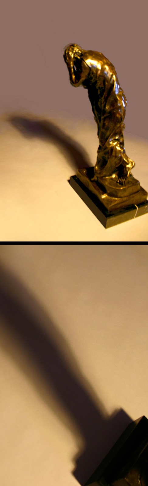
Over the last few years, Auguste Rodin’s (1840–1917) six bronze figures that make up his sculpture group, The Burghers of Calais, have made their way into my life. My studio is now dotted with models, drawings and prints about this moody group of figures and I know that the root of my interest in them is all about the play of light and shadow on their forms. For instance, last night I spent my evening drawing Rodin’s emotionally burdened, Andrieu d’Andres (shown below). My attention focused on modelling the figure’s form out of a mass of dark bronze reflections and shadows set against a stark white background. In short, my present preoccupation with shadows is driving the following discussion. Its focus is on key principles and conventions behind portraying shadows: the principles that artists apply when constructing shadows; traditional approaches used to represent shadows; and, the conventions underpinning chiaroscuro lighting (i.e. theatrically dramatic lighting featuring sharp contrast of light and shadow). As the scope of the topic is large, I will break the discussion into three parts and for the first part I will deal with the construction of shadows.

Detail of Auguste Rodin’s Andrieu d’Andres
(one of six figures featured in The Burghers of Calais)
James Brown
Andrieu d’Andres after Rodin, 2013
Pen and ink on 300gsm Saunders Waterford watercolour paper
75.5 x 56 cm
I am selling this drawing for $850 AUD including postage and handling to anywhere in the world. Please contact me using the email link at the top of the page if you are interested or click the “Buy Now” button below.
[deleted] 

With regard to the principles for constructing shadows on the ground, there are five fundamental points in an image for an artist to establish (see illustration below). The first of these points (see “A” in the illustration) is the centre of the light source casting the shadow. The second point (see “B” in the illustration) is on the ground vertically below the light source. The third point (see “C” in the illustration) is on the portrayed subject from which the artist wishes to cast a shadow. The fourth point (see “D” in the illustration) is on the ground vertically below the previous point. The fifth point (see “E” in the illustration) is at the far end of the shadow.

Five fundamental points in the construction of shadows
From point A, the artist inscribes a line passing through point C on the subject to mark the farthest point of the shadow cast by point C on the ground. This point on the ground is point E. To determine the angle of the cast shadow, the artist inscribes a line from point B, through point D and the angle of this line establishes the angle of the cast shadow connecting point D with point E (as shown in the illustration below).

Establishing the length and angle of a shadow
Note that the length of a shadow is determined by the angle of a line inscribed from the light source (point A) to the point on the subject casting the shadow. Essentially, this means that shadows are different lengths depending on this angle of incidence (i.e. the angle determined by a line drawn from the light source that tangentially brushes against the subject). For example, in the illustration shown below the shadow cast by the lit candle is much shorter than a shadow that would be cast from the unlit candle.

Shadows vary in length according to the angle of incidence
Note also that the angle of a shadow is determined by inscribing a line from the point on the ground (point B) vertically below the light source to the point on the ground vertically below the point on the subject casting the shadow (point D). This allows for a radiation of shadows when there is more than one subject (as shown below).

Radiating shadow effect

When there is a broad light source illuminating a subject (as opposed to a pin-light for instance) a fractured shadow with three distinctly different tones is cast radiating from the far edges of the light source. In technical terms the dark centre triangle of tone is called the umbra. The lighter outer edge of such a shadow is called the penumbra and the farther out triangle of shadow that is formed is called the antumbra (see illustration below).

Umbra, penumbra and antumbra
The same formation of an umbra and penumbra also occurs when there are two or more lights (see illustration below).  

Umbra and penumbra shadows
Beyond the fundamental rule that shadows are darkest close to the subject casting them and are progressively lighter in tone towards the regions furthest away, there is an optical phenomenon that is also important to artists. This phenomenon, however, is subtle and easily overlooked, but it is important: the effect of simultaneous contrast (discussed in the earlier post, Colour and spatial depth). It is important because the edges of shadows—regardless if they are umbra, penumbra or antumbra—all appear darker than the rest of the shadow as an involuntary optical response by the eye. Or conversely, the centre of each shadow region appears lighter in tone than its edges as may be seen in the cast umbra and penumbra shadows shown below. When an artist takes into account the effect of simultaneous contrast the portrayed shadow nearly always appear luminous.

Simultaneous contrast (note how the tones are lighter in the centre and darker at the edges of the umbra and penumbra regions)
In the next post—Shadows (Part 2)—I will discuss how artists apply the above principles but as a foreshadowing of how the use of simultaneous contrast is applied consider the luminous shadows in Michel Dorigny’s (1617–65) Bacchanal of Children (shown below).

Michel Dorigny (1617–65)
Bacchanal of Children, 1659
Described by the British Museum as “Three putti and young satyr helping another young satyr to climb a tree; on the right, a putti feeding a goat with grapes”
From a suite of twelve prints after Nicolas Chaprond’s bacchanalia
Etching on laid paper
18.8 x 16.5 cm (sheet)
Condition: Strong impression, with fine margins in very good condition. The print has a very small collector’s stamp verso (see below).
I am selling this print for ... [deleted]  including postage and handling to anywhere in the world. Please contact me using the email link at the top of the page if you are interested or click the “Buy Now” button below.

[deleted] 
Verso of Dorigny’s Bacchanal of Children
(right image shows collector’s stamp)
Detail of Dorigny’s Bacchanal of Children