What are some principles that can be applied to botanical illustration to give images pictorial vitality: a spark of life?
This post will explore the use of four principles used by botanical illustrators to breathe life into their images: cropping, tangents, projection and juxtaposition. Before entering too far into the discussion, however, I wish to recount the advice given to me by my always wise and wonderful cook, Isabelle, concerning good illustrations:
Like an advertisement, there has to be something [in a botanical illustration] that catches your eye … [and] makes you want to keep looking and thinking about it. (Isabelle 2014 pers. comm. 29 April)
From my experience, Isabelle’s advice is absolutely correct—as is all advice from the cook. Regardless of the need to be circumspect, however, Isabelle’s insight lies at the heart of any memorable botanical illustration or artwork, in that it should:
- Catch (i.e. “hook”) a viewer’s attention;
- sustain a viewer’s interest; and,
- communicate meaning through visual relationships within the image.
 |
H. Weddell (engraver),
from the design/drawing by Charles M. Curtis (1795–1839)
Fuchsia [Fuchsia arborescens Sims] (Plate 2620), 1825
Published by S. Curtis. Walworth in Curtis's Botanical Magazine, Volume 53, 1826
Engraving with hand-colouring and gatefolds (as published) on fine cream wove paper
Inscribed in plate: (upper-right) “N.2620.”; (lower-left) “Chas. M. Curtis.
(sheet) 30.5 x 22.8 cm; (plate) 23.2 x 20.2 cm
(see illustration: http://www.plantillustrations.org/artist.php?id_artist=371&lay_out=1&hd=0 [viewed 2 May 2014]).
Condition: marvellous impression with superb colour in near pristine condition (i.e. the colour has not faded and there is no sign of foxing, bumps or tears).
I am selling this print and Weddell’s Hellebore Leaved Calanthe (shown further below) for a total cost of [deleted] including postage and handling to anywhere in the world. Please contact me using the email link at the top of the page if you have any queries or click the “Buy Now” button below.     |
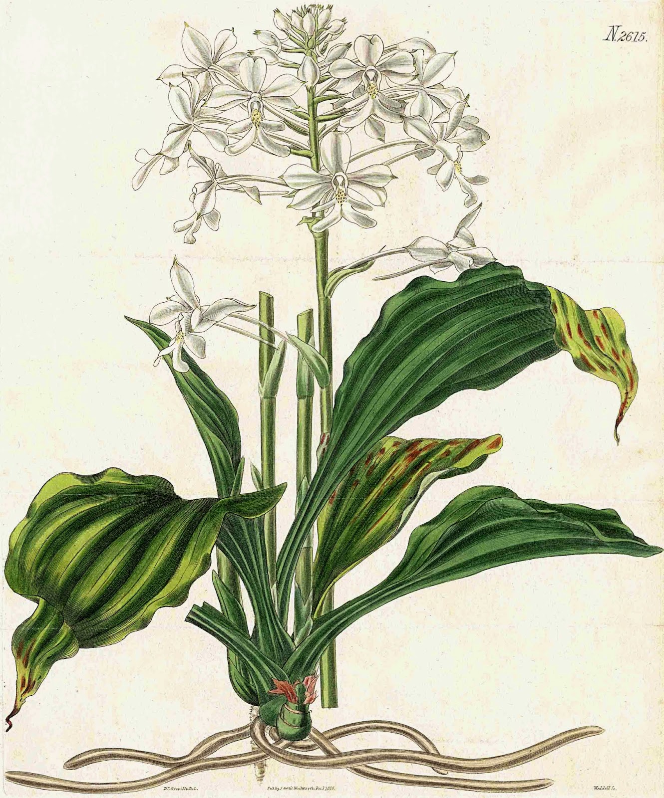 |
H. Weddell (engraver),
from the design/drawing by Robert Kaye Greville (1794–1866)
Hellebore-Leaved Calanthe/ Calanthe triplicate/Christmas Orchid (Plate 2615), 1825
Published by S. Curtis. Walworth in Curtis's Botanical Magazine, Volume 53, 1826
Engraving with hand-colouring and gatefolds (as published) on fine cream wove paper
Inscribed in plate: (upper-right) “N.2615.”; (lower-left) “Dr. Greville.
(sheet) 30.5 x 22.8 cm; (plate) 26.5 x 21.8 cm
(see illustration: http://www.plantillustrations.org/illustration.php?id_illustration=9630 and http://www.panteek.com/CurtisDoubles2/pages/CBM2615-271.htm [viewed 4 May 2014]).
Condition: marvellous impression with superb colour in near pristine condition.
I am selling this print and Weddell’s Fuchsia (shown above) for a total cost of [deleted] including postage and handling to anywhere in the world. Please contact me using the email link at the top of the page if you have any queries or click the “Buy Now” button above.
This print and been sold
      |
Regarding the first dot-point—to catch/“hook” a viewer’s attention—both engravings are arresting to the eye because the hand-colouring is as saturated in hue as flowers are in reality. There is, however, a subtle principle at play in the formatting (i.e. the pictorial framing) of Fuchsia that arrests the eye more than the formatting of Hellebore-Leaved Calanthe. This principle is simple but effective in giving a spark of life that attracts the eye: cropping (i.e. cutting) the subject at the format edge. By this I mean that in Fuchsia the leaves are pictorially cropped at the edge of the image. For the viewer this cropping implies that the leaves extend beyond the picture/plate area and as such the viewer is enticed into the active role of conceptually visualising—or to “picture in the mind’s eye”—more of the subject than is actually portrayed. By contrast, the formatting of Hellebore-Leaved Calanthe presents the whole plant and casts the viewer into the more passive role of the subject's observer. Although the principle of cropping a subject at the format edge may seem trivial, it is important. It offers artists a simple way to catch the eye and excite the brain to start thinking about the subject presented.
Perhaps pertinent to the question of whether to crop a subject or not is that the Weddell’s (1825) adaptation of Robert Kaye Greville’s original design for Fuchsia underwent a revision by Ernst von Reider’s for the publication, Blumen und Ziergewachse (1832) (see fourth image from the top of the page at http://www.nkvf.nl/Gelderse_Fuchsia_info-%20site/P16-eng.Antique_Botanical_Fuchsiaprints.htm [viewed 2 May 2014]). In this version of Greville’s design the leaves of the plant are not cropped but, to my eyes, the composition is awkward, squashed and exhibits artifice rather than life.
Using a principle such as cropping, however, raises the sticky question of whether a botanical artist needs to be concerned about catching a viewer’s attention, giving a spark of life, or any other aesthetic considerations. After all, I envisage that there are many botanists who consider that the role of a botanical illustrator should be focused solely on accurate scientific representation. Certainly, Sacheverell Sitwell (1990) in Great Flower Books 1700–1900: A Bibliographical Record of Two Centuries of Finely-Illustrated Flower Books raises the question about looking “from the point of view of aesthetics, not ‘botanics’” (p. 17) and to clarify the position held by botanists, he offers the following unapologetic criticism of Dutch flower painters of the early eighteenth century:
They [the Dutch flower painters] sacrificed everything to effect; and in simple words, what did they do during the rest of the year if they did not paint flowers during the six months when they were not in season? They cannot have remained idle. So they worked from notes, or after sufficient experience went straight ahead as if the flowers were there in front of them. We have only to look at the great flower pieces to know that it is impossible that they should be done from nature. They are fanciful arrangements, aided by drawings … and finished during the long winter. This is an offence to the botanists … . (Sitwell 1990, pp. 13–14)
Of course, botanical illustrators are not obliged to use the principle of cropping. Moreover, use of the principle is not an essential way to catch a viewer’s attention with a vital spark. There are many other ways. For instance, a perfect example of a print that clearly does not rely on the subject having been cropped and yet it is riveting to the eye is Edward Joseph Lowe's (1825–1900) Hymenodium Crinitum (shown below). From a personal viewpoint this print catches my attention and it exudes an aura of presence for an antithetical reason to the cropped leaves of the Fuchsia engraving: in Hymenodium Crinitum the central placement of the subject—a leaf—is like the bullseye in a target in which the strong symmetry and the virtual sea of negative space surrounding it generates a commanding aura of presence for the subject.
 |
Edward Joseph Lowe (1825–1900)
Illustrated by A.F. Lydon
Printed by Benjamin Fawcett
Hymenodium Crinitum, 1856
From Lowe's Ferns: British and Exotic, Vol 1 (Plate XLI), published 1856 by Groombridge and Sons,
Woodblock/chromoxylograph (see description of the process below) on cream wove paper
24.9 x 14.5 cm
Rare Prints Gallery offers the following insight into Lowe’s publication and printing process:
It was Lowe’s botanical expertise and funding that produced the work, but A.F. Lyon was the artist for the work, and Benjamin Fawcett’s printing talent created the plates. Fawcett was a well-known color printer of the time. His technique of using multiple engravings from the end-grain of the wood, known as chromoxylography, was used on this work. It was one of the first large publications to be printed in color with no hand-finishing. (http://www.rareprintsgallery.com/store/product/loweframeddes [Viewed 15 May 2014])
Condition: crisp impression with minor age-toning otherwise in good condition (i.e. the colour has not faded and there is no sign of foxing, bumps or tears).
I am selling this print (Hymenodium Crinitum) and the print shown further (Horminum: Angurice Folio) for a total cost of [deleted] including postage and handling to anywhere in the world. Please contact me using the email link at the top of the page if you have any queries or click the “Buy Now” button below.
   |
Equally riveting in terms of central placement is Paul Herman’s (1646–95) early botanical study, Horminum (shown below), where the plant’s stem creates an uninterrupted vertical line through the composition’s centre. Unlike Lowe’s print, here the strong attraction to the centrally placed line of the stem is offset by the use of another principle/rule of composition that commands the eyes’ attention and, arguably, gives the subject vitality: use of tangents. In Horminum these tangents occur where the extremities of the plant abut with (i.e. “brush against”) the sides of the plate marks.
Interestingly, this principle/rule of composition is usually avoided (as discussed in the posts, Compositional Rules, Part 1 and 2) because tangents attract attention away from the centre of a composition. In this composition, however, creating interest at the peripheral edges of the format is not a problem as the centre is already asserting an overly strong attraction and the use tangents help to counteract and balance a viewer’s interest.
 |
Paul Herman (1646–95)
Horminum: Angurice Folio, c. 1700
From Paradisus batavus, innumeris exoticis curiosis herbis, & rarioribus plantis, magno sumptu & curâ ex variis terrarum orbis regionibus, tam oriente, quam occidente, collectis, acquisitis, illustratus. Ingeniosissima, & dexterrima artificum manu elaboratis iconibus, ad vivum æri incisis. Eruditissimâ suâ, & magnorum in re herbaria versatissimorum virorum, methodicâ descriptione, & catalogo plantarum, nondum præ immatura morte auctoris delineatarum, locupletatus [Google translation: Paradise is the Batavi, and countless exotic herbs, the curious, and the two more rare plants, to the great expense and care, from the various lands of the world countries, as well as the east, rather than west, collections, acquired, enriched by. Talented, icons, and skilfully from the artists of the hand-prepared, to the life of the brass was cut. Erudite essay, and the great men versed in botany, methodical description, and the catalog of the plants, not because of the untimely death of the author outlined endowed]
Published in 1698–1705 by Peter van der Aa,
(This book may be downloaded as a digital file or read online at: https://archive.org/details/paulihermannipar00herm [Viewed 15 May 2014])
Copper engraving on fine laid paper with 2.5 cm chainlines
(sheet) 24.4 x 17.4 cm; (plate) 15.5 x 11.6 cm
Condition: strong, richly inked impression with appropriate age-toning towards the extremities of the sheet and light handling marks otherwise in good condition.
I am selling this print (Horminum: Angurice Folio) and the print shown further above (Hymenodium Crinitum) for a total cost of [deleted] including postage and handling to anywhere in the world. Please contact me using the email link at the top of the page if you have any queries or click the “Buy Now” button above.
     |
 |
Hendrik Adriaan Van Reede Tot Drakenstein (1636-1691)
Schadida-calli (Plate 82), 1679
From Hortus Indicus Malabaricus, vol. 2: t. 82 (1679)
To view this book online or download a pdf copy, see archive.org: https://archive.org/details/mobot31753003370076 (viewed 19 May 2014)
(This print and its descriptive text in Latin may be referenced in the above digital copy, pp. 304-05 or pp. 80–81 in Volume 2 of the original text)
Engraving on fine laid paper with 2.5 cm chainlines and gatefold as published
(For further references, see http://plantillustrations.org/species.php?id_species=423398 and http://publicdomainreview.org/collections/hortus-malabaricus-1678-1693/ [viewed 19 May 2014])
(sheet) 38.1 x 47.7 cm; (plate) 34 x 44.2 cm
Condition: extremely rare, richly inked and crisp impression in near pristine condition.
I am selling this print (Schadida-calli) and the related print shown further above (Bahel schulli ) (i.e. two engravings) for a total cost of [deleted] including postage and handling to anywhere in the world.
      |
 |
Hendrik Adriaan Van Reede Tot Drakenstein (1636-1691)
Bahel schulli [Hygrophila schulli] (Plate 45), 1679
From Hortus Indicus Malabaricus, vol. 2: t. 45 (1679)
To view this book online or download a pdf copy, see archive.org: https://archive.org/details/mobot31753003370076 (viewed 19 May 2014)
(This print and its descriptive text in Latin may be referenced in the above digital copy, pp. 311-12 or pp. 86–87 in Volume 2 of the original text)
Engraving on fine laid paper with 2.5 cm chainlines and gatefold as published
(For further references, see other images from Hortus Indicus Malabaricus : http://plantillustrations.org/volume.php?id_volume=1983&lay_out=1&hd=0&compare=0 and http://plantillustrations.org/species.php?id_species=541803 see also http://publicdomainreview.org/collections/hortus-malabaricus-1678-1693/ and from Ebay http://www.ebay.ca/itm/van-Rheede-tot-Drakenstein-1678-Folio-Botanical-Print-Bahel-Schulli-45-/331133660850 [viewed 19 May 2014])
(sheet) 38.1 x 47.4 cm; (plate) 33.8 x 44 cm
Condition: rare and superb impression in near pristine condition.
I am selling this print (Bahel schulli ) and the related print shown further above (Schadida-calli) (i.e. two engravings) for a total cost of [deleted] including postage and handling to anywhere in the world. Please contact me using the email link at the top of the page if you have any queries or click the “Buy Now” button above.     |
From personal experience of looking at prints such as these, I have found that images which actively invite my gaze are more likely to succeed in sustaining interest and projecting the idea that a plant is alive. Fortunately the principle that performs this task the best is not a well kept secret. It is simply the use of projection. In practice this means ensuring that the portrayed subject has features that pictorially jut out towards the viewer and/or features that recede away.
To illustrate the use of projection, note how the cactus depicted in Schadida-calli arcs towards the viewer or, for some viewers that read the image differently, the cactus arcs away. This angled arrangement of the cactus acts like a conceptual bridge in welcoming a viewer to look into the pictorial space of the image. With regard to whether the use of projection also breathes life into the cactus is best answered by comparing the projecting arrangement of the cactus in Schadida-calli with the non-projecting arrangement of the marsh herb in Bahel schulli where the plant is arranged parallel to the viewing plane. For me, the herb seems lifeless because I examined it passively whereas subjects like the cactus that are angled towards me seem to arouse a feeling that I need to interact with them and in the process this active engagement lends the suggestion that they are alive.
Regarding the third and final dot-point—to communicate meaning through visual relationships within the image—this is a critical strategy in botanical illustration. After all, without clear and unambiguous communication, an image is unlikely to be a meaningful showcase repository of botanical information and the image is also unlikely to be memorable. To illustrate how an artist can communicate key attributes of a plant with clarity, I wish to focus on the compositional arrangement of six engravings (shown below) from the eighth volume of James Sowerby’s (1757–1822) justifiably famous English Botany.
 |
James Sowerby (1757–1822)
6 original engravings with hand-colouring as published in the 1799 (first) edition of English Botany; or, Coloured Figures of British Plants, with their Essential Characters, Synonyms, and Places of Growth, Volume 8, with accompanying text page descriptions of each plant.
Greater Stitchwort, Plate 511;
Vernal Sandwort, Plate 512;
Oxlip, Plate 513;
Greater Periwinkle, Plate 514;
Bulbous Crowfoot / Butter-cups, Plate 515;
Creeping Crowfoot, Plate 516
Engraving on early cream wove paper
Each leaf: (sheet) 22.6 x 13.7 cm; (plate) 17 x 9.4 cm
(See http://www.illustratedgarden.org/mobot/rarebooks/author.asp?creator=Sowerby,%20James&creatorID=94 and http://en.wikipedia.org/wiki/English_Botany
[Viewed 23 May 2014])
Condition: crisp impressions with hand-colouring (as published in 1799) in pristine condition. The pages are taken from a book that is in poor condition hence the pages are loose. I am selling all 6 prints with their accompanying page of descriptive text for a total cost (including shipping to anywhere in the world) [deleted].
       |
Even a cursory glance at the six prints reveals the following attributes (among others):
- each plant is depicted close to the picture plane and is centrally arranged so that its distinctive details (e.g. leaves, flowers and roots) can be examined closely;
- each plant is aligned parallel to the picture plane and set against a blank/featureless background; and,
- a large section of each plant is portrayed in full-colour while smaller details of the plant are rendered schematically in black line.
Sowerby’s choice to arrange his prints in this way is far from accidental. By design, the composition of his prints is all about providing botanists with accurate visual information about the distinctive features of each plant.
With regard to a particular specimen’s leaf-shape, for instance, Sowerby applies the principle of juxtaposition wherein two related pieces of visual information are juxtaposed to clarify the distinctive characteristics of a leaf’s shape. In Greater Stitchwort (shown as the top-left image in the panel of six prints and the first detail), Sowerby offers a full-colour overview of the Greater Stitchwort’s leaves and how they are attached to their stem; this is the first piece of visual information. To ensure that a botanist is unlikely to make an error in reading the lanceolate shape of the leaves and how they are attached, Sowerby offers an outline drawing of the leaf and stem arrangement; this is the second piece of visual information. By intention, both these juxtaposed pieces of information are correlated by the botanist’s eye so that a very clear picture of the leaf-shape is understood.
Although I would love to claim that an illustrator can succeed in achieving clear and unambiguous visual communication and can breathe life into an ostensibly dead specimen to make it seem to be alive, this is an unrealistic dream. Viewers are not all the same and personal interests and desires change how a subject is perceived. The fallacy of achieving such a goal was made crystal clear to me after attending a recent lecture on forensic photography where the lecturer screened a video (shown below) that I had seen before but if ever there is proof that personal interests change what we see this is a perfect demonstration …
(Created by research by Daniel Simons and Christopher Chabris
Copyright 1999 Daniel J. Simons)
Although there is strong evidence (such as the video above) to rebuff the idea that viewers are likely to perceive the same things in images, this does not mean that images cannot be massaged with appropriate principles (e.g. cropping, tangents, projection and juxtaposition) to facilitate clarity of visual communication. This is important as the use of such principles can change what might otherwise be an unexciting representation of a subject into one that “breathes” with vitality. Moreover, appreciating the importance of manipulating an image underpins the straight forward and sensible advice that Isabelle offered at the beginning of this discussion: “there has to be something that catches your eye … [and] makes you want to keep looking and thinking about it.”
Although there is strong evidence (such as the video above) to rebuff the idea that viewers are likely to perceive the same things in images, this does not mean that images cannot be massaged with appropriate principles (e.g. cropping, tangents, projection and juxtaposition) to facilitate clarity of visual communication. This is important as the use of such principles can change what might otherwise be an unexciting representation of a subject into one that “breathes” with vitality. Moreover, appreciating the importance of manipulating an image underpins the straight forward and sensible advice that Isabelle offered at the beginning of this discussion: “there has to be something that catches your eye … [and] makes you want to keep looking and thinking about it.”


