Showing posts with label Lepère (Auguste). Show all posts

Wednesday, 12 February 2025

Jules Léon Perrichon, “Bust of Victor Hugo by Auguste Rodin”, c.1900

Jules Léon Perrichon (1866–1946)

“Bust of Victor Hugo by Auguste Rodin”, c.1900, a rare proof state impression of a wood-engraving after Auguste Rodin’s (aka Pierre Auguste Rodin) (1840–1917) “Buste de Victor Hugo”, inscribed in pencil as a retouching proof (“epreuve de retouche”) and with the artist’s monogram as the engraver (“JLP. sc.”).

Note that Auguste Lepère (aka Louis Auguste Lepère) (1849–1918) executed a wood-engraving of the same bust by Rodin in 1902; see https://www.britishmuseum.org/collection/object/P_1949-0411-3756 (BM inv. 1949,0411.3756) &  https://www.britishmuseum.org/collection/object/P_1949-0411-3754 (BM inv. 1949,0411.3754).

Wood-engraving on Japanese paper, pencil inscribed as a “epreuve de retouche” (retouching proof), backed with a support sheet.

Size: (sheet) 15.5 x 11.7cm; (plate) 11.8 x 8.5cm.

Inscribed in pencil below the image borderline: “epreuve de retouche/ [monogram of the artist] JLP. sc.”

Condition: a strong, near faultless impression in an excellent condition with no tears, holes, folds or stains and laid upon a support sheet of archival (millennium quality) washi paper.

I am selling this rare, pencil monogramed and inscribed, proof-state wood-engraving showing a sculpted bust by Rodin of the famous author and artist, Victor Hugo, for the total cost of AU$292 (currently US$183.41/ EUR 176.64/ GBP 147.20 at the time of this listing) including Express Mail (EMS) postage and handling to any location worldwide. Please note that import duties or taxes may apply in certain countries and are not included in the price. Payment is requested in Australian dollars (AU$292).

If you are interested in purchasing this unique pencil inscribed artist’s proof, please contact me (oz_jim@printsandprinciples.com) and I will send you a PayPal invoice to make the payment easy.

This print has been sold


Thursday, 9 January 2025

Auguste Lepère, “La France”, 1912, after Rodin

Auguste Lepère (aka Auguste Louis Lepère) (1849–1918)

“La France”, 1912, wood-engraving  printed from two plates in an edition of 130 impressions (this is copy number 104) after Auguste Rodin’s (aka Pierre Auguste Rodin) (1840–1917) high-relief monument to the explorer, Samuel Champlain (1574–1635)—interestingly, the sculpture was modelled on the superb sculptress and Rodin’s muse, Camille Claudel (1864–1943)—on the exterior wall of the lighthouse at Crown Point (aka Chimney Point), New York (see Janet Biehl [2023], “The Rodin Sculpture at Crown Point” [https://www.aflcr.org/the-rodin-sculpture-at-crown-point/]), pencil signed at lower-right and numbered (104/130) at lower-left.

Wood engraving printed in pale tan (olive-brown) and dark tan on tissue-thin China paper (papier serpente) and backed with a support sheet

Size: (sheet) 30.6 x 23cm; (image borderline) 15.1 x 11.5cm.

Lettered in plate: (left) “A.Lepère/ d’après”; (lower left of centre) “A/ RODIN”; (upper centre) “LEXX JVILLET MDCIX LE FRANCAIS S. CHAMPLAIN/ A DECOVVERT LE LAC OVI PORTE SON NOM/ LE III MAI MIMXII/ LES ETATS DE/ NEW YORK ET/ DEVERMONT/ ELEVANT CE/ MONVMENT/ VNE DE-/ LEGATION FRANCAISE/ A SCELLE/ CETTEFIGVRE/ DE LA/ FRANCE”.

Pencil inscribed below the image borderline: (left) “104/130”; (right) [signature of the artist; compare with: https://www.invaluable.com/auction-lot/auguste-lepere-1849-1918-signed-wood-engraving-%20%20%20%201317-c-b8a499e91c].

Texier-Bernier 526 (GM Texier-Bernier 1931, “Auguste Lepere: Peintre et Graveur”, Paris, cat. no. 526).

See also the description of this print offered by the Art Institute of Chicago: https://www.artic.edu/artworks/33307/france.

Condition: a strong and near faultless impression with wide margins laid upon an archival support of millennium quality washi paper. Beyond a small tear to the lower right corner of the margin, the sheet is in an excellent condition with no holes, folds, abrasions or stains.

I am selling this remarkable pencil signed wood-engraving printed from two printing blocks after an almost forgotten sculpture by Rodin attached to a former lighthouse in New York—surprisingly, the sculpture was so forgotten that as late as 2006 even “the Rodin Museum in Paris had been unaware of it” (see Janet Biehl [2023], op. cit.)—for AU $279 in total (currently US $172.88/ EUR 167.74/ GBP 140.69 at the time of posting this listing) including Express Mail (EMS) postage and handling to anywhere in the world, but not (of course) any import duties/taxes imposed by some countries. Note that payment is in Australian dollars (AU $279) as this is my currency.

If you are interested in purchasing this very beautiful wood-engraving that I understand (and may be very wrong) showing the personification of France as a liberty leading woman, please contact me (oz_jim@printsandprinciples.com) and I will send you a PayPal invoice to make the payment easy.


Saturday, 25 September 2021

Auguste Lepère’s drypoint, “In the Flooded Marsh: The Shepherd”, 1892 (pub. 1911)

Auguste Lepère (aka Louis Auguste Lepère) (1849–1918)

“In the Flooded Marsh: The Shepherd” (“Au Marais Inondé: Le Berger”), 1892 (pub. 1911?). This impression is from the recut plate of larger rectangular composition originally featuring a mother and child at left and signed in the plate at lower left and now signed in the plate at upper right; see https://www.nga.gov/collection/art-object-page.8469.html.

Drypoint (and etching?), with pale plate tone printed in a warm black ink on wove (Japan) paper with margins as published.

Size: (sheet) 30.4 x 22.6 cm; (plate/image) 17.9 x 17.2 cm.

Inscribed in plate: (upper right corner) “A.Lepere.”

Texier-Bernier 394 (G M Texier-Bernier 1931 “Auguste Lepere: Peintre et Graveur”, Paris, cat. no. 394 [http://www.artoftheprint.com/artistpages/lepere_auguste_louis_aumaraisinondeleberger.htm].

See also the description of this print offered by the Yale University: https://artgallery.yale.edu/collections/objects/14240.

Condition: a richly inked and well-printed (near faultless) impression in near pristine condition with no tears, holes, folds, abrasions, stains or foxing.

I am selling this superb drypoint showing a shepherd ferrying three sheep in a narrow boat across flooded marshlands, for the total cost of AU$237 (currently US$172.10/EUR146.87/GBP125.80 at the time of this listing) including postage and handling to anywhere in the world, but not (of course) any import duties/taxes imposed by some countries.

If you are interested in purchasing this wonderful example of confident and loose/free drypoint drawing, please contact me (oz_jim@printsandprinciples.com) and I will send you a PayPal invoice to make the payment easy.


Friday, 10 January 2020

Auguste Lepère's woodcut, "Nude Statue, Seen from Behind", 1898, after Rodin's "Eve"


Auguste Lepère (aka Louis Auguste Lepère) (1849–1918)

"Nude Statue, Seen from Behind" (The MET title) (aka “After the Statue by A. Rodin” [tissue guard title]), 1898, two-colour woodcut after Auguste Rodin’s (1840–1917) sculpture, “Eve”, published in “The Studio”, vol. 14, no. 66, 1898, signed on the plate and stamped with the red seal of The Studio with the protective tissue guard printed with the explanatory text: “WOODCUT IN TWO BLOCKS/ BY A. LEPÈRE. AFTER THE STATUE BY A. RODIN”.

Chiaroscuro woodcut in two blocks, printed in black and olive-green ink on cream wove paper with the Studio stamp in red and full margins as published in 1898.
Size: (sheet) 28.4 x 20.1 cm; (image borderline) 18 x 9.2 cm.
Inscribed on plate within the image borderline: (partially obscured at lower right corner) “ALepère / d'apres / A RODIN”.
Stamped with the publisher’s seal below the image borderline: “THE STV- / CDIO”

The Metropolitan Museum of Art offers a description of this print:

See also the description offered by WorthPoint:

Condition: near faultless impression with full margins in near pristine condition—there is a very faint dot in the lower right corner of the margin.

I am selling this woodcut masterpiece showing Rodin’s famous sculpture, “Eve”, portrayed as if the figure is seemingly suffering in grief under the strong raking light from above—at least that is how I read this superb woodcut—for a total cost of AU$314 (currently US$216.22/EUR194.86/GBP165.38 at the time of this listing) including postage and handling to anywhere in the world.

If you are interested in purchasing this incredibly insightful and skilful woodcut—note for example how Lepère creates a transition in the treatment of light and shade on Eve from the long contour marks giving form to her legs and casting them in shadow to the dots of broken white lines connoting extreme light and texture on her shoulders—please contact me (oz_jim@printsandprinciples.com) and I will send you a PayPal invoice to make the payment easy.

This print has been sold


Wednesday, 7 November 2012

Formatting an image: Van Sichem, Springinklee, Sadahide, Hecht, Smith, Legros & Lepere


What are some issues underpinning the choice of a format shape (i.e. outer boundary) for an image?


To thoroughly address the issues involved in formatting an image, the range of format shapes (or lack of a boundary at all) would necessitate tedious and repetitiously listing of similar issues. Moreover there is also the phenomenon that the digital age has brought a new meaning to what constitutes the boundary edge of an image—at least from the audience’s viewpoint. After all there is no longer a tangible support sheet of paper or canvas that sets the outer limits for an image. Mindful of the above realities, I have limited the scope of the following discussion to the following format shapes in the hope that most of the key issues concerning formatting of images will be addressed: an image with a delineated boundary (i.e. a borderline around the image); a polyptych (i.e. a group of images abutting each other that may be read individually in terms of their composition or as a single cohesive group composition); a vignette (i.e. an image fading away from the centre); and, a free-form boundary (i.e. a border created by the pictorial requirements of the subject).

Regarding the first of these boundaries (i.e. a borderline marking the outer edge of the image), the earliest woodcuts invariably feature a bold borderline, such as the Christoffel van Sichem II’s Saint Paul (shown below and discussed in the earlier post, Van Sichem II: Advancing & receding forms). One reason for using a solid line around a woodcut image is certainly to separate the image from potentially distracting imagery or text surrounding it, but there is also a practical reason: the printing process involved in creating a woodcut impression “needs” the borderline. This is because the solid edging of wood on the woodblock that produces the printed borderline acts as a physical support during the process of inking and pressing the print to ensure that the ink is distributed evenly. Moreover, without such an edge the finely cut lines further within the image would crumble very quick during successive printings as there would not be a supporting rim of wood taking the impact of the printing process.

Christoffel van Sichem II (1581–1658)
St Paul, published 1648 (but most likely executed in 1620)
From the 17th century biblical text, t'Scat der Zielen, dat is: Het geheete leven ons Heeren Jesu Christi..., published in Amsterdam in 1648 by Pieter I. Paets.
Woodcut, 34.2 x 21.7 cm (sheet)
(see further discussion about this print in the earlier post: Van Sichem II: Advancing & receding forms)
For example in Hans Springinklee’s The Ambassadors of Emmanuel, King of Portugal, demanding the Hand of Eleanor, eldest daughter of Philip I of Castile (shown below) the print is a composite of two plates and no borderline exists where the plates abut each other. To fully appreciate the importance of the outer framing line, compare the sharpness of the printing where the imagery is close to the borderline (see details A and B shown further below) with the areas towards the centre of the print which do not have a borderline support (see detail C also shown below).

Hans Springinklee (c.1490/95–c.1540)
The Ambassadors of Emmanuel, King of Portugal, demanding the Hand of Eleanor, eldest daughter of Philip I of Castile, 1515–1518
from the 1775 edition of Weisskunig, plate 156. 
Woodcut in two sections
This print is a composite image taken from two separate blocks with two versions of the smaller block allowing for three different printed variations (see The Fitzwilliam Museum catalogue entry for this print: http://www.fitzmuseum.cam.ac.uk/opac/search/cataloguedetail.html?&priref=129820&_function_=xslt&_limit_=10 [accessed 27.10.2012]).
Condition: strong impression on paper with no foxing or blemishes. There is a previous collector’s ink stamp on verso, along with pencil and ink inscriptions and mounting hinges. The original packaging for this print (no longer available) showed the following inscription that may provide authenticy and printing state information but I am not familiar with these catalogue sources:C.D.I., 374, 4 (1); Put 220 v." I am selling this print for ... [deleted] including postage and handling to anywhere in the world. Please contact me using the email link at the top of the page if you are interested or click the “Buy Now” button.


[deleted] 
(left) Detail A of the left side of Springinklee’sThe Ambassadors of Emmanuel, King 
of Portugal, demanding the Hand of Eleanor, eldest daughter of Philip I of Castile
(right) Detail B of the right side
Detail C of the unsupported centre area of Springinklee’sThe Ambassadors of Emmanuel, King of Portugal, demanding the Hand of Eleanor, eldest daughter 
of Philip I of Castile

With regard to the formatting of a polyptych, the boundary edge separating each panel in a multi-panelled overall image serves two vital functions. First, the abutting edge of each of the panels helps the viewer to visually digest what may be a large and conceptually complex image into smaller more easily negotiable portions to contemplate and understand. Consider, for instance, the difficulty in reading the text and images interspersed in the pages from a nineteenth-century Japanese woodcut book shown below and compare this sea of visual information with the text and images separated into abutting panels in the three pages from Gountei Sadahide’s (1807–1873) The Chronicle (shown further below).

Two-volume book of Japanese tales bound together with a colour woodcut frontis plate for each volume and black woodcut illustrations throughout, c. 1880
16.5 x 11 cm
Condition: poor condition with significant signs of handling, worm holes and general grubbiness. I am selling this book for $120 AUD including postage and handling to anywhere in the world. Please contact me using the email link at the top of the page if you are interested or click the “Buy Now” button.


This book has been sold


View of the above book showing one of the colour woodcuts
Gountei Sadahide (1807–1873)
Three pages from The Chronicle
25.5 x 16.5 cm (approximate size of each leaf)
Condition: slightly worn impressions with age toning, I am selling the three prints for ... [deleted]  including postage and handling to anywhere in the world. Please contact me using the email link at the top of the page if you are interested or click the “Buy Now” button.


[deleted] 

The second important function is all about visual dialogue. Here, the abutment of each panel with the next invites the viewer to see relationships among the displayed features of the panels and to correlate the projected meanings of all the panels into a single collective multi-layered meaning—a bit like two people on either side of a river noticing each other and starting a conversation. The critical difference between a collection of artworks wedged together and a polyptych lies with the concept of visual dialogue: the collection of artworks wedged together can only be conceived as a polyptych if there are conceptual links uniting them as a composite whole. There is also a difference between a large image that is simply broken into panels and then reunited and a polyptych with is a composite image of separate but related components.

Sometimes, however, the difference is not so clear. For example, in another nineteenth century Japanese book of woodcuts shown below, there is a borderline around each plate that separates one image from the next. When the book is opened, the portrayed subject in each pair of prints—termed a diptych—is a continuation of the same scene. This would normally mean that these prints are not diptych panels at all, but rather a single image that is broken into two portions. From my standpoint, however, the pairs of prints are diptych panels rather than a single cut image as each plate is a separate unified composition with features clearly intended to be read in visual dialogue with its partner. For instance, both pairs of images shown below feature a figure in one plate responding to another figure in the opposing plate. And, importantly, this portrayed communication between the figures is across the printed borderline and the physical gap of the pages (see details further below).


A Japanese book of black and white woodcut illustrations with a colour woodcut frontis on original paper cover, c. 1880
16.5 x 11 cm
Condition: a little worn, marked, some creasing and wormholes. I am selling this book for ... [deleted]  including postage and handling to anywhere in the world. Please contact me using the email link at the top of the page if you are interested or click the “Buy Now” button.

[deleted] 


Cover of the above book


Detail of visual dialogue between figures

Regarding the third type of image format—the vignette—the all important issue is to fade the image from a point of fixation usually arising from a binocular viewpoint. By this I mean, looking at the subject with two eyes where the focus is narrowed to a point while away from this point, in a full 360 degrees, the focal clarity diminishes. An example of this approach to the vignette format may be seen in Wilhelm Hecht’s (1843–1920) etched portrait of the German painter, Carl Piloty (shown below). Here, the viewer’s attention is focused on the Piloty’s face, partly because it is positioned towards the centre of the plate mark on the vertical axis and also because the treatment of the facial features are so finely rendered in detail. As the viewer’s eye strays away from this area of high focus down the subject’s coat and away into the background, the treatment of the surface details becomes progressively more about loosely laid strokes than with showing intimate details of the subject (compare the details further below).

Wilhelm Hecht (1843–1920)
Carl Piloty, 1883
Etching on heavy cream wove paper
Signed in the plate lower left: “W. Hecht. 83”
Inscribed below the image at the centre, “DRAWN & Etched by W. Hecht.”, with “CARL PILOTY” inscribed further below at the centre
35 x 28.5 cm (plate); 24.6 x 20.3 cm (image); 43.5 x 32.5 cm (sheet)
Condition: very strong impression. The paper is clean (almost pristine) with small nicks and minimal handling marks. I am selling this print for $85 AUD including postage and handling to anywhere in the world. This is a large print and will be shipped in a tube. Please contact me using the email link at the top of the page if you are interested or click the “Buy Now” button.

This print has been sold
Detail of Hecht’s Carl Piloty

Another use of the vignette is to recreate the effect of tunnel vision—arguably, a peculiarly male type of vision arising from the primordial hunter’s targeted focus. As an example of this curious phenomenon of tunnel vision, John Moyr Smith’s (1839–1912) Macbeth and Macduff (shown below) is ideal. By design, the print focuses attention on the two outstretched arms of the protagonists at the centre of the image by progressive darkening and distorting the scene towards the peripheral rim (see details further below). This treatment of the outer boundary raises the question that is not often addressed by artists: how should artists portray subject material at the outer field of their vision—the peripheral rim? Of course this seemingly simple question raises a host of other closely linked questions relating to the various vision types such as day vision (also known as phototopic, cone and colour vision) and night vision (also known as scotopic, rod and peripheral vision).

John Moyr Smith (1839–1912)
Macbeth and Macduff, 1889
Etching in brown ink on heavy cream wove paper
26.3 x 17.5 cm (plate); 40.2 x 18.7 cm (sheet)
Illustration (plate 25, Act V, Scene Vll) from, The Tragedie of Macbeth, published by Sampson Low, Marston, Searle & Rivington, London.
Condition: strong impression in pristine condition. I am selling this print for ... [deleted]  including postage and handling to anywhere in the world. This is a large print and will be shipped in a tube. Please contact me using the email link at the top of the page if you are interested or click the “Buy Now” button.

[deleted] 

Detail of John Moyr Smith’s Macbeth and Macduff, 1889
Although the point of fixation may be more than a fine point and in fact may span a whole face, or even a much larger area, as in the case with Moyr Smith’s print, with some images the point of fixation is indeed a very small area that is in focus. For example, in Alphonse Legros’ (1837–1911) portrait of the artist, George Fredrick Watts (1817–1904)(shown below), the point of fixation is Watt’s nose. Compare, for instance, the transition in focus between the sharp focus on his nose with soft focus on his ear (see details further below). In rendering the nose, Legros has used fine, short lines that are closely spaced and modelled with strong contrast between the dark of the nostril and the light on the nose ridge. By contrast, the ear is treated with more widely spaced and broken strokes and with minimal tonal contrast. As is the case with Hecht’s portrait, the portrayed deterioration of focal clarity continues from Watt’s face to the lower reaches of his coat. Interestingly, Legros must have been very conscious of presenting a smooth transition in focus in this area. I mention this as he has diminished the initial strength of loosely laid lines describing the lower coat in the earlier state of the print (see the first image) so that the edition with the text line, “G.F.Watts” (see the second image), presents a more gradual softening of focus.


Alphonse Legros (1837–1911)
Portrait de G.F. Watts RA, 1879
Etching and drypoint printed in brown-black ink on wove paper
(upper image) state before letters
18.5 x 13.5 cm (plate); 31.5 x 24.5 cm (sheet)
(lower image) state with the text line: “G.F.Watts” (lower centre) and “A.Legros sc” (lower right). This state has a revised image margin created with plate tone. The line work of the previous state is still visiable where the plate tone has been erased.
Published in the Journal of Modern & Ancient Art (1900).
18.3 x 13.3 cm (plate); 28.8 x 21.8 cm (sheet)
Condition: both prints are strong impressions in pristine condition.
I am selling both states of this print (i.e. two prints) for $210 AUD including postage and handling to anywhere in the world. Please contact me using the email link at the top of the page if you are interested or click the “Buy Now” button.

These prints have been sold
Detail of Legros’ Portrait de G.F. Watts RA
(left) initial strokes before the line of text is added
(right) the same strokes softened (burnished) after the line of text is added
Before moving to the issues underpinning the next approach to formatting—a free-form border—I need to point out that there is a difference between Legro’s etching of Watts that relies on a binocular viewpoint (i.e. Legros’ had both eyes open when he drew Watts) and a monocular representation of Watts (i.e. if Legros had portrayed Watts by only looking through as single eye in the same way that a single lens camera would capture Watts). In the case of a monocular depiction of Watts, the focus would be on a single plane, like a sheet of glass extending to infinity, that is parallel with the eye or lens and every feature of the subject on this plane would be in focus and every feature behind or in front of the plane would gradually become blurred away from the plane. The reason that this may be an issue with a vignette lies with the fact that the plane of focal clarity extends “forever” without fading towards a peripheral rim. In reality, however, a single eye or lens does have a limited range of view and so a vignette using monocular vision is a fully justifiable and authentic format.


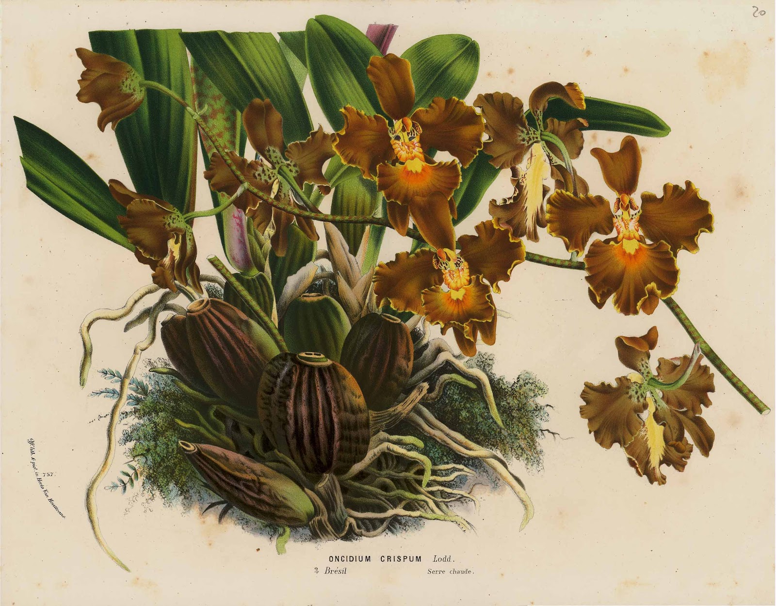
The final type of format I wish to discuss is not really a format shape at all but rather an inevitable outer boundary to an image dictated by the subject’s physical dimensions. For example, the hand-finished offset lithograph prints, Oncidium Crispum and Stenocarpus Cunningham (shown below), at first glance look like they both have rectangular format boundaries suggested by the portrayed plants having been pictorially cropped on all sides. On closer inspection, however, this perception is not true. In fact the leaves of the plants are depicted as physically cut along with the far right flower stem of the orchid (see details further below). In short, the initial perception of the featured subjects having been composed in a neat rectangular frame is simply an illusion, but an illusion designed to fool the eye nonetheless.

Instead of the tight constraint of a rectangle’s geometrical format, the plants form their own naturally composed frame, which, by the artist’s clear intention, just happens to be like a rectangle. Such a “naturally composed frame” is not limited to the silhouette edge in two dimensions. In the image of the orchid, Oncidium Crispum, for instance, the artist projects the orchid bulbs and the spray of flowers towards the viewer carving in space a three-dimensional format perceived as the outer surface of a free-form volume.

Oncidium Crispum, c. 1860
from Louis Van Houtte & Charles Lemaire’s Flore des serres et des Jardins de l’Europe, published in Ghent, 1845–88
Offset lithograph hand finished at the time of publication.
25 x 32 cm (sheet)
Condition: sharp image with strong colour, reverse side blank and with centre fold as issued. There is scattered foxing otherwise in good condition. I am selling this print (Oncidium Crispum) and the print below (Stenocarpus Cunningham) (i.e. two prints) for the total cost of $58 AUD including postage and handling to anywhere in the world. Please contact me using the email link at the top of the page if you are interested or click the “Buy Now” button.


This print has been sold

Detail of Oncidium Crispum showing cut leaves
Detail of Oncidium Crispum showing cut spray of flowers
Stenocarpus Cunningham, c. 1860
from Louis Van Houtte & Charles Lemaire’s Flore des serres et des Jardins de l’Europe, published in Ghent, 1845–88
Offset lithograph hand finished at the time of publication.
34 x 24.5 cm (sheet)
Condition: sharp image with strong colour, reverse side blank and with two centre folds as issued. There is light offsetting of text showing on the background and wear on the two folds, otherwise in good condition. I am selling this print (Stenocarpus Cunningham) and the print above (Oncidium Crispum) (i.e. two prints) for the total cost of $58 AUD including postage and handling to anywhere in the world. Please contact me using the email link at the top of the page if you are interested or click the “Buy Now” button above.
Detail of Stenocarpus Cunningham showing cut leaves
The concept of an image having its free-form boundary determined by the portrayed subject’s form does not have to be limited to the subject’s silhouette edge. In Lepere’s etching, Un quai à Rouen (shown below), for instance, the borderline is the outcome of the artist’s perceiving a line of connected features of the portrayed busy quay—a type of line that I have discussed in the post Linear Vectors & Nodal Points in terms of a linear vector. It begins in the immediate foreground with cobble stones. Next, when reading anti-clockwise, the line links together the outer edge of a group of wharf-workers before it ascends vertically following the shadow side of a docked ship to its uppermost point on the ship’s flag pole. From this uppermost point, the line then follows, in a much less delineated course, the outline of distant clouds and the far side of the harbour before descending to the water and once again follows the outer edge of the same group of wharf-workers. The reading of this line of connected features has elements of the vignette format but the essential difference is that here the boundary does not show a significant focal deterioration of details.

Auguste-Louis Lepère (1849–1910)
Un quai à Rouen, 1899
Published in Revue de l'art Ancien et Moderne
Etching printed by Chardon Wittmann on cream wove paper
20.8 x 14.4 cm (plate); 26 x 20.2 cm (sheet)
Condition: strong impression is pristine condition.
I am selling this print for ... [deleted]  including postage and handling to anywhere in the world. This is a large print and will be shipped in a tube. Please contact me using the email link at the top of the page if you are interested or click the “Buy Now” button.


[deleted] 

Detail of Lepere’s Un quai à Rouen, 1899

There are so many different types of formats that I could—and perhaps should—discuss; for instance, the tondo (a circular format) and formats where the border annotates the portrayed subject that it frames, such as may be seen in the engravings by Pintz (discussed in the post Expression by Juxtaposition. Although I do not wish to dismiss this consideration, my intention, as I commented at the start of this discussion, is to clarify the issues underpinning just a handful of different types of formatting with the view that the same issues also underpin most of the other format types. Nevertheless, in future posts I will address more formats, as there are some that are very interesting ones that draw upon the world of optical illusions.