Showing posts with label Kilian (Lucas). Show all posts

Thursday, 27 January 2022

Wolfgang Kilian’s engraving, “Portrait of Maria Anna of Spain”, 1639, after Lucas Kilian

Wolfgang Kilian (1581–1662)

“Portrait of Maria Anna of Spain” (1606–1646)—Holy Roman Empress consort; German Queen consort; Queen consort of Hungary and Bohemia; Archduchess consort of Austria (1637–1646), 1639, after a drawing from direct study of Maria Anna (ad vivum delineavit) by Lucas Kilian (1579–1637).

Note that Diego Velázquez (aka Diego Rodríguez de Silva y Velázquez) (1599–1660) also executed a portrait of Maria Anna (c1630) from a very similar angle of view; see https://royal.myorigins.org/p/Maria_Anna_of_Spain_Holy_Roman_Empress_consort/.  

Engraving on laid paper trimmed along the image borderline and backed with a support sheet.

Size: (sheet) 22.7 x 16 cm.

Lettered in plate within the image borderline: (lower cartouche) “SERENISSIMA ET AVGVSTISSIMA DOMINA/ DOMINA MARIA, ROM IMPERATRIX. GERM. HVNG./ ET BOHEMIÆ REGINA. INFANS HISPANIARVM./ Eiusdem Augustissimæ Mariestati, humillimè ac deuote se suagq[ue] studia/ comendans L. m. dedicat Wolfg. Kilianus, Sculptor.”

Lettered in plate below the image borderline: (left) Lucas Kilian Ad uiuum [vivum] delineauit [delineavit],”; (right) “Wolfgang Kilian Sculpsit. Anno 1639.”

State i (of i), a lifetime impression based on the crisp quality of line showing no sign of wear to the printing plate.

Hollstein 375 (Wolfgang Kilian); Hollstein 783 (after Lucas Kilian); Drugulin 13043; Hirth 1887

Condition: an exceptionally fine (near faultless) richly inked impression, trimmed along the image borderline and laid upon an archival support sheet of millennium quality washi paper. The sheet is in a near pristine condition with no tears, holes, folds, abrasions, stains or foxing.

I am selling this magnificent engraved bust-length portrait of Maria Anna of Spain shown in an oval frame with two putti each holding a crown and a larger crown over her head—possibly the three crowns signify her roles as queen of Hungary and Bohemia and (from 1637) as the Holy Roman Empress (but I may be wrong)—for a total cost of AU$322 (currently US$226.64/EUR203.27/GBP169.31 at the time of this listing) including postage and handling to anywhere in the world, but not (of course) any import duties/taxes imposed by some countries.

If you are interested in purchasing this remarkably rich engraved impression—undoubtedly a lifetime impression as the linework shows no signs of wear to the printing plate—please contact me (oz_jim@printsandprinciples.com) and I will send you a PayPal invoice to make the payment easy.

This print has been sold 


Thursday, 5 December 2019

Lucas Kilian's engraving, “Wilhelm von Welsperg, Bishop of Brixen”, 1632


Lucas Kilian (aka Lukas Kilian) (1579–1637)
“Wilhelm von Welsperg, Bishop of Brixen” (aka “Rm[us] et Illm[us] D D. Gvilielmvs D. G. Episcopvs et Princeps Brixinensis” [title on plate]), 1632, published in Augsburg,
Engraving on laid paper trimmed along platemark and backed with a support sheet.
Size: (sheet) 33.6 x 25.1 cm; (image borderline) 33.4 x 24.8 cm.
Lettered on plate: (oval portrait frame) “RM[us]. ET ILLM[us] D D. GVILIELMVS D. G. EPISCOPVS ET PRINCEPS BRIXINENSIS.”; (four lines of Latin on tablet below portrait) “'Viua mihi ueteris .../ …/ …/ … comifafur Amor.”;  (on shell ornament below tablet) “Lucas Kilian. sculpsit. A.o 1632.”
State i (of i) lifetime impression based on the crisp line showing no sign of wear to the printing plate.
Hollstein German 481 (Fedja Anzelewsky [ed.] 1976, “German Engravings, Etchings and Woodcuts, ca. 14001700: Lucas Kilian to Philipp Kilian”, vol. 17, Amsterdam, Van Gendt & Co, p. 131, cat. no. 481); HAB A 25571 (Peter Mortzfeld 19862008, “Katalog der graphischen Porträts in der Herzog August Bibliothek Wolfenbüttel 1500–1850: Die Porträtsammlung der Herzog August Bibliothek Wolfenbüttel”, Munich, K G Saur, cat. no. A 25571).
The British Museum offers the following description of this print:
“Portrait of Wilhelm von Welsberg, Bishop of Brixen, nearly half length in an oval, wearing hat and collar, and holding a small book; allegorical border.”
See also the description of this print offered by the Rijksmuseum:
Condition: an exceptionally fine (near faultless) richly inked impression trimmed along the platemark with a narrow margin around the image borderline. The sheet is in an almost pristine condition laid upon an archival support sheet of millennium quality washi paper.
I am selling this stunning engraving designed to represent in allegorical terms —somewhat playfully I should add from how I perceive the slightly mischievous grin on the putto wearing a bishop’s mitre—good government, for a total cost of AU$322 (currently US$220.08/EUR198.39/GBP167.57 at the time of this listing) including postage and handling to anywhere in the world.
If you are interested in purchasing this remarkable portrait of Wilhelm von Welsperg (1585–1641)—featuring (at top) a putto as a bishop, Prudentia (at left), Pax (at right) controlling Invidia (below her foot) with putti (further below) personifying art and the sciences—please contact me (oz_jim@printsandprinciples.com) and I will send you a PayPal invoice to make the payment easy.
This print has been sold


Sunday, 13 May 2018

Lucas Kilian’s engraving, “The Miracle of the Loaves and the Fishes”, 1602, after Tintoretto


Lucas Kilian (1579–1637)

“The Miracle of the Loaves and the Fishes” (aka “Die wundersame Brotvermehrung”; “Multiplication of Bread and Fishes”), 1602 (as inscribed on the plate “M.DCII”), after the painting (1578–81) by Jacopo Tintoretto (1518–94) in the Scuola Grande di San Rocco (Sala Superiore) in Venice, published by Pierre Mariette (1596–1657).

Engraving and etching on laid paper with small margins backed with a support sheet.
Size: (sheet) 49.2 x 39 cm; (plate) 46.8 x 37.7 cm; (image borderline) 42.1 x 36.8 cm

Inscribed on plate within the image borderline at the lower edge: (left of centre) “A Paris chez Pierre Mariette.”; (right of centre) “Jacobus Tinctoretus pinxit.”; (left) “Lucas Kilian. Augs. scalpsit Venctiis.”
Lettered on plate below the image borderline in five lines with a coat of arms breaking the text at the centre of each line: “BIS DVO PAVISTI QVONDAM QVI MILLIA, SEPTEM […] ET TVA NVNC POTIS EST PAVCIS BENEDICERE, MVLTOS / PANIBVS, ÆTHERII CHRISTE PROPAGO PATRIS: […] VT SATIENT, POTIS ET DEXTERA SEMPER ERIT. / REVERENDISS.mo ET ILL.mo PRINCIPI. DÑO. D. WOLFGAN: […] GO EPISCOPO RATISPONENSI PRÆPOSITO ELVA. / CENSI DÑO SVO. OMNI OBSERVANCIA COLEN: […] DISS. DOMINICVS CVSTOS AVG. VIND. DDdt. / AÑ. P.C.N. […] M.DCII."

Hollstein: 13.1
See the description of this print at the Met: https://www.metmuseum.org/art/collection/search/766954
See also Anette Michels in J.R.Paas (ed.) 2001, “Augsburg, die Bilderfabrik Europas”, Augsburg, pp. 41–54.

Condition: crisp, well-inked and well-printed impression with small margins (approx. 1 cm) in very good condition for the age of the print (i.e. there is a closed tear on the right edge of the sheet and minor abrasions otherwise there are no significant holes, folds, stains or foxing). The sheet is backed with archival (millennium quality) washi paper.

I am selling this exceptionally rare, large and superbly executed engraving for the total cost of AU$323 (currently US$243.76/EUR204/GBP180) including postage and handling to anywhere in the world.

If you are interested in purchasing this important print that has been professionally cleaned and backed with a support sheet, please contact me (oz_jim@printsandprinciples.com) and I will send you a PayPal invoice to make the payment easy.

This print is reserved pending confirmation about its purchase


Sometimes when a painting is translated into a print the reproductive artist captures a special essence in the print that is hidden in the original painting. Let me explain …

This evening when I was comparing Tintoretto’s painting with Kilian’s translation of it into this line engraving, I remembered reading about a sign that Tintoretto is purported to have had in his studio:  “Il disegno di Michelangelo ed il colorito di Tiziano” ("Michelangelo's design and Titian's colour").

Mindful of Tintoretto’s esteem for Michelangelo, I was surprised that Kilian’s engraving seemed to have more of Michelangelo in it than I could see in Tintoretto’s painting. For example, note how the two figures in the lower left foreground of the engraving are rendered with a flow of rhythms that actively invite the eye to move around them. By contrast, when I look at the same figures in Tintoretto’s painting, I do not see the same Michelangeloesque conception of three-dimensional voluminous space.  Instead, Tintoretto’s figures appear somewhat flattened in this comparison.

In terms of compositional design, I believe that Killian has again captured more of Michelangelo’s understanding of design than Tintoretto has been able to express in his painting. For example, note how Kilian has clarified the pivotally important line of separation in the composition between the dark foreground and the light background. By contrast, Tintoretto still has the same division separating both spatial zones but, to my eyes, Tintoretto “muddies” the tonal juxtaposition by introducing his love of Mannerist light spots within the dark zone and dark silhouette shapes of trees within the light zones.

In short, what I am proposing—and I may be very wrong—is that in the case of Kilian’s translation of Tintoretto’s painting into an engraving, Kilian may have captured the strength of design that Tintoretto professed to seek.


Tuesday, 23 October 2012

Expression by juxtaposition: Kilian, Pintz, Orlik & Carracci


What are some of the most effective ways to express meaning?

At a very fundamental level, visual communication relies on the viewer of an artwork recognising relationships between the portrayed features. If I may push this bold statement a little further, visual communication also relies on the relationships between complementary (i.e. opposite) qualities of the portrayed features.

For example, if an artist wishes to express the concept of strong light (as discussed in the previous post), the viewer would need to see and, importantly, to compare areas of the portrayed subject illuminated by the light against the areas of the subject portrayed in shadow. Based on the compared difference in the two extremes of light and shadow a viewer can then rationalise the light’s level of intensity. Of course, there is a plethora of issues that may interrupt a viewer’s recognition of intended relationships in a clear communication of any idea; even one as simple as showing the effects of bright light.

From my experience, the potential for misreading an artist’s intention is minimised when artists pictorially abut the complementary features underpinning the concept with pictorial emphasis on one of the features; such as juxtaposing large brilliantly lit areas of the subject beside small darkly shadowed areas if the intention was about bright light. Going further, the expression of meaning can be further enhanced if this abutment of opposites is arranged at a pivotal point in the composition—such as abutting areas of black and white at an “eye-catching” line of intersection between light and shadow when communicating the concept of bright light—rather than dispersing the abutment of opposites in a broadly scattered manner.

A fine example of such a juxtaposition of light and dark can be seen in Lucas Killian’s (1579–1637) large engraving, The Miracle of the Loaves and Fishes (shown below). Here, the silhouette edge of a hillock marks a line separating eight figures in the shadowy foreground from a horde of folk further back in the light. From a personal reading, this line differentiates the two figure groups. Those in the foreground I see as restless—perhaps because they are hungry as they are being attended to with food by two apostles—while the figures portrayed in the light are less agitated—perhaps because they have already been fed. Whether my reading is “correct” or not is not the point, but rather that the juxtaposition of opposites (i.e. dark with light and restless figures with relaxed figures) projects meanings that can be deciphered. If this line of demarcation were not such a noticeable feature in the composition I wish to propose that a viewer may have difficulty with framing a reading such as mine.


Lucas Kilian (1579-1637)
Die wundersame Brotvermehrung [The Miracle of the Loaves and the Fishes]; after Jacopo Tintoretto (1518-1594), 1602
Engraving and etching
Lettered at lower right: 'Jacobus Tinctoretus pinxit./ Lucas Kilian Aug.s scalpsit Venetiis.'
46.5 x 37.5 (plate); 48.5 x 385 cm (sheet)
Hollstein: 13.1
Condition: strong impression with traces of handling, a horizontal fold and a few spots commensurate with the age of the print.

Detail of Kilian’s The Miracle of the Loaves and the Fishes, 1602


For the following discussion I will move away from the juxtaposition of strong light and shade and address three other ways that artists use the juxtaposition of complementary attributes of the portrayed subject to express meaning.

As a first approach, I will to return once more to biblical imagery, but the use of juxtaposition in the images that I am about to examine is far from the approach used by Kilian and the artist he copied, Tintoretto. The source of the images is Jacob Scheuchze’s (1672–1733) Physica Sacra (also known as the Kupfer-Bibel) designed to showcase and explain by natural science his conviction that the Old Testament is a true account of our historical past. Sadly Scheuchze’s belief that he had discovered the fossilised remains of a victim of the great Genesis’ flood was later revealed to be that of a large salamander instead.

In Pintz’s illustration for this natural history interpretation of the bible, TAB. CCCCXVIIII. Reg. Cap. IV. V. 33. Cedrus, Hyffopus (shown below) an acorn from the cedar pine, Cedrus Hyssopus, is portrayed as a “real” specimen juxtaposed beside an elaborately framed image of a scene featuring the tree from which it grew. What is expressed by this juxtaposition is clear: the artist is showing the viewer the acorn as a representation of objective physical reality set against a background of pictorial invention. In this image the intersection of where these two realities intersect is the elaborate frame that can be seen as either a solid three-dimensional form (in the sense that Pintz has rendered the frame with light and shade) or as a schematic representation of a frame (in the sense that the frame features volutes that may be read simultaneously as a view from below and from above).


I.G. Pintz [Johann Georg Pintz] (1697–1767)
TAB. CCCCXVIIII. Reg. Cap. IV. V. 33. Cedrus, Hyffopus, 1731
From Scheuchze’s (1672–1733) Physica Sacra
Engraving on laid paper
32 x 20.5 cm (plate); 42.8 x 25 cm (sheet)
Condition: superb impression with no foxing and minor traces of handling. The print has generous borders on three sides but the right side has a 1 cm border from the plate mark.
I am selling this print for [deleted] including postage and handling to anywhere in the world. This is a large print and will be shipped in a tube. Please contact me using the email link at the top of the page if you are interested or click the “Buy Now” button below.
[deleted]
Detail of Pintz’s TAB. CCCCXVIIII. Reg. Cap. IV. V. 33. Cedrus, Hyffopus, 1731

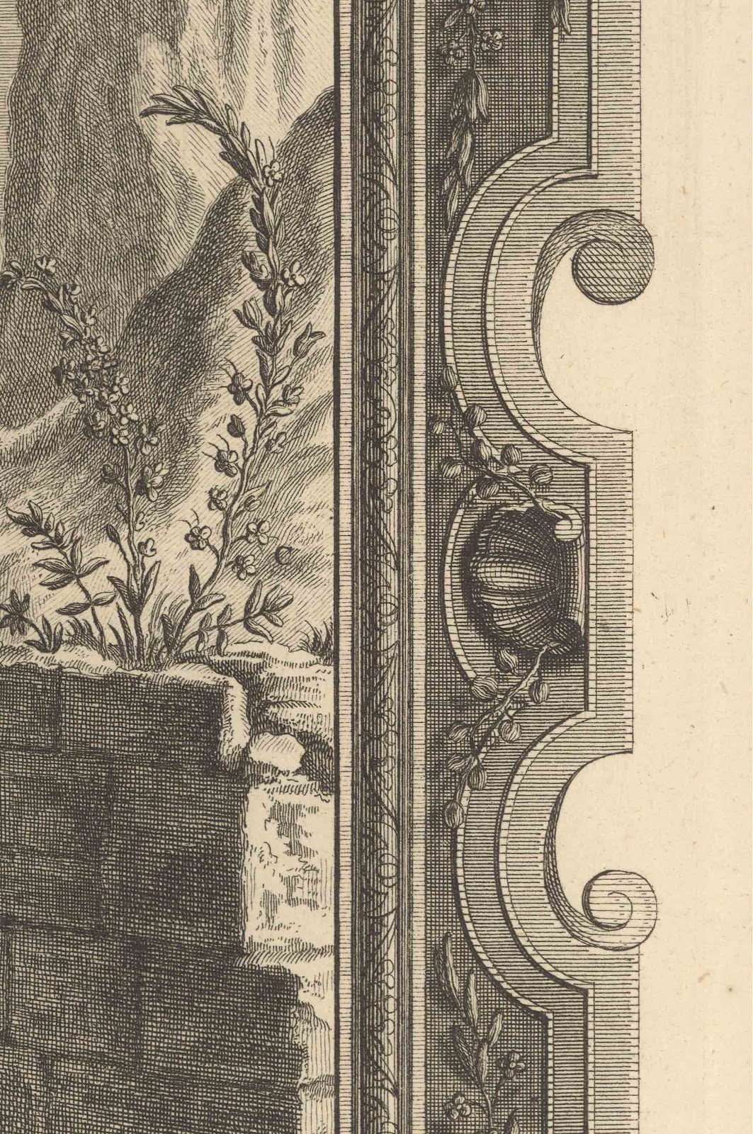
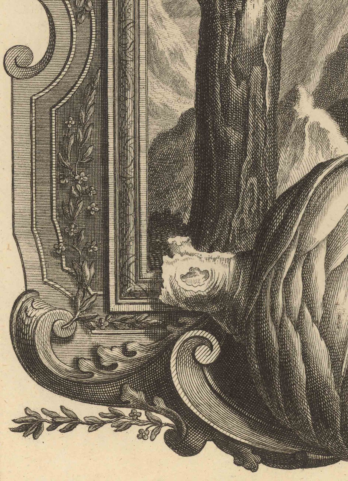
The use of a frame to differentiate two ways of looking (i.e. objective and subjective) is taken a stage further in Pintz’s illustration, TABDXXVI—IOB. Cap. XXX. V.4 Pauperiores Iro. (shown below). Here, the featured frame is adorned with plant specimens from the landscape portrayed within the frame in an even more physically abutting manner than employed in the last print. The abutment, however, goes beyond the frame. Even the pictorial space of the portrayed framed landscape is overlaid with a trompe-l'oeil (i.e. a pictorial illusion designed to “fool” the eye that what is represented is “real”) of a pseudo-scientific illustration showing botanical details on a battered leaf of paper wedged into the frame’s top lip (see details further below). From my reading of the expressed meaning of these visual devices, the juxtaposition of “real” objects (i.e. the plant specimens and the trompe-l’oeil slip of paper) with fabricated reality (i.e. the pictorial space of the landscape within the frame) expresses a conscious intent by the artist to link reality with concept. This intent is made apparent once again by the use of alphabetical inscriptions that would correspond with text-based explanations annotating the illustration. This approach to juxtaposition to express meaning may be intimately connected to Scheuchze’s Physica Sacra but it opens a way forward to other artists exploring links between illusion and reality.


I.G. Pintz [Johann Georg Pintz] (1697–1767)
TABDXXVI—IOB. Cap. XXX. V.4 Pauperiores Iro., 1731

From Scheuchze’s (1672–1733) Physica Sacra
Engraving on laid paper
32 x 20.5 cm (plate); 43 x 25 cm (sheet)
Condition: superb impression with no foxing. The extreme edges of the sheet have browned (probably from dirt accumulating on the outer edges of the book. The print has generous borders on three sides but the left side has a 1 cm border from the plate mark.
I am selling this print for [deleted] including postage and handling to anywhere in the world. This is a large print and will be shipped in a tube. Please contact me using the email link at the top of the page if you are interested or click the “Buy Now” button below.

This print has been sold
Detail of Pintz’s TABDXXVI—IOB. Cap. XXX. V.4 Pauperiores Iro., 1731

A second way to juxtaposition complementary attributes of the subject also involves different realities but this time these realities are to do with contrast between graphic space (i.e. a conceptualised space represented by the artist’s personal way of making marks such as scribbled lines to represent abstract ideas) and pictorial space (i.e. an illusionary space of superficial appearance). Excellent examples of this type of abutment may be seen in artworks by the Vienna Secessionists like Gustave Klimt (1862–1918) but for this discussion I wish to focus on Emil Orlick’s (1870–1932) lithograph, Porträtstudie [Portrait Study] (shown below). 

Emil Orlick (1870–1932)
Porträtstudie [Portrait Study], 1899
Chine colle colour lithograph on heavy wove paper
Text inscription: “DRUCK K. K. HOF- UND STAATSDRUCKEREI, WIEN.” (lower left); “PORTRÄTSTUDIE. ORIGINAL-LITHOGRAPHIE VON EMIL ORLIK.” (lower centre); 
“VERLAG DER GESELLSCHAFT FÜR VERVIELFÄLTIGENDE KUNST, WIEN.” (lower right)
40 x 30.2 cm (chine colle image); 54.4 x 45 cm (sheet)
Condition: strong impression. The sheet has no tears but there is scattered light foxing on the support sheet. There are two white flicks on the image but these may be part of the print rather than surface damage.
I am selling this print for [deleted] including postage and handling to anywhere in the world. This is a large print and will be shipped in a tube. Please contact me using the email link at the top of the page if you are interested or click the “Buy Now” button below.

[deleted]

From my standpoint, the intriguing beauty of this profile portrait of a young woman rests with my eye being caught in a visual play between looking at first at the highly refined—almost photographic—grey-toned rendering of her face and then at the largely flat background of red-orange edged with a warm black border. To my eye there are opposing tensions between the three-dimensional treatment of her face—viewed as pictorial space—and the two-dimensional treatment of the space surrounding her—viewed as graphic space. This tension of contrasting opposites presents her face as physically real (in terms of three-dimensional appearance) while at the same time it draws attention to the flat planes upon which her face is set. The important link between the abutment of these two spaces—graphic and pictorial—is the hair. In representing the hair, Orlik uses lightly drawn details of the hair locks over the otherwise flat brown-black shape of the hair mass (see details below). These lightly drawn details act as the conceptual bridge connecting the complementary spaces of three-dimensional form and flat pattern.

Detail of Orlik’s Porträtstudie [Portrait Study], 1899

The last approach I wish to discuss is one that engages the viewer in looking, thinking and responding, consequently it is an important one for visual communication: the juxtaposition of reflexive and reflective responses. To have an image that engages with a viewer in a way that prompts a reflexive response (i.e. an instinctive automatic response) means that the viewer is no longer an impassive spectator. Instead, the viewer is drawn to “participate” (in the sense of unmediated personal involvement) with the meaning projected by the image. After this initial involuntary response (a bit like being tapped on the knee by a doctor when testing one’s reflexes) the viewer may then choose to engage with the image in a reflective way; seeing relationships between portrayed features, deciphering meanings and correlating what is observed with associated experiences from the viewer’s past.

An example of how the juxtaposition of imagery for both readings is set in motion may be seen in Agostino Carracci’s (1557–1602) A Satyr Approaching a Sleeping Nymph (shown below). Here, a satyr portrayed approaching the viewer and a sleeping nymph holds up a finger to his lips in a gesture to the viewer to be quiet (see detail further below). For the viewer—or at least for me—this gesture and the way the satyr’s eyes are directed towards the viewer generates a reflexive response that he is making eye contact with the viewer and to be silent. This reading (for me) is unambiguous and automatic but the reason for the reflexive response is driven by the context where the satyr’s actions are contextualised with the sleeping nymph. The deciphering of the satyr’s need for silence is to involve the viewer in a complicit act of voyeurism with peeping on the sleeping nymph. Not all viewers may respond to the satyr’s “invitation” and at this point of reading is where there is a leap from reflexive response to reflective contemplation

Agostino Carracci (1557–1602)
A Satyr Approaching a Sleeping Nymph c. 1590–95
From the Lascivie series of fifteen prints
Engraving on laid paper
Only state
Bartsch: XVIII, 108.128; Bohlin 184
Condition: slightly grey impression trimmed to plate in pristine condition
I am selling this print for $360 AUD including postage and handling to anywhere in the world. Please contact me using the email link at the top of the page if you are interested or click the “Buy Now” button below.

This print has been sold
Detail of Carracci’s A Satyr Approaching a Sleeping Nymph

The potential to misread the satyr’s intention for lascivious behaviour is minimised nevertheless by the compositional arrangement. By design, the satyr and the nymph are pictorially linked together by the overlapping of their arms; a connection made even more noticeable by the contrast of the satyr’s dark tone juxtaposed with the nymph’s light tones (see detail below).


Detail of Carracci’s A Satyr Approaching a Sleeping Nymph 
All of the above approaches to project meaning using juxtaposition of complementary attributes of the subject rely on how well contextualised the meaning is and how attuned the audience is to read the intended meaning.  Of course, no matter how well orchestrated the image is composed there remains what some may see as the fundamentals of the viewer seeing (in an everyday biological sense) what is portrayed. In this regard I have to remind myself of the down-to-earth quip by the marvellous arts writer Peter Fuller after hearing a formal sociological explanation by a “prominent post-structuralist” as to why the central figure in the classical sculpture, The Laocoon Group, could be interpreted as being in pain: “’But Griselda, he’s being strangled by a sea monster.’ ‘Yes,’ she retorted, ‘but we have no means of knowing whether or not he’s enjoying it. …’” (Fuller, Peter 1983, The Naked Artist: Art and Biology. Writers and Readers, London, pp. 2–3)