What are some approaches that artists use to inspire themselves?
For a number of years I’ve been pondering approaches to creativity and recently one of my Honours students even focused her study on this topic because it is so interesting. This fascination with the creative impulse stretches way back through history. Artists like Alexander Cozens (1717–86), for example, created ink blots and used their patterns like a Rorschach test to stimulate his creativity in order to see potential landscape subject material in how the blots were configured. In fact Cozens was so delighted with this approach to creativity that he even documented the process in his book: A New Method of Assisting the Invention in Drawing Original Compositions of Landscape (for an explanation of his practice see
After much navel-gazing and chatting with students and colleagues I wish to propose that there are three fundamental approaches for creative invention: verisimilitude (i.e. using an observed subject as a platform for creative replication of it in an artistic medium), interpolation (i.e. portraying a subject in a way that adds fresh meanings to the subject’s original meaning) and fountainhead (i.e. an approach like Cozens developed where a subject of fixation becomes the point of departure—“ground zero”—for a creative leap to a subject that may be far removed from the original). The following discussion explores these three approaches by examining how different artists (Charles Cousen [c. 1813–89], Timothy Cole [1852–1931], John Park [1851–1919] and I) have used Constable’s painting, The Cornfield (1826), as a subject for their personal artworks.
Let me begin with the verisimilitude approach. Looking back to the prints by reproductive printmakers of the nineteenth and earlier centuries, these artists’ interest in the process of copying paintings, sculpture and drawings often went beyond a singular desire to create close pictorial resemblance. For instance, Franklin Robinson (2005) perceives in the seventeenth-century Dutch printmakers’ reproductive prints a desire “to possess the object itself, in a heightened, intenser form” (p. 5). Whether the motivation is to psychologically “possess” the subject, to see and understand it better by close scrutiny, or simply to fulfil a contract, there is a very real and practical necessity for all artists engaged in making reproductive prints to tap into their creativity to translate the addressed subject’s form, colour and surface texture into a meaningful image.
In Charles Cousen’s engraved replication of The Cornfield (shown below), for example, he has converted the colour-tones of Constable’s oil painting into a grey scale of tones through a complex layering of lines. A broad comparison of Cousen’s engraved replication of the painting’s colour-tones (see further below) reveals his keen eye—mindful that Cousen was not able to click a button in a digital program to make the conversion as we can today. Interestingly, Cousen’s tonal interpretation of Constable’s painting is much more creative on close examination. For example, Cousen has manipulated (i.e. “toyed with”) the tonal contrasts within the trees to help a viewer’s reading of the trees as three-dimensional forms. Of particular interest to my eye is his reconfiguration of the tones within the clouds to create a strong upward rhythm that may be seen to give the cloud mass a forward projecting and (again) greater three-dimensional form.
 |
Charles Cousen (c.1813–89)
The Cornfields after John Constable, c.1870
Steel engraving, 24.5 x 21 cm
|
 |
(left) Charles Cousen, The Cornfields after John Constable, c.1870
(right) digitally modified gray-scale image of John Constable’s original painting
|
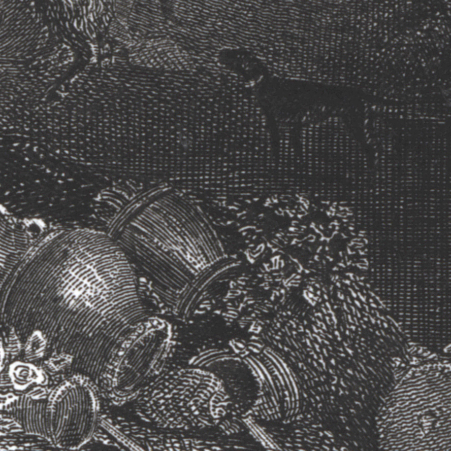
Beyond Cousen’s conversion of the painting’s colour-tones to greys, he also shows creative invention in his mimetic representation of the oil painting’s textures. Consider, for instance, his juxtaposition of mechanically engraved marks portraying the sky (see detail below), designed to suggest a comparatively smooth application of paint, with the scribble-like marks portraying the foliage, designed to suggest freely laid and thick paint. Of course, there is always the question of the degree of mimetic translation that an artist wishes to engage in.
 |
(upper) detail of Charles Cousen’s The Cornfields after John Constable, c.1870
(lower) arrow indicating the reference area in John Constable’s original painting
|
For example, compare Cousen’s approach with Timothy Cole’s much more inventive approach to creating a faithful copy of Constable’s The Cornfields shown below in his wood engraved version. In Cole’s print the original painting is now converted into a pattern of negative (white) marks resulting from the relief (i.e. raised) printing process. These negative marks with their complex arrangement and variations of shape reveal an even more codified pattern than exhibited in Cousen’s print. In the detail shown further below, see how Cole’s creative invention in the reproduction of Constable’s sky is now a carefully calculated optical pattern of closely aligned curving stokes that at one moment appear to be negative lines and at the next moment are seen as positive (black) lines. Going further, Cole has portrayed the expansive plane of the sky region as optically energised by the sinuous flow of these lines. By contrast to this flow, also note how he has synthesised the texture of the foliage into wedge-shaped dots that to my eyes present a convincing approximation of the facture (i.e. the handmade physicality) of Constable’s brushwork.
 |
Timothy Cole (1852–1931)
The Cornfields after John Constable, 1899
Wood engraving, 15.5 x 13.4 cm
|
 |
(upper) detail of Timothy Cole’s The Cornfields after John Constable, 1899
(lower) arrow indicating the reference area in John Constable’s original painting
|
Mindful that most artists are not
prone—perhaps even unable—to disengage their personal interests and
sensitivities when portraying a subject objectively, the approach of
verisimilitude in achieving what the OED defines as “the appearance of being
true or real” needs a caveat to allow for an artist’s personal perception of
what constitutes truthful representation. From the standpoint of allowing such
a caveat, this means that an artist is liberated from a strict and soulless
copying of a subject’s superficial pictorial reality and can portray an
interpretation of truth based on the dimensions of the artist’s perception of
the subject.
Regarding the interpolation approach where an artist adds fresh meanings to the subject’s original meaning, this is different to the last approach in that here the artist intentionally changes the original subject to project a personal perception. For example, in John Park’s print of The Cornfields (shown below) the image may be instantly recognisable as matching that of Constable’s painting but Park has changed the essential mood (i.e. the projected emotional tenor) of the painting with swirling line work in the sky (see detail further below) and a darkening of the painting’s tonal key. As a result, this print projects turmoil and drama. It is not the same view of landscape as a calm place where a shepherd boy can calmly drink that Constable presents. In short, Park has creatively reinvented Constable’s painting as his own artwork.
 |
John Park (1851–1919)
The Cornfields after John Constable, 1885
Etching on wove paper
25.6 x 22.6 cm (plate); 42.5 x 29.9 cm (sheet)
|
 |
view of whole sheet
Condition: very rich impression with a faint stain 5 cm from plate mark in lower margin and a small clipped lower-right corner otherwise in pristine condition.
I am selling this print by John Park along with the two above prints by Charles Cousen and Timothy Cole after Constable’s The Cornfield for a total combined cost of $110 AUD including postage and handling to anywhere in the world. Please contact me using the email link at the top of the page if you are interested or click the “Buy Now” button.
|
 |
John Park,
(detail) The Cornfields after John
Constable, 1885
|
Regarding the final approach to
creativity—the fountainhead approach—I have decided to discuss my adaptation of
Constable’s painting as a way of illustrating how an original image can serve
as a pictorial launch pad for one’s own artistic practice.
For me, there are few images that
are more closely identified with the English landscape than Constable’s The Cornfield. For some historically-minded
viewers it epitomises an idealised view of English rural life a few centuries
ago. Moreover, it for foretells the developing interest in the effects of light
by the tiny flecks of white that Constable scattered through the areas of
foliage to capture the sparkle of light glinting on leaves—commonly referred to
as “Constable’s snow.” My interest, however, lies with the “U”-shaped
composition of the painting and it is this component of his painting that
became my point of departure for my very free adaptation of The Cornfield (shown below).
Specifically, my fascination lies with Constable’s curious blend of Western
conventions of composition that invite a left-to-right reading and the
conundrum posed on such a reading by the direction of light coming from the
right and the arrangement of trees that invite a right-to-left reading.
.jpg) |
James Brown
Referencing Constable, 2011
Oil on canvas, 100 x 80 cm
(This painting has been sold)
|
In Referencing Constable I explored what would happen if the
composition were mirrored (i.e. pictorially reversed) so that the direction of
light and the arrangement of key features encouraged a left-to-right reading
that is more in keeping with the Occidental way of reading.
Beyond the reconfiguring of
Constable’s composition this is not an attempt to revive Constable’s view of
the English landscape. My painting revises—probably closer to obliterates—an
Englishman’s view of an English landscape and offers instead a North
Queenslander’s view of the region I am most familiar: the hot dry tropical
landscape of Australia.
_______________
Robinson, Franklin 2005, The Illustrated Bartsch 5: Netherlandish
Artists, Araris Books, New York